Monday, June 24, 2024

Penciled Pears Again

Hello Friends!  I've got another card to share today that uses the interesting Penciled Pears again.  I wasn't sure this would be on my list of must-have stamps, but Connie proved me wrong.  I'm so happy I was able to give the set a trial run at her house.  It totally convinced me that it was a good idea to order it!  She had already made a card with the set when I got there that intrigued me, but it used several items that were not current SU! products.  I wanted to stay current with what I was using, so Connie and I made another set of cards basing them loosely on her original.  Let's look at them all and see what you think.

First, I'll share my version of her original card.  I seem to be on a kick of using the new Basic Beige cardstock and ink.  I just love this color that enhances any card with a neutral look.  It seems to be my new go-to color!  The card base measures 8 1/2" x 5 1/2" and is folded in half.  The strip of four Penciled Pears is stamped with Basic Beige ink.  I staggered them going across the card front so they look a little more random. 

The large pear is stamped using Basic Beige ink on Basic White cardstock.  A little extra color was added using Soft Seafoam Light & Dark Blends on the pear and leaf, Old Olive Light on the stem and light touches in the shading of the pear and leaf, and Gray Granite Light on the shadow under the pear.  This was die-cut using the Countryside Corners die set.  The pear was kept near the top of the die-cut area.  

A larger die from the set die-cut a piece of Soft Seafoam cardstock to frame the pear.

Sneak Peek Alert!!  I love the sentiment used here.  It's from a set called Winterly Tree Tops.  It won't be available for a few months, but it is coming!  All I can say is you'll love it!!  Anyway, the sentiment is stamped with Memento Tuxedo Black ink on the bottom area of the die-cut.  

After stamping, the Basic White layer is attached to the Soft Seafoam layer with adhesive.  Some Linen Thread was wrapped around three times and tied into a loose bow.

The die-cut layers are attached to the card front using Dimensionals.

Three Opal Rounds gems are added to the design.

Now on to Connie's version of this design...

The first change is the Basics Embossing Folder that was used for the background of her card base instead of the stamping.

The same Countryside Corners die set was used on the Basic White cardstock, but the layer is changed to Lemon Lime Twist.  This automatically gives the card a much greener look.  

The pear is stamped just about in the middle using Basic Beige ink.  Touches of color are added with Stampin' Blends:  Light Soft Seafoam, Light Crumb Cake, Light Old Olive, Light Gray Granite, and Light Granny Apple Green

After coloring, the two die-cuts are attached together with adhesive.  Then they are attached to the card front using Dimensionals with the top very close to the top of the card base.

The same sentiment is stamped on a strip of Basic White cardstock using Gray Granite ink.  Looks like the strip is about 3/4" x 4 1/4".  It's attached flat to the card front.

For an embellishment, three of the Tinsel Gems 4-pack are attached to the white die-cut under the pear.

This is a picture of the original card Connie made.  Looking at it you can see different elements we each picked out from it to focus on for our cards.

I'm not going to give you a list of items used, because I don't have it written down anywhere.  I'll just give you a quick summary instead.  

There is a light green foil used in the band across the card and to frame the sentiment.  

There is a yellow color added to parts of the pear for added interest.

There are three olive-toned gems added to the finished card for embellishment.


That's all I can give you today.  I hope you enjoy the three different versions using this interesting Penciled Pear stamp set.  Like I mentioned earlier, I didn't think I needed this set, but I've changed my mind after creating with the pears.  Hope you give this set a try and see what you create with it.

That's it for now.  I'm visiting the doctor tomorrow as this sneezing and coughing and congestion stuff is hanging on.  It's been almost two weeks now, and that's just too long!  Wish it didn't make me so exhausted all the time.  Maybe my doc has a miracle cure and I'll be back to myself soon.

Happy stamping and creating,
Sharon

Saturday, June 22, 2024

Hello stamping friends!  You know that old saying about the best laid plans of mice and men?  Well, that goes double for women too!  Here it is a week after I got back from my visit to my sister's, and I've finally got enough energy to get a post done.  The first couple days at Connie's were stamping heaven.  The fourth day, I woke up with a not-so-lovely fever and I was out of it for the rest of my stay, the drive home, and the next day or so.  Then came the coughing that knocks me off my feet and the recuperating.  So there, you have a rundown of my last two weeks.  Definitely not what we planned, but that's the way it goes sometimes.  I do have a few cards to share that Connie and I worked on, which is good since I haven't been in my stamp room for a long while!

I love the Layers of Beauty stamps, dies, and masks!  They are so quick and easy to work with and I've made several cards featuring these products.  Now I have a "mine and hers" version for you.  

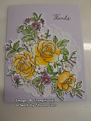
First, we started out by stamping the main image onto a quarter sheet of Basic White cardstock using Memento Tuxedo Black.  You need to angle it a little to get it to fit nicely.  After stamping, the image is placed under Mask #1 lining it up carefully.  For this layer, I lightly colored in with Lemon Lolly with a small Blender Brush.  In the areas for the tiny flowers, I added a light layer of Azure Afternoon ink.

Mask #2 has a light layer of Daffodil Delight ink added.  The tiny flowers have another light layer of Azure Afternoon on some of the petals.

Mask #3 has a layer of Peach Pie added for the deeper shading.  The centers of the tiny flowers are added with this mask too using Daffodil Delight ink.

Mask #4 has a light layer of Lemon Lime Twist added on all the leaves.

Mask #5 has a heavier layer of the same Lemon Lime Twist ink to add shading on the flowers.

Next, the image was die-cut using the coordinating dies.  The card base I chose for this card is Lemon Lime Twist.  It's not a color I use often, but I thought it was a perfect complement for the pretty yellows and blues on the image.

The design needed something else for a layer and all ideas I had didn't work.  Connie suggested a doily from her stash, and that was a perfect touch in my humble opinion.

The sentiment is from Thoughtful Wishes stamp set.  It's stamped on Basic White with Tuxedo Black ink.  Then it was fussy cut to fit the design.

The doily was attached with adhesive just in the center area.  The floral image is attached with both regular and Mini Dimensionals to give it some lift.  The sentiment is also attached with Dimensionals.  For a little bling, some Flat-backed Pearls were added.  I thought they really enhanced the look.

When I was finished with my card, it looked a little unbalanced to me.  All the design elements were too high on the card with too much space at the bottom.  I really couldn't take it all apart, so I did the next best thing.  I cut 1/4" off from the bottom of the card to make it just a bit shorter.  Did you notice?

Here are our cards side by side.  If you look closely you can see, we really did start out the same, but we diverged quickly.

For the tiny flowers on the floral image, Connie went with a purple tone.  I think she used Fresh Freesia.

She also kept her roses a lighter golden yellow.  The second layer of green on her leaves is Granny Apple Green which changes the look quite a bit.


I believe she used a sentiment from the Thoughtful Wishes set.  There is also a doily used on her card, but the card base is different.  I didn't write it down, but I think she used Bubble Bath for the card base.  If I'm wrong, she'll let me know.

She had some tiny little cute white flowers that she tucked in around the design, attaching them with Mini Glue Dots.  Nice touch!

Oh, one last thing I almost forgot.  She was using a Stampin' Blends to deepen the shadows on the roses to give her the look she wanted.  I think it was the Peach Pie Light color of Blends, but I wouldn't swear by it!

OK, I think that's all for now.  Besides, I'm wiped out and it's time to rest again.  What a bummer this flu is!!

Don't forget that the extra 10% off Bundles sale is still going on.  It lasts until the end of the month.  If you're planning on ordering, I would appreciate your business.  Thanks!

Happy stamping and creating,
Sharon

Tuesday, June 11, 2024

Pear Line-up Card

Hello there!  So good to be here with you tonight posting another card.  I'm visiting my sister this week and we've stamped ourselves ragged.  Who would believe it?!  We've been trying to do our regular thing of starting out with the same basic idea and then seeing where we end up with our ideas.  I actually thought I would have a pair of cards to share each night.  Last night I was just too worn out to type, so this will be the first one.  Let me know what you think of the designs.

The card we worked on first is using the Penciled Pear stamp set.  It's a lovely set with sketched pears and several sentiments which I do not own - yet.  I'm so glad Connie owned it so I could give it a try.  After working with the set, it just might be appearing on an order soon!  

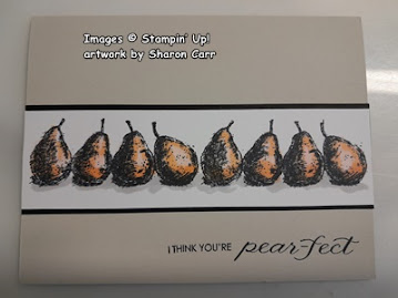
We decided on using Basic Beige for the card base and add a strip of pears going across the card.  This is my version of her design.  The Basic White strip measures 1 1/2" x 5 1/2".  There is a stamp of 4 pears in a row.  Two of these rows were stamped with Memento Tuxedo Black ink across the center of the strip.

The pears were colored using Stampin' Blends as follows:
Pears - Soft Sea Foam Light on 7 of the pears.  Then a layer of Granny Apple Green Light sketched on the where the shadows are.  The yellow pear has a layer of Lemon Lolly Light, with both Light & Dark Daffodil Delight added for the shaded areas.  A light touch of Soft Sea Foam was added to this one on the bottom left edge so it blends with the other pears better.
The shadows for the pears was added with Gray Granite Light Blends

The sentiment is from the Penciled Pears set also.  It's stamped with Memento Tuxedo Black ink near the bottom right of the card front.  The Basic White strip is layered onto a Basic Black strip that measures 1 3/4" x 5 1/2" using adhesive.  Then these layers were added to the card front just above the sentiment  

Here are our two cards hanging out here so you can see both of them together.  As you can see, Connie and I decided on totally different colors for our pears.  Which do you like better?  I'd love to hear from you on this.  And if you like hers better than mine, I promise I won't be too dejected.  😢

We do agree that the new Basic Beige color is delightful.  It's an awesome neutral color that is very versatile.

We also agreed that there was no need for any bling added to these cards.  They are nice and simple just as they are.  But of course, if you feel the need to add bling, bling away!
The colors she used on her pears are:
Light Petal Pink, Light Peach Pie, Light Pumpkin Pie, with Light Gray Granite for the shadowing.

The sentiment she chose is a non-SU! stamp, but doesn't it match this nicely?

I find it amazing how just changing a few colors on a card give it a totally different look.  I have to admit, I still like my D'Anjou Pears better than hers.  But which one will you choose?

I doubt if you need a reminder of the extra 10% off Stamp & Die Bundles Sale at Stampin'Up!  The sale will run through the month of June.  It's best to shop early because some of the more popular stamp and die bundles are already on backorder.  Plus, the Stampin' Cut and Emboss Machines are both on sale for 10% off during this time too.  Now is the perfect time to get one of these if you don't own one yet.  You really need one for all your embossing and die-cutting projects.  Talk to me if you have any questions.

Back to the creating room!  Talk soon...

Happy stamping and creating,
Sharon

Thursday, June 6, 2024

Ready for Watermelons!

Hello my friends!  Today's post is a little different than usual.  I was planning this month's cards for the shut-ins at church when I had some watermelon for lunch and that triggered my imagination.  Remember last year during Sale-a-bration there was a watermelon stamp set as one of the freebies to choose?  Well, this month's cards are all about watermelon and the cards are bright and fun and absolutely full of watermelons!  The set I used is called Watercolor Melon.  If you don't have this particular set, I'm sure you could find something similar and take this idea and run with it.

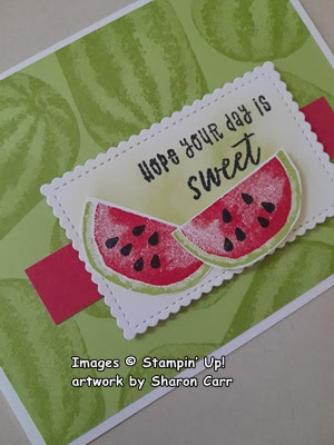
The base for the card is Basic White cardstock.  It measures 8 1/2" x 5 1/2" and is scored at 4 1/4" and folded in half to give you a 'landscape' style card.

The layer is the retired Parakeet Party cardstock that is still on my shelf and begging to be used.  This has about eight full and/or partial watermelons stamped on it using the matching Parakeet Party ink.  They are stamped randomly just so the background is covered.  After stamping, it's attached to the folded Basic White card front using adhesive.
Since I was using a retired In Color, I thought I'd use another retired In Color from last year too.  This is Sweet Sorbet and is one of the red colors that I really like.  Isn't a perfect color for the watermelon?  There is a small strip of the Sweet Sorbet cardstock that measures 4 1/4" x 3/4" attached across the card about 2" from the top of the Parakeet Party green layer.  It's attached flat on the front of the card using adhesive.

Next comes the cute, scalloped rectangle die-cut from the Stitched So Sweetly Dies.  I love the tiny delicate scallop along with the stitching lines.  Just adorable.  The center of the label has some Parakeet Party ink softly blended with a Small Blending Brush.  Keep the color soft and in the center so the white edges show up well.

The sentiment used here is from the Ice Cream Swirl stamp set.  It's stamped with Memento Tuxedo Black ink near the top right side.  This is attached over the Sweet Sorbet strip using Dimensionals for a little height.

Next up was stamping the watermelons.  First the rind was stamped using Parakeet Party ink.  I love the way the rind stamps darker on the outside and getting lighter on the inside just like any real watermelon.  The inner stamp was inked with Sweet Sorbet ink and stamped inside the rind.  Two sets of the seeds were stamped on each melon. They were carefully punched out using the Modern Oval Punch that fits the watermelons perfectly.  Two watermelons were made for each card.  That means there was a pile of 55 watermelons when I was finished.  There were a few extras as a "just in case" precaution. Whew!

One watermelon was attached flat to the left side of the label using adhesive.  The second melon is attached with Dimensionals partially covering the first melon.  Then the label was added to the card front using Dimensionals.

I didn't add anything to the inside of the card because I always print out an inside piece on the computer.  So, I was done and there was a slew of cards ready to send out.  Just need the envelopes printed up for me and that's a job for hubby.  He really helps out by printing them all out for me each month!  A real time-saver!

I thought you'd like to see all the cards that I send out.  These aren't quite all of them though.  Four of them are already in their envelopes and I'm not taking them out!!  Hope these cards will bring some sweet smiles to these kind people.  BTW, I'm so excited about this Friday.  One of the ladies from church that does some of the shut-in visits is taking me with her to visit three of these people!  Woo Hoo!  It will be wonderful to have a face to put with the names on the envelopes.  

Hope you enjoyed this cute card idea and get inspired to keep sending your hand-made cards out to brighten the day for someone.  This project is truly a labor of love for me and is so worth it.  Thanks for spending some time with me.  Enjoy yourself creating interesting cards to share with others.

Happy stamping and creating,
Sharon

Wednesday, June 5, 2024

Cute Little Fun Fold

Hello Friends!  Today's card is all about bright and cheerful, with a little fun-fold action thrown in for kicks.  I have a friend who's having another surgery soon.  This will be the third in three months.  The surgeries are going well, but it's still a lot of stress and worry.  I was looking for an idea that would be just a little something to cheer her up.  I think this little card fits the bill.

Isn't this a darling little card?  And I do mean little in size.  With it all folded up, it's not even 3" wide and only 4 1/4" tall.  Like I said, little.  But it's just the cutest card when it's standing up with all those folds and angles.  Are you interested in making one of these?  Well, let's get stamping!

The card starts out with a base of Thick Basic White cardstock that measures 4 1/4" x 11".  Then it's scored at 1 1/2", 3", 5 1/2", and 8".  This is folded like an accordion with the first fold going to the back.  Make sure to use your bone folder to get a good crease on each of the folds.

The DSP color is called Shy Shamrock and is in the 2024-2026 In Color Designer Series Paper.  Here are the sizes you need to cut:  
2 @ 1 1/4" x 4"
2 @ 2 1/4" x 4"
1 @ 2 3/4" x 4"

Adhere each of these to the corresponding folds of the card base.  I used "green glue" to attach these pieces.  The two smaller ones go on the front folds, the largest is the back piece, and the middle two go on the middle folds on the card.  Make sure you line up all the top and bottom edges to keep it neat.

Next up are the daisies.  These are from the Cheerful Daisies Bundle.  There is one die that has three daisies and some leaves all connected in the one die.  One of these was cut from Basic White cardstock, then trimmed apart with Paper Snips.   The three layering pieces for these daisies was cut from Basic White.  And several extra leaves and one of the airy fern pieces were also die-cut from white.   Then the fun begins.  On the center of each of the flowers and layers, Daffodil Delight ink was added to them with a Small Blending Brush.  Try to keep the yellow ink in the centers only with the edges of the petals still white.  Another Blending Brush was used to add Shy Shamrock color to the white leaves and airy fern.  This was not a solid coverage at all, but kind of hit or miss, light and dark.

The centers on the flowers were stamped on the layering flower pieces.  Then a little adhesive was added to the center of the top layers and added to the coordinating flower with the darker centers showing through. 

The two smaller flowers were arranged on the front fold with petals slightly overlapping the fold.  They are attached with adhesive.  Two of the leaves were tucked in under the flowers.  Leave a little space between the flowers for a sentiment.

The 2nd fold has the large flower attached with adhesive.  It also overlaps the fold.  The leaves and part of the airy fern were tucked in around the daisy.  When the card is shut, the two layers of daisies overlap the fold and gives the look of a bouquet.

Next was cutting a white layer for the inside message on the card.  I wanted to use the Deckled Rectangle Dies, but they were too wide.  After one was cut from Basic White, I laid the long edge of the die about 1/4" in from the edge and ran it through again.  This gave me the size I needed to fit inside the card without showing through on the front when closed.  It has some triple daisies stamped on opposite corners to bring the yellow inside of the card.

Lastly is adding the sentiment.  I found this perfect little sentiment in the Delicate Forest stamp set found on page 76 of the current annual catalog.  Unfortunately, it was really close together and I wanted it split to use half outside and half inside of my card.  It is stamped onto a Basic White strip using Pecan Pie ink.  First, it's cut in half between the lines with a Paper Trimmer.  Then the ends were angle cut on the card front and attached with adhesive on the left side only, so it overlaps.  The words on the bottom of the stamp were cut in half at an angle and the outer edges of the words also trimmed at an angle to match.  They are attached flat with adhesive leaving plenty of room to write a little note.

Here's the finished card.  As you can see, the daisies overlap onto the under layers.  The large daisy even sticks out past the edge of the card.  Because of the small size of this card, it isn't a problem fitting it into a regular envelope.

I really gave some thought to adding some extra bling to the card.  But after really looking at this little card, I was afraid it would be too busy looking.  It was just perfect as is for what I wanted to mail out to my friend.  Sometimes I find it hard to make a specific card for illnesses and sympathy in the moment.  For me it seems better to have a couple different styles made up ahead of time and just pick one that fits.  But this one was not only fun to make, but I was praying for her surgery and recovery while making it.  Isn't that a win-win?

Thank you for sharing some of your precious time with me today.  This is a darling little card that is so easy to make.  Now that I've made one, I'll have to see what else I can come up with next.  How about you?

Stampin' Up! is having a sale starting today until the end of the month.  This sale features 10% off Bundles and 10% of the Stampin' Cut & Emboss Machine.  If either of these things interest you, head on over to the store and see what's available.  If you'd put me down as your demonstrator, I'd be very appreciative!  Thank you.

Happy stamping and creating,
Sharon

Saturday, June 1, 2024

Unbounded Love in Neutrals

Hi there!  Today's post will be quite quick.  At least that's the plan at this moment.  We'll see how well I stick with the short and sweet plan!  I was in the mood for neutrals today.  I've been doing most of my creating lately with lots of color.  Today I'm toning things down with a very simple but sweet card.  Let's get stamping!

The base of the card is the new Basic Beige.  If you haven't gotten this yet, you don't know what you're missing.  It's turning into one of my favorite colors.  Can beige be considered a color?  hmmm  Anyway, the base is 8 1/2" x 5 1/2".  It's scored and folded in half.  The next layer is Basic White.  It measures 3 7/8" x 5 1/2".  It's ripped on the bottom to give it a length of about 5 1/8".

The next layer is a pretty eyelet print from the Country Lace DSP (pg 51).  This is a very subtle print and I love it.  This layer measures 3 3/4" x 5 1/4".  This is also ripped along the bottom edge until it fits nicely on the Basic White layer.  This is about 4 7/8" or 5" in length.  Attach the DSP onto the Basic White layer using adhesive.  Then attach this to the card base using Dimensionals.

The sentiment and label die-cuts are part of the Unbounded Love Bundle featured on pages 54-55. This versatile set includes sentiments for both the inside and outside of your cards—a true essential! For the label, I utilized two distinct dies: the larger one to cut the Night of Navy base and the smaller one to cut the Basic White layer, which is one of the two pieces produced. The remaining outer frame is reserved for a different project. To coordinate with the frame, the sentiment is stamped in Night of Navy ink. Both pieces are then adhered together.

The cute little open-work leaves are another die from the set.  There is a single leaf and a double leaf die to choose from.  I actually cut one of each from both Basic White and Basic Beige cardstock to use here.  

The sentiment label is attached to the card front with Dimensionals.  The leaves are tucked in under the sentiment at opposite corners.  These were attached with small touches of "green glue".

A small bow was made from the white ribbon that is part of the Petal Pink and White 1/4" Diagonal Trim Pack.  It's number 11 and is found on page 113.  It's attached with a Mini Glue Dot just under the label.  I like the small tone-on-tone diagonal weave that sets this ribbon apart from just a plain white ribbon.  It's the little touches that make a card special, you know?

Lastly, I used something that isn't available quite yet, but keep your eyes open for it.  The gems are called Earth-tone Gems and I think they're great.  They are lovely, faceted gems that are opaque and are a nice touch here.

That's it.  With just this one stamp set, a pack of DSP, and some Basic White and Basic Beige cardstock, you can easily make this card.  It's a great basic set to have on hand for your creating.  

I think I managed the short and sweet part okay with this post.  I want to mention that Stampin'Up! is having a great sale starting June 5th - 30th.  Stamp and Die Bundles will be 10% off.  Also, the Stampin' Cut and Emboss Machine will be 10% off during this time.  If you're thinking about purchasing a Bundle or more, now would be the opportune time to get the extra discount.  Don't we love our sales ladies?  If you have any questions or would like help ordering, contact me at sharoncarr50@gmail.com.  I will get back with you asap.

Happy stamping and creating,
Sharon