Showing posts with label Blessings of Home. Show all posts

Thursday, January 26, 2023

Dainty Flowers DSP Cards

Hello dear Friend!  Glad you stopped by today.  I planned on using one of the pieces of the Dainty Flowers Designer Series Paper to make my card for today.  It is one of the freebies available during Sale-a-Bration.  It will be available until the end of February or until it sells out.  So far, this has been the most popular item from the Sale-a-bration brochure by far.  If you've put off choosing this one so you can get something else first, please don't wait too long!  Anyway, back to my project.  I had cut the DSP at 5 1/4" across the 12" piece, then cut off one 4" piece from that.  So far, no problems.  Then I started trying to figure out what green I wanted to use for my layering color and/or card base.  Hmmm...  I tried the greens that were listed to match with the DSP.  That was fine, but then I went further afield.  I liked other greens that weren't listed to match so why not make several cards using the different greens and then decide what I liked the most.

After playing around all afternoon, I finally stopped after making three cards.  But I will revisit this little print again sometime soon.  It's a nice, quiet little print and quite my style. As I went along, more color was added to the card instead of just the greens and a neutral.  I'll have another picture of each one at the end of this post, but I wanted to focus on just one of these cards today.

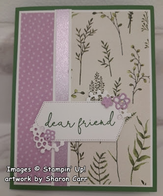
This is the card I chose for today.  It uses many of the dies from the Sentimental Park Bundle that I absolutely love!  The label dies are so much fun to use either singly or together.  And as you can see, they were used on each one of these cards.

To make this card, I started with a card base of Mossy Meadow cardstock that measures 11" x 4 1/4", scored at 5 1/2" and folded in half.  I cut a layer of Old Olive cardstock that measures 5 1/4" x 4".  To this a layer of the Dainty Designs DSP that measures 5 1/8" x 3 7/8" was attached with adhesive.  A strip of a different print (from another stamping session) that measures 4" x 1 1/2" was attached across the middle of the card.  This was attached to the folded card base using Dimensionals.  

For the focal point of the card, I die-cut Old Olive cardstock using the largest of label dies in the Sentimental Park die set.  Then the middle-sized die which is plain was used to cut a Very Vanilla label.  The really cool thing about these dies is that the smaller one tucks right under the flowers on the larger die-cut.  It lines up so nice and easily slides right into place.  Before attaching them together, the sentiment from the Blessings From Home set was stamped in the center with Mossy Meadow ink.  Then it was tucked in nice and neat with just a smidge of adhesive to hold it in place.

I cut an 11" length of Fresh Freesia 3/8" Open Weave Ribbon.  After putting adhesive on the back of the labels, I laid the ribbon back and forth at a diagonal, so it showed on both sides of the label.  This was a nice way to dress up the card with ribbon without trying to force a bow to fit in there somewhere.  At this point, I attached the beribboned label to the card front using Dimensionals.  So pretty!

There are multiple different small flower dies in the Sentimental Park set.  I used two of them to make the clusters of flowers.  Fresh Freesia was die-cut to make these detailed flowers.  They were scattered around until I was happy with the layout.  Then they're attached to the label with Mini Glue Dots. 

The tiny gold pearls (retired) were attached to the larger flowers.  I thought they were too big for the tiny flowers, so I added just a touch of Gold Wink of Stella which is also retired.  After looking at the card some more, I went back and added more of the gold pearls to the label to balance it out.

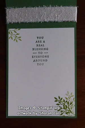
There's a layer of Very Vanilla cardstock inside the card.  It has a 1/8" strip of the same Old Olive DSP that is going across the card front attached down the side to finish it off.  

This is the 1st card that I made.  It's time to share the other two.

This card ended up being a very toned-down version of the last one.  The greens used are Soft Sea Foam for the card base and Mossy Meadow for the framing layer in between.
On this card, I used the smallest label in the die set.  This was cut from Mossy Meadow.  A skinny label from the Cracker & Treat Box Die Set found on page 170 in the Annual Catalog is used to cut Very Vanilla cardstock.  The sentiment is from the Sentimental Park set and is stamped with Mossy Meadow ink.
Extra flowers were cut from Very Vanilla and added to the label with Mini Glue Dots.  Tiny pearls are added to the flowers.
Two of the little wood elements were added for interest.  They are attached to the card base with rolled Mini Glue Dots.  And a double bow made from Linen Thread was added as the final touch.

The last card was changed quite a bit.  The base card ended up being Garden Green with a framing layer of Basic White which brightened the card up a lot.  The size of the DSP is the same.  It was just cut to make a 1 1/4" strip along the side of the card.  The backside of Fresh Freesia polka dots also brightened the card immensely.  
I added a 5/8" strip of Basic White to cover the seam between the two colors.  Then I added a 3/8" strip of the Fine Shimmer Paper in the Fresh Freesia color over the white strip.  Wow, that really popped it!  It can be found on page 15 of the Mini Catalog, and it's gorgeous!
The label is the smallest in the Sentimental Park set.  It's die-cut from Basic White with the sentiment from the Sentimental Park set stamped with Garden Green ink.  Three of the tiny flowers were die-cut from Fresh Freesia cardstock and attached to the label.  Three Opal Rounds were added for bling.

There you have three different cards using the same piece of DSP but coming up fairly different looking.  It's amazing how a different color green cardstock started the whole process to make them different with minimal changes.  Yes, the last one was quite different because I used the backside of the DSP.  But still....  I'm thinking I want to go back and try some cards using Rich Razzleberry as a layer and see how they turn out.  I think it would be lovely, but I need to see it first.

Thanks for stopping in to check on what's new around here.  Hope you like today's post with the different versions of the same DSP.  That's really been fun for me.  Remember, if that Dainty Flowers DSP is one of the Sale-a-bration freebies you want to get your hands on, don't wait too long.  I'm thinking that it'll be the first one to sell out.

By the way, thanks to those of you that have been sending me cards in the mail.  I've received some really fabulous cards and I can tell you've put time, effort, and thought into making them.  Thank you so much for thinking of me.  They really brighten those dreary, rainy days we've had so many of lately.  I'm planning another Friendship Friday post to share all these cards with you.   Love you all so much and miss you!!!

Happy stamping and creating,
Sharon

Thursday, January 13, 2022

Blessing of Home Birthday

 Hey y'all.   It's official now.  I'm back on my "pastel" card kick again.  I just love the look of pastels and I keep heading in that direction.  I try hard to work with bright colors or the rich dark colors to appeal to others, but pastels are definitely my favorite.  And today's card certainly fits that category in spades!  Have a look...

It's pretty here in the picture, but in real life it's just simply gorgeous!  To keep the card from being too pastel, I started with a base of Basic Gray.  Dark, but not too overpowering.  This was cut to 11" x 4 1/4" to make a top fold card.

Next is a layer of the Friendly Hello Designer Series Paper that comes in a bundle with the Friendly Hello stamp set.  And yes, they are one of the free items in the Sale-a-bration catalog right now.  The prints and colors on this 12" x 12" set of papers are so pretty and I love them all.  (That doesn't happen very often, like almost never!)  

This card uses a pretty Pale Papaya and white print for the layer that is 5 1/4" x 4".  It's attached to the Basic Gray card base with adhesive.

The Basic White layer with all the stamping is cut at 4 1/2" x 3 1/4".  The larger floral image is from the Blessings of Home stamp set.  It was stamped on the white using Basic Gray ink to keep it softer looking.  I added color very sparingly with Stampin' Blends. Fresh Freesia L & D, Soft Succulent L, Pale Papaya L & D, So Saffron L & D, Pool Party L & D, Cinnamon Cider L, Pumpkin Pie L, and Highland Heather L. 

To get this look, keep the color to the shaded areas of the flowers and leaves.  The trick is to leave most of the areas clear of color.  I found this to be challenging, because I usually lay in the light colors and go back to shade with darker ones.  This is such a different coloring technique for me, but so fabulous looking!

After coloring, the white layer was attached to a Basic Gray layer cut at 4 5/8" x 3 3/8".  Used adhesive to attach.  This gives a very thin gray layer that frames the image nicely.  It was attached to the center of the card front using Dimensionals.

The sentiments both inside and outside for the card are from the Blessing of Home stamp set.  The front sentiment is stamped in Basic Gray ink onto a small strip of Basic White that was 1/2" wide.  After stamping, it was trimmed on the sides to 3 1/4" long.  This is layered onto a Basic Gray strip that was trimmed to 5/8" x 3 3/8".  It was adhered directly to the focal image at an angle using adhesive.

The inside has a 3/4" strip of the Pale Papaya print (that matches the front) attached to the right side of the Basic White layer.  The sentiment is stamped with Basic Gray ink.  It's attached to the card with adhesive.

Lastly, I felt the card needed some bling to enhance it.  There is a new rhinestone in the 2022 January - June Mini Catalog that's fabulous - the Iridescent Rhinestone Basic Jewels.  Totally awesome looking.  I put 1 large and 2 medium ones in the bottom corner.  Then I couldn't stop and added 2 small ones to the design too.  Oh, so lovely!!

Hope you enjoyed the technique I shared today.  I have no idea if there is a special name for it, but it is easy to do once you get the hang of not coloring in the whole image, just the shading.  Give it a try and let me know how it worked out for you.  Just leave me a comment!  I'd really love to hear from you.  

Keep stamping and creating!

Sharon

Monday, January 3, 2022

A Friendly Hello Bundle

Oh, my goodness!  I've been having so much fun with a new Sale-a-bration bundle.  Yes, you heard correctly there.  After you spend $100 in regular merchandise, you can choose to get this bundle.  It has an awesome stamp set with 13 photopolymer stamps to start with that includes 3 sentiments.  And it has a gorgeous 12 x 12 set of Designer Paper that coordinates with it!  They're my sort of colors too - more on the brighter pastel side.  Woo Hoo!!  Can you tell I'm just a little excited? 

Here's the first one I made with both the Friendly Hello stamp set and the Friendly Hello matching Designer Paper.  It's turned out such a bright cheerful green as the main color on the print I used is Granny Apple Green.  It just screams 'spring!' to me.  To make this card, I started with a card base of Garden Green for some contrast.  This was cut 11" x 4 1/4", scored at 5 1/2" and folded in half to make a top fold card.  The layer of DSP is cut 5 1/4" x 4".  It's attached to the card front with adhesive.  I wanted as much of this to show as possible, so I looked for a die that wouldn't be too small for the sentiment.  But it shouldn't cover the whole card front either.  The die from the Tasteful Labels Dies was just the right size and a pretty shape with a little outline detailing too.

The hello friend sentiment from the set was stamped with Garden Green ink more to the right side of the label.  That left lots of room on the left side for the pretty flowers that are part of the set too.  These were stamped with Garden Green ink onto a scrap of Basic White cardstock.  I also stamped 5 solid leaves with the Garden Green ink on the scrap of white.  

The flowers were just lightly accented with some water and a Water Painter brush to soften the shading lines inside each flower.  It actually makes the centers look like Granny Apple Green.  Who knew...?   

The flowers and leave were all fussy cut because there are no dies or punches.  Surprisingly, it took almost no time at all to cut the 6 pieces.  It was time to position all the pieces around the sentiment.  The flowers were attached only on the edge of the label die-cut.  Several of the leaves were tucked underneath the flowers.  The label and flowers were attached to the card front using Dimensionals.  The last two leaves were attached flat to the card front with adhesive.  This gave the flowers cluster more depth.


Looking to finish off the card front, I added a length of the new 3/4" wide Frayed Ribbon wrapped across the top of the card and tied into a square knot.  There is a bit of extra fraying going on with the ribbon edges on purpose.  I liked the shabby chic look of the fraying. This ribbon is pretty thick though, so I'll probably need to add extra postage when I mail it.

The flower centers looked really bare, so I added some Genial Gems which are found in the 2021-2022 Annual Catalog.  There are some green gems, but they didn't look nice with the greens already going on here.  So I used the Pale Papaya ones instead.  These added just a bit of color without being overpowering.  The two flower centers are the larger gems.  Then I couldn't stop myself and added 3 of the smaller gems to highlight the sentiment.


The inside of the card got some special treatment too.  The sentiment is from the new Blessings of Home stamp set.  It is stamped on a layer of Basic White cardstock with Garden Green ink to match the front.

The Friendly Hello stamp set has a leafy branch that I thought would be a good accent.  It was stamped with Granny Apple Green in the top left corner and the opposite bottom right corner.  On the bottom corner, it was stamped once at full strength and then off-stamped two more times to fill it in.  I also like the look of the frayed ribbon wrapping around on the inside of the card.  Just an added benefit.

Thanks for stopping in today to see what's happening.  I'm enjoying playing with the new stamp sets I've already purchased from the 2022 January - June Mini Catalog and the Sale-a-bration bundle I received free.  It's always interesting to see how people interpret using the new sets.  Yes, I've been hanging out at Pinterest to see what others are doing.  It seems to jump-start my own creativity to see what's out there.  If you're like me and need a little push to get going, I hope my ideas will jump-start your creativity!  If there are any questions you have, feel free to contact me.  I'm here to help you be the very best stamper you can be - and have fun doing it!!

Happy creating and stamping!
Sharon

Thursday, December 30, 2021

Blessings of Home Card

Hello again!  Glad to see you stopped by.  With yesterday's card, I had one strip of the Harvest Meadow Designer Series Paper left over after I had the stack of cards finished.  And that pack of Soft Succulent cardstock was still sitting out, and the Basic White cardstock was just sitting there too.  So, since everything is out already, why not design a different card to use up those items.  I've got some friend's birthdays coming up that I'll need cards for in January and thought it would be a good place to start.

This card uses the Soft Succulent cardstock for the base with a layer of Basic White on top.  Before the white is attached though, I stamped the largest floral stamp in the new Blessings of Home stamp set as a soft, mono chromatic background.  The stamp was inked, then off-stamped for a softer, 'sketchier' look to the background.  That left-over 1" strip of the DSP was attached to the left side again to anchor the design.  Then it was all attached to the Soft Succulent card base using Multi Purpose Liquid Glue.

The next part of the design was stamping the smaller floral image onto a Basic White layer.  The Stitched So Sweetly Dies have a pretty scalloped and stitched rectangle die that looked to be the perfect size for this.  After die-cutting the white, the floral image was stamped using Memento Tuxedo Black ink.  
For coloring, I chose to use my Stampin' Blends.  I have a couple friends that love purple - any shade will do to make them happy!  So of course, this card has a mix of purple shades for the flowers:  Purple Posy L&D, Highland Heather L, Fresh Freesia L&D.  The leaves are Soft Succulent L&D.  And the flower centers are So Saffron L&D and Cinnamon Cider L.  The pictures really don't do the small flowers justice.  They are the ones colored with Fresh Freesia ink and are so cute in real life.  Much pinkier-purple than they look in the photos.
After coloring, the die-cut was attached to the card front using Dimensionals for some interest.  

The sentiment is the same one from the Inspiring Thoughts set that I shared yesterday, except today the full stamp was used.  It's stamped on Basic White with Soft Succulent ink, trimmed, then layered on a Soft Succulent cardstock piece.  This is attached with adhesive to lay flat on the left and a Dimensional on the right to keep it level.

Hopefully you can see some of the layered Stampin' Blend colors on this close-up of the image.  It was fun using so many layers of color on each flower to get the look I wanted.  Yes, I do love my Blends!!

Underneath the sentiment I added a small knot of Fresh Freesia 3/8" Open Weave Ribbon.  It's attached with a Mini Glue Dot.  

For this card, I felt I needed to add some bling.  The 2021-2023 In Color Jewels just called out to me, so I gave them a try.  I could have used the Fresh Freesia ones, but finally decided on the Soft Succulent gems.  Either color would have worked out well, but since I have more of the Soft Succulent gems I used them for this card.  I love the iridescent look of these gems!  It actually makes them blend in with so many more colors than just the In Colors they should match.  In my humble opinion, these are a must have in your "bling box".


Hope you enjoyed today's post.  I'm having a great time playing around with my newest stamps.  I might have to start branching out to other colors though.  I've been stuck on the Soft Succulent for awhile now.  What color should I play with next?

Happy stamping and creating!  It's a great way to finish out the old year. Of course, it's also the perfect way to start fresh in the new year!  Have fun...

Blessings and many hugs,
Sharon