Showing posts with label Biggest Wish. Show all posts

Saturday, March 23, 2024

Show Off Those Prints!

 Hey!  How are you today?  I've been playing around with ideas to enjoy both sides of your print paper designs.  Most of our designs are beautiful and coordinate both front and back.  It's so hard to choose which side to use to create your project.  I have to admit, there are times when I only like one side of the DSP, so there's not a problem deciding.  But sometimes, it's hard to choose.  And when the prints work so well together, it's a no brainer - use a design that showcases BOTH sides of the paper.  Even though this DSP was a Sale-a-bration item and no longer available, I still like the prints and colors and wanted to use it.  I know you've got some of this tucked away and maybe need an idea for using it.  Right?  Of course, this layout will work for so many other prints that are currently available.  Just use this idea as a jumping off place and have fun creating this idea with any other DSP prints that coordinate on both sides!

I really like the Pool Party and Wild Wheat colors together.  I had trouble deciding which way to fold the Softly Stippled DSP for this card idea as both ways worked quite nicely.  But this is what I chose.  Let's get to the instructions so you can make this idea too.

Start with the designer paper that you want to use so you can find a coordinating color for the card base.  For mine, I chose Wild Wheat as it matches the main print on the DSP that I wanted to use.  This is cut at 8 1/2" x 5 1/2", scored at 4 1/4" and folded in half.

The Softly Stippled DSP measures 6" x 5 1/4".  This is scored at 2" and folded back on itself.  The piece is then attached to the folded Wild Wheat card base with adhesive.

When the front flap is open, there is room for an extra sentiment.  A Basic White cardstock piece was cut to measure 5" x 1 3/4" which will fit on the fold over flap.  One of the Courage & Faith stamps (pg 72 in the 2023-2024 Annual Catalog) was used to add the sentiment.  It's stamped in Wild Wheat ink at the top of the white piece.  To fill in the bottom of this, a small rose from the Stippled Roses (Jan-April 2024 Mini Catalog) was stamped using Pool Party ink.  Before attaching this, there are a few other things that need doing.
The front of the fold over piece has a 3/4" x 5 1/4" piece of the DSP print attached down the center of the flap.  To dress this up, a ribbon was added.  This is a current ribbon combo (with Real Red) in the Annual Catalog.  It's more a neutral color, but I think it blended well.  The ribbon was cut 7 1/4" long to lay across the front and fold and attach on the back about an inch top and bottom.  After attaching the ribbon, the white layer was added using "green glue" to attach in place.  This will help anchor the ribbon in place too.

On the front of the card, a piece of Basic White was cut at 2" x 2 1/2" and a piece of Wild Wheat was cut at 2 1/4" x 2 3/4" to frame the white piece.  The sentiment is from the Biggest Wish stamp set.  The large Hello was stamped with Pool Party ink and the overlapping friend is stamped with Wild Wheat.  These pieces were attached together with adhesive.  Then they were attached to the card front using Dimensionals.  Make sure the Dimensionals stay to the side of this, so it doesn't catch the back when the card is closed.  A spray of leaves from the Stippled Roses dies was cut from Wild Wheat cardstock.  A few leaves were trimmed from this to fit the card better.  It's just tucked in under the sentiment using adhesive to keep in place. 

The inside of the card has a piece of Basic White cardstock cut at 5 1/4" x 4".  A sentiment from Hope & Prayer (pg 72 in A. C.) was added.  This time it's stamped with Memento Tuxedo Black ink.  I love how these two faith-based stamp sets go together.

To add interest, the rose leaves from the Stippled Rose set was stamped with Wild Wheat ink in the bottom corner and the butterflies were stamped with Pool Party ink around the sentiment.

After stamping, the Basic White layer was attached inside the card with adhesive.

I thought a picture from a top angle would help to understand the special fold on this card.  

After looking at the finished card, I thought of the Brushes Brass Butterflies in the Annual Catalog that would be a good addition to this design.  They are small enough to add to the little sentiment tag and would coordinate with the butterflies inside the card.  That's it for this card.  But, I was on a roll with this DSP and tried another card...

Here's the next card made with this fun fold idea.  Changes to the design are minor.  The card base changed to Pebbled Path and a different DSP print from this paper pack was used.  A retired Calypso Coral ribbon was used this time.  

The same sentiment set as the first card was used with Calypso Coral and Pebbled Path inks instead, and the sentiment layer was changed to Calypso Coral cardstock.

The accents on this card are the 2023-2025 In Color Dots.  I added one of the Pebble Path Dots on each of the sentiment areas.

Hmmm, which DSP duo should I use to make the next card?  Any ideas or suggestions?

Hope you enjoyed this interesting way to showcase both sides of your DSP that you love.  I'm sure each card will be as unique as the DSP prints that are used.

Happy stamping and creating,
Sharon


Monday, April 4, 2022

Pretty Poppy Moments

Hi Friends!  Happy April!  I guess spring is truly on its way.  Have you ever had one of those days where you see an idea and it just makes you happy?  So of course, you have to sit right down and try making it, right?   That's what happened this morning.  I saw a card designed by Peggy Noe that just made me smile as soon as I saw it.  And I owned everything that she used to design her card too.  Woo Hoo!  The card uses the Poppy Moments Dies for the focal image. The only stamping on this card is the sentiment.  Oh, did I mention I made a few changes as I went along?  Let's get started.

This card starts with a Thick Basic White cardstock piece cut at 11" x 4 1/4" that's scored at 5 1/2" and folded in half.  I guess that's my first change - she cut her cardstock differently, so the fold was along the side.  The pretty striped layer is from the Pattern Party DSP that is a Host Reward.  This paper pack has so many different prints in both black & white and colors that you can find something to fit almost any occasion.  For this card, I chose a Calypso Coral and white stripe.  It's cut at 5 1/4" x 4" and attached to the white base just using adhesive.  The black & white print is from the same paper pack.  This was cut 4" x 3" and layered onto the stripes with adhesive. 

The poppy base was die-cut with the Poppy Moments dies and cut from Calypso Coral cardstock.  The open-work layer was die-cut from Flirty Flamingo cardstock. They are attached together with several Mini Dimensionals under the flower's center. 

The die set has two different full flower centers that are die-cut from Daffodil Delight cardstock.  Holding them in my palm, I used the Take-a-Pick Tool with the cover on to make the centers curve up a little.  They are layered together using Mini Glue Dots.  Another Mini Glue Dot was used to add this to the poppy's center.  Don't they all look great layered up together?

I changed things a little here.  She added several loops of black & white baker's twine and attached this under the poppy.  I preferred to use some die-cut Old Olive leaves to frame up the poppy instead. 

The sentiment layer was die-cut using the Stitched So Sweetly dies.  It's cut from Daffodil Delight cardstock using the 2nd smallest rectangle die.  I will greatly miss this set of dies as it is retiring.  I seem to grab it all the time.  Guess I'll have to find a new go-to die set.  

The sentiment comes from the Biggest Wish stamp set.  This is one of my favorite sets if I'm looking for bigger words to make a statement on the card front.  The hello was stamped with Memento Tuxedo Black ink.  After stamping, it was attached to the card front with adhesive. 

The last touch was the addition of some Matte Black Dots.  A large one went on the flower center.  A couple of the small ones were added to the sentiment - she only used one.  Then I thought I'd try a few more changes and make another card or two.  Since everything was out on my table, why not?


As you can see on this card, I did a major change in the orientation.  
The layer of black & white DSP is smaller - only 1 3/4" wide instead of 3". 
I still added the leaves, but fewer.  This time the leaves were cut from Pear Pizzazz cardstock.  
Only one of the Matte Black Dots was added to the card.

This one has even more changes to it.  The card base was changed to Poppy Parade.  
The black & white DSP is a different print from the same Pattern Party pack, but back to 3" wide.
The base of the poppies is die-cut from Poppy Parade cardstock. The open-work layer is cut from Calypso Coral cardstock.  I added one of the smaller poppies to fill in, and a few more leaves.

Oh my goodness!  How much fun was that to take Peggy's card idea and play around with it to make it my own.  I forgot how much fun those poppy dies are to play with!!  They all look different but similar.  Each one was sort of a springboard to the next one.

I hope you use my card ideas in the same way.  I know I often look at cards on Pinterest to get the creative ideas flowing and then go to my stamp room and play.  Sometimes what I come up with is fairly similar, but sometimes it takes a few twists and turns and comes out looking nothing like the original.  And either way is good.  Somedays, the ideas just aren't there so copying others is fine.  The important part is to actually find the time to get creative.  If you don't try, it will never happen.  

Ok, that's my lecture, or pep talk (or whatever this is) for the day.  Thanks for stopping in to see what's happening here.  Just a quick reminder that the new catalog will be starting in May and is being sent out to you.  But with a new catalog, that means the old one is retiring.  Lots of items are on sale, but not all of them.  When you are ordering, please use the Host Code on the upper right corner on the blog page.  It's much appreciated!  And hurry to pick up what you want before they are sold out!  

Love you guys! 

Sharon

Sunday, January 23, 2022

Simple Card with Designer Paper

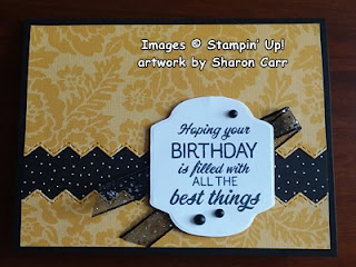
Hi there!  Happy Sunday to you.  Hope you're doing well and staying warm.  This has been so crazy - leaving Michigan but having more snow here in the south than up there!  Who would have guessed?  Just goes to show that there are always surprises around the corner, and we need to expect the unexpected!  I guess my card for today's post is kind of unexpected for me.  I tend toward florals and pastels, and that sure doesn't describe this card!  There are bold colors, and very simple lines and shapes on this card.   These enhance the Pattern Party Designer Series Paper which brings it all together nicely.  Simple but elegant.

The theme here was to be black and bold.  The Pattern Party DSP has so many colorful and fun prints on one side and all black and white with more geometric type prints on the other side.  They made a good contrast together with the Basic Borders Die set to add another dimension to the design.  Both of these items are in the Annual Catalog.

The card design starts with a Basic Black piece of cardstock cut 8 1/2" x 5 1/2", scored and folded in half.  The Crushed Curry DSP floral print was cut 5 1/4" x 3 3/4".  The black with white dots DSP print was cut 5 1/4" x 1 1/2".

Using the stitched zigzag die from the Basic Borders Die set, cut between about 1" in from the edge.  These two pieces will be split to put the black and white print in between.  Make sure to keep the die straight while you're cutting.

Put adhesive on the back of the smaller Crushed Curry pieces along the stitched zigzag edge.  Attach the black and white print under this near the die-cut edge, covering all the zigzag edges.  Put adhesive on the rest of this and attach to the open edge of the card front as shown.  Make sure to line up the three edges evenly.  Put adhesive on the larger Crushed Curry piece all over and attach to the card front lining up the edges evenly with the piece you just attached.  At this point, you've got a black band about an inch wide going across the card.  Love those stitched zigzag lines - so nice and bold!

Since I wanted as much of the design to show when finished as possible, I looked for a sentiment to be the focal image and nothing else.  This sentiment is from the Sunny Sentiments stamp set in the Annual Catalog.  It's stamped on Basic White cardstock with Memento Tuxedo Black ink.  After looking through my dies, I reverted back to the Seasonal Labels Dies from the just retired Mini Catalog.  This die was just the perfect size and nothing else I had really worked well.

When I tried the sentiment label by itself, it didn't stand out from the card like I had hoped.  After trying different solutions, I decided on the Black Glittered Organdy Ribbon from the Annual Catalog.  The little glitter bits reminded me of the white dots on the DSP and also gave just a little bit of glitz and glam to the card.  This was folded in half and attached to the back of the sentiment with adhesive.  The whole label was then attached to the card front using several Dimensionals.  The Dimensionals also helped to anchor the ribbon between the card and label.

After looking at the finished card front, I added three Matte Black Dots to draw the eye to the sentiment even more.  Just the accent it needed.  

Since the rest of the card looked bold, the sentiment inside needed to follow the look.  The Biggest Wish stamp set fit this idea for the card quite well.  First, the birthday stamp was placed on the Stamp-a-ratus and stamped with Crushed Curry ink.  Then the happy stamp was positioned on the Stamp-a-ratus and stamped with Memento Tuxedo Black ink.

I loved the look of the zigzag edge so much, it was carried into the inside of the card to match.  I used a strip of the same Crushed Curry print that was used on the card front.  This was cut 5 1/4" x 1".  The same die was used to cut it in two pieces.  The wider part was attached over the sentiment and the smaller piece was attached along the bottom edge.

Hope you enjoyed today's card idea.  It really is different from my usual.  Just stamping outside my box!  If you're like me and love your pastels, try bright and bold.  Or if that's your preferred look, give pastels a try. You never know - you might just find something else that you really love!  Keep creating and experimenting.   Try for the unexpected today!

Wanted to give a big thanks to each of you that have been ordering from me.  And those special calls from you that make my day.  I can't tell you how much I appreciate each and every one of you!

Blessings and hugs,
Sharon

Sunday, August 8, 2021

Gorgeous Delicate Dahlias

 Hi all!  So glad you've stopped by today.  I just got my new Sale-a-bration free set called Delicate Dahlias and I've got to tell you that I am impressed.  This is a two-step set that's just lovely, and the detail is simply awesome.  On the cards I want to share today, I didn't even use the outline stamps, just the more solid stamps.  And they certainly aren't lacking in any kind of detail.  Let me show you what I mean...

Aren't these cards just absolutely beautiful?  I'm so pleased with how they turned out.  As you can see, I couldn't decide which way to use my favorite color combo, so I made the cards both ways.  I just love the combo of Pale Papaya and Mint Macaron, so I tend to grab those colors a lot.  Hope you're not tired of them yet, because I'll probably be using them for a good long while.  *grins*

For the first card, Mint Macaron in the card base that's cut at 11" x 4 1/4" and scored at 5 1/2".  This is a slightly different way of using that size - usually the card is a top fold, but I put the fold on the side instead.  I added a 1 1/2" strip of the same color, but used a Blending Brush and Mint Macaron ink to add some soft shading on all the edges of it.  Then I ran it through my Stampin' Cut & Emboss Machine with the Meadow Moments Embossing Folder.  This was attached to the cardfront about 1/2" from the left edge using MultiPurpose Liquid Glue.  I wrapped a length of Soft Succulent Open Weave Ribbon around the center of this and tied it into a pretty bow.

For the stamping, I chose Pale Papaya ink and stamped the Dahlia in the center of the 3 1/2" square Basic White cardstock piece.  I added two of the 3 leaf stems to this using Mint Macaron ink.  The sentiment was stamped with the Mint Macaron ink also.  I wanted to add a couple of the pretty smaller flowers to fill in, and decided on Pumpkin Pie ink.  Love how that turned out.  And can you see all the detail on those little flowers?  Oh my, just fabulous!  There's a tiny little leaf in the set also, so those were stamped around the smaller flowers.  The edge of the cardstock have color very lightly added with the Blending Brush and Mint Macaron ink.  Then a layer of Pale Papaya cardstock, cut at 3 1/2" square, was layered behind this.  Dimensionals popped it up from the card base.

For the Pale Papaya version of this card, the cardstock is cut at 8 1/2" x 5 1/2" and scored at 4 1/2".  The extra strip of cardstock on the front of this card is only 1" and embossed with the Checks & Dots Embossing Folder.  It's also been shaded on the edges with the Blending Brush and Pale Papaya ink.  This time a Pale Papaya Open Weave ribbon was tied around and a bow added with a Mini Glue Dot.

The stamping on this one is all the same as the first one.  The sentiment ended up in a different corner because it seemed to fit better there.  Again it has Mint Macaron ink softly added to the edges with the blending Brushes.  Mint Macaron is the layer behind and was attached with Dimensionals.  The little rhinestone on each card is from the 2021-2023 In Color Jewels.  I used the Soft Succulent color on each card.  

Ok, that was fun.  But I didn't want to stop there yet.  I wanted to try it out using bolder, brighter, sort of fall looking colors.  Here's the next versions...


I think these turned out beautifully!  It's basically the same pieces for the main part of the card and a few tweaks when putting them together.  

The Basic White cardstock piece on both of these was a smidge bigger - 3 1/2" square with backings of either Old Olive or Pumpkin Pie that is 3 3/4" square.  I didn't add any embossing or coloring to the strips of cardstock used as accents on the Daffodil Delight card base. The colors of ink used for stamping on these was Daffodil Delight, Pumpkin Pie, and Old Olive.

On these two cards, I added three smaller flowers to each instead of only two like the first version.  Since the cardstock was bigger, I felt it would fill the space better.  Also, I switched up the wording and used the Biggest Wish hello stamped in Old Olive ink to make a card to use at any time.

These two cards also used the 2021-2023 In Color Jewels, but in the Pale Papaya color as accents.  Each card here used three of these lovely jewels.

Ok, there you have it - my soft pastel version and the bolder, bright summer or fall look.  Which do you like better?  Lots to choose from here.  And it's wonderful that the Delicate Dahlias is a stamp set that you can choose for free when you spend $100 or more on your next order.  I have a feeling that this one is going to be one of my favorites and I've just barely started in on what can be done with this set.

If you're planning on ordering in August (and who wouldn't with Sale-a-bration going on!) please use the Host Code on the left.  I greatly appreciate it.  And for those of you who've already ordered this month, Thank You So Much!

Make sure you keep an eye on how much you spend to maximize your Sale-a-bration freebies!  I don't want you missing out on anything special!

Just wanted to mention that we had a great time in Charleston and saw so many interesting things.  But there wasn't near enough time and we're going to have to make time for another short trip.  We didn't even get to go on one of the 'ghost tours' and we really want to try that!  Maybe in October closer to Halloween??  Anyway, it's good to be back and creating again.  I'm all revved up with some great ideas I'm looking forward to sharing with you.  Come back again soon!

Happy stamping and creating!
Sharon

Tuesday, August 3, 2021

Last Minute Sneak Peek

 Hi everyone!  So excited today.  Yeah, I know - today's the August 3rd so it's not a sneak peek anymore. Just got a little confused there for a minute as I'm getting this set up to post ahead of time.  By the time you're reading this, we'll be in Charleston doing a little sight-seeing for a couple of days.  This is someplace I always thought would be an interesting place to visit, so yes! I'm really excited to be going.  Oh but, that's not really what you're here for today, is it?  Ok, I do have some new goodies on cards to share with you today.  They use both a new stamp set and a Sale-a-bration freebie!  In case you haven't figured it out yet, I thoroughly love those little penguins and friends on the Penguin Playmates Designer Paper!  And it's even free!  Yes, I'm just a little bit excited here.  And talk about taking a little bit of this, and a little bit of that, and then throwing everything together,  That is exactly what ended up happening with these cards.  

When I was planning this card, I couldn't decide on which of the two cardstock colors to use, so I just went ahead and made two.  You can never have too many Christmas cards, right?  These cards each used a strip of Designer Series Paper that is 5 1/4" x 2".  I switched back and forth between Fresh Freesia and Soft Succulent for the card base and the accent strips.  Both of those colors are listed as matches on the Penguin Playmates paper, so either should work just fine.

On the top one, I started with Soft Succulent cardstock, cut in half and folded in half.  Next a layer of Basic White cardstock to build the card on is cut at t 5 1/4" x 4".  Figuring out the placement of the sentiment, I stamped the HAPPY from the Biggest Wish stamp set using Fresh Freesia ink.  It worked out great using the Stamparatus for this in case the word didn't get quite enough ink (which is exactly what happened).   Then I lined up the Merry Christmas from the new Sparkle of the Season stamp onto the Stamparatus for stamping right over the happy.  I had to carefully ink up only the Christmas to get the look I wanted.

After getting the stamping out of the way, the strip of Penguin Playmates paper is attached at the bottom of the white cardstock layer.  A strip of Fresh Freesia cardstock cut 5 1/4" x 3/4" is attached right above the DSP layer.

For accents, I thought snowflakes would be perfect, so I dug out the So Many Snowflake dies that are a carry-over from last year.  I really liked the smaller detailed snowflake for this, so I die-cut three from both the Soft Succulent and the Fresh Freesia cardstocks deciding which ones to use.  Since I made two cards, I just decided to use the color that matched the card base.

Even though the cards are basically the same, because of the color switching they tend to look somewhat different.  The real difference between the two are the type of bling that was added.  On the first card, I used the retired Artistry Blooms sequins in a really light blue shade on the snowflakes.  For the Fresh Freesia one, I used Opal Rounds in the center of the snowflakes.  Again, a different look, but both are pretty.  It really is worth it to check in your stash of goodies every once in awhile to see what's hanging out there and could be used on that project you're in the middle of.  *grin*

Now I have three more cards to share with this same layout.  This one is actually the first one made.  I wanted to use the Biggest Wish set and play around with it a bit.  Loved how this one turned out, so kept on coming up with more cards.

This uses a Poppy Parade cardstock base, You're A Peach DSP, Old Olive cardstock strip, White Crinkled Seam Binding, and Poppy Parade and Petal Pink ink pads. 
This version uses a card base of Pool Party cardstock, with a 1 3/4" strip of Bird Ballad DSP (miss it so much!), a 1" strip of Old Olive cardstock, and the White Crinkle Seam Binding again.  The ink used are Pool Party and Old Olive.  Totally different look.


Lastly, this has a card base of Poppy Parade again with a 2" strip of the retired Peaceful Poppies DSP.  I also used the 3/4" strip of Old Olive on this card.  The ribbon in Mossy Meadow striped was used to give a darker definition between the layers.  The ink colors are Poppy Parade and Flirty Flamingo.

Whew!  That was a lot of sharing today.  Hope you see how you can take a simple card layout and do so many different things with it.  Just change out the colors, DSP, ribbons, wording, etc and you can use the layout over and over again - even for Christmas cards!

Ok, that's it for today.  I've probably got you on total overload right now.  But I just want to remind you, if you're placing an order this month, please use the Host Code shown here.  And yes, you can order from the new catalog today!  And don't forget to choose your free Sale-a-bration item(s) that you qualify for.  If you have any questions, please feel free to contact me  Even though I'll be in Charleston, I'll still have my phone with me.  *grins*

Happy shopping, creating, and stamping,,,,,
Hugs,
Sharon