Showing posts with label Techniques. Show all posts

Thursday, August 7, 2025

More Sunflowers!

Hello my friends!  Hope this finds you all doing well and having fun creating.  I wasn't ready to put away my Sunflowers 3D Embossing Folder just yet.  It's been fun creating with this embossing folder and the ideas keep popping.  Some of the cards have already made it into the mail to cheer someone or let them know they are thought of often.  But I have a few still sitting here that I thought it would be fun to share.

Today's cards are featuring the "embossed" or raised side of the paper that is used after embossing.  Aren't these pretty with the varying tones of color in the design?  I just love them!

All that gorgeous color is all from this one piece of Meandering Meadow 6" x 6" Designer Series Paper.  Amazing, right?

To make these cards, the first step is finding a DSP design that you love.  Find one with multiple colors in a random pattern.  This one has a nice mix of purples, plummy/pink, orange and vanilla.  It gives me so much leeway in how to play with it.

Since the Sunflowers 3D Embossing Folder is so large, I was able to emboss the entire 6" x 6" piece at once.

The first step would be running the edge of a Gorgeous Grape ink pad very lightly across the embossed design.  This was kept very light!  I didn't want an excess of purple overpowering the lovely colors.

Since I knew I only wanted to use 5" of the piece, 1" was cut from the bottom edge.  Of course this was saved for future reference.  I just wasn't sure where or how it would be used yet.  That would come later.

Next came ripping the DSP into useable pieces.  Figuring out where the 4" mark would be from the left side, I ripped along the length of the piece just a little short of 4" wide.  I want to mention that ripping this embossed piece was very different from ripping cardstock or plain paper.  The ripping wanted to follow the embossing in areas, so I had to be careful and rip slowly to stay in control of the rip.  Since this piece was just under 4" wide, that left another piece about 2 - 2 1/4" wide for another card design.

When embossing the DSP, I found the paper becomes rather fragile.  First thing for this piece was to adhere it to a piece of Basic White measuring 5 1/4" x 4".  Tombow Liquid Glue (green glue) was used for this job.

The layers were attached to a folded Gorgeous Grape card base that measured 11" x 4 1/4" and scored at 5 1/2".  I used "green glue" to attach.

The sentiment was chosen from the Thankful Garden stamp set.  Dies from the coordinating set were used to cut one Basic White oval and three Gorgeous Grape ovals.  The center of the white oval is stamped with Gorgeous Grape ink.  The three outer oval frames were layered one on top of the other to create a dimensional frame for the sentiment.

Before attaching the sentiment, I wanted to add a ribbon embellishment to the design.  After trying both purple and Petunia Pop ribbons, I thought they looked too heavy for the design and decided to use this old standby sheer white ribbon with a silver edge.  It's just looped on the card front and attached with a small bit of Tear & Tape which would be covered by the sentiment.  Next the sentiment was layered over the ribbon.

The inside of the card has a layer of Basic White cardstock that is 5 1/4" x 4".  The sentiment from the Thankful Garden stamp set is stamped with Gorgeous Grape ink.

That 1" strip of embossed DSP that was cut from the bottom edge at the very beginning was trimmed on each end to measure 4".  Pieces were cut off each side to get the optimum design to add to the card.  "Green glue" was used to attach to the Basic White layer and then attach inside the card.

Three of the Gorgeous Grape Glossy Dots were used to enhance the card design.  Yes, I think they're retired, but they really worked the best of all my embellishments.

Now on to the second half piece of that embossed DSP we made.

The plan for this card started with the idea of adding the DSP to a layer of Gorgeous Grape cardstock to compliment the DSP.  The purple cardstock was too plain by itself.  I embossed the left side of the cardstock with the Glass & Garden Embossing Folder.  The geometric design seemed to be a good contrast to the bold Sunflower embossed design.  

"Green glue" was used to attach the DSP to the right side of the cardstock.  Then used again to attach the layers to a Petunia Pop card base.  Sorry the picture doesn't show the Petunia Pop cardstock in all its glory.  It just didn't want to play nice.

The sentiment this time is from the Unbounded Love stamp set.  It is stamped onto a label die-cut from Basic White cardstock using one of the Unbounded Love dies.  Gorgeous Grape ink was used for this.  

To make the sentiment label stand out, a 1" strip of Petunia Pop cardstock was cut about 3 3/4" long and then one end was trimmed with Paper Snips to flag it.  This was attached from right to left about 3/4 of the way down the card.

The sentiment still needed a little more definition.  Two different open-work leaf dies from the Unbounded Love set cut some leaves from Gorgeous Grape cardstock.  There was a sprig already cut from Highland Heather cardstock using one of the Painted Lavender dies sitting on my table.  This seemed to be just what the card needed.  The small die-cuts were all attached with "green glue" and the sentiment label was attached over them using Dimensionals.

Three of the Purple Fine Simmer Gems were added for a pretty touch of bling.

Since I had none of the left-over embossed DSP left, I added some strips of Gorgeous Grape cardstock to embellish the inside of the card.


I hope you enjoyed this look at the Sunflower 3D Embossing Folder used with some pretty DSP.  Just keep playing around with your ideas and have fun.  With each little tweak you make whether to the DSP print or cardstock colors or ink color, you can come up with something new and unique to you.

I hope you've been paying attention to the 2025-2027 In Color Sale going on right now through the end of August.  You can save 15% off each item.  

Plus, you can actually buy Sale-a-bration items found in the Last Chance area of the SU! store right now.  It's on a first come, first served basis, so please don't wait too long if you want something.

That's it for today.  Thanks for stopping in to see what's new.

Happy stamping and creating,
Sharon  

Wednesday, July 30, 2025

Love Sunflowers!

Hello, my stamping friends.  Have you missed me?  It's been a super crazy month with first my husband having thyroid surgery because of a spot of cancer on his thyroid.  He's doing well and prognosis looks great.  Then my daughter scratched a cornea and was out of commission for several days because she couldn't see well enough to drive, etc.  Then on Sunday she went to ER with awful pain.  There was discussion for over 36 hours about whether her gall bladder needed to come out now or later.  The doctors opted for now and she had surgery yesterday.  All is well with her too.  Just needs to go through the healing process now.  Thank God for his goodness and grace in getting us through it all.  

Needless to say, I've spent little time in my stamping room getting anything made.  In fits and starts, I was able to do a little playing around with the awesome Sunflower 3D Embossing Folder.  I've got three projects to share with you today, but there's so much more that can be done with this embossing folder.  So far, I've just scratched the surface, but it's a start.

This is the second card I made and the absolutely easiest one.  I couldn't believe this card was designed and made in about 15 minutes.  How's that for quick?

The main ingredient here is the two-tone cardstock.  I used Crushed Curry Two-Tone cardstock for this.  When embossing, the darker side was placed up in the folder before running it through the Big Shot.

Using a sanding block that I purchased years ago from SU!, I lightly sanded over the raised areas on the cardstock.  I found using a swirly circular stroke over the cardstock worked well.  You don't need much pressure at all.  If there are any areas that didn't get sanded, I went back with a corner of the block and lightly sanded the tiny areas.  The piece looks good here, but I wish you could see it in person.  The sanded detail is so prominent.  I just love it!

Because I was working on these cards on the fly, I didn't write down the info on what stamps I used.  So, let's see how my memory is working today.  The ribbon used is a length of Black and Vanilla Checked ribbon that we used to carry.  I'm sorry I didn't use anything current, but I love the look of a black accent with this design.

After adding the ribbon, the layer was attached to a Basic Black card base.  The sentiment used is from the You Are Remarkable stamp set.  It's stamped on Very Vanilla with Memento Tuxedo Black ink.  The punch used is the Labeled With Love Punch.  The small black die-cut pieces are from the Gallery Blooms Die set.  These are attached to the label and then attached to the card with Dimensionals.

The last touch here are the Muted Palette Dots.  I colored three of the darkest ones with the Dark Basic Black Blends, because I wanted black accents for the card.


This is the first card I did with the embossing folder.  I was trying for an autumn look to the card.  I'm still kind of ambivalent about this card.  I like it but it's not the best card I've ever done.  I need to play with the colors a bit more.  The finished look reminds me of tooled leather and looks rather masculine.

This time I started with Daffodil Delight cardstock for the embossing.  On the raised embossed side, I started by swiping the Crumb Cake ink pad over it using just the edge of the pad with almost no pressure.  Next Timid Tiger was swiped over the design leaving more color.  Then a layer of Pecan Pie was added.  As you can see, I kept going darker with less pressure and coverage with the color applications so you can see the different colors.  The final swipe of Early Expresso ink kind of pulled it all together and really made the design pop.  

The cardstock layer was trimmed smaller and layered onto Early Espresso cardstock.  This was layered onto a card base of Pecan Pie using Dimensionals.

For the sentiment, I was looking for something small but bold looking to really stand out from the design.  Not sure where this comes from, but I think it was a retired stamp that I decided to use.  It's stamped with Early Expresso ink onto a Daffodil Delight skinny strip.  It's then punched out with a retired punch and layered onto a 2 1/4" x 3/4" strip of Early Espresso cardstock and popped up with Dimensionals.

The last step was adding the bling.  For this card, three of the Low-Profile Dots in the gold tone were added to perk it up.

Now for the last design, and my absolute favorite...

This design shows off the reverse side of the embossing folder or what would be called the "DEbossed" side.  For this card, I started with Basic Beige cardstock to emboss.  On the back side, I used Basic Beige ink to swipe across the cardstock piece.  As you can see, this puts the ink on all the background areas and the details of the sunflowers and leaves.  It just took my breath away with the very first swipe across the design.  I absolutely love this soft neutral look.  It definitely needed to be paired with black to really stand out.

First, I layered it onto a piece of Basic Blask cardstock with just a thin edge showing all around.  I went back to a retired Basic Black and White Checked Ribbon.  It was perfect with this color and design.  It's wrapped around and a large bow is tied to the left side.  

I liked the idea of a die-cut sentiment for this card.  The Delightful Wishes Die set would be perfect.  I added some of the Adhesive Sheets to the back of both Basic White and Basic Black cardstock pieces.  They were both die-cut.  Then the backing was peeled from the black detailed word first and layered onto the white background for the word.  Next the back was taken off the white layer and the word was attached to the card front.  Using the Adhesive Sheets to add adhesive to the back of these detailed pieces makes it so easy to attach them to your design!

The rest of the sentiment is stamped with Memento Tuxedo Black ink onto a strip of Basic White.  The ends were trimmed before adding it to the card with Dimensionals.

The card layers were attached to an Old Olive card base to play up the greenish tones of the Basic Beige ink.  I used Dimensionals to attach it.

Last up is the bling on this card.  After trying a few ideas, the Holographic Resin Dots were added to the design to finish.  So elegant!  

Did I say this was my favorite?  Absolutely.  But there is more I want to try with this embossing folder.  If you like to play around and be creative, I think you're going to love designing with this embossing folder.  It's so versatile and simply down-right fun.

Last look at the three cards together.  I find it amazing what you can do with one little embossing folder.  So many techniques and so many looks.  This one item could keep you busy for a good long while all by itself.  Just get yourself a good sentiment set that's versatile, and you really like, and then the sky is the limit!

Thank you for bearing with me this month while I've been too scattered to create much.  Hopefully this spate of craziness is finished, and we can all get back to normal around here.

Happy stamping and creating,
Sharon


Wednesday, May 7, 2025

Ombre and Black Silhouette Card

Hello friends!  Yes, I love the look of an ombre background with an interesting black silhouette contrasting with it.  It has such a crisp, clean look that I'm drawn to.  I've had this idea rolling around for a bit, but I didn't have a really wonderful silhouette die-cut that would really stand out.  My sister, Connie, brought several sets that I don't own yet, so I was able to use one of them to create my idea.  I'm so thrilled with how beautiful it turned out!  I hope you try the idea yourself.  Of course, you can use the materials that you have and use whatever color combo you might prefer when trying this.  I'd love to hear about what you create.

Here is my creation and I love it!  It starts with a 5" x 3 3/4" piece of Basic White cardstock along with an oval die.  I used the Layering Ovals dies that we had a few years back for this card.  I cut a piece of computer paper the same size as my white cardstock, die-cut the oval from it, then used a piece of Scotch tape over the top edge to hold them in place together while color blending.

Then comes the magic.  Get out your Blending Brushes and three ink pads that look nice together.  I used Old Olive, Pool Party, and Lemon Lolly.  I started with the Old Olive and added color to the bottom of the die-cut oval.  I purposely did not go straight across but angled the color a little.  Keep the color darker at the bottom edge and blend up into the 1/3 area very lightly.  Next, I added Pool Party ink blending down into the Old Olive area and up into the top 1/3 area keeping that top edge light.  Lastly the Lemon Lolly was added to the oval.  This time I didn't take the color up to the top edge but just feathered it out near that edge to give the illusion of the full shape.


Peek under the mask.  If the colors are as you like, then take it off entirely.  You can always reuse this mask to make another card if you want.  Isn't it gorgeous?  I went with colors that reminded me of a sunny day with the grass, sky, and sunshine.

It's time to make the silhouette image for the design.  The design is die-cut from the black cardstock piece cut to frame the white layer.  The Basic Black layer measures 5 1/8" x 3 7/8".  The die is from the new Beautiful Motifs Die set.  Isn't it the perfect delicate detailed piece?  After die-cutting, it's attached over the color-blended oval.

Next the sentiment was stamped with Memento Tuxedo Black ink.   The sentiment is from the Thoughtful Wishes stamp set.  I love the two different fonts here.  It's stamped to kind of curve around the bottom of the oval.  

After stamping, the white layer is attached to the black layer with "green glue".  The card base is Pool Party cardstock that measures 8 1/2" x 5 1/2".  It's scored and folded in half.  The layers are attached to it with Dimensionals for a little pop.

Lastly are the lovely Pool Party clear gems that are added to the design.  These are from the Glossy Dots Assortment.  They are the perfect match for this crisp design.  

I love the overall clean look of this card.  It's so serene and calms me right down just looking at it.  Maybe I need to hang it on my bedroom wall so I can calm down and sleep at night?  😉 So funny!

Hope you enjoyed this simple idea.  You could use different shapes, or different color combos and silhouette shapes to make your creation.  The ideas are pretty much endless when you start thinking about it.  I'd love to see what you create.

Thanks for stopping by to see what is going on here.  Just hanging out in my craft room and creating as usual.  I'm happy to have the company.  Feel free to leave a comment to let me know what you think.

Happy stamping and creating,
Sharon

Tuesday, January 14, 2025

Heart Shaped Cards Again

 Hello my friends!  Back again with a couple of cards using the Heart Shaped Sale-a-bration bundle.  It's definitely my favorite and seems to be a favorite of pretty much everyone else too.  The card I shared previously used it for a non-Valentine purpose.  Today's cards follow that idea, and one is an anniversary card for my daughter and son-in-law.  The other one is a just because card.  I love making generic cards like that because you can always add a sentiment that fits the need.  

Before I made the cards, there was a little prep work to do ahead of time.  Back a number of months ago I shared a technique that requires several coordinating ink colors and Blending Brushes to match.

This is a half piece of Basic White cardstock.  The colors on the right were brushed on first.  I started with the lightest color, Petal Pink, and made random circles that were about 1 1/2" or more in size.  The next color added was Pretty in Pink.  Then circles of Melon Mambo were added last.  Keep all the inks fairly light so nothing jumps out at you when you look at the finished paper.  Yes, I know it looks kind of 'blobby' right now but just wait until you start die-cutting pieces out of this!  Wow!

On the other half of the paper, I brushed on sections of Bubble Bath, Fresh Freesia, and Petunia Pop.  You might notice in one section I got a little heavy-handed with the Petunia Pop color.  But it still all worked out fine when I used it on the projects.  What surprised me the most with this was that the colors worked well together when my die-cut piece overlapped onto the two sides.  You never know what might surprise you!

I worked with two colors at a time because I wasn't sure what I was making with them or how it would all turn out.  Right now, it looks sort of like a mess.  But now the magic happens when this cardstock is die-cut into piles of heart wreaths, the "wishing" word die-cuts, and bunches of small flowers.  You should see the oodles of pieces I have to work with now - such fun!

This is the first card made with these die-cut pieces.  The base is Basic White cardstock.  Next is a layer of Petal Pink that measures 5" x 3 3/4".  This is attached flat to the card base with adhesive.  

The next layer is Basic White measuring 4 3/4" x 3 1/2".  Using the largest Stylish Shapes circle die, cut a circle centered on the upper part of this layer.  This layer has a Petal Pink Ribbon wrapped around the bottom half and then tied into a knot.  It's then attached to the card base using Dimensionals.

On the circle that was cut out, use the Blending Brush to lightly add some Petal Pink ink to the center.  Attach this back inside the circle opening using adhesive.  This will make the circle piece sunken into the front.

Next, I went through my stash of die-cut hearts to find the one with just the right color combination on it.  This was added to the center of the circle with little drops of "green glue" added to the wreath.  

Three of the flowers were chosen for the card.  They were slightly curled and then added to the wreath using Mini Glue Dots.

The sentiment is from the Heart Shaped bundle.  It was stamped on a scrap of Petal Pink cardstock using Pecan Pie ink to keep it lighter.  Then it was die-cut using the die that coordinates with it.  This was popped up over the wreath using Mini Dimensionals.

Three small pearls were added to the center of the flowers for an embellishment.

Okay, that's the first card.  It only used one heart and three small flowers, so I still have lots more to use.

This is the anniversary card I made.  As you can see, the colors look very different on this card.  The wreaths were cut from the left side of my blended paper so there's all kinds of lavenders and purples to use.

The "wishing" die is part of the Delightful Wishes bundle along with the sentiment I used.  There were three "wishing" words that were cut from my paper.  I chose the one with the most Petunia Pop ink on it.

The card has a Basic White base.  The layer is Petunia Pop.  It's been embossed with the Distressed Tile 3D Embossing Folder to give it interest.  Then it's attached to the card base with adhesive.

Two of the heart wreaths were chosen and added to the card front.  I used touches of "green glue" again to hold in place.  Then two flowers were shaped and added to the design.  They are attached with Mini Glue Dots.

The sentiment was stamped on Basic White cardstock using Petunia Pop ink.  It was die-cut using the die from the Heart Shaped bundle.  The more detailed "Wishing" is die-cut from the paper I made and is backed with a "bubble" word in white to make it stand out.  It is attached to the card front using a bunch of Mini Glue Dots to hold in place.

One of the plain Rhinestone Basic Jewels is added to the center of each flower for an accent.

Thought you needed one last look at these two lovely cards.  I'm so happy with how they turned out.  This technique of brushing color onto cardstock to make any color combination you need or want is so much fun to do.  I don't know why I don't do it more often!  But since I did do this, I now still have three extra heart wreaths, two more "wishing" words, a small pile of flowers, and even the inside of the heart wreaths that I intend to play with some more.  If all goes as planned, I'll have some cards to share with you tomorrow using more of these pieces that are left.  I certainly can't throw them away.  But if I put them away somewhere, I'll forget about them and never get around to using them.  So, this is what I'll be sharing again.  If this isn't your cup of tea, I'm sorry.  Give me a few days and I'll start creating with something else.  Okay?

Did I mention that Sale-a-bration is going on right now?  And did I happen to mention this is my very favorite set?  I hope you get this free item and use it well.  And fall in love with it like I have!!

Happy stamping and creating,
Sharon


Friday, April 19, 2024

Easy Collage Cards X 2

Hello Friends!  Hope you're doing great today.  I've been planning possible card ideas for the shut-ins at church for the month of May.  I haven't made a collage card in ages, so I thought it would be a great idea.  I ended up making two of them using a different color palette and different stamps too.  Which one do you like better?

We'll start with the blue card first.  The card base is Basic White cardstock that measures 8 1/2" x 5 1/2".  It's scored at 4 1/4" and folded in half to make a basic card base.  The piece of Basic White cardstock that will be stamped on is cut to 3" x 4 1/4".  

The stamps used for this collage are from three different sets.  I was just looking for collage items that would work together.  The leaves are from the Botanical Layers set and are stamped with Crumb Cake ink.  There were four partial leaf stems stamped in different directions on the white.

The second stamp used is the daisy cluster from the Cheerful Daisies set.  It's stamped in Boho Blue ink that has been off-stamped at least once.  So there are some second and third generation stamping to get a variety of colors.

After the blue was added, I went back to the Crumb Cake and the grid stamp from the Notes of Nature stamp set.  This was partially stamped about five times so the grid shows up in multiple areas.

Next the Boho Blue cardstock layer to frame the collage was cut.  It measures 3 1/4" x 4 1/2".  The collage layer is attached to the blue layer using adhesive.  Then it's all attached to the folded card base using adhesive.

The sentiment is from the Quiet Meadow stamp set.  It's stamped on a 1/2" x 2 1/2" strip of Basic White using Boho Blue ink.  It's layered onto a 1" x 3 1/2" piece of Boho Blue cardstock using adhesive.  Then it's popped up with Dimensionals to the right side of the card front.

The final touch for this card is the addition of the blue dots from the 2023-2025 In Color Dots.  I think they make the perfect accent for the card.


On to the second card.  I haven't used Moody Mauve much in my creating even though I really like the color.  So today was the day to get it out and play with it.

The measurements for the Basic White card base and collage layer are the same as the first card.  The stamps used are different though.  The leaves from the Inked & Tiled stamp set were used to stamp four - five leaves with Crumb Cake ink.

The double flowers from the same Inked & Tiled set were used with Moody Mauve ink.  These are also off-stamped, so we have second and third generation stamping again to get the color variations.

The extra stamping on the background is from the Notes of Nature set stamped with Crumb Cake ink.  There are about five of these stamped to fill in open areas.

The collage layer is then attached to the 3 1/4" x 4 1/2" Moody Mauve layer using adhesive.  Then it's attached to the folded Basic White card base using adhesive.  (you could use Dimensionals if you want this popped up, but I didn't)

The sentiment is also from the Inked & Tiled set.  It's stamped with Crumb Cake this time, though I might switch it out to Moody Mauve later.  I think the Crumb Cake might be just a little too pale to show up easily for the people who receive my cards.  The sentiment is attached to a 3/4" x 3" strip of Moody Mauve.  Then it's attached to the card front with Dimensionals.

The gems on this card are from the Tinsel Gems 4 Pack.  They are supposed to match with Berry Burst, but I love how they look here.  They have just a little bit of sparkle added to make them stand out.

There you go, two cards made with a collage technique that is quick and easy to accomplish when you're short on time but want something interesting to send.  Just check in your stamp stash to find some images that work well together and have fun!  Let me know what you make with this technique.  So, have you decided which one you prefer?  Boho Blue or Moody Mauve?  Try either one (or both!) or make up your own combo using your favorite colors.

Thanks for stamping with me.  Hope you're inspired to get out your stamps and create something wonderful today.  Have you gotten all of the retiring items on your list before they are gone?  Time is running out for this.  Of course, that means it's almost time for the new catalog! Yay!!  Ordering from the new Annual Catalog begins May 1st!!  Get your wish list ready and start dreaming about what projects you want to make.

Happy stamping and creating,
Sharon

Tuesday, June 27, 2023

Fun with Inked & Tiled Set

Hello, hello!  Seems like it's been forever since I sat down to write on this blog.  Vacations will do that to you, so I've heard.  We had such a good time together in North Myrtle Beach, but it's great to be back home.  The first half of the week we had heavy rain storms every day and some at night too.  But the weather finally settled down and Nathan's team was able to play Friday, Saturday, and Sunday.  Some wins, some losses, but the boys played hard and didn't give up.  I really don't understand how the organizers just arbitrarily decided to up the team's standing to a higher level of players.  It makes it really rough when you're used to playing at one level and now you're against much better players.  Oh well, obviously I'm not in charge!

Okay, enough of that.  Let's get to the stamping part!  I've been playing around with the Inked & Tiled set before vacation and again today.  This has been an easy set to use, and I love the finished cards.  I think I might run a mini-series on this set so you can get a good idea of some ways to use it.

This card was made over a week ago, but I'm still happy with it each time I look at it.  It starts with a base of Very Vanilla cardstock measuring 8 1/2" x 5 1/2", scored and folded in half.  The DSP is one of the prints from the Inked Botanicals 6" x 6" Designer Series Paper.  I used the colors on this paper to decide what to use on my card.  This print was cut at 5" x 3 3/4" for this card.  Since the DSP is 6" x 6", the extra cut off piece of DSP was attached across the larger piece about 1/3 up from the bottom for a nice contrast.

I originally planned to frame it with a full layer of Pool Party cardstock but changed my mind at the last minute.  I liked the asymmetrical look better.  The Pool Party was cut at 1 1/2" x 5 1/4" which happened to be a left-over piece from another project.  This was attached behind the DSP, then attached to the card base with adhesive.

The Very Vanilla cardstock piece for stamping the focal image measures 2 1/4" x 4 1/4".  This seems to be a good size for the floral image.  The flowers were inked with a Calypso Coral marker directly onto the stamp, and the stems and leaves were colored with a Lost Lagoon marker.  Remember to "huff" on the stamp before stamping.  This will help the ink stay wet, so you get a good print.  The sentiment was also stamped on the Very Vanilla with Calypso Coral ink using one of the sentiments from the Inked & Tiled stamp set.

It all seemed sort of boring at this point, so I grabbed those markers again and spattered the background with both colors.  Then added an extra spattering using Wink of Stella which adds a slight touch of glimmer to it.

This layer was then added to the card front using Dimenisonals.  Almost finished now.  I wanted to add just another bit of accent.  I almost added some Brushed Butterflies which looked nice.  But I went with some Ombre Matte Decorative Dots instead.  I liked the added pop of the Pool Party dots to accentuate the card.

Hope you like the card idea.  Like I said, I've been having fun with this set and plan on making another post or two using it.  At first, I didn't think I needed another floral stamp set, but I'm so glad I picked this one up.  I think the images look like pressed flowers, so it was different from any other floral I had.   Also, there is no die set that coordinates with it, and you know how much I like my bundles!!  I've gotten so lazy about cutting out the images, but I've made a card with the image cut out and it really wasn't too hard.  So, this seems to be one of my new favorite stamp sets.  At least until I get another new one!  LOL

Thanks for stopping by today to see what I've been stamping.  You never know just what you'll find.  If you're planning on ordering, please check on this blog for the current Host Code.  I really appreciate you using it when you order online.  And don't forget to check out all the Online Exclusives and new kits that are available.  There are more showing up next month that are great for a head-start on your Christmas cards.  The Clearance Rack is also shown online for you too.  If you haven't checked it out in a while, you really should take the time to look around.  Always something good out there!

Happy stamping and creating,
Sharon

Sunday, June 18, 2023

Use Up Those Scraps!

Hello Friends!  Today's post revolves around using up all those 1" and smaller strips of Designer Series Paper that are left over from trimming it down to fit your cards.  Do you have a whole pile of those like I do?  This is a technique I saw on a video that Wendy Lee made.  Loved it and had to give it a try.  I've done these cards using strips of the Countryside Inn Designer Series Paper, so they are a mix of blue tones.  You could use strips that are the same color tones but different prints like these.  Or spice it up by using a multitude of colors and prints that you like together.  Either way works beautifully, and you use up some of those strips that are too nice to throw away, but you've got way too many of them to manage.

Here's a sampling of the different cards I made with this technique.  As you can see, all the prints are from the Countryside Inn DSP, but not all of the prints are used on each card.  I just laid them out in what I thought was a pleasing fashion and each card ended up a little different.

To make these cards, start with a card base of Thick Basic White cardstock.  It measures 8 1/2" x 5 1/2", scored and folded in half.  The Basic White piece that you'll be using to create the card front measures 5" x 3 3/4".  You will also need a coordinating cardstock that has the same dimensions of 5" x 3 3/4".  For this I used Boho Blue cardstock.  On the Boho Blue cardstock, measure 1 1/2" in from the top left side and place a little mark.  Then measure in 1 1/2" from the bottom right corner and make a mark.  Next you cut diagonally from mark to mark so you have a base to attach all the DSP strips.  In fact, you have two bases the exact same size so you might as well make two cards at the same time!  (Or more if you really get hooked on this idea and need a bunch of cards!)

On one of the Boho Blue pieces, we'll start layering on the strips of DSP.  I found that strips that measured between 1/2" and 1" work best.  As I got into making these cards, I got a little more adventurous in choosing sizes and patterns to make them.  

Hopefully you can see from this picture that the bottom strip will go in first.  If you start at the right corner of the strip at the bottom edge of the Boho cardstock and angle it up so the bottom left edge is slightly above the corner of the Boho cardstock, you will get a really good angle to work with.  On this card I left a small 1/16" or so between each strip so the cardstock shows through.  On more than one of the cards, I forgot to leave the space between them, but it didn't seem to be a problem.  Just follow through on all the strips in the same way.  When all the strips are attached, turn it over and carefully trim off the excess.  Now comes the interesting part.

On my Simply Scored Scoring Tool I've used a marker to draw down a line at the 5 1/2" mark.  This makes it easy to see the correct line on both edges of the cardstock you want to score.  For this, take your White cardstock piece and place the Boho Blue piece with all the strips face-down onto the back of the white and line them up.  Place them down onto the scoring tool with the edge of the Boho Blue following the 5 1/2" mark.  Next use the stylus to score lines in the next three grooves right next to the blue cardstock.  These will show up really nice when turned over to the front of the card.
Here you can see the front of the blue prints with the cardstock brought to the front of the white card.  See how the scored lines enhance the diagonal cut of the card?

At this point, stamp whatever sentiment you want on the right side of the card front.  I used the new Courage & Faith set found on page 72 of the catalog.  I love the four Bible verses that are part of the set along with some sprays of greenery and flowers.  The sentiment was stamped with Misty Moonlight ink that matches some of the blues in the prints I used on the card.

After stamping the sentiment, attach the blue prints layer to the front of the card matching up the diagonal scores and all the edges.  I used "green glue" to attach these together.

To separate the two white layers a little, I added a vellum layer on some of the cards I made.  The vellum measures 5 1/4" x 4".  It's attached flat to the card base.  The focal point layer is attached to the card with Dimensionals.

At this point you could add some bling if you wanted.  For these cards, I decided to forgo any more distractions to the card.  I was worried that adding more would take away from this design.  Now that these cards are finished and in the mail, maybe I need to try this technique using different colors and prints.  Just curious how it would look. 

Thanks for stopping in to see what's going on around here.  Hope you like this idea and give it a try.  It's really not as hard as it looks.  And no two end up exactly the same which makes it fun!

Reminder that the 15% off sale of Designer Series Paper is still going on until the end of June.  The last time I looked, none of the papers were sold out yet, but some of them were showing "low inventory".  Don't wait too much longer if you really want a certain DSP.  Get it while you can.

Happy stamping and creating,
Sharon

Thursday, May 4, 2023

Fracture Technique

Hi there!  Hope you're doing well today.  I was browsing around on YouTube and found an absolutely cool technique on the Robins Roost channel.  I had to sit down and try to replicate it right away before I forgot how to do it.  While making the card, I might have changed up things a little bit, but it's pretty spot-on.  You might have seen this idea already, but if you haven't, hope you like it.  

This is my version of Robin's card.  Don't you just love how it looks to be cut into all these sections?  I thought it would be very hard to make, but oh my.  Once you know the tricks it's easy peasy to do.

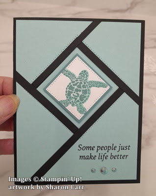
Start out with two pieces of cardstock that are cut to measure 4" x 5 1/4".  I used Basic Black and Pool Party cardstock for these pieces.  Next I used two of the Stylish Shapes dies.  The 2nd largest square die was used to cut the Pool Party.  Line up the sides and top to be about equal and cut.


Sorry, different color cardstock here.  I forgot to take this picture to show the action.  The next step is to line up the two cardstock pieces that were cut placing the Basic Black behind the die-cut color piece.  Carefully line up the middle square die onto the Basic Black piece.  At this point I added a bit of Washi Tape to hold it in place.  Die-cut this square.  Set aside the extra black square piece.

On the back of the color piece, add adhesive.  I added Multi Purpose Liquid Glue here to give it a little wiggle room when adjusting the pieces to line up.  If you need to do any trimming of the black that might show on the front side, do it now.  If it's just a minute edge, it won't show later with the Basic Black card base behind it.

On the backside of the Basic Black piece, add a small line of Multi Purpose Glue around the die-cut square.  Attach the extra die-cut Pool Party piece to cover the square hole.


The next step is to cut the little strips of Basic Black.  The video suggested to cut Basic Black strips 1/4" wide.  For me, I thought it was a little too wide for my taste, so I cut mine at 3/16".  The piece of Basic Black I was using to cut these from was about 5" long.  

Attach the strips over the black inner layer.  I started at the top and attached a strip down to the right.  Then started at the side of the black strip you just laid down and went towards the bottom left.  Then the strip from the bottom angled towards the top left off to the side.  Lastly the strip from the left side to the top.  I used just a tiny bead of Multi Purpose Glue along the strips to attach.  Kind of watch how long you need the strips to be, so you don't waste adhesive where it's not needed.  Plus it's very messy having glue where you don't need it!  For this step, one of those Silicone Craft Sheets (page 138) are a great tool to use!!

You probably didn't need this picture to see the next step, but here it is anyway.  Trim off the excess strips along all four sides.   This is showing the front of the card ready to finish.

At this point, I stamped the sentiment on the bottom right section of the card.  I chose a sentiment from The Cottage Wreaths set (page 39) for this card.  It's stamped with Memento Tuxedo Black ink.

Using the Stylish Shapes Dies again, I cut a Basic White piece from the 2nd smallest sized die.  On this piece, the smaller tortoise from the Sea Turtle set (page 108) was stamped.  I used Lost Lagoon ink on the detailed stamp, then used Pool Party to stamp the backside of the stamp right over it.  I love how these turned out on that tiny square.  

I could have cut down that last Basic Black die-cut piece for layering but chose to use Lost Lagoon cardstock instead.  The white square is 1 1/2" x 1 1/2".  To give just a tiny frame, I cut the Lost Lagoon at 1 5/8" x 1 5/8".  They are attached together then attached in the center of the squares with Dimenisonals to make it really stand out.

There is a Basic White cardstock piece added inside the card.  It measures 4" x 5 1/4".  A 1/4" strip of Pool Party was added to the bottom of this piece to bring the color inside the card too.

For embellishments, three of the Iridescent Pastel Gems were added.  I really like how these add a pop of glam to the card.

Here is the first version of this card that I made.  It follows the original concept I saw which used the new color, Lemon Lolly and the new stamp set, Cheerful Daisies (page 111).  I love the pop of color using Lemon Lolly and Basic Black.

This card also uses a Wonderful Thoughts (page 41) sentiment stamped in black.

Did you notice there is a small layer of black behind the white square?  It really makes the white layer stand out more.

Also, small gold pearls from the Festive Pearls (page 140) were used for the accent on this card.

I just couldn't resist doing one of these cards in Fresh Freesia too.  Didn't it turn out nice?  Changes on this card include using Wink of Stella on the daisy.  Really.  You can't see it in any of the photos I did, so you have to take my word for it.

On this card, the Iridescent Rhinestone Basic Jewels were used.  They always look lovely with the purple-y shades on cards.

Okay, that's it for today's message.  Hope you like this new technique.  At least it was new to me!  It really is very striking when you see it in person.  But it isn't a hard card to make.  Awesome!  That's what I look for - a card that has a wow factor but doesn't take me hours to create.  Give it a try.  If you run into any problems, give me a call and we'll work through it.

If you would like to place an order to get any of these new products from the catalog or just need to stock up on cardstock or accessories, please use the Host Code shown at the top of this post.  It is very appreciated.

Happy stamping and creating,
Sharon

Tuesday, September 21, 2021

More with the Baby Wipe Technique

Hi y'all!  I had so much fun playing with the Baby Wipe Technique the other week.  I just wanted to do a little more with this technique and see what else I could come up with.  The leaves outside should soon start turning all those lovely shades of yellows, oranges, and reds.  I thought I'd get a head-start by making my own colorful fall leaves.  And the Baby Wipe Technique makes it so easy to get fabulous color on your stamped leaves.  I can't wait to look outside and see something that looks like this...

Aren't the colors on the leaves just fabulous?  I've always loved autumn and I can hardly wait for the real thing to appear outside.  At least I hope the leaves will change here like in Michigan.  Guess I really have to wait and see.

The card starts out with a base of Early Espresso cardstock cut at 8 1/2" x 5 1/2", then scored and folded in half.  The layer of Designer Series Paper is from the pack - Beauty of the Earth.  All of the designs in this paper pack are truly works of art.  There isn't a single one that I don't like, and that makes it difficult to decide which one to use.  This print has modern-looking branches with multiple leaves in many fall colors.  It's a great place to start on this fall card.


There is a layer of Early Espresso cardstock cut with the Stitched So Sweetly Dies.  Then the next smaller die cuts out a layer of Basic White cardstock.  This is what we do all our colorful stamping on.  First make a palette of 3-4 baby wipes folded in 3rds or 4ths depending on the size of the wipes.  I put this in an empty stamp box so the ink doesn't go everywhere, but can be easily washed out.  I used these re-inkers:  Crushed Curry, Pumpkin Pie, Cajun Craze, and Rich Razzleberry.  Drops of the re-inkers were placed in an area a bit larger than the maple leaf I planned to use.  Each color had at least 5 drops placed randomly next to each other.  Then the stamping begins!  The maple leaf and the tiny three leaf cluster are from the Gorgeous Leaves stamp set.  When inking the stamp, keep inking in the same area, don't wander all over the pad.  This way the ink colors stay fairly crisp even after multiple inkings.  If the ink colors are real intense, clean the stamp before inking in another area so as not to muddy all the colors together.   After the maple leaf was stamped 3 times, I changed up and used the cluster of three leaves to fill in the open areas on the rectangle.

At this point, the stamped rectangle was attached to the Early Espresso layer using adhesive.  Then this was all layered onto the card base using Dimensionals.  I liked the look of it off to the right side for this card.  

It needed a cute fall sentiment and the perfect one was in the Banner Year stamp set.  It fits right in with my move to the south!  This was also stamped using the baby wipe palette we used for the leaves.  After inking the stamp, it was stamped on a 3/4" wide strip of Basic White cardstock.  The Triple Banner Punch was used on each end of the strip to make a banner.  This was layered onto the card with adhesive on the right side, and a Dimensional on the left side to raise it up level.

The card needed some bling to make it pop a just little more.  After trying and discarding of lots of rhinestones, linen thread, ribbon etc, it was decided that the Sequins for Everything would work nicely.  I added two of the brown ones and four of the golden-orangey/yellow ones.

The last part was the inside of the card.  There is a layer of Basic White cut at 5 1/4" x 4".  This has one maple leaf stamped in the corner to match the front.  I've left the inside blank to accommodate one of the many notes I send out.  But this could make a cute birthday card or of course a Thanksgiving card.

If you haven't given this technique a try (or it's been years since you did), why not try it out?  It's definitely fun, and no two cards ever really look the same.  Just remember to wash your hands when you get ink on them!  Sometimes it does get just a little bit messy.  But there's nothing wrong with inky fingers.  It shows what you've been doing!     *big grin!*

Thanks for stopping by again.  Hope you're inspired to give this technique a try.  And fall leaves are a wonderful way to try it!

Here's the code for September orders if you are placing one.  I truly appreciate my customers.  Thank you in advance for any order you may place.

Reminder:  Sale-a-bration ends September 30th.  Be sure to get your order in as soon as possible.  There are still many items available for you to choose from.  I'm sure you'll find something to love in the selections.  Please call me if you have questions or have trouble placing your order.  I'm here to help!


Happy stamping!
Sharon