Showing posts with label Perennial Postage Bundle. Show all posts

Tuesday, June 16, 2026

Flower Fair with Blends

Hello again.  Just got back in from picking more blueberries.  At least it's only 72 degrees and semi cloudy today so it wasn't a problem.  There were 2 1/2 pints the other day with at least another 2 1/2 pints today.  And there's many more berries still on the bushes in the process of ripening.  For our two smallish bushes I'm thrilled with the yield.  There's lots of cobbler, coffee cake and muffins in our future in the coming months.  YUM!  Okay, now that you know all about the blueberries it's time to talk about stamping.  Right?

 I've decided to put aside the Framed Violets bundle for a tiny bit and share some other things I've been playing with lately.  Today's card features the single Flowers Fair stamp that nicely covers a card front.  I'm not using the full stamp but just cut off a section about 3 1/2" tall instead to fit my card.  I love the warm look of this card with the different elements that come together to make the whole.  I wish the camera captured the colors better.  Here the card looks much darker than it looks in person.

The whole design started with the Flowers Fair stamped with Memento Tuxedo Black onto a Basic White cardstock piece approximately 5" x 5".  This was colored with Stampin' Blends:
Large flowers - Crisp Cantaloupe Light & Dark, adding touches of Cajun Craze for shading
Small flowers - Hydrangea Hue Light & Dark with Daffodil Delight Dark in the centers
Leaves and stems - Peaceful Pine Light & Dark

After coloring, this was die-cut with the second largest Perennial Postage die.  Then a layer of Cajun Craze was cut to give an accent frame around it.  The Cajun Craze cardstock measures 4 7/8" x 3 5/8".  The two layers are attached with adhesive.  A retired black and white checked ribbon was tied around the layers with a knot to the side.  I thought the checked ribbon gave it more of a relaxed country vibe.

 
The card base used this time is Crisp Cantaloupe. It measures 8 1/2" x 5 1/2" and is folded in half.  The two layers that were just finished were added to the base using Dimensionals.

The sentiment comes from the ready-made sentiments in the Greetings For All Mix & Match Ephemera Pack.  These sentiments come either black-on-white or white-on-black which is what I used here.  The sentiment was attached over the ribbon using Dimensionals.

I really debated whether any embellishments should be added or not.  After much thought and trying just about everything I owned, absolutely nothing was added after all that fussing.  I'm happy with it just as it is.  What do you think?  Does it need something else?  If it does, what would you add to it?

I hope you're playing around with coloring some of your floral stamps with Stampin' Blends.  They work so nicely and can give you such beautiful colors when adding a little extra color for either shading or highlighting with another color.  The flowers looked a little flat before the Cajun Craze was added.  What a difference a little extra shading color can make.

Thanks for stopping in today.  Hope you're inspired to get out those stamps that need a bit of coloring and have yourself a color date.  Doesn't that sound like fun?  Wish I could join you for that!

Happy stamping and creating,
Sharon 

Tuesday, April 23, 2024

Window-Style Card Collection

Hello my stamping friends!  Hope you're enjoying your spring and getting a few things done outside.  I guess the outdoor vistas inspired me to make this series of cards.  My sister, Connie, also shared a couple of window-style cards with me a couple weeks ago when I saw her.  That was my starting place, but you'd never know it from the looks of my cards compared to hers.  Anyway, I have five cards to share with you today.  They all have the same premise of looking through a window to the great outdoors. 

This is the collection that I ended up making.  As you can see, there are lots of different colors used and several sets of dies used too.  Four of the cards use the Meandering Meadow DSP but one uses the new Thoughtful Journey DSP that is coming in the new Annual Catalog.  Both of these paper sets have the most gorgeous water-color style of designs you can imagine.  I love them!  And they are so easy to use to create interesting cards for any occasion.

The first card I'm sharing is the last card I made.  It uses the new Thoughtful Journey DSP along with the Everyday Details Dies.  To make the card, start with a card base of Mossy Meadow cardstock that measures 8 1/2" x 5 1/2".  It's scored at 4 1/4" and folded in half.

Next comes a layer of Basic Beige cardstock.  What?  Yes, this is the newest color that's now part of the neutral basics line-up.  Love this color!  (You can order this May 1st).  This layer measures 5 1/4" x 4".  The largest Everyday Details die is used to cut a window on the left side of this layer.  Don't you love the dotted frame around the window?  Of course, keep the cutout piece for use another time.

The DSP is a piece of 6" x 6" that is cut in half.  The top and bottom of this piece is trimmed a little to hide behind the Basic Beige layer.  It's attached behind the window area with adhesive.  

I left a little extra room on the right side of the beige layer to add a ribbon accent.  After trying several different ribbons, I came across an Old Olive twine that seemed to be the perfect accent.  It's wrapped around twice and tied into a bow.  After this is added, the layers are attached to the center of the card front using Dimensionals.

The sentiment is from the Perennial Postage set.  It's stamped with Memento Tuxedo Black onto a 5/8" strip of Basic Beige cardstock.  After trimming the ends to fit, a little bit of Mossy Meadow ink is added to the edges of this using a Blending Brush.  The sentiment is attached to the card front using Dimensionals.  

Ok, that's the last card of the batch that I made and it's also the most involved.  Let's move on to the rest of the collection of cards to see what catches your fancy.

I was looking to make several get well type of cards.  Seems like there are a lot of surgeries going on among my friends, so I was looking for something bright and cheerful.  This is a cheerful and super quick card to make.  

Start with a card base of Daffodil Delight.  A layer of Garden Green cardstock is cut to 4 3/4" x 3 1/2". Next a layer is cut with the Deckled Rectangle dies from the Meandering Meadows DSP.  This piece measures just under 3" wide, so you can get two of these from one piece of DSP.  The print is attached to the green layer with adhesive.  Then this is attached to the folded card base using Dimensionals.

The sentiment is from the new Unbounded Love stamp set.  It was a perfect sentiment for the card.  It's stamped with Garden Green ink onto a 1/2" strip of Basic White cardstock.  The end is trimmed with the Banners Pick a Punch.  Then it's attached with Mini Dimenisonals.  To finish, three dragonflies from the Birds and Dragonflies accents that are an Online Exclusive item were added.  Thought they looked nice with the scenery.

This next card uses the other half on the DSP sheet from the last card.  The card base for this one is Crushed Curry.  There is a layer of Basic White next that measures 5 1/8" x 3 7/8".  The largest square die from the Stylish Shapes die set is used to cut a window this time.  The DSP is trimmed to fit top and bottom of the card, then attached behind the window with adhesive.

The sentiment for this card uses one from Perennial Postage stamp set.  It's stamped with Garden Green ink onto the bottom area.   

The accents on the card are Brushed Brass Butterflies that will still be available in the new Annual Catalog.  There is also a double piece of twine tied into a bow added to the corner of the design.  The color is Cherry Cobbler and was retired several years ago.  I liked how it picked up the color of the reddish flowers.

This card uses another of the Meandering Meadows prints.  It's cut with one of the Everyday Details Dies that shows all the dots around the print as an accent.  

The card base is Starry Sky cardstock that is retiring soon.  This is the only card that has a landscape fold.  The layer used on it is Bubble Bath.  The sentiment from Unbounded Love is used again on the card.  It's stamped with Starry Sky ink.

The DSP layer is attached with Dimensionals.  This makes the die-cut edge show up nicely.  The bow is made from Bubble Bath ribbon from the Sheer Ribbon Combo Pack.  It's attached with two Mini Glue Dots.

The last card uses the back-side of the previous card's print.  The card base is Blueberry Bushel this time.  There is a layer of Basic White that I used the new Eyelet 3D Embossing Folder.  I think this is a pretty background texture that will be very versatile.  The rectangle window is cut with one of the Everday Details dies.  The DSP is attached behind this using adhesive.  I have to admit, once I got the DSP trimmed to fit, I wasn't sure which side was up anymore.  So, if it doesn't look right to you, it's all my fault!

Before attaching the layer to the card base, the same Bubble Bath ribbon was used to wrap around the side of the layer and tied into a knot.  Then the layer was attached with Dimensionals. 

The sentiment is from the Perennial Postage set again.  It's stamped with Blueberry Bushel ink onto a Basic White piece.  It's die-cut with the smallest rectangle die from the Everyday Details dies.  It's attached with Dimensionals.

And that's it.  Five cards using the same window style layout with a scenery print DSP with it.  I needed a number of get-well cards, and I think these cards will fit nicely.  As I made each card, I was thinking about the person it's going to and trying to fit their style with the cards I made.  I hope the cards will underscore that I care about each person and hope things improve for them.  It's a perk to be able to make similar cards but tailor them to fit each person.  That's one of the things I love about stamping and card making!

Are you watching the calendar?  It's just about time for the new Annual Catalog to be available.  I still have a few things (lol) I'd like to get.  I've been working on my wish list.  Have you?

Happy stamping and creating,
Sharon 

Tuesday, February 13, 2024

Painted Lavender Bouquet

Hello, hello.  I can't believe the sun is finally shining again after several rainy days in a row.  I've had more than enough rain this winter.  Of course, in the middle of a dry, hot summer I'll be praying for some of that rain, won't I?  And instead of whining about the excessive rain, I should be thankful it wasn't all snow!!  Seems like we're still adjusting to things down here, but certainly loving it.  Thinking ahead to spring, I was ready to make a card with the Painted Lavender Bundle.  These pieces make a up a bouquet in no time at all.  

I haven't made a gatefold card in awhile, so that was my plan.  For a summery feel, I chose a card base of Garden Green.  This measures 8 1/2" x 5 1/2", and it's scored at 2 1/8" and 6 3/8".  Folding these two sides in should give you a nice gatefold card as your base.

There are two pieces of Soft Sea Foam cut to layer onto the sides.  These measure 2" x 5 1/4".  To add some interest to these panels, they were embossed with the Softly Sophisticated Embossing Folder which is one of the Sale-a-bration items.  I love the delicate design on this embossing folder.  Can't tell you how many times I've used it already!  After embossing, the panels were attached to the card front using "green glue" making sure they lined up top and bottom.

Next, the Basic White panel was die-cut with the Perennial Postage dies.  I used the 2nd largest die, but it was still too wide for what I wanted to do.  Taking the largest die, I placed it over my die-cut piece and lined up the postage edge cutting off about 1/2" from one side.  This worked out pretty well.  I used two bits of washi tape to hold it in place while cutting.  A second piece was cut and left the full size to go inside the card for the sentiment.

On the trimmed down die-cut piece, first there is some Soft Sea Foam ink that is added to the center of the white using a Blending Brush.   The leafy stem was stamped with Garden Green ink in this area of the card at least twice and several times using 2nd and 3rd generation stamping to fill in a bouquet shape.  This gives a good base for all the die-cut stems that are coming next.

The die with the two flower stems was used to die-cut most of the pieces.  Stems were cut from Gorgeous Grape and Fresh Freesia cardstock.  There were also a set of stems cut from the Soft Shimmer 12" x 12" Specialty Paper in the Bubble Bath color.  A smaller die was used to cut stems from Highland Heather cardstock.   A Granny Apple Green Blender Pen was used to color the stems in-between the flowers.  

They were layered up in this order: 2 Gorgeous Grape stems, 2 Fresh Freesia stems, 2 Bubble Bath Shimmer stems, and the one Highland Heather stem last.  They were all staggered as they were added so they weren't lined up like soldiers. The stems were attached only on the bottom two-thirds of each stem using "green glue".  This kept the tips of the flowers looser and more natural looking.  After all the flowers were added, the stem ends that were off the card were given a trim with Paper Snips.

Butterflies from the Painted Lavender set were stamped with Gorgeous Grape ink on Basic White cardstock.  They were die-cut with the matching dies from the set and attached with Mini Dimensionals.  The sentiment from Darling Details was stamped with Gorgeous Grape ink onto a Basic White strip.  The smallest Perennial Postage die was used to cut it out.  

The left half of the lavender bouquet label has two strips of Tear & Tape added to the length.  Then it's attached to the center of the card front.  Make sure there is no adhesive on the right side of the label, or it will be glued closed.   And you don't want that!  The birthday label is attached with Dimensionals under the left side only so it's free on the right edge.


The 2nd die-cut label has a faint blush of Soft Sea Foam ink added to the center with a Blending Brush.  Now it's ready to stamp.  I used a sentiment from Everyday Details stamp set.  It is stamped with Gorgeous Grape ink.  Those butterflies that were used earlier are now stamped inside the card with Highland Heather ink, so they are lighter than the sentiment.  The layer is attached in the center of the card with "green glue".
The final touches on the card are the Purple Fine Shimmer Gems.  These are so pretty and there are three different colors of purple in this set.  I used one of each of the colors on my card.  They all matched with the multiple purples I used for the lavender stems.  Can you find them tucked in the design?  There is also a double bow made from Linen Thread.  It's attached with a Mini Glue Dot.

That's my first attempt at creating with the Painted Lavender set.  It's kind of funny that there's almost no stamping on the card, but still a lot going on.  I'll have to try stamping those gorgeous lavender stems the next time around.

Thanks for stopping in to see what's new.  If you're looking for a demonstrator, I'd love to fill the position.  Don't forget the month of February is almost half over so that means Sale-a-bration is almost over too.  I don't want you to miss out on one of the fun Sale-a-bration items for you to earn free.  If you don't know how that works, feel free to contact me.  I'd love to help.  

Hope you enjoyed and were maybe inspired to give this idea a try.  It was fun creating with all of these purple shades on one card, and I love how they look together here.   Today was definitely a creatively fun day!

Have fun stamping and creating,
Sharon

Thursday, January 18, 2024

Painted Lavender Wishes

 Hello there!  Have you warmed up yet?  I just got back from running errands and I'm so cold.  It seems as I get older, I can't tolerate the cold as easily.  I'm ready to get wrapped up in my fuzzy blanket and chill for a while.  Hmmm, maybe chill is the wrong word to use here.  How about warm up??  Anyway, I've got a card for you today that focuses on the gorgeous Perennial Lavender Designer Series Paper(found on pg 23) that's in the new mini catalog.  If you haven't noticed this yet, you need to take the time right now to check it out.  The colors used and the soft prints are simply fabulous "dahling"!  I just had to find a card layout that really showcased the prints.   This card is also a fun fold.  I think it's called a fold back front card.  It is a pretty card and easy to make too!  win-win

The card starts out with a Pretty Peacock base that measures 8 1/2" x 5 1/2".  It's scored at 1" and 4 1/4" and folded in half and then back again on the 1" mark.  See, so far it's very easy.

The Perennial Lavender DSP is cut at 5 1/4" x 2 1/4" for the checked print.  This gives it a little amount tucked in under the fold over front of the card.  The two strips of the other print measure 3/4" x 5 1/4".  

Attach the checked print to the front of the card using adhesive.  Make sure all the edges are even.  Attach the two strips of DSP - one to the fold over front of the card and the other to the inside of the back of the card making sure they line up evenly.  At this time, I added some Tear & Tape to the back of the fold over flap.  This will keep the flap flat in the front and be nice and smooth.

The Heartfelt Hexagon Punch (pg 12 Mini Catalog) was used to punch a label from Crumb Cake cardstock.  After it's punched out, I used Pretty Peacock ink and a sentiment from the Perennial Postage set (pg 25 Mini Catalog).  This label was attached to the front of the card with adhesive.  The center of the label matches the center of the fold over front and overlaps to the back inside as shown.  Make sure to keep the adhesive only on the part that is the front of the card.

The gorgeous cutout butterfly is also from page 23 in the Mini Catalog.  You get 40 butterflies to use in one pack, and there are 5 different sizes to choose from for your project.  They are all white and you can use either side, depending on what you need.  For my card, I used Gorgeous Grape ink and a Blending Brush to add some pretty color to the butterfly.  It's attached to the label only on the body of the butterfly with adhesive.  

When the card is opened, there is a layer of Basic White that's been hidden behind the flap.  This measures 5 1/4" x 3" to make it line up nicely with the other layers.

This sentiment is also from the Perennial Postage set.  It's stamped with Pretty Peacock ink to match the card.

Final look at this pretty card.  Did you notice the Purple Fine Shimmer Gems that are added to the card?  These are new in the Mini Catalog too.  They have three different purple shade of gems, so you'll have no trouble matching the purples on your project.  They're faceted so they sparkle nicely.  I was pleased at how nice they looked on the Crumb Cake label.  Sometimes putting gems onto a color really diminishes the impact of the gems.  But not these - they're fabulous "dahling" and you'll love them.

That brings us the end of another post.  Hope you were inspired to try this project or at least try out the materials I used.  If you gravitate more towards the softer looks in your cards, I think you'll like this one.  Have fun making this and let me know how it goes.

The products I've used are all in the Jan - April Mini Catalog and at this moment everything is available.  Purchasing these items will make you eligible for a Sale-a-bration freebie.  Remember that Sale-a-bration ends on February 29th.  For every $50 (or $100) you spend, you get to choose one (or more) of the items for free.  And who doesn't like free stamps, dies, DSP, or embellishments?  Woo Hoo!

If you are placing an order soon, please consider ordering from me and using the Host Code at the top of this blog page.  I truly appreciate it!  

Happy stamping and creating,
Sharon

Monday, January 15, 2024

Flight & Airy Card Collection

Hello and happy Monday to you!   Do you ever get an idea rolling around in that brain of yours about a card idea that just percolates for a while?  Then all of a sudden, you've got a full-blown idea that you can't wait to try making?  That's what happened with today's grouping of cards.  I love the layout I'll be sharing with you today.  It's one that is a real stand-by layout for me, and it gets used often.  The premise of the layout all hinges on a 2" strip that goes down either side of the card.  From that point, the possibilities are truly endless depending on colors and DSP used.  I hope you enjoy the collection I have for you today.  I tried to stick with a small palette of colors and the Flight & Airy Designer Series Paper that is one of the awesome items you can earn free during Sale-a-bration.  Let's have a look and you can decide if you like this layout, especially with this DSP.

This is the collection of cards that I made yesterday.  All of them use the Flight & Airy DSP as the focal point of the card, but there are different sentiments, colors, die-cuts, and embellishments.  I chose all the colors by using the colors listed on the DSP.  Aren't they a wonderful mix of bright springy colors?  They look like they belong in a gift set, and that might be how they end up.  Or they might all be sent out individually.  Who knows?  Let's get started with the instructions for each individual card.
This one starts with a base of Misty Moonlight cardstock.  The layer of Flirty Flamingo cardstock measures 5 1/4" x 4".  The DSP print measures 2" x 5 1/4" and is attached near the left edge.  The bird is one of the Flight & Airy DSP sheets with all birds.  I fussy cut the entire sheet of birds and will continue to play with the individual birds adding them to cards as needed.  The fussy cutting was very easy as there wasn't very much detail.

The sentiment is from the Perennial Postage set.  It's stamped with Misty Moonlight ink onto a Basic White piece punched with the Heartfelt Hexagon Punch.

The leaves are all punched with the Bough Punch.  The green colors used are Garden Green, Soft Sea Foam, Shaded Spruce, Old Olive, and Lost Lagoon.  They are attached to the label with adhesive.  The label is attached to the card with Dimensionals.  The bird is added to this with Dimensionals also.  The gems are the Misty Moonlight color from the Tinsel Gems Three-Pack.

Next card starts with Boho Blue for the card base.  The layer is Misty Moonlight.  The DSP print is the same as the first and measures 5 1/4" x 2".  It's attached near the left edge.  

The focal point started with a label die-cut with the Perennial Postage set using Petal Pink.  It's attached flat with adhesive.  The same assortment of leaves is attached to the label with adhesive.  One of the birds from the collection was added over the leaves using Dimensionals.  

The sentiment is from Timeless Arrangements.   It's stamped with Misty Moonlight ink on a 1/2" wide strip of Basic White.  The Banner Pick A Punch was used to flag the ends.  It's attached with Dimensionals.  A double bow made from Linen Thread was tucked under the bird and is attached with a Mini Glue Dot.  The beautiful finish pieces are the pink pearls from the Blooming Pearls set. 


The next card in the series has a base of Flirty Flamingo cardstock.  The 2" strip of DSP is a different print than the others that I've used.  This is the back side of the blue print used in the next card.  It has a frame of Misty Moonlight cardstock surrounding it and attached with adhesive.  

A large circle was die-cut from Basic White cardstock.  It has a sentiment from the Perennial Postage set stamped with Misty Moonlight Ink.  The same collection of leaves was used with another bird attached with Dimensionals.  The circle was attached to the card with Dimensionals also.  

A double bow made from the Simply Elegant Trim was added to the sentiment area.  Three of the Misty Moonlight color gems from the Tinsel Gem Three-Pack were added to finish the card.

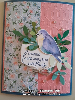
This is where my card designs changed, and I started adding the embossed background for added interest.  The card base on this one is Misty Moonlight.  The layer is Flirty Flamingo, and the DSP print is the blue background floral.  After attaching the DSP, the cardstock is embossed with the Softly Sophisticated Embossing Folder that is found in the Sale-a-bration brochure as a free combo item.  I love the delicate design it gives here!  Then it's attached to the folded card base.

The Heartfelt Hexagon Punch was used again, as was the Perennial Postage sentiment.  The same assortment of leaves were added to the sentiment.  The bird was attached to this with a Dimensional.  It's all attached to the card with Dimensionals.

A small double bow of Linen Thread was added under the sentiment with a Mini Glue Dot.  A trio of the new Iridescent Foil Gems was added to finish.

This card starts with a card base of Petal Pink.  It's embossed with the Timeworn Type Embossing Folder before adding any layers.  The 2" DSP is back to the pink floral.  It has a thin layer of Misty Moonlight cardstock behind is to frame it.

The large circle punch was used for the sentiment which is stamped with Misty Moonlight ink.  The same assortment of leaves was added.  It was attached to the card with Dimensionals, and a bird was added with Dimensionals also.  

A double bow of Linen Thread was added to the sentiment layer.  Three Iridescent Rhinestone Basic Jewels were added as an accent. 

The last card in this collection starts with Boho Blue cardstock for a base.  The layer is Calypso Coral this time with the 2" DSP layer attached to the left.  It's embossed with the Timeworn Type on both layers.  After embossing, they're attached to the card base with adhesive.  

The Perennial Postage dies were used to die-cut a Petal Pink label.  This is embossed with the 3D Basic cross-hatch embossing folder.  The assorted leaves are attached to this, then it's attached to the card front with Dimensionals.  The bird is added with Dimensionals..

The sentiment is from Timeless Arrangements and stamped with Boho Blue ink.  The ends are angle cut.  Then it's attached to the label with adhesive.

A double Linen Thread bow is added with a Mini Glue Dot.  Three Iridescent Rhinestone Basic Jewels were added to finish the card.

There you have six cards all made with the same basic layout and using most of the same pieces to assemble the cards.  What a pretty set of cards these turned out to be.  The different prints in the Flight & Airy Designer Series Paper pack are all gorgeous and easy to create with.  It was hard choosing what prints to work with.  I still have more ideas for cards using these items.  

I love how the mixture of different greens on the leaves add a lot of visual interest without taking away from the overall look.  I started making these cards with only Garden Green leaves, and it just didn't have the same appeal to me.  Once I planned to use more colors of leaves, I just punched a bunch of each color then picked through the stash to find what I wanted for each card.  So now I still have a stash of leaves and another of all the extra birds that I cut from that one sheet of DSP.  Ah, I see more cards in my future!  lol

Have fun creating your own cards with these ideas.  If you love this Flight & Airy DSP, place a $50 order so you can get the DSP for free.  It's only available through February 29th or until it's sold out, so don't delay on getting this.  It seems to be the most popular item in the Sale-a-bration brochure.

Happy stamping and creating,
Sharon