Hello Friend! Hope you're having a fabulous Monday. So far this has been a very productive day. Hubby has been playing with the electrical stuff again, but we're all good and everything has power that's supposed to. Yay! It's been a while since the last post. If you're one of those who have been praying for Rick's health, the procedure last Friday went well, and he came home from the hospital on Saturday. Yay! Health-wise, things are looking good right now and I thank God for it all! But that, along with Father's Day, has kept me away from posting anything for awhile.
While meandering around Pinterest the last week or two, I saw a good number of 'vintage-looking' ideas that I want to try making again. It's been a while since I've made this kind of card and thought it was time to try again. It's the idea of working more in the muted tones - usually browns, and many times with some collage type stamping in the background too. I used the Nature's Prints stamp set and the matching Natural Prints dies. So far, I've stamped this set in greens and blues. Now it was time to try it in browns. Here's what I came up with...
I love the tone-on-tone look of this and was very pleased how it turned out. Just what I planned, (well mostly), and you know that doesn't usually happen!
It all starts with a card base of Soft Suede cardstock cut at 8 1/2" x 5 1/2", scored in half and folded. At this point, I figured the next layer would be Early Espresso, with Very Vanilla cardstock on top of that. So that's how I cut it.
First I stamped on the Very Vanilla piece using Crumb Cake and the fern stamp. This was stamped in around the outside edges. I switched to the 'berry branch' stamp and used Soft Suede ink. This was also stamped along the edges. Then I added Crumb Cake ink around he edges with a Blending Brush. This gave a nice soft color, but it needed more.
This piece was embossed with the Timeworn Type 3D Embossing Folder to give added texture and interest to the layer. After embossing, there was another layer of Crumb Cake ink added with the Blending Brush along the edges, and even a touch of Soft Suede ink brushed onto the corners. It was good to go.
Time to work on the sentiment. This sentiment is one of four that are part of the Nature's Prints set. It was stamped with Early Espresso ink onto Very Vanilla. It was die-cut using the sentiment label from the Natural Prints Dies. The die gives a nice, embossed edge all around it. Part of the 'berry branch' was stamped to the left side using Crumb Cake ink to fill in.
At this time, I decided a layer of gold paper would perk up the whole card which was getting pretty dark. The Very Vanilla layer was cut down a bit to 3 3/4" x 5". The Early Espresso layer was trimmed to 3 7/8" x 5 1/8". And a gold layer was cut to 4" x 5 1/4". Before layering it all up, I did a little die-cutting in both the gold and Early Espresso layers. On the Early Espresso layer, I cut three of the longer stems and one of the short stems. The gold layer has one long stem and also a sentiment label cut. I just cut the ends of the label off to place under the sentiment so just the very end of the gold shows on each side.
The layers were all attached together with adhesive. A piece of the crocheted trim (retired) that's Very Vanilla looked nice with this. A 6" piece was banded across the card and attached in the back. The layers were then attached to the Soft Suede card base using Dimensionals.
The sentiment was attached over the trim using Dimensionals. The stems were all attached to the card under the sentiment layer on the left side. The gold one was tucked in between all the browns.
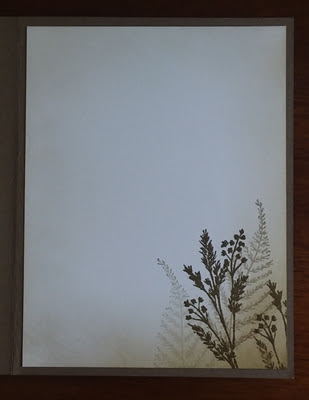
The inside of the card needed to match with the front design, so the fern was stamped twice with Crumb Cake ink. The 'berry branch' was stamped twice with Soft Suede ink. Then to carry the vintage look even more, the edges of the Very Vanilla layer were brushed with Crumb Cake on all edges and Soft Suede just on the bottom right corner where the stamping is. Altogether it worked just fine.
Do you ever get done making a card and then wish you had done just one more thing? Looking at the "finished" card, I decided it needed some speckles added with the Early Espresso marker flicked on the card front. So that was added and the card was finally pronounced finished. Yay!
Hope you like this idea. I think it came out quite nicely and is just what I wanted. It's nice to go back to ideas I've used in the past and give them a redo with new stamps, dies, or whatever.
If you're placing an order soon, please use the Host Code shown at the top of my blog page. I really appreciate it! Hope you've gotten your new holiday mini catalog and Sale-a-Bration brochure by now. If you don't have it yet, it should be coming soon. If you don't get it by July 6th, let me know so I can send another one out to you. Thanks for everything, especially your patience with me. You're the very best!!
Happy stamping and creating,
Sharon


This is beautiful! I think the gold adds the perfect touch.
ReplyDeleteThanks Barb! It really did add some brightness to the card.
Delete