Tuesday, June 27, 2023

Fun with Inked & Tiled Set

Hello, hello!  Seems like it's been forever since I sat down to write on this blog.  Vacations will do that to you, so I've heard.  We had such a good time together in North Myrtle Beach, but it's great to be back home.  The first half of the week we had heavy rain storms every day and some at night too.  But the weather finally settled down and Nathan's team was able to play Friday, Saturday, and Sunday.  Some wins, some losses, but the boys played hard and didn't give up.  I really don't understand how the organizers just arbitrarily decided to up the team's standing to a higher level of players.  It makes it really rough when you're used to playing at one level and now you're against much better players.  Oh well, obviously I'm not in charge!

Okay, enough of that.  Let's get to the stamping part!  I've been playing around with the Inked & Tiled set before vacation and again today.  This has been an easy set to use, and I love the finished cards.  I think I might run a mini-series on this set so you can get a good idea of some ways to use it.

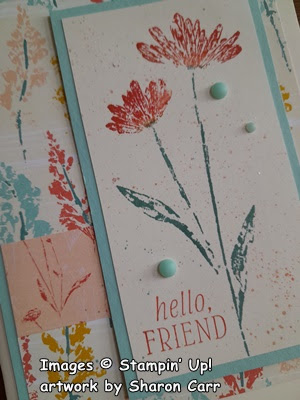
This card was made over a week ago, but I'm still happy with it each time I look at it.  It starts with a base of Very Vanilla cardstock measuring 8 1/2" x 5 1/2", scored and folded in half.  The DSP is one of the prints from the Inked Botanicals 6" x 6" Designer Series Paper.  I used the colors on this paper to decide what to use on my card.  This print was cut at 5" x 3 3/4" for this card.  Since the DSP is 6" x 6", the extra cut off piece of DSP was attached across the larger piece about 1/3 up from the bottom for a nice contrast.

I originally planned to frame it with a full layer of Pool Party cardstock but changed my mind at the last minute.  I liked the asymmetrical look better.  The Pool Party was cut at 1 1/2" x 5 1/4" which happened to be a left-over piece from another project.  This was attached behind the DSP, then attached to the card base with adhesive.

The Very Vanilla cardstock piece for stamping the focal image measures 2 1/4" x 4 1/4".  This seems to be a good size for the floral image.  The flowers were inked with a Calypso Coral marker directly onto the stamp, and the stems and leaves were colored with a Lost Lagoon marker.  Remember to "huff" on the stamp before stamping.  This will help the ink stay wet, so you get a good print.  The sentiment was also stamped on the Very Vanilla with Calypso Coral ink using one of the sentiments from the Inked & Tiled stamp set.

It all seemed sort of boring at this point, so I grabbed those markers again and spattered the background with both colors.  Then added an extra spattering using Wink of Stella which adds a slight touch of glimmer to it.

This layer was then added to the card front using Dimenisonals.  Almost finished now.  I wanted to add just another bit of accent.  I almost added some Brushed Butterflies which looked nice.  But I went with some Ombre Matte Decorative Dots instead.  I liked the added pop of the Pool Party dots to accentuate the card.

Hope you like the card idea.  Like I said, I've been having fun with this set and plan on making another post or two using it.  At first, I didn't think I needed another floral stamp set, but I'm so glad I picked this one up.  I think the images look like pressed flowers, so it was different from any other floral I had.   Also, there is no die set that coordinates with it, and you know how much I like my bundles!!  I've gotten so lazy about cutting out the images, but I've made a card with the image cut out and it really wasn't too hard.  So, this seems to be one of my new favorite stamp sets.  At least until I get another new one!  LOL

Thanks for stopping by today to see what I've been stamping.  You never know just what you'll find.  If you're planning on ordering, please check on this blog for the current Host Code.  I really appreciate you using it when you order online.  And don't forget to check out all the Online Exclusives and new kits that are available.  There are more showing up next month that are great for a head-start on your Christmas cards.  The Clearance Rack is also shown online for you too.  If you haven't checked it out in a while, you really should take the time to look around.  Always something good out there!

Happy stamping and creating,
Sharon

Sunday, June 18, 2023

Use Up Those Scraps!

Hello Friends!  Today's post revolves around using up all those 1" and smaller strips of Designer Series Paper that are left over from trimming it down to fit your cards.  Do you have a whole pile of those like I do?  This is a technique I saw on a video that Wendy Lee made.  Loved it and had to give it a try.  I've done these cards using strips of the Countryside Inn Designer Series Paper, so they are a mix of blue tones.  You could use strips that are the same color tones but different prints like these.  Or spice it up by using a multitude of colors and prints that you like together.  Either way works beautifully, and you use up some of those strips that are too nice to throw away, but you've got way too many of them to manage.

Here's a sampling of the different cards I made with this technique.  As you can see, all the prints are from the Countryside Inn DSP, but not all of the prints are used on each card.  I just laid them out in what I thought was a pleasing fashion and each card ended up a little different.

To make these cards, start with a card base of Thick Basic White cardstock.  It measures 8 1/2" x 5 1/2", scored and folded in half.  The Basic White piece that you'll be using to create the card front measures 5" x 3 3/4".  You will also need a coordinating cardstock that has the same dimensions of 5" x 3 3/4".  For this I used Boho Blue cardstock.  On the Boho Blue cardstock, measure 1 1/2" in from the top left side and place a little mark.  Then measure in 1 1/2" from the bottom right corner and make a mark.  Next you cut diagonally from mark to mark so you have a base to attach all the DSP strips.  In fact, you have two bases the exact same size so you might as well make two cards at the same time!  (Or more if you really get hooked on this idea and need a bunch of cards!)

On one of the Boho Blue pieces, we'll start layering on the strips of DSP.  I found that strips that measured between 1/2" and 1" work best.  As I got into making these cards, I got a little more adventurous in choosing sizes and patterns to make them.  

Hopefully you can see from this picture that the bottom strip will go in first.  If you start at the right corner of the strip at the bottom edge of the Boho cardstock and angle it up so the bottom left edge is slightly above the corner of the Boho cardstock, you will get a really good angle to work with.  On this card I left a small 1/16" or so between each strip so the cardstock shows through.  On more than one of the cards, I forgot to leave the space between them, but it didn't seem to be a problem.  Just follow through on all the strips in the same way.  When all the strips are attached, turn it over and carefully trim off the excess.  Now comes the interesting part.

On my Simply Scored Scoring Tool I've used a marker to draw down a line at the 5 1/2" mark.  This makes it easy to see the correct line on both edges of the cardstock you want to score.  For this, take your White cardstock piece and place the Boho Blue piece with all the strips face-down onto the back of the white and line them up.  Place them down onto the scoring tool with the edge of the Boho Blue following the 5 1/2" mark.  Next use the stylus to score lines in the next three grooves right next to the blue cardstock.  These will show up really nice when turned over to the front of the card.
Here you can see the front of the blue prints with the cardstock brought to the front of the white card.  See how the scored lines enhance the diagonal cut of the card?

At this point, stamp whatever sentiment you want on the right side of the card front.  I used the new Courage & Faith set found on page 72 of the catalog.  I love the four Bible verses that are part of the set along with some sprays of greenery and flowers.  The sentiment was stamped with Misty Moonlight ink that matches some of the blues in the prints I used on the card.

After stamping the sentiment, attach the blue prints layer to the front of the card matching up the diagonal scores and all the edges.  I used "green glue" to attach these together.

To separate the two white layers a little, I added a vellum layer on some of the cards I made.  The vellum measures 5 1/4" x 4".  It's attached flat to the card base.  The focal point layer is attached to the card with Dimensionals.

At this point you could add some bling if you wanted.  For these cards, I decided to forgo any more distractions to the card.  I was worried that adding more would take away from this design.  Now that these cards are finished and in the mail, maybe I need to try this technique using different colors and prints.  Just curious how it would look. 

Thanks for stopping in to see what's going on around here.  Hope you like this idea and give it a try.  It's really not as hard as it looks.  And no two end up exactly the same which makes it fun!

Reminder that the 15% off sale of Designer Series Paper is still going on until the end of June.  The last time I looked, none of the papers were sold out yet, but some of them were showing "low inventory".  Don't wait too much longer if you really want a certain DSP.  Get it while you can.

Happy stamping and creating,
Sharon

Wednesday, June 14, 2023

Earthen Textures is Fantastic

Hello there!  It's good to be home again and I'm brimming with ideas to share with you.  It seems I've always got more ideas when I'm stamping with someone else.  It's just that back and forth of "what if..." and then jumping from here to there with ideas.  You know what I mean?  So, of course it was fun stamping with my sister over a long extended weekend.  Let's get started right away.  The card I'm sharing is the Earthen Textures Bundle which I wanted to order as soon as I laid eyes on it.  I had so many ideas spinning around and I've already made some of them, but certainly not all of them by any means.

I love how earthy the colors on the card are with a pop of brightness so it's not too dark.  This card starts with a base of Crumb Cake cardstock measuring 8 1/2" x 5 1/2", scored and folded in half for a basic card.  The next layers are made this size because the piece of Fresh as a Daisy Designer Series Paper was 4 1/8 x 2 3/4".  The Pecan Pie layer measures 4 3/8" x 3 1/8" for a nice frame.  The Early Espresso layer measures 4 1/2" x 3 1/4" to give a skinny frame of dark color to balance the dark in the design.

I love these die-cuts from the set!  The tall pot is stamped on Pecan Pie cardstock with Pecan Pie ink.  This gives it a wonderful, mottled look.  The shorter pot was stamped with Pecan Pie also, but this time it was off-stamped to give a lighter, more subtle look.  Isn't it fun how the tone-on-tone inks look so different simply by off-stamping one of them?  These both were die-cut and sort of arranged on the DSP layer.  

It was too blah at that point, so the two extra pieces were die-cut from Distressed Gold DSP.  Wow, what a difference adding that pop of old gold to the pots.  I wasn't sure the gold handles would work on the taller pot, but I just added them lower where they fit better.  They're both attached with adhesive.

I love these big palm branches and cut several from Early Espresso cardstock.  Two seemed to fill in the card without being too busy.  These were attached behind the short pot using adhesive.  After having these pieces ready to go, I attached the tall pot where I wanted it flat with adhesive.  The short pot was attached with Dimensionals to pop it up a bit.

The sentiment is from the Earthen Textures stamp set.  I like the nice simple font used on these.  It was stamped on the bottom right of the card base with Early Espresso ink, so it stands out.

I tried several different embellishments and thought the gold sequins from the Pastel Sequins set worked the best.  Two of the larger size and one of the smaller size were added.   The brushed gold on them was a good compliment to the Distressed Gold accents.

After the card was done, I felt it still needed a little something dark near the bottom of the design.  There was a cute little branch in the Timeless Arrangements bundle that was a good size.  It's die-cut from Early Esspresso cardstock, then attached with adhesive near the bottom of the pots.  I think it made a great balance with the colors.

Hope you like this edition featuring the Earthen Textures Bundle.  Has it given you any ideas that you'd like to try?  How about a few more ideas?  

This design was made by my sister Connie.  She used the coordinating DSP for the background with an added pop of the More Dazzle DSP.  Love the sentiment too.  It is another one from this same set.
Another design from Connie with this set.  I love how the feel of the cards is different just because of the colors used and the placement of all the pieces.  I'm absolutely thrilled with the versatility of this set.  So many ways to use this.  And think outside of the usual earth tones when using this set.  I'll have more to share in the future, of course!

Just a quick reminder of the Designer Paper that's on sale this month.  Lots of interesting paper packs to choose from. 15% off.  The DSP on sale is shown on pages 129 through 132.  Check it out!

If you're ordering soon, please consider using the Host Code shown at the top of the post.  It's so greatly appreciated.

Happy stamping and creating,
Sharon


Tuesday, June 6, 2023

Timeless Arrangements in Greens

Hello and a happy Tuesday to you.  Hope you're doing well and enjoying summer wherever you are.  So far, our weather has been quite lovely.  But the heat is building up and we're going to have some really hot days coming soon.  So the card I'm sharing with you today has some lovely, cool, green tones to cool you down.  Back maybe 2-3 years ago, there was a Sale-a-bration item that was a pack of cards and envelopes in either Soft Sea Foam or Pool Party.  These cards and envelopes were lovely, but I never used up all the ones I had.  Thought this would be a good month to use some of them for the shut-ins at church.  I think they turned out really pretty and are so easy to do once you plan it out.  There's even a special cut on the card to make it special!

This is the card design for today.  Of course, you don't have to use the card base I chose.  I just had them on hand and needed to use them up.  Can you see the very subtle design in the card?  It's white on the Soft Sea Foam color, so is very subtle but pretty.  You could always do some stamping or embossing on your card layer to give it some definition from the added-on piece.  That bottom right corner is Soft Sea Foam cardstock to fill in the angled cut.

Let's figure out how to make this, shall we?

First off, you need to cut the bottom corner at an angle.  I figured the picture here would explain better, so you can see what I mean.  Look at where the card pieces line up on my cutter.  The top right fold of the card is at the 2 1/2" mark on the cutter.  The bottom left corner is at the 3/4" mark.  This gives you a nice angle cut to work with on your card front.  This is the whole basis on which the card design rests.  After you make one card, you can change your dimensions if you want because you understand how this is made.

Next I attached a quarter piece of Soft Sea Foam cardstock to the inside of the card front.  This completes your card front and gives you a base to add the strips of either a metallic, DSP, or contrasting color of cardstock.  I chose to use Silver Foil and Lost Lagoon cardstock for my strips.  These strips are 1/4" in width and about 6" long so they will fit.  The Silver Foil was added first with a fine line of 'green glue' and slid right up next to the cut.  Next the Lost Lagoon cardstock strip was added in the same way.

(I was only going to use the Silver Foil at this point, but changed my mind and added the Lost Lagoon before putting the card together.)

For the sentiment, I chose one of the sentiments in the Timeless Arrangements set.  It's stamped with Lost Lagoon ink on a Basic White strip, then die-cut with the matching die in the bundle.

The best way to show you how the Timeless Arrangements dies work was to share them in picture form.  The different dies I used each cut a different cardstock, Basic White, Lost Lagoon, and Soft Sea Foam.  To help the Soft Sea Foam layer stand out a little better, I used the smaller size of Blending Brush to add Soft Sea Foam ink to the branches.  Can you see how it's a little darker on the ends?

To put these together, I added adhesive to the front of the bar on the Soft Sea Foam piece and attached it to the back of the sentiment layer.  The same was done to the Lost Lagoon layer, and lastly the Basic White layer.  So all the layers were attached behind the sentiment when finished.  Since that makes it rather thick on the top edge of the sentiment, I added a Dimensionals strip to the bottom edge to level it out when attaching to the card front.  There was only adhesive put on the back of the white strip when attaching, and the tops of the greenery sprigs are all loose and unattached.

For the added bling to really "snazz" this pretty card up, I tried several different items.  In the end, I chose to use the 2022-2024 In Color Pearls.  This is the Parakeet Party color, but I love how it coordinates with the Soft Sea Foam of the card.  Who knew that would work?

Anyway, a dozen of these cards were made to send out for June.  Hope you like this little twist on a card front with the angled cut.  And I really hope you're interested in giving the Timeless Arrangements Bundle a try.  It's so easy to layer all these sprigs and twigs together since they have two or three each on a bar of cardstock.  Makes them easy peasy to work with.  

Don't forget about the Designer Series Paper sale that's going on during the month of June.  Who can't use an extra 15% off those fabulous DSP packs?  Remember the sale is only for packs shown on pages 129 - 132.  Have fun shopping!

Happy stamping and creating,
Sharon


Friday, June 2, 2023

Focus on the DSP

Hello friends!  Another day and more ideas for you.  Today's idea was to share one sheet of the Fresh as a Daisy Designer Series Paper as my inspiration.  Well, I've mostly done that with a slight exception.  The set up for this post will be mostly the pictures without much in the way of dimensions or instructions.  These cards are pretty self-explanatory.  But of course, if you have questions, you can always contact me for more info.  The cards showcase the sheet of DSP that has a patchwork of different patterns and colors.  There are multiple color choices available to use for these cards.  I'm just sharing what I decided to do with this one sheet of DSP.  There are lots of cards to look at, so let's get started right away.

This one took me the longest to create as I really didn't want to cover up any of the design.  The new Bubble Bath cardstock was used for the card base with a layer of Basic White.  The white was die-cut along the bottom edge with a border die.  Doesn't this dress up the card nicely?  

Some White Glittered Ribbon (retired) was used as an accent.  I just wasn't happy with any of the current stash of ribbons I owned.  Hmmm, maybe I need more ribbons??  There's also a sprinkle of Iridescent Pearls added for some bling.  Quick and easy card.

Love this one!  There is a base of Moody Mauve cardstock.  The printed piece of DSP for this was so small there had to be lots of layers involved to make it a card size.  There is a Basic White layer, then a Basic Black partial layer was added to this.  The DSP print only covered part of the black layer.  So some flowers were added that were stamped in Moody Mauve and die-cut.  Then some leaves were inked with Pebbled Path ink which matched the flower centers on the DSP print.   They were off-stamped before stamping on Basic White to keep them lighter.  These were also die-cut.  

The sentiment was stamped with Moody Mauve.  A tiny strip of DSP print (back side) was added under the sentiment.  The centers of the flowers are the new Adhesive-backed Sparkle Gems in black.  So pretty in person.  Just lovely.

This card uses only half of this print of DSP.  The rest is on the next card.  This card uses a base of Copper Clay.  There is a piece of Boho Blue that frames around the DSP.  For the sentiment, a piece of Basic White was stamped on repeatedly with Boho Blue ink.  Then it was stamped again with Copper Clay ink onto a skinny strip of white.  The ends were punched, then it was attached over one of the blue hellos with Dimensionals.

A piece of the Boho Blue Textured Ribbon was wrapped around the focal piece.  Linen Thread was tied to the side to hold it together and keep it fairly flat.  Three tiny flowers were die-cut and attached over the ribbon.  No other bling was added.

This time the card starts with a Petal Pink card base.  A layer of Copper Clay was added.  It has a Boho Blue ribbon wrapped around this before attaching to the card base.
 
The DSP is framed with Boho Blue cardstock and attached to the card with Dimensionals.  The sentiment is stamped with Copper Clay ink on Basic White.  The ends are trimmed up and it's attached with Dimensionals.

For a little bling, three Brushed Brass Butterflies are added to the design.  Subtle, but noticeable.

This time it's a blue and white card.  The base is Boho Blue cardstock.  The DSP print is framed up with Basic White that was die-cut with the Deckle Edge Dies.  It's attached to the card base with Dimensionals.

Two layers of the daisies from the Cheerful Daisies set were die-cut and attached together with 'green glue'.  These were attached flat to the card front.  A sentiment was stamped with Boho Blue ink and trimmed up to fit the card.  It's also attached flat.

There are three gems added to the center of the largest flower for some bling.

I love how elegant this card turned out, just golds and browns.  So very fancy.  This panel was fairly large, so there was little room to do much layering.  Distressed Gold Designer Series Paper was used behind the design to frame it and then layered onto an Early Espresso cardstock base. Another strip of the Distressed Gold DSP was added over the design.  

A small strip of Basic White was stamped with the sentiment using Early Espresso ink.  It was trimmed up and added to the card front with Dimensionals.  

Three of the new Adhesive-backed Sparkle Gems in gold were added for some extra glam.  Easy, but beautiful.

Here's the last one I have for you today.  This has a card base of Shaded Spruce.  I thought adding white and silver would keep this fresh and bright looking.  The Basic White layer is die-cut with the retired Stitched So Sweetly Dies to get the correct size of frame.  It's attached to the card front with Dimensionals.

All the die-cut pieces are from the new Timeless Arrangement Bundle.  I just love these!  The sentiment is stamped with Shaded Spruce ink onto Basic White.  Then all the sprigs and branches are tucked behind.  There are Dimensionals just on the very ends of the sentiment, so it looks flat to the card.  I wasn't sure anything else was needed, but a few of the Iridescent Pearls were added at the end.

I have to admit, it was really fun giving myself the challenge to use this one sheet of Fresh as a Daisy DSP.  I'm more comfortable with all the new colors now that I've played with them.  But I've really struggled with the smaller pieces of the DSP print.  There are still two more pieces that I haven't figured out what to do with yet.  Yes, that one sheet of DSP gives you so many different options in color and design.  In a way it was kind of intimidating, but it was fun too!  I hope these cards get your mind swirling with some fabulous ideas and you can't wait to dive in.

I hope you've heard that Stampin'Up! is having a great sale featuring the fabulous Designer Series Paper they have.  All of the Designer Series Paper packs on pages 129 through 132 are on sale.  They are 15% off for the whole month of June!  You can buy just one package or a whole stack of them and still get the 15% off.  Woo Hoo!  I just love a sale like this!  Please let me know if you have a problems ordering.  Or if you have any questions about today's projects.  I'm always happy to hear from you.  (Just a heads-up.  I've been having trouble with my phone lately with calls not going through or dropped calls.  I've been assured there's nothing wrong with phone, but I'm not happy.)

Thanks for sharing some of your time with me today.

Happy stamping and creating,
Sharon