Showing posts with label Timeless Arrangements Bundle. Show all posts

Monday, January 15, 2024

Flight & Airy Card Collection

Hello and happy Monday to you!   Do you ever get an idea rolling around in that brain of yours about a card idea that just percolates for a while?  Then all of a sudden, you've got a full-blown idea that you can't wait to try making?  That's what happened with today's grouping of cards.  I love the layout I'll be sharing with you today.  It's one that is a real stand-by layout for me, and it gets used often.  The premise of the layout all hinges on a 2" strip that goes down either side of the card.  From that point, the possibilities are truly endless depending on colors and DSP used.  I hope you enjoy the collection I have for you today.  I tried to stick with a small palette of colors and the Flight & Airy Designer Series Paper that is one of the awesome items you can earn free during Sale-a-bration.  Let's have a look and you can decide if you like this layout, especially with this DSP.

This is the collection of cards that I made yesterday.  All of them use the Flight & Airy DSP as the focal point of the card, but there are different sentiments, colors, die-cuts, and embellishments.  I chose all the colors by using the colors listed on the DSP.  Aren't they a wonderful mix of bright springy colors?  They look like they belong in a gift set, and that might be how they end up.  Or they might all be sent out individually.  Who knows?  Let's get started with the instructions for each individual card.
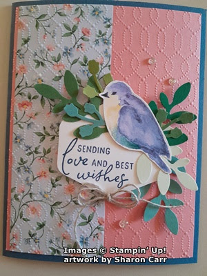
This one starts with a base of Misty Moonlight cardstock.  The layer of Flirty Flamingo cardstock measures 5 1/4" x 4".  The DSP print measures 2" x 5 1/4" and is attached near the left edge.  The bird is one of the Flight & Airy DSP sheets with all birds.  I fussy cut the entire sheet of birds and will continue to play with the individual birds adding them to cards as needed.  The fussy cutting was very easy as there wasn't very much detail.

The sentiment is from the Perennial Postage set.  It's stamped with Misty Moonlight ink onto a Basic White piece punched with the Heartfelt Hexagon Punch.

The leaves are all punched with the Bough Punch.  The green colors used are Garden Green, Soft Sea Foam, Shaded Spruce, Old Olive, and Lost Lagoon.  They are attached to the label with adhesive.  The label is attached to the card with Dimensionals.  The bird is added to this with Dimensionals also.  The gems are the Misty Moonlight color from the Tinsel Gems Three-Pack.

Next card starts with Boho Blue for the card base.  The layer is Misty Moonlight.  The DSP print is the same as the first and measures 5 1/4" x 2".  It's attached near the left edge.  

The focal point started with a label die-cut with the Perennial Postage set using Petal Pink.  It's attached flat with adhesive.  The same assortment of leaves is attached to the label with adhesive.  One of the birds from the collection was added over the leaves using Dimensionals.  

The sentiment is from Timeless Arrangements.   It's stamped with Misty Moonlight ink on a 1/2" wide strip of Basic White.  The Banner Pick A Punch was used to flag the ends.  It's attached with Dimensionals.  A double bow made from Linen Thread was tucked under the bird and is attached with a Mini Glue Dot.  The beautiful finish pieces are the pink pearls from the Blooming Pearls set. 


The next card in the series has a base of Flirty Flamingo cardstock.  The 2" strip of DSP is a different print than the others that I've used.  This is the back side of the blue print used in the next card.  It has a frame of Misty Moonlight cardstock surrounding it and attached with adhesive.  

A large circle was die-cut from Basic White cardstock.  It has a sentiment from the Perennial Postage set stamped with Misty Moonlight Ink.  The same collection of leaves was used with another bird attached with Dimensionals.  The circle was attached to the card with Dimensionals also.  

A double bow made from the Simply Elegant Trim was added to the sentiment area.  Three of the Misty Moonlight color gems from the Tinsel Gem Three-Pack were added to finish the card.

This is where my card designs changed, and I started adding the embossed background for added interest.  The card base on this one is Misty Moonlight.  The layer is Flirty Flamingo, and the DSP print is the blue background floral.  After attaching the DSP, the cardstock is embossed with the Softly Sophisticated Embossing Folder that is found in the Sale-a-bration brochure as a free combo item.  I love the delicate design it gives here!  Then it's attached to the folded card base.

The Heartfelt Hexagon Punch was used again, as was the Perennial Postage sentiment.  The same assortment of leaves were added to the sentiment.  The bird was attached to this with a Dimensional.  It's all attached to the card with Dimensionals.

A small double bow of Linen Thread was added under the sentiment with a Mini Glue Dot.  A trio of the new Iridescent Foil Gems was added to finish.

This card starts with a card base of Petal Pink.  It's embossed with the Timeworn Type Embossing Folder before adding any layers.  The 2" DSP is back to the pink floral.  It has a thin layer of Misty Moonlight cardstock behind is to frame it.

The large circle punch was used for the sentiment which is stamped with Misty Moonlight ink.  The same assortment of leaves was added.  It was attached to the card with Dimensionals, and a bird was added with Dimensionals also.  

A double bow of Linen Thread was added to the sentiment layer.  Three Iridescent Rhinestone Basic Jewels were added as an accent. 

The last card in this collection starts with Boho Blue cardstock for a base.  The layer is Calypso Coral this time with the 2" DSP layer attached to the left.  It's embossed with the Timeworn Type on both layers.  After embossing, they're attached to the card base with adhesive.  

The Perennial Postage dies were used to die-cut a Petal Pink label.  This is embossed with the 3D Basic cross-hatch embossing folder.  The assorted leaves are attached to this, then it's attached to the card front with Dimensionals.  The bird is added with Dimensionals..

The sentiment is from Timeless Arrangements and stamped with Boho Blue ink.  The ends are angle cut.  Then it's attached to the label with adhesive.

A double Linen Thread bow is added with a Mini Glue Dot.  Three Iridescent Rhinestone Basic Jewels were added to finish the card.

There you have six cards all made with the same basic layout and using most of the same pieces to assemble the cards.  What a pretty set of cards these turned out to be.  The different prints in the Flight & Airy Designer Series Paper pack are all gorgeous and easy to create with.  It was hard choosing what prints to work with.  I still have more ideas for cards using these items.  

I love how the mixture of different greens on the leaves add a lot of visual interest without taking away from the overall look.  I started making these cards with only Garden Green leaves, and it just didn't have the same appeal to me.  Once I planned to use more colors of leaves, I just punched a bunch of each color then picked through the stash to find what I wanted for each card.  So now I still have a stash of leaves and another of all the extra birds that I cut from that one sheet of DSP.  Ah, I see more cards in my future!  lol

Have fun creating your own cards with these ideas.  If you love this Flight & Airy DSP, place a $50 order so you can get the DSP for free.  It's only available through February 29th or until it's sold out, so don't delay on getting this.  It seems to be the most popular item in the Sale-a-bration brochure.

Happy stamping and creating,
Sharon

Tuesday, June 6, 2023

Timeless Arrangements in Greens

Hello and a happy Tuesday to you.  Hope you're doing well and enjoying summer wherever you are.  So far, our weather has been quite lovely.  But the heat is building up and we're going to have some really hot days coming soon.  So the card I'm sharing with you today has some lovely, cool, green tones to cool you down.  Back maybe 2-3 years ago, there was a Sale-a-bration item that was a pack of cards and envelopes in either Soft Sea Foam or Pool Party.  These cards and envelopes were lovely, but I never used up all the ones I had.  Thought this would be a good month to use some of them for the shut-ins at church.  I think they turned out really pretty and are so easy to do once you plan it out.  There's even a special cut on the card to make it special!

This is the card design for today.  Of course, you don't have to use the card base I chose.  I just had them on hand and needed to use them up.  Can you see the very subtle design in the card?  It's white on the Soft Sea Foam color, so is very subtle but pretty.  You could always do some stamping or embossing on your card layer to give it some definition from the added-on piece.  That bottom right corner is Soft Sea Foam cardstock to fill in the angled cut.

Let's figure out how to make this, shall we?

First off, you need to cut the bottom corner at an angle.  I figured the picture here would explain better, so you can see what I mean.  Look at where the card pieces line up on my cutter.  The top right fold of the card is at the 2 1/2" mark on the cutter.  The bottom left corner is at the 3/4" mark.  This gives you a nice angle cut to work with on your card front.  This is the whole basis on which the card design rests.  After you make one card, you can change your dimensions if you want because you understand how this is made.

Next I attached a quarter piece of Soft Sea Foam cardstock to the inside of the card front.  This completes your card front and gives you a base to add the strips of either a metallic, DSP, or contrasting color of cardstock.  I chose to use Silver Foil and Lost Lagoon cardstock for my strips.  These strips are 1/4" in width and about 6" long so they will fit.  The Silver Foil was added first with a fine line of 'green glue' and slid right up next to the cut.  Next the Lost Lagoon cardstock strip was added in the same way.

(I was only going to use the Silver Foil at this point, but changed my mind and added the Lost Lagoon before putting the card together.)

For the sentiment, I chose one of the sentiments in the Timeless Arrangements set.  It's stamped with Lost Lagoon ink on a Basic White strip, then die-cut with the matching die in the bundle.

The best way to show you how the Timeless Arrangements dies work was to share them in picture form.  The different dies I used each cut a different cardstock, Basic White, Lost Lagoon, and Soft Sea Foam.  To help the Soft Sea Foam layer stand out a little better, I used the smaller size of Blending Brush to add Soft Sea Foam ink to the branches.  Can you see how it's a little darker on the ends?

To put these together, I added adhesive to the front of the bar on the Soft Sea Foam piece and attached it to the back of the sentiment layer.  The same was done to the Lost Lagoon layer, and lastly the Basic White layer.  So all the layers were attached behind the sentiment when finished.  Since that makes it rather thick on the top edge of the sentiment, I added a Dimensionals strip to the bottom edge to level it out when attaching to the card front.  There was only adhesive put on the back of the white strip when attaching, and the tops of the greenery sprigs are all loose and unattached.

For the added bling to really "snazz" this pretty card up, I tried several different items.  In the end, I chose to use the 2022-2024 In Color Pearls.  This is the Parakeet Party color, but I love how it coordinates with the Soft Sea Foam of the card.  Who knew that would work?

Anyway, a dozen of these cards were made to send out for June.  Hope you like this little twist on a card front with the angled cut.  And I really hope you're interested in giving the Timeless Arrangements Bundle a try.  It's so easy to layer all these sprigs and twigs together since they have two or three each on a bar of cardstock.  Makes them easy peasy to work with.  

Don't forget about the Designer Series Paper sale that's going on during the month of June.  Who can't use an extra 15% off those fabulous DSP packs?  Remember the sale is only for packs shown on pages 129 - 132.  Have fun shopping!

Happy stamping and creating,
Sharon


Friday, June 2, 2023

Focus on the DSP

Hello friends!  Another day and more ideas for you.  Today's idea was to share one sheet of the Fresh as a Daisy Designer Series Paper as my inspiration.  Well, I've mostly done that with a slight exception.  The set up for this post will be mostly the pictures without much in the way of dimensions or instructions.  These cards are pretty self-explanatory.  But of course, if you have questions, you can always contact me for more info.  The cards showcase the sheet of DSP that has a patchwork of different patterns and colors.  There are multiple color choices available to use for these cards.  I'm just sharing what I decided to do with this one sheet of DSP.  There are lots of cards to look at, so let's get started right away.

This one took me the longest to create as I really didn't want to cover up any of the design.  The new Bubble Bath cardstock was used for the card base with a layer of Basic White.  The white was die-cut along the bottom edge with a border die.  Doesn't this dress up the card nicely?  

Some White Glittered Ribbon (retired) was used as an accent.  I just wasn't happy with any of the current stash of ribbons I owned.  Hmmm, maybe I need more ribbons??  There's also a sprinkle of Iridescent Pearls added for some bling.  Quick and easy card.

Love this one!  There is a base of Moody Mauve cardstock.  The printed piece of DSP for this was so small there had to be lots of layers involved to make it a card size.  There is a Basic White layer, then a Basic Black partial layer was added to this.  The DSP print only covered part of the black layer.  So some flowers were added that were stamped in Moody Mauve and die-cut.  Then some leaves were inked with Pebbled Path ink which matched the flower centers on the DSP print.   They were off-stamped before stamping on Basic White to keep them lighter.  These were also die-cut.  

The sentiment was stamped with Moody Mauve.  A tiny strip of DSP print (back side) was added under the sentiment.  The centers of the flowers are the new Adhesive-backed Sparkle Gems in black.  So pretty in person.  Just lovely.

This card uses only half of this print of DSP.  The rest is on the next card.  This card uses a base of Copper Clay.  There is a piece of Boho Blue that frames around the DSP.  For the sentiment, a piece of Basic White was stamped on repeatedly with Boho Blue ink.  Then it was stamped again with Copper Clay ink onto a skinny strip of white.  The ends were punched, then it was attached over one of the blue hellos with Dimensionals.

A piece of the Boho Blue Textured Ribbon was wrapped around the focal piece.  Linen Thread was tied to the side to hold it together and keep it fairly flat.  Three tiny flowers were die-cut and attached over the ribbon.  No other bling was added.

This time the card starts with a Petal Pink card base.  A layer of Copper Clay was added.  It has a Boho Blue ribbon wrapped around this before attaching to the card base.
 
The DSP is framed with Boho Blue cardstock and attached to the card with Dimensionals.  The sentiment is stamped with Copper Clay ink on Basic White.  The ends are trimmed up and it's attached with Dimensionals.

For a little bling, three Brushed Brass Butterflies are added to the design.  Subtle, but noticeable.

This time it's a blue and white card.  The base is Boho Blue cardstock.  The DSP print is framed up with Basic White that was die-cut with the Deckle Edge Dies.  It's attached to the card base with Dimensionals.

Two layers of the daisies from the Cheerful Daisies set were die-cut and attached together with 'green glue'.  These were attached flat to the card front.  A sentiment was stamped with Boho Blue ink and trimmed up to fit the card.  It's also attached flat.

There are three gems added to the center of the largest flower for some bling.

I love how elegant this card turned out, just golds and browns.  So very fancy.  This panel was fairly large, so there was little room to do much layering.  Distressed Gold Designer Series Paper was used behind the design to frame it and then layered onto an Early Espresso cardstock base. Another strip of the Distressed Gold DSP was added over the design.  

A small strip of Basic White was stamped with the sentiment using Early Espresso ink.  It was trimmed up and added to the card front with Dimensionals.  

Three of the new Adhesive-backed Sparkle Gems in gold were added for some extra glam.  Easy, but beautiful.

Here's the last one I have for you today.  This has a card base of Shaded Spruce.  I thought adding white and silver would keep this fresh and bright looking.  The Basic White layer is die-cut with the retired Stitched So Sweetly Dies to get the correct size of frame.  It's attached to the card front with Dimensionals.

All the die-cut pieces are from the new Timeless Arrangement Bundle.  I just love these!  The sentiment is stamped with Shaded Spruce ink onto Basic White.  Then all the sprigs and branches are tucked behind.  There are Dimensionals just on the very ends of the sentiment, so it looks flat to the card.  I wasn't sure anything else was needed, but a few of the Iridescent Pearls were added at the end.

I have to admit, it was really fun giving myself the challenge to use this one sheet of Fresh as a Daisy DSP.  I'm more comfortable with all the new colors now that I've played with them.  But I've really struggled with the smaller pieces of the DSP print.  There are still two more pieces that I haven't figured out what to do with yet.  Yes, that one sheet of DSP gives you so many different options in color and design.  In a way it was kind of intimidating, but it was fun too!  I hope these cards get your mind swirling with some fabulous ideas and you can't wait to dive in.

I hope you've heard that Stampin'Up! is having a great sale featuring the fabulous Designer Series Paper they have.  All of the Designer Series Paper packs on pages 129 through 132 are on sale.  They are 15% off for the whole month of June!  You can buy just one package or a whole stack of them and still get the 15% off.  Woo Hoo!  I just love a sale like this!  Please let me know if you have a problems ordering.  Or if you have any questions about today's projects.  I'm always happy to hear from you.  (Just a heads-up.  I've been having trouble with my phone lately with calls not going through or dropped calls.  I've been assured there's nothing wrong with phone, but I'm not happy.)

Thanks for sharing some of your time with me today.

Happy stamping and creating,
Sharon

Saturday, May 27, 2023

Boho Blue Medley

Happy Saturday.  Hope you're having a good day and maybe doing some Memorial Day celebrating.  I thought I'd get a post in today while I still could.  I've been fretting about which one of these cards to focus on, but really couldn't decide.  They all use the same colors and DSP and embossing folder and dies, but all have a slightly different twist to them.  This morning I got the brilliant solution to just share them all in this post and give just a small bit of information on each one instead of a long dissertation on each.  Hope you like this approach today, as it will give you ideas to use when looking at a piece of Designer Paper and not sure where to go with it.  Ok, let's dig in.

My idea started with the thought of using a 3 1/2" wide strip of Countryside Inn Designer Series Paper (page 129) and cutting a segment as needed for my project.  For the first card made, I cut the DSP at 3 1/2" to make it a square.  Basic White Thick is used for the base.  It's cut at 10 1/4" x 4 1/4", scored at 5 1/2".  The 3/4" piece that was cut off the front was attached to the bottom of the inside of the card for as extra layer.  A layer of Basic White 4 1/2" x 4" was embossed with one of the Basic 3D embossing folders (Online Exclusives), then layered onto the card base.  Changed my mind about the layout and trimmed down the DSP to 3" wide and attached it to the base.  The 1/2" I cut off was turned on its side and attached to the bottom of the inside of the card that shows.
Now for the fun part.  The Timeless Arrangements Bundle (page 67) is so much fun to create with!!  I was die-cutting the different layers of leaves with Night of Navy, Misty Moonlight, Boho Blue, Balmy Blue and Silver Foil.  I had a small pile of pieces to choose from when putting these cards together.  I started by stamping a sentiment from Inked & Tiled set (page 95) with Misty Moonlight ink onto a Basic White 1" strip.  I trimmed it to fit my design, then laid different pieces behind it until I had something pleasing to my eye.  Each piece was attached with adhesive then the whole piece was attached to the card front with adhesive.  One card done, on to the next.

First the minor changes.  The added Misty Moonlight layer was cut to 5" x 4" and run through the embossing machine with the same cross-hatch design used above.  Then 1" was cut from the bottom end.  Both of these pieces were attached to the folded 8 1/2" x 5 1/2" Basic White card base.  The DSP was again cut to 3 1/2" x 3 1/2" but not attached to the card front yet.

The sentiment is from the Timeless Arrangements set.  It's stamped with Night of Navy ink onto a 5/8" x 3 1/4" strip of Basic White.  Then again, I played around arranging the bits and pieces die-cut from the same bundle.  All the colors but the Balmy Blue were used here.  As you can see, several pieces were also stamped in Night of Navy ink on white, smudged with a little Wink of Stella and die-cut.   This gives another dimension and texture to the die-cut pieces.

The pieces were all attached behind the sentiment strip.  Then this all was attached flat to the DSP layer with adhesive.  Then the DSP was attached to the card front using Dimensionals.

Two clear Rhinestone Basic Jewels were added to the sentiment strip.  Some small flowers die-cut from the Sentimental Park die set were added to the design.  They are attached with Mini Glue Dots.

I wanted to add some of the Boho Blue Ribbon but didn't want a bulky bow or knot.  So instead, a 3 1/2" piece of ribbon was cut and attached over the bottom piece of Misty Moonlight cardstock using adhesive.  Another texture without the bulk.  Ok, another one finished.  On to the last design.

Same Basic White card base and same Misty Moonlight layer as before.  The Misty Moonlight was not embossed this time.  The DSP layer is also the same 3 1/2" x 3 1/2" size but was turned over so the back side could show.  It is framed with a 3 5/8" x 3 5/8" Basic White layer to break up all the blue.  The white layer is attached to the card front with Dimensionals.

The sentiment I wanted to use for this card is from the new Courage & Faith set on page 72.  I really like the sentiment/Bible verses in this set.  It's stamped on Basic White with Misty Moonlight ink.  It's die-cut with one of the rectangles in the Timeless Arrangements Bundle.  I like the slightly different look to the stitching lines on these and they're great sizes to fit a sentiment.

After die-cutting the sentiment, the layers of greenery were attached with adhesive.  This time only the Balmy Blue and Night of Navy pieces were chosen.  This gives it a cleaner look than the last one.  The sentiment was attached with Dimensionals and the greenery is not attached at the top, just on the sentiment layer.  

At this point I realized I had forgotten to add the ribbon knot to the front of the card.  I pried up the edges and tucked the ribbon in behind the Misty Moonlight cardstock.  That's definitely the hard way to do it!  It was a little loose, so a Mini Glue Dot was tucked under the knot to hold it in place.

To finish it off, three clear Rhinestone Basic Jewels were added to the design.  

By now, I'm assuming you noticed that all the cards basically have the same layout.  But the look is quite different with the layering and pieces used.  I'm definitely a huge fan of the Timeless Arrangements Bundle and all the coordinating pieces that go with it.  If you love blues, you'll love the Countryside Inn DSP.  It's so pretty.  And don't think this can only be done with blues, because the sky is the limit with color combos.  I've already used the stamps and dies with greens, and I've got ideas dancing around in my head with fall colors too.  Yes, this is a total must-have in my book!

If you have any questions about these projects that I didn't cover, please get in touch with me.  I'd love to hear from you and help you out.   Thank you for sharing your time with me and my ramblings.  Enjoy the rest of your holiday weekend.  Make sure you take time to think about all the soldiers through the years who have given their lives for our country.  And don't forget all those who have served in the Armed Forces and are dealing with the aftermath of war. We are truly blessed to live in this country even though there are many problems going on at the moment.  Keep our country in your prayers.

Happy stamping and creating,
Sharon