Wednesday, July 30, 2025

Love Sunflowers!

Hello, my stamping friends.  Have you missed me?  It's been a super crazy month with first my husband having thyroid surgery because of a spot of cancer on his thyroid.  He's doing well and prognosis looks great.  Then my daughter scratched a cornea and was out of commission for several days because she couldn't see well enough to drive, etc.  Then on Sunday she went to ER with awful pain.  There was discussion for over 36 hours about whether her gall bladder needed to come out now or later.  The doctors opted for now and she had surgery yesterday.  All is well with her too.  Just needs to go through the healing process now.  Thank God for his goodness and grace in getting us through it all.  

Needless to say, I've spent little time in my stamping room getting anything made.  In fits and starts, I was able to do a little playing around with the awesome Sunflower 3D Embossing Folder.  I've got three projects to share with you today, but there's so much more that can be done with this embossing folder.  So far, I've just scratched the surface, but it's a start.

This is the second card I made and the absolutely easiest one.  I couldn't believe this card was designed and made in about 15 minutes.  How's that for quick?

The main ingredient here is the two-tone cardstock.  I used Crushed Curry Two-Tone cardstock for this.  When embossing, the darker side was placed up in the folder before running it through the Big Shot.

Using a sanding block that I purchased years ago from SU!, I lightly sanded over the raised areas on the cardstock.  I found using a swirly circular stroke over the cardstock worked well.  You don't need much pressure at all.  If there are any areas that didn't get sanded, I went back with a corner of the block and lightly sanded the tiny areas.  The piece looks good here, but I wish you could see it in person.  The sanded detail is so prominent.  I just love it!

Because I was working on these cards on the fly, I didn't write down the info on what stamps I used.  So, let's see how my memory is working today.  The ribbon used is a length of Black and Vanilla Checked ribbon that we used to carry.  I'm sorry I didn't use anything current, but I love the look of a black accent with this design.

After adding the ribbon, the layer was attached to a Basic Black card base.  The sentiment used is from the You Are Remarkable stamp set.  It's stamped on Very Vanilla with Memento Tuxedo Black ink.  The punch used is the Labeled With Love Punch.  The small black die-cut pieces are from the Gallery Blooms Die set.  These are attached to the label and then attached to the card with Dimensionals.

The last touch here are the Muted Palette Dots.  I colored three of the darkest ones with the Dark Basic Black Blends, because I wanted black accents for the card.


This is the first card I did with the embossing folder.  I was trying for an autumn look to the card.  I'm still kind of ambivalent about this card.  I like it but it's not the best card I've ever done.  I need to play with the colors a bit more.  The finished look reminds me of tooled leather and looks rather masculine.

This time I started with Daffodil Delight cardstock for the embossing.  On the raised embossed side, I started by swiping the Crumb Cake ink pad over it using just the edge of the pad with almost no pressure.  Next Timid Tiger was swiped over the design leaving more color.  Then a layer of Pecan Pie was added.  As you can see, I kept going darker with less pressure and coverage with the color applications so you can see the different colors.  The final swipe of Early Expresso ink kind of pulled it all together and really made the design pop.  

The cardstock layer was trimmed smaller and layered onto Early Espresso cardstock.  This was layered onto a card base of Pecan Pie using Dimensionals.

For the sentiment, I was looking for something small but bold looking to really stand out from the design.  Not sure where this comes from, but I think it was a retired stamp that I decided to use.  It's stamped with Early Expresso ink onto a Daffodil Delight skinny strip.  It's then punched out with a retired punch and layered onto a 2 1/4" x 3/4" strip of Early Espresso cardstock and popped up with Dimensionals.

The last step was adding the bling.  For this card, three of the Low-Profile Dots in the gold tone were added to perk it up.

Now for the last design, and my absolute favorite...

This design shows off the reverse side of the embossing folder or what would be called the "DEbossed" side.  For this card, I started with Basic Beige cardstock to emboss.  On the back side, I used Basic Beige ink to swipe across the cardstock piece.  As you can see, this puts the ink on all the background areas and the details of the sunflowers and leaves.  It just took my breath away with the very first swipe across the design.  I absolutely love this soft neutral look.  It definitely needed to be paired with black to really stand out.

First, I layered it onto a piece of Basic Blask cardstock with just a thin edge showing all around.  I went back to a retired Basic Black and White Checked Ribbon.  It was perfect with this color and design.  It's wrapped around and a large bow is tied to the left side.  

I liked the idea of a die-cut sentiment for this card.  The Delightful Wishes Die set would be perfect.  I added some of the Adhesive Sheets to the back of both Basic White and Basic Black cardstock pieces.  They were both die-cut.  Then the backing was peeled from the black detailed word first and layered onto the white background for the word.  Next the back was taken off the white layer and the word was attached to the card front.  Using the Adhesive Sheets to add adhesive to the back of these detailed pieces makes it so easy to attach them to your design!

The rest of the sentiment is stamped with Memento Tuxedo Black ink onto a strip of Basic White.  The ends were trimmed before adding it to the card with Dimensionals.

The card layers were attached to an Old Olive card base to play up the greenish tones of the Basic Beige ink.  I used Dimensionals to attach it.

Last up is the bling on this card.  After trying a few ideas, the Holographic Resin Dots were added to the design to finish.  So elegant!  

Did I say this was my favorite?  Absolutely.  But there is more I want to try with this embossing folder.  If you like to play around and be creative, I think you're going to love designing with this embossing folder.  It's so versatile and simply down-right fun.

Last look at the three cards together.  I find it amazing what you can do with one little embossing folder.  So many techniques and so many looks.  This one item could keep you busy for a good long while all by itself.  Just get yourself a good sentiment set that's versatile, and you really like, and then the sky is the limit!

Thank you for bearing with me this month while I've been too scattered to create much.  Hopefully this spate of craziness is finished, and we can all get back to normal around here.

Happy stamping and creating,
Sharon


Tuesday, July 15, 2025

Using a Basic Template

Hello friends.  Today I've got a whole pile of cards to share with you.  It all started with a Basic Template using a piece of 6" x 6" DSP to cut all the main pieces.  My template I used is very basic and can be cut either way, depending on the direction of the print and what you want to do with it.  First, I want to show you a picture of the 5 cards that are made from one 6" x 6" piece.  Then we'll get into the cutting and details to make these cards.

The DSP that was used for these cards is maybe my favorite print in the Floral Charm DSP pack that is part of the Charming Day collection.  The roses are a pretty soft color with Night of Navy and Pretty Peacock leaves.  It's just yummy.   Of course, when I create with the other prints in the set, I fall in love with the other designs too.  Guess this DSP pack is definitely my favorite at this point!

Anyway, can you see how just a small amount of this print can go a long way?  It's so pretty even when you've only got a 1 1/2" x 3 1/2" piece!

Let's get to the Basic Template that I used.

Sorry, this isn't all fancy like other people can make it.  When I'm working out a design, I just make a sketch and add dimensions for it.  That's it.  But you can see exactly what you need and how to cut.  Want to give it a try?

The first card up is using the top left piece of the Basic Template.  This measures 3" x 3 1/2".  I decided to use Fresh Freesia for the card base even though that's not one of the colors that are recommended for this.  I just liked how it looked, so that was my choice.  

The DSP is framed with a piece of Night of Navy cardstock that measures 3 1/4" x 3 3/4".  It's attached to the base with Dimensionals.

The sentiment is from the Charming Day set and is stamped onto a Basic White circle using Night of Navy ink.  It is die-cut with the Stylish Shapes Dies.  It's backed with the next largest circle cut from Night of Navy cardstock.  The circles are attached together with adhesive.  Then they are added to the card with adhesive where they overlap the DSP and Dimensionals on the right side to keep it flat.

A sheer white ribbon with silver edges was cut in half and then both pieces were tied into a pretty bow.  A trio of Purple Fine Shimmer Gems in the plummy color were added to finish the design.

Next up is one of the two left side pieces of the Template that measure 1 1/2" x 3 1/2".  This time the card base is Bubble Bath.

A 2 1/4" x 4 1/4" piece of Berry Burst was cut for an accent.  About 1/2" was ripped from the right edge.  Then it was embossed with the Distressed Tile Embossing Folder to give it extra interest.  This was attached about 1/2" up from the bottom of the card using Tombow Liquid Glue (green glue).

Next a piece of Night of Navy was cut to frame the DSP.  This measures 1 3/4" x 3 3/4".  They are attached together with adhesive.  Then they're attached flat to the card base right over the Berry Burst layer.  I used "green glue" again for this layer.

The sentiment for this card is from the Unbounded Love set.  It's stamped with Night of Navy ink onto a circle cut from the smallest circle die in the Stylish Shapes Dies.  It's backed with the next largest circle from the same die set.  This is attached over the corner of the DSP using both adhesive and Dimensionals so it lays flat on the card.  

I happened to have a small open leaf die-cut leftover from a precious project that was in Shaded Spruce.  This was tucked in slightly under the Berry Burst layer for some added interest.

There are three gems from the 2021-2023 In Color Dots that are added to the card.  They were originally supposed to match with Moody Mauve, but I loved the look on this card.

This card uses the 2nd small piece of DSP from the left side of the template.  I'll confess, I had quite a time making this card and I'm not sure I got it right.  If anyone has any suggestions, I'm open to hearing them!

This card started with a lovely die-cut from the Charming Day set.  It's cut in Berry Burst so I thought it would go with this idea.  

The card has a base of Pretty Peacock cardstock.  The DSP has a layer of Night of Navy framing it that measures 3 3/3" x 1 3/4".  It's attached near the bottom of the card front using Dimensionals.

The berry die-cut has some Mini Dimensionals under some of the wider areas to give it lift.  Then part of one of the flowers is tucked under the DSP and some leaves are brought forward on the design.

The sentiment used here is from the Perfectly Pears stamp set.  The die used to cut the label is from the same set.  It's stamped with Night of Navy ink.  There are Mini Dimensionals behind this to elevate it to match the rest.

Three of the Pecan Pie & Clear Ribboned Adhesive-backed Dots are added to the design to finish it.

The fourth design features the piece of DSP from the top right of the Basic Template.  This piece measures 2 1/2" x 4".  The layering piece is Night of Navy cardstock that measures 2 5/8" x 4 1/8".  The pieces are attached with adhesive. 

The card base for this design is Bubble Bath cardstock.  The two layers are attached to this with Dimensionals.

There is a die-cut of Pretty Peacock leaves added to the bottom left corner.  It's attached with dots of "green glue" on some of the leaves to hold in place.   

There is an open rose die in the same set that was used to cut this Berry Burst rose.  It's attached over the leaves with several Mini Dimensionals.

The sentiment is from the Perfectly Pears stamp set.  It's stamped onto a small label that's cut from the same set.  After stamping, it's attached flat to the card front with adhesive.

There are three of the Pecan Pie & Clear Ribboned Adhesive-backed Dots added as a pretty accent.

This one might be my favorite card of the batch.  At least for now!

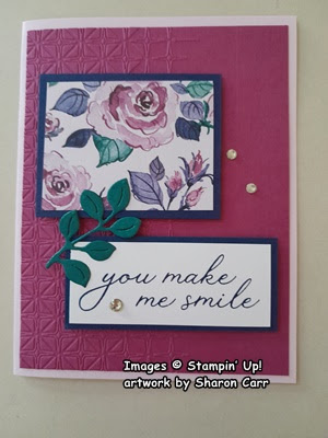
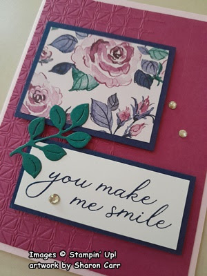
This is the last card of the batch.  It uses the DSP piece from the bottom right-hand corner.

The card base is Bubble Bath again.  There is a layer of Berry Burst that measures 5 1/4" x 4".    To add some interest to the layer, I used the Glass & Garden Embossing Folder for texture.  I like how subtle this is, but it does make a difference.

The sentiment is from the Sweet Blooms stamp set.  It's stamped with Night of Navy ink onto a 1 1/4" x 3" strip of Basic White cardstock.  It's framed with a layer of Night of Navy cardstock.

The DSP piece is layered with Night of Navy cardstock.  This piece and the sentiment label are positioned on the card front.  Both pieces are attached with Dimensionals.

There is another leafy sprig from the Charming Day set added here.  It's die-cut from Pretty Peacock cardstock.  It bridges the two pieces and is attached with adhesive under just a few leaves.

The last bits on the card are the Rhinestone Basic Jewels in clear.  I thought they were all that was needed.

Ok, you've now seen all five cards that were made from one 6" x 6" piece of the Floral Charm DSP.  It was challenging to stick with those five pieces and come up with cards I liked.  I found it quite fun to do, so I made another batch of cards using a different DSP.  I'm going to share the cards, but I won't be giving you the rundown of all the materials because I didn't write them down.  It would probably take me another couple of hours to figure that out, so you'll need to just use the cards as ideas to get your ideas flowing.  Let me know what you think of the Basic Template I made and the cards that came out of it.  I'd love to hear what you think.

All five cards from one piece.
top left of template
bottom left of template
top right of tamplate
bottom right of template


Hope these ideas all inspired you to try out this template.  Or even make a template of your own to use.  I keep reminding myself that it's only paper and if I really, really hate it, it can go in the circular file and get recycled!

Have fun with these ideas.

Happy stamping and creating,
Sharon

Tuesday, July 8, 2025

Pretty Impressions Abloom Cards

Hello, my stamping friends!   It's still hot as can be around here.  It feels like I'm going to melt if I stand around outside for too long.  These temperatures in the high 90's are really taking a toll on us.  I guess that means we need to find more things to do inside the house rather than outdoors.  I made some simple cards the other day to send out to the shut-ins at church.  They turned out so pretty, I thought you'd like to see them and maybe try these quick cards for yourself.

These happen to be the only ones I have left.  When making them, I had actually used two other prints from the Floral Impressions Designer series paper along with this one to make a nice variety of cards.

For all of the different cards, I started with a Basic White Thick card base that measures 8 1/2" x 5 1/2".  This is scored and folded in half to make a basic card.

For this card, I cut a piece of the Floral Impressions DSP that measures 3" x 4".  Watch the direction of the design so it is cut in the proper direction. The wider measurement is the width of the paper's design.  

A layer of Petunia Pop was also cut for these cards.  This measures 4 1/4" x 3 1/4".

Holding the DSP with the front facing you, rip approximately 1/2" from the bottom edge by pulling it towards you.  Take the top part of the paper and attach to the Petunia Pop layer.  Do not attach along the bottom edge.  With the strip of DSP that you ripped off, flip over so the back side shows and tuck the unripped edge underneath the 1st piece and attach to the Petunia Pop cardstock.   This will make both of the ripped white edges of the paper show when it's layered to the Petunia Pop.  After layering together, this was attached to the center of the folded Basic White Thick card base using adhesive.

There was a veritable garden of flowers stamped for accents on the cards.  For this one, the solid daisy type flower was stamped with Peach Pie ink that was off-stamped, then stamped on Basic White Cardstock.  Then the detail stamp was stamped with Peach Pie ink full strength over this.  The plummy flowers were stamped with the solid smallest flower with Petunia Pop ink that is off-stamped first.  Then the detail stamp with the same color was stamped over this.  All the flowers had centers stamped in using Gray Granite ink.  After stamping, all the flowers were die-cut with coordinating dies.  The extra detail dies fit into the outline dies on the flowers and gave the flowers lots of added detail.

Leaves were die-cut from both Old Olive and Garden Green cardstock pieces.  There were two different sizes cut also.  

The sentiment is from the Everyday Greetings stamp set.  It is stamped on a label that is cut with a die from the Greetings of the Season die set.  The sentiment for this card was stamped with Timid Tiger ink.  Other inks were used on the different cards depending on the colors in the DSP prints.

All three of the flowers are attached to the corner of the design using Dimensionals.  The sentiment label is tucked in partially under the flowers and attached flat with adhesive.  One of the larger leaves and two smaller leaves are tucked in around the flowers.  I used both greens on each card for added interest.

I had some retired sequins in a peachy tone that went nicely with this design.  On some of the other cards, different gems were used that matched the other DSP print colors better.

The ladies that have been joining me each month to put the cards together had no problems with the ripping and tucking on the DSP piece.  They were all impressed with how easy these cards were to put together and they looked so bright and cheerful.  Hope all the recipients of the cards will enjoy them too.

Hope you're inspired to get out some of those leftover pieces of DSP that you don't know what to do with.  Maybe this technique would be the perfect solution for using some of that DSP that you have sitting around.  I know I'll be considering this idea again when I'm looking through my stash of DSP.

Happy stamping and creating,
Sharon
sharoncarr50@gmail.com

Monday, July 7, 2025

Floral Charm Simplicity

Good day all you lovely people.  It's been an interesting bunch of days lately.  Hope you all enjoyed the 4th of July festivities with picnics, fireworks, etc.  Now that that's all over, it must be time to get back down to business making cards.  What do you think?  Today's card features the new Floral Charm Designer Series Paper that coordinates with the Charming Day stamp and die bundle.   The whole suite of items is new in the Online Exclusive section of the SU! store. This Designer Paper has such pretty prints and they're all in colors that are right up my alley.  Yes, they're all lovely pastels.  Yum!  I just want to continue to look at them and wrap them all around my house so I can enjoy them all the time.  But that's impossible, so I guess we'll just have to cut into them and see what we can create!

This is the first card using this paper.  I wanted the print to be the focal point so there is a good size piece front and center.  Looking at this print, the first color that jumped out at me was the Petal Pink.  So that will be used for the card base which measures 8 1/2" x 5 1/2".  It's scored in half at 4 1/4" and folded.

The DSP print is cut at 3 1/2" x 3 1/2" square to be the focal point.  I liked the look of Pretty Peacock cardstock as a great accent for the colors in the print.   The dark color really highlights the pretty print. This was cut to 3 5/8" x 3 5/8" square.  This gave me just a skinny bit of Pretty Peacock showing all around the DSP to frame the look.   

The DSP print was attached to the Pretty Peacock cardstock using adhesive.  For a pretty accent, a 4 1/2"- 5" strip of Petal Pink Metallic Edged Ribbon was wrapped around the layers and attached in the back with adhesive.  Another length of ribbon was used to make a bow that was attached over the strip of ribbon using Mini Glue Dots.  Yes, I know the ribbon is retired.  Unfortunately, I don't get through the spools of ribbon in the allotted time while they're still current.  They are way too beautiful to get rid of, so there you go.  I'm still using those retired bits of ribbon and will most likely continue to do so.

Another cardstock color that looked great with the print was the new 2025-2027 InColor Cloud Cover.  Doesn't this soft blueish/gray fit nicely?  I just love this color!  Okay, back to creating.   I wanted a good bit of the Petal Pink showing on the card, so the Cloud Cover was cut a bit smaller than a regular layer.  It measures 5" x 3 3/4".  

I debated with myself about using an embossing folder on this layer, but decided I wanted a plainer look that wouldn't detract from the print.  So, no embossing on this.  

It was attached to the folded card base with adhesive.  Then the print layers were attached to the card front making sure the top and two side edges were spaced evenly on the Cloud Cover layer.  These were attached with adhesive also so all the card at this time is pretty flat.

I've been enjoying using the More Messages stamp and die set for my card sentiments lately.  The single large stamp was inked with Pretty Peacock ink and stamped onto a piece of Basic White cardstock.  Then the matching die cuts them all out at the same time.  It's wonderful having 19 different die-cut sentiments ready to use that quickly.  I just keep the rest in a little container then pick through and find just what I need when I need it.  Now that's quite handy dandy.

The sentiment is attached in the open area in the bottom half of the card.  For this, I used Dimensionals as I wanted it to stand out from the rest of the card.

For the touch of bling on this card, I chose a retired batch of gems - the Earth Tones Shimmer Gems.  They just matched the Petal Pink portions of the card perfectly.  If you don't have any of those in your treasure chest of gems, you might want to use either the pale pink or clear gems in the Strawberry Slush & Pretty in Pink Gems.  They should work nicely.  Or if you'd like to give the design a more vintage look, the Antique Pearls would look lovely here.

Just wanted to give you a small peek at all the lovely prints in the Floral Charm Designer Series Paper.  Aren't they all lovely?   I don't know which one to work with next!  Decisions, decisions!

The whole Floral Charm Suite is just filled with wonderful items from the Charming Day stamp set and dies to the DSP, ribbon, and gems.  I'm just loving this whole suite and can't get enough of it.  If you like pastels and soft brights along with pretty florals, you're going to fall in love with this suite too.

Happy stamping and creating,
Sharon