Showing posts with label Grateful Blessing. Show all posts

Tuesday, September 9, 2025

Autumn and More

Hey friends!  Let's get back to some autumn ideas again.  Today is a perfect fall day with sunshine and blue skies with puffy white clouds and temps requiring a sweater.    Doesn't that sound perfect?  It's been a great day to go out for a walk and just enjoy the beauty around me.  It hasn't been quite cool enough at night to get the leaves to start changing to those glorious fall colors.  But it's coming soon, and I want to be ready for it.  Today's cards are featuring the Gathering Together DSP with a fun fold that's easy to do.  Ready to get started?

Here are two of the cards I've made with this quick fun fold.  The colors are just gorgeous for this time of year with all the golds, rust, and browns.  The Gathering Together Designer Series Paper has an assortment of colorful prints that are just perfect for this time of year.  These cards only feature one of the prints, but I'll get around to using the other prints soon.  They are too pretty to ignore.

My plan was to do basically the same card using both Cajun Craze and Crushed Curry, just switching out which color would be the base and which one the layer.  Doesn't it give a different feel to the cards?

Let's focus on this one first.  The card base is Crushed Curry cardstock that measures 7 1/2" x 5 1/2".  It is scored at 3 1/4" and 6 1/2".  The 3 1/4" section is folded over to make the front flap of the card.

There are three Cajun Craze layers.  They measure (2) 3" x 5 1/4" and (1) 3/4".

The three DSP pieces measure (2) 2 7/8" x 5 1/8" and (1) 5/8" x 5 1/8".

There is one Basic White piece that measures 3" x 5 1/4".  There is also another piece needed for the sentiment.  For this sentiment I used a 3" x 3" piece.

Layer each of the DSP pieces onto the coordinating size piece of Cajun Craze.  I used "green glue" to attach these together, so I had a bit of "wiggle" time to get them on straight.
Attach the two larger pieces of DSP and layer onto both the outside and inside front flap of the card.  The skinny layers get attached to the right edge of the card onto the area that was scored earlier.  This will be put aside while we work on the inner Basic White piece and also the focal sentiment piece.

The sentiment I used here is from the Grateful Blessing set.  It's sort of hard to find in the catalog, but you can find it on page 98 in the Annual Catalog.  I like the nice bold size of the font, so it really makes a statement.  One of the Spotlight on Nature dies was used to cut a label with plenty of room for this sentiment which is stamped with Early Espresso ink.  

One of the leaves in the Grateful Blessing set was inked with Crushed Curry ink then off-stamped before stamping over the wording. 

To attach this to the card front, two Dimensionals were placed on the back of the circle where it would be positioned on the skinny layer of DSP.  When the card is closed the label is just a decoration.  But when you fold back on that 1" score line, the card pops open  

A double strand of the new Old Olive Linen Thread was tied into a bow and attached to the label with a rolled Mini Glue Dot.  A trio of Pecan Pie & White Dots are added to the sentiment label.  Sorry, I thought these were still current, but they sadly are not.

Here is the darker version of the card.  The dimensions are all the same as the previous card.  The base is Cajun Craze cardstock, and the layers are Crushed Curry cardstock.

Did you notice a different DSP on the skinny side piece?  That is just the backside of this lovely leaf print.  I thought it went well with these colors.

The sentiment used here and on the inside of the card are both from the Grateful Blessing set.

The leaves stamped here use Cajun Craze for the larger and Crushed Curry for the smaller.

The gems are the new Cajun Craze & Gold Dots that are an Online Exclusive item.  They really have a pretty gold sparkle to them that nicely enhances the gold touches in the DSP print. 

This card also has a double strand bow, but it uses one strand of Old Olive, and the other strand is Early Espresso.  I liked the darker mix on this card to go with the darker overall look.

I thought it might help to visualize the card using another angle of photo.  With the 1" score line on the right side, it's so easy to just slightly bend back and have the card pop open.

Since I was having so much fun making this style of card, I had to try a different DSP to see how it looked.  Love it!

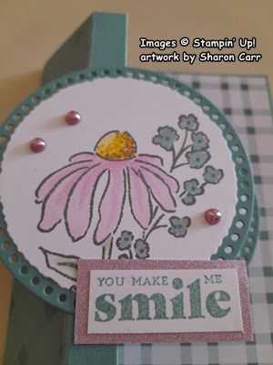
The dimensions are all the same, but the colors are sure different.  This looks so summery and happy.  For this one, the cardstock colors were Pretty in Pink and Basic White.

The pretty print paper is from the Florals in Bloom DSP.  The skinny piece on the right edge is the backside of the floral print.  I thought it was a nice contrast.  I used the Pretty Florals stamp set for all the stamping on this card.

This also uses the Spotlight on Nature dies, just a smaller size.  

Three of the Holographic Dots were used here.  I was surprised how well they picked up and blended with all the colors on the card.

These flowers turned out so pretty and matched the DSP nicely.  The colors used are Pretty in Pink, Real Red, and Garden Green.  When stamping the flowers, the stamps were off-stamped, so the ink was lighter and more transparent.  The sentiments were stamped full strength with the Garden Green ink.

I hope you enjoyed and were inspired to try making this fun fold card.  Just by rethinking your color palette and DSP print you could make a card to fit any occasion or time of year!  How many ideas can you think of right now?  Let me know what you do with this fun fold idea.

Happy stamping and creating,
Sharon

Tuesday, June 3, 2025

Textured Notes Thank You

Hello stamping friends!  I think we've survived the cold and damp rainy days we've been experiencing.  On to the sunshine and warmth again!  Yay!  Along with the dreary weather getting me down, a good friend from our Sunday School class passed away very suddenly last week.  It definitely threw me into a blue mood for a time.  But I realized even though I'd only known Judy for less than two years, I have many fun memories of time spent in her presence.  It's time to embrace the good memories and put away the sadness and live life to the very fullest extent possible.  Just like she would.   She loved Jesus and loved serving others and that's a wonderful legacy to leave behind.  As Judy would say, "Let's get on with it!"

Today's card idea came from the need of some masculine thank you cards.  I had a good assortment of floral thank you cards, but those really don't work too well for the manly men out there.  So, I turned to the Textured Notes stamp and die bundle for some un-girly inspiration.  These are part of the Online Exclusive products available to you.

With all the intersecting lines and angles along with the nature theme on this card, I think I achieved my goal.  There's a good number of textures and layers used here to keep things interesting.  Ready to make it?

Start with a base of Crumb Cake cardstock as a good neutral.  This measures 8 1/2" x 5 1/2" and is scored and folded in half.

The first layer is Very Vanilla cardstock that measures 5 1/4" x 4".  I wanted to give this some subtle interest, so the larger leafy stamp from the Textured Notes set was used.  To achieve the very light background, the stamp was inked in Lost Lagoon ink then off-stamped twice before stamping randomly on the vanilla cardstock.  This gives just a hint of color and design but really made a difference from the plain Very Vanilla cardstock.

Next there is a 2" x 4" layer of Lost Lagoon cardstock.  This lays across the card to anchor the design elements.  Before it was attached, it was embossed with the retired embossing folder called Tasteful Textiles.  I love the texture this adds to the layer, but it's still subtle and just blends in.  It's attached about 1" from the bottom of the Very Vanilla layer.  I used "green glue" to attach the layer to the Very Vanilla layer.  If there is any overhang on the sides, this is the time to trim it up. Then these both were attached to the folded card base.

Now we get into the lovely Textured Notes rectangle dies.  Each of the rectangle dies has a different texture cut into the edges.  For this card, I used three different dies.  The 2nd smallest size cut the Very Vanilla cardstock.  The 3rd smallest size cut the Pretty Peacock cardstock, and the 4th smallest cut a piece of Crumb Cake.

On the Pretty Peacock layer, the smaller leafy stem from the Textured Notes set was randomly stamped several times using Pretty Peacock ink.  This added a nice print on the darker layer.

This picture really shows off the interesting details on each rectangle layer and also the embossed Lost Lagoon layer too.

The Pretty Peacock layer was attached to the Crumb Cake layer with "green glue".  Then this was attached to the card front fairly close to the right edge.  Again "green glue" was used to keep these layers flat.

The same large leafy stamp used on the background was used again.  It's stamped onto Very Vanilla cardstock using Lost Lagoon ink full-strength.  Since there is no die for this, it was fussy cut with Paper Snips.  Set aside for a minute.

The sentiment is from the Textured Notes set.  It's stamped to the left side of the Very Vanilla layer that was already die-cut.  Pretty Peacock ink was used for this.  It is attached over the two layers that were just added.  This time Dimensionals were added to give it some lift.  The leafy stem you just cut layers over this.  Dimensionals were used under the top leaves and the bottom stem, and the center part lays flat across the sentiment layer.  The leaves were curled slightly to give more dimension.

On to the inside of the card.  A layer of Very Vanilla cardstock was cut at 5 1/4" x 4" for this.  The sentiment is from the Grateful Blessings set found in the Annual Catalog.  I love both the words and the font on this stamp.  It is stamped with Pretty Peacock ink to show up nicely.  

Using the smaller leafy stamp from the Textured Notes set, the leaves were partially stamped in the top left and bottom right corners.  Lost Lagoon ink was used for this.

The layer was attached inside the card using "green glue" to hold it.


Last look.  As you can see, I couldn't resist adding a few embellishments.  I thought the metallic dots would continue the more masculine look of the card.  Three of the Adhesive-backed Textured Dots were used.  Aren't they the perfect embellishment for this masculine card?

And then I couldn't stop myself.  I added a small bow made with Linen Thread to the design.  It's attached with a rolled up Mini Glue Dot.

That's it.  I had to stop, or it would end up too girlie.  I hope you like the card idea for today.  I know I find it much harder to make the more masculine style of cards.  Thankfully, those aren't needed too often around here.  But that means I get out of practice.  Ahh, sounds like a vicious circle.

In case you haven't heard yet, Stampin'Up! is having a special sale right now.  You can Buy One and Get One 50% Off on all suites and suite products.  Definitely mix and match suites and products from both the catalog and Online Exclusives.  The more expensive item is full price, and the 2nd item is half off.  If you have questions, feel free to get in touch with me.

Happy stamping and creating,
Sharon
sharoncarr50@gmail.com 

Friday, February 7, 2025

Another Side Box Fun Fold Card

 Hey there!  Hope you're having a great day today.  Wouldn't you know it?  As soon as I gave up on making more of the fun fold cards that I shared yesterday, I went downstairs today and quickly put together another one with some of those leftover parts.  I was just stuck on the stamp set I wanted to use.  Once that idea changed, finishing it was a breeze.  So, what did I actually end up making?  So glad you asked!

Didn't this work out nicely?  I love the mix of Bubble Bath with the Lost Lagoon.  As you can see, the basic card is totally identical to the Friendly Seagulls I posted yesterday.  I had cut two of everything at the time because I was planning on making two seagulls cards the same.  But plans change, you know?  I decided I wanted to try something else instead.

I won't go over the directions for the card base again here.  Please check yesterday's post for the dimensions and directions.

Today the Mixed Florals set came to mind and I checked to see how the stamp would fit on the Deckled Circle die-cut.  Enough of the design fit to make it work.  The stamp was inked up with Pebbled Path ink to give the design a slightly softer color.


The images were colored with Stampin' Blends:  Bubble Bath Light & Dark, Lost Lagoon Light, Daffodil Delight Light & Dark, Copper Clay Light, and Soft Seafoam Light & Dark.

Because the image was so small it only took about 10 minutes or so to color.  After coloring it was attached to the Lost Lagoon Everyday Details circle die-cut using adhesive.

It was attached to the card base the same way as before by carefully marking the size of the circle on that 1/2" strip with a pencil.  Then adding Tear & Tape within that space.  Peel off the backing on the tape and attach the circles so they are in the center of the card front.

The sentiment comes from the Hugs For Love stamp set.  It's stamped on a Basic White strip that is about 5/8" wide and is stamped with Lost Lagoon ink.  It's carefully trimmed on the sides to fit.  A small piece of In Color Glimmer Specialty Paper in the Bubble Bath color was used to frame the sentiment.  The piece measures 7/8" x 1 7/8".  Guess it pays to hang on to all those skinny strips.  You never know when you'll need just that little bit.  This has two Mini Glue Dots on the top left area of the label to adhere to the circle.

The circles inside the card match the front ones in size and color.  The sentiment I chose for this is from the Grateful Blessing stamp set.  This will be a perfect "just because" card to send out to a friend or family member.  It's stamped with Lost Lagoon ink to match.  

There was a small flower left over from a huge batch of valentines that I made.  I added it here with a Mini Glue Dot.  I liked that little pop of pink inside the card.

I tried several different gems for that little touch of glitz.  I was surprised that these little pearls were such a good match!  They are the Adhesive-backed Pearl Trio.  I thought they would be too big and purply for the card, but I really like them.

Thank you for coming by today.  Hope you enjoyed another look at this cute Left Side Box Fun Fold card.  Whew!  That's a mouthful.  But I just love how cute this little fun fold is when you want to send a special card.  Hope you give this fun fold a try.  It's not as hard as it looks.  I always try the measurements and scoring out on a piece of computer paper to get the hang of what I'm trying to make.  I am absolutely, definitely not an engineer! 

There's only several more weeks to go until Sale-a-bration will be over and done.  Did you see that a good number of new items have been added to the freebie list?  Don't miss out on something you've been wanting and wait til it's too late.  I'd be happy to be your demonstrator if you're looking for one.  Be sure to use the new Host Code at the top of the page.

Happy stamping and creating,
Sharon