Saturday, February 19, 2022

Setting Sail

Good morning, friends!  Hope you're having a bright and sunny day this Saturday.  Right now, the sun is trying to peek through, and hopefully it will turn out to be a sunny day.  As promised, I'm turning back to some Sale-a-Bration freebies for my inspiration on today's card.  Make sure you check out the Simply Marbelous Designer Series Paper.  It really is very 'marbelous' and the color choices are perfect for my craving for pastels.  Just gorgeous!  Check out how the Balmy Blue and Misty Moonlight work together on this card to make a lovely watery background.

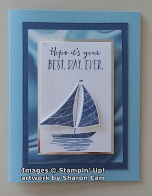
Aren't they just a perfect backdrop for the sailboat?  Ok, let's take apart this card so we can put it together again for you.  Start out with a card base of Balmy Blue which is cut at 8 1/2" x 5 1/2", scored and folded in half.  The next layer is Misty Moonlight.  It's been die-cut to be 4 3/4" x 3 3/8" using the versatile Stitched Rectangle Dies to give it a nice clean edge.  And of course, I love the stitching on it to define the edge.  Sometimes it's those little touches that make a simple card stand out.

Next the Simply Marbelous DSP is cut to 4 1/4" x 3 1/8".  I used the side that almost looks like a piece of scrunched together satin fabric with the light playing with the hills and valleys.  It really is gorgeous!  Of course, I chose to use the Balmy Blue/Misty Moonlight color choice.  It's just right for a sailing card.  This is attached to the Misty Moonlight layer with adhesive to keep it flat.  

Next, I cut a piece of Basic White cardstock to 3 1/2" x 2 1/4". Time to get out the Let's Set Sail stamp set from the January-June 2022 Mini Catalog.  You can find it on page 70.  I made the Basic White layer just big enough to have the words across the top without feeling too crowded.  They are stamped with Misty Moonlight ink.  Coming down to about 1" from the bottom on the white cardstock, the hull and mast of the sailboat were stamped with Misty Moonlight too.  The sails were stamped on a scrap of Basic White so they could be punched out with the coordinating punch. (I guess if I can't have a die for every set, a punch will work fine!)  

The sails were attached with Mini Glue Dots close to the mast, and a Mini Dimensional was used at the outer edges of the sails to make them stand out from the card.  I thought it looked more like it really was sailing this way.

The last bit of stamping on the front is the reflection of the boat on the water.  This is also stamped with Misty Moonlight ink but was off-stamped first to keep it much lighter than the boat.

To set the whole focal point off, a layer of silver mirror foil was used.  Since I was at my sister's when this card was made, the silver foil is an off brand that I have no name for.  I believe I have some mirrored foil in my retired stash of metallic papers at home though.  This is a good example of using what is at hand.  It was cut 3 3/4" x 2 1/2" to frame the focal images.  I like how the back sail (does that have a name??) flows off the card and gives an illusion of movement.  At least, that's my take on it!  To finish the front, this was all attached in the center of the card and popped up with Dimensionals.

The inside of the card has the sentiment stamped in Misty Moonlight right on the Balmy Blue cardstock.  I decided not to add a white layer inside of this card for a change.  A sailboat was added to the bottom corner for an accent.  It was stamped with Misty Moonlight off-stamped to create a much lighter look.

Just a quick reminder that Sale-a-Bration is ending soon - February 28th.  Can't believe that's almost here already.  Where do the days go?  If there's anything you still want from this, please don't wait until the very end.  So often items will sell out and not be available again.  I'd hate for you to miss out on some item you really wanted...  like the Simply Marbelous DSP!

Hope you're taking time to be creative.  It's a great way to relieve stress and really feel good about getting something accomplished.  And you have a card (or many cards) that you can share with family and friends.  See, it's a win-win situation when you get creative!  Have a very creative day!

Happy stamping,
Sharon

Friday, February 18, 2022

Birdhouse Birthday Card

Hello everyone!  Hope you're ready for an interesting card today.  It's a tri-fold card that is just a little bit different.  At least I hope it's different for you!  When visiting my sister Connie, she shared a tri-fold card that was lovely.  But I didn't want to make the card in the same way, so I did a little bit of artistic license voodoo on it and came up with my own way of making it.  Not only did I change up the way to cut the cardstock base, but the stamps used changed too.  So much fun!  Hope you like the idea.

For this special fold, I started with an 8 1/2" x 11" piece of Basic White cardstock.  I cut 3" off from the side to end up with 5 1/2" x 11".   This was scored at 4" and 8".  When folded, this gives you a card that is just a bit skinnier than normal, and the top flap does not reach over to the other side.  

The flap on the right was embossed with the Brick and Mortar 3D Embossing Folder.  To make the lovely brickwork stand out more, I used Crumb Cake ink and a Blending Brush to rub color over the bricks. Extra attention was paid especially to the raised bricks which received much more ink.  You could add more color with other pale colors if you'd like a different look.

The stamps used for this are from the Garden Birdhouses in the Annual Catalog on page 107.  It was one of my first choices from this catalog, but when I got the set, I had no idea what I wanted to do with it.  It languished on the shelf until I got this creative nudge, and here it is.   


On the top flap, the branch on the bottom was stamped first.  I used Memento Tuxedo Black ink and stamped the branch with enough room for the smaller birdhouse to tuck in under it, but over to the edge of the paper as far as possible.  The branch was stamped again pretty close to the top and not quite so close to the edge of the cardstock.  Then the birdhouses were stamped in the open areas tucked up under the branches.  The third birdhouse was stamped on a scrap of Basic White and cut out after coloring.

The birdhouses were colored in with a Blender Pen (haven't used one of those in a while!) and these inks:  Crumb Cake, So Saffron, Pear Pizzazz, and Old Olive.  The leaves were lightly colored in with a Pear Pizzazz marker, leaving some areas of the leaves alone.

After coloring, I cut a curvy edge very loosely following the stamped images, making sure the top edge ended up shorter than the bottom edge.  When folded, there wasn't enough contrast between the two panels, so a 3" x 5 1/2" piece of Pear Pizzazz cardstock was attached inside the flap with adhesive.  The cardstock was then cut to follow the curvy line of the white layer on top of it.  This gave just enough of a contrast to please me.

When the flap is opened, you have the lovely green color complimenting the bricks.  It needed a sentiment on this layer, but I wanted it to be small enough to be hidden.  One of the sentiments from the Color & Contour stamp set was used.  It was stamped on a scrap of Basic White with the Memento Tuxedo Black ink.  Then it was cut out following the contours of the lettering.  It was attached to the bricks using adhesive.  When making this sentiment piece, I also stamped the Happy Birthday sentiment from the Garden Birdhouses and contour cut them too for later.

On to the inside of the card.  I'm still fussing about what I can add or change on that, but here it is for now.  The sentiment comes from the Garden Birdhouses.  It was stamped with the Memento Tuxedo Black ink.  I added a little bird sitting on one of the words.  I haven't decided if that leafy branch should be stamped partially inside the card, or would it be too much.  What do you think?  Input please???

The very last thing to do on the card is the belly band.  Pear Pizzazz cardstock was used here.  It was cut 1" x 11" and folds around the card.  I actually trimmed off about 1" to make the overlap shorter.  You want to make sure the overlap can be hidden under the third birdhouse which is attached with a Dimensional.  The birthday sentiment that was made earlier is also attached with Mini Dimensionals.  And there you have it.  A tri-fold card that is just a little bit different.  If you try doing a card like this, let me know how it went and send me a picture if you can.  I'd love to see what you do!

Just a short reminder that Sale-a-Bration is just about over.  It ends on February 28th.  If there's something on your wish list, now might be a great time to order it.  I'll have to go back to sharing cards made with Sale-a-Bration freebies to show you possibilities before they aren't available anymore.  And there are many!  When you do order, please remember to use the Host Code at the top right corner on my blog page.  I would greatly appreciate it.

It was fun being away visiting Connie, but great to be home again.  Connie and I had lots of fun creating together and bouncing ideas around.  She is such a creative person and it's so great to see how someone else pulls ideas together.  I'll have her here guest hosting again sometime soon.

Thanks for taking the time to stop by for a read and hopefully a dose of creativity.  Stay in touch and keep on creating.  It's good for your disposition - at least that's what hubby says.

Hugs,
Sharon

Monday, February 14, 2022

Wildlife Wonder with a Guest Designer

Hey there!  Happy Monday to you!  And Happy Valentine's Day too!   I figured since I was here in North Carolina helping out my sister, that I should ask her to be a guest designer.  She was tickled with the idea of being a guest designer, so we chose a card that she made that I really liked.  And since I didn't own the stamp set, it stood to reason that she should make the card and I'd share it with you.

Isn't this just gorgeous?  I love her style and the very gentle way she colors her wildlife animals.  She used the wolf from the Wildlife Wonder stamp set that's in the January - June 2022 Mini Catalog on page 71.

She started with a piece of Basic White cardstock that is 3 5/8" x 2 7/8".  On this, she stamped the wolf using Smoky Slate ink.  Under this, she stamped the shadowy image also with Smoky Slate ink.  She added some color to the rock and also the shadow with a Crumb Cake marker.

She did additional coloring with an Aqua Painter using Smoky Slate very lightly under the shadow area, and Balmy Blue lightly sketching in the sky background area.  There was a small black dot added to the eye with a Basic Black marker.

At this point, she stamped a sentiment from the Wildlife Wonder stamp set.  She used Memento Tuxedo Black ink for this to make it really stand out.  She layered this onto a silver mirror-finish piece of cardstock that measured 3 3/4" x 3".  Set this aside to work on the card base.

A piece of Basic White cardstock was cut at 11" x 4 1/4".  It was then scored at 2 3/4" and 8 1/4" for the gate-fold.  Balmy Blue was layered inside the card for a different look.  There are two pieces cut at 2 3/4" x 4 1/4", and one piece cut at 5 1/2" x 4 1/4".  She basically covered the whole inside with the Balmy Blue.  You might need to shave off just a smidgen from the edges of the blue that are at the folds to allow it to fold easily.

The wood grain DSP on the front is from the In Good Taste Designer Paper.  These two pieces are cut at 2 3/4" x 4 1/4".  These pieces also cover the front of the card, edge-to-edge.  To finish the card, fold it closed and determine where the wolf focal point will be going.  Carefully add adhesive only to the left side of the back of the wolf, so it won't glue the whole card closed.  She kept the design flat, but you could use Dimensionals under just the left side to give the card more dimension.

Hope you enjoyed Connie's artwork and idea.  You're welcome to CASE any part of it, or the whole deal.  She does have a wonderful way with some stamps, cardstock, and ink!  It's good to see her during the design process.  Maybe I learned a thing or two.

TIP: When Connie was water coloring, she said her Aqua Painter was almost dry for the sky area.  This gives a much more streaky, sketchy look to it.

If you're thinking of ordering, please use the Host Code shown at the top of the blog.  That would be greatly appreciated.  You know I appreciate you!  Hope you received your Valentine's Day card on time.  I sent out a big stack of them.  It was fun working with a Paper Pumpkin kit, but none of the cards were made the way it was designed.  Each card was one-of-a-kind made especially for you.  Enjoy!

Lots of Hugs & Kisses!
Sharon


Friday, February 11, 2022

On The Horizon Quick Cards

 Well ladies, I must admit to being totally hooked on the gorgeous New Horizons Designer Series Paper.   It was so easy to make two lovely cards from just one 6" x6" piece of this paper.  Then just add a few small, stamped accents and the cards almost make themselves.  If you haven't gotten this paper yet, what are you waiting for?  And if you have gotten the paper (you smart thing you), have you gotten the On the Horizon Bundle that coordinates with it?  Wow!  Together they are fabulous!  Let me share the two cards that went together so quickly...

Here they are - similar and yet different.  Only 1 3/4" of the paper was cut from the top and set aside for future dealings.  The paper was then cut in half and used on the two cards.  Both of the papers used the same trio of trees from the On the Horizon stamp set.  The trees were stamped along the horizon line using Shaded Spruce ink on each card.  The other stamping was the flight of birds in the sky of each design.  The birds are from the On the Horizon set and were stamped with Basic Gray ink.
Both cards started out with a base of Misty Moonlight cardstock which was cut at 8 1/2" x 5 1/2".  It was then scored and folded in half.  I thought a framing of white would set the DSP off and also make it more rigid for attaching with Dimensionals.  The Rectangle Stitched Framelits were used to give the layered edge some more definition and interest.  The DSP design was attached to the Basic White layer using adhesive.  Then it was popped with Dimenisonals.

Here's where these designs took on a life of their own and went their separate directions.  

On this card, one of the sentiments from the On the Horizon stamp set was used for a birthday card.  It was stamped with Misty Moonlight ink onto a scrap of Basic White cardstock.  It was punched out with the Label Me Fancy punch which fit it perfectly.  

To add a very small bit of bling to this card, I took a 6" length of the Black Glittered Organdy Ribbon and folded it in half behind the sentiment label.  The label was then popped up and attached to the card front.

The other card went in a more clean and minimal direction.  The sentiment (again from the On the Horizon stamp set) was stamped on a 1/2" strip of Basic White cardstock that was about 3 1/2" long.  Misty Moonlight ink was used to stamp this.  The ends were punched with the Banners Pick a Punch. Then it was laid on a strip of Misty Moonlight cardstock that was 3/4" x about 3 1/2" and attached with adhesive.  Then the ends of this were again punched with the Banner Pick a Punch to frame the white. 

This was attached over the water portion of the DSP print using Dimensionals.  I didn't think anything else was needed or added at this point.  It's hard to improve on perfection.  (Do you hear me laughing in the background here?)

Both cards have a layer of Basic White inside of them for stamping a sentiment, or just for you to write a nice, long letter.  On the first card, I used another of the sentiments from the stamp set on the inside layer.  The wording went well along with the front to make a nice masculine card.  (That is, unless the guy is allergic to glitter!)

I hope I'm not too nutsy on this post.  I've been staying with my sister Connie in North Carolina this week.  She's broken her leg right at the ankle bone, so she's not getting around too well on her own.  We've been having a great time stamping and talking, but probably not getting enough sleep.  Today my brother, sister-in-law, and nephew stopped by for a visit too.  It's been great catching up with family I haven't seen in a while.  If this post isn't making enough sense, now you know why.  In fact, you better double-check any and all measurements, you never know!!

Just a quick reminder that Sale-a-Bration is only going to be around a little longer.  So far, the freebies have all been available, but when they are gone that's it.  If there's something you've been thinking about but haven't jumped on yet, don't put it off too long.  If you do place an order, I'd appreciate it if you would use me as your demonstrator and also use the Host Code at the top of my blog.  I truly appreciate all of you and thank you from the bottom of my heart for your orders.

Thanks for stopping by today to see what's new.  If possible, I'll try to get another post in before I come home.  But I'm not making any promises.  I've got several cards I'd like to share, but don't seem to have enough time to sit down and write.  We'll see what happens.

Many hugs to you!
Sharon


Friday, February 4, 2022

Get Well Card in Neutrals

I don't know about you, but I've had a run on my 'get well' cards lately.  I don't have any left, so it was necessary to get some made quickly.  Since I've been sending cards to both men and women lately, I was trying to make some cards that would work for either.  That is, until I have time to make more specific cards.  At least that was my idea.  Usually, neutrals work quite well for both, so that was my starting point.  I hadn't used the Artistically Inked stamp set in a long while, and the flowers weren't too over the top feminine.  Let's go with that and see where it ends up.

The base of this card is Crumb Cake cut at 8 1/2" x 5 1/2", then scored and folded in half.  I had a 2 3/4" x 4" piece of Basic White just hanging out on my desk, so that is what I used.  The large flower from Artistically Inked was stamped with Crumb Cake ink on the two opposite corners.  Both of them were positioned partially off the white cardstock.  

On a scrap paper, I tested a couple of green colors for leaves and So Saffron for the flower center.   I didn't care for the center stamped in, so it's left plain on this one.  Pear Pizzazz was chosen as the color for the leaves.  There are four sets of two leaves each stamped around the flowers.  Some of these are 2nd generation stamped.  (This is when you ink up a stamp and stamp twice without re-inking in between.)

To make this very soft pastel design stand out, it was layered onto a Basic Black cardstock piece cut 3" x 4 1/4".  This gives such a nice bold frame around the stamped layer and defines it from the card base.  All those soft neutrals needed a bold pop of black to offset them.  

For the sentiment, the Inspired Thoughts stamp set in the Annual Catalog has some words that worked well here.  They are stamped on a Basic White 1/2" strip.  After stamping the words with Memento Tuxedo Black ink, the strips were cut down to 2 1/2" long.  It was layered onto a Basic Black strip that's 3/4" x 2 3/4".  

At this time, I played with the stamped layer and the sentiment to see how to place it onto the card base.  The stamped layer was attached with Dimensionals a little to the left and down from the center point.  The sentiment was attached over this with Dimensionals on the left, and double-layering the Dimensioinals on the right so it lays flat.

Three of the Classic Matte Dots in black (from the January - June Mini Catalog pg. 59) were added to the card for extra interest.  

The inside of the card has a layer of Basic White.  The same flower was stamped on two opposite corners with Crumb Cake ink, but this time they were off-stamped once to create a much softer color.  The leaves were stamped with Pear Pizzazz ink and were also off-stamped.  The effect is just gorgeous.  Unfortunately, it was so soft looking that I couldn't get a decent picture to show it off!


I made a second card with the same colors but with a different size of Basic White cardstock because it was already cut.  Then I went ahead and made one with Rococo Rose.  Remember that color from last year's In Colors?  It was one of my all-time favorite colors and was fun to use again.   I think it turned out just gorgeous and hope you like it too.

That's it for today's posting.  Hope you enjoyed the idea and see how easily it is to adapt to different sizes of the focal layer.  Each of the cards were made the way they were because of a piece of Basic White cardstock that was left-over from a different project.  

I didn't use anything from the Sale-a-bration brochure today.  I guess I'll have to work on something tomorrow using those fun free items before Sale-a-bration is a thing of the past.  Remember, it ends with the end of February.  So if you've been thinking about ordering, don't wait too long.  When these freebies are gone, that's it.  They won't be coming back.

Have fun creating something new and unique!
Sharon

Wednesday, February 2, 2022

Another Friendly Hello

 Oh my goodness!  I just checked and this will be the 5th card I've shared using the Friendly Hello Bundle.  Hmm, does that give you the idea that I like it - a lot?!  Today's version started out similar to yesterday's card, but quickly took a turn in another direction.  When I started playing with the Friendly Hello DSP that I had cut yesterday, I thought it would become the same card with 2 exceptions - different base color cardstock, and a landscape style instead of portrait.  No biggy.  But as I tried to work with it, nothing wanted to play nice.  So, even though those changes are still there, there are a few extras added in to make it happy.  Let's see what all the changes brought about.

Wow, doesn't even look like I had planned on making the same card at all!  This one starts with a Fresh Freesia card base cut to 8 1/2" x 5 1/2", scored and folded in half.  Like yesterday's card, there is a Basic White layer next, and a layer of Friendly Hello DSP cut to 3 3/4" x 5" attached onto this.  There is also the same 1" x 5" strip of Pool Party and white DSP is attached to the card front.  The ends are not punched but go right to the edge of the layer. 

As an added bonus, the little diamond-detailed strip was added to go across this.  This is from the Delightfully Detailed Laser-Cut Specialty Paper that was retired a couple years ago.  I just have some bits left from it and couldn't throw them away because they're just too pretty as you can see.  I was going to use the white side, but when it was flipped over to add the adhesive, I realized the cream color was a softer look for the card. 

At first, I colored the bird on the DSP just like yesterday, but this one didn't stand out as much for some reason.  I had already stamped, colored with Stampin' Blends, and fussy cut a bird and flowers for another project that had been put on hold while I thought about it.  I held it over the bird on the DSP and realized they were a perfect match.  Now why didn't I know that before?  I also had a couple extra flowers colored and cut out to use as needed.  Well, this was the time they were all needed.  I love how they all work together even with the different tones for coloring that aren't part of the DSP colors.  The bird was colored with Balmy Blue Light & Dark, 2 flowers are Highland Heather Light & Dark, and 2 flowers are Fresh Freesia Light & Dark.  Flower centers are Daffodil Delight, but you can't really tell with the rhinestones over them.

The bird and flowers were all attached to the card front right over the original bird using Dimensionals.  The 2 extra flowers were tucked in a little under the bird's tail.  The focal point here still needed something else.  After looking for some type of delicate greenery to add, I remembered the Christmas Trimmings Die set in the Annual Catalog.  It has a spray of berries that is just what I was looking for.  There are 3 bunches cut from Fresh Freesia cardstock. I tried several green colors and wasn't happy with them.  So now I've got more "table trinkets" laying around for the next card marathon!

The sentiment is from the Celebrating You stamp set that I used yesterday.  Like I said earlier, it covers most sentiment needs other than the fall and winter holidays, so is a good useful and versatile word set to get.  It's stamped on a 1/2" strip of Basic White scrap using Fresh Freesia ink.  The Banners Pick a Punch was used to flag the ends.  It was then attached to the card front using Dimensionals.

Several of the gorgeous Iridescent Rhinestone Jewels were added to the flower centers for a pretty touch of bling.

I wanted the inside to be as pretty as the front, so a 1/4" strip of the lovely Pool Party and white print from the Friendly Hello DSP was attached across the bottom of the Basic White layer.  The strip was just a smidgeon too short, so I flagged one end.  Think it adds a cute touch.  

The sentiment is from the Friendly Hello stamp set.  It's stamped with Memento Tuxedo Black ink off to the left side.  And at the bottom right corner, a small stamp with flower and leaves was stamped in Fresh Freesia ink for the final touch.

Hope you've enjoyed seeing the different way you can use the very same products.  With a change in colors and/or accessories used, the final project can look amazingly different.  Just take one of your stamp sets (or maybe a piece of DSP like I started with) and start playing around with different colors and layouts.  I know we all have our favorite layout ideas, but maybe try something different today. You just might be in for a pleasant surprise and find a new favorite layout idea!  Or maybe get adventurous and try a new fun-fold idea!  The whole premise of this is to have fun creating and have even more fun sharing those creations with your family and friends.

Stay warm my friends and create something beautiful!
Sharon
 

Tuesday, February 1, 2022

Love That Friendly Hello

 Hi there!  So glad you've stopped by for a short read.  Both today and tomorrow, I'll be sharing cards that use the Friendly Hello Stamp Bundle from the 2022 January & February Sale-a-bration brochure.  Yes, I know I've shared something already using this bundle, and I've made several cards that I've popped in the mail for friends that you haven't even seen.  I'm just having trouble putting this bundle down.  Since this is February 1st, that means there are only 28 more days that you can get this for yourself.  When you place a $100 order, you can choose this bundle as your free Sale-a-bration item.  The stamps are both solid and line-art, and there are 3 sentiments that are becoming favorites of mine.   And the Friendly Hello Designer Series Paper is just too wonderful for words.  I hate to get too mushy-mushy, but I really do like these prints and colors.  Just perfect for my taste.  Here's the card for today...

This is my first Easter card for the year.  I wanted to make the DSP the main focus on this card.  The print with the bird would be the perfect piece to use.  I actually cut two pieces of this with the bird front and center.  I'll share the other card tomorrow.

Pool Party cardstock was the card base used here.  It's cut at 8 1/2" x 5 1/2", scored and folded in half.  The next layer is Basic White cut at 5 1/4" x 4".  The layer of Friendly Hello Designer Paper is cut at 5" x 3 3/4". These pieces are all layered together and attached with adhesive for a more streamlined look.

Before layering together, Stampin' Blends were used on the bird very lightly to enhance the color already there.  Pool Party Light, Pale Papaya Light, and Crumb Cake Light were used to make the bird and branch images stand out just a bit more.

These pastel colors put me in mind of spring, so I thought this would make a nice Easter card.  The sentiment is from the Celebrating You set in the January thru June 2022 Mini Catalog on page 65.  That is a wonderful stamp set that has sentiments for everything but the fall and winter holidays.  This is definitely a keeper!  The sentiment was stamped on Basic White cardstock using Shaded Spruce ink.  It was punched out with the Double Oval Punch.  The scalloped oval part of the punch was then used on Pool Party cardstock to provide a nice frame for the sentiment.

There is a 1" strip of the Pool Party and White print from the Friendly Hello DSP added to the lower portion of the card.  It has the ends punched with the Banners Pick a Punch before attaching with adhesive.   This makes a good base for the sentiment focal point. 

Before adding the punched sentiment, it needed some kind of greenery around it.  The new Bough Punch from the January thru June 2022 Mini Catalog on page 26 looked to be the right size.  I punched out two sprigs of the larger one from Soft Succulent cardstock, and two of the smaller ones from Soft Sea Foam.  Though these two colors aren't technically part of the color array in the DSP, I thought they blended nicely with this very soft looking card.  These sprigs were attached between the Basic White oval and the scalloped oval that is Pool Party.  Then the whole sentiment bundle was attached to the card front with Dimensionals.

Of course, the card needed some bling at this point.  The new Iridescent Rhinestone Jewels were my first choice for this pastel card.  The iridescence of the jewels picks up whatever color they are next to.  Some have a peachier look going on and some look more pinkish or lavender.  Just simply gorgeous! Gotta say these are definitely my go-to bling at the moment.

So last thoughts... Don't forget to check out the Friendly Hello Bundle in the January-February Sale-a-Bration brochure.  It's a real winner and so versatile.  I'll have another version of this card tomorrow so you can see how just a few changes will give you an entirely different card.  That is part of what I like about stamping.  Every time you sit down to create something, even when using most of the same products, you can create something totally new and beautiful.  You don't have to own half of the catalog yourself.  (oops, did I say that out loud??)  You can still create lovely projects that are different each time and uniquely you.

Have a happy creative day!
Sharon