Showing posts with label 2022 Winter Sale-a-bration. Show all posts

Monday, July 25, 2022

Ombre Tea Cup

 Hello ladies!  Hope you're having a fabulous day today.  My psycho cardinal is back running into the dining room window again.  That poor girl must have an awful headache by now!  She usually sits on my car window and fusses at the side-view mirrors.  We've had to fold them back in against the window when we're not driving to make her stop.  So now she's back at the dining room and bedroom windows.  She actually woke me up way too early banging on my bedroom window this morning.  Whoever heard of a cardinal that flies into windows on a regular basis?  And not just once, but maybe 12 - 15 times before she quits.  Then she's back again to go at it another day. BTW, this has been going on for months. Crazy!  I wish I knew what to do to make her stop before she hurts herself.  Any suggestions?  Ok, that's enough about my crazy cardinal.  I don't suppose that's why you showed up here today, is it?  I had to make a card for a friend of mine going through some health issues.  We used to sit and have a cup of tea and visit on a regular basis. But both of us moved away.  I really miss our chats.  So, the Cup of Tea stamp set was my choice for her card.

My thinking here was to make something really bright and cheery, because I can't be there to cheer her up in person.   I started out by working with the Sale-a-Bration freebie - Silver & Gold 6" x 6" Designer Series Paper.  I cut a 1/2" strip from the bottom edge of the dotted print.  Then I cut it in half to get two 3" x 3" strips.  One I'll save for another project.  

I started with So Saffron ink and a Blending Brush to bring the yellow up from one end about halfway.  The end is darker with it blending out to very light as you go up.  Then I used Balmy Blue ink and came down from the top edge and blended dark to light in the middle where it overlapped the So Saffron and became a soft green color.  The blue wasn't dark enough for this, so Tahitian Tide was blended from the top edge to darken.  This only goes down about 1 1/2" or so.

The next thing was stamping the striped teacup with Tahitian Tide ink.  I liked the stripes as a contrast to the dots on the DSP.  The greenery in the set was stamped with Parakeet Party ink.  Then the band of 5 flowers was stamped twice - once with So Saffron and once with Daffodil Delight.  Out of the ten flowers stamped, only seven were used.  After the stamping of the teacup, greenery, and flowers, they were all die-cut using the matching Teacup Dies.

The sentiment is from the same set.  It's stamped with Daffodil Delight ink onto a 1" strip of Basic White cardstock.  The ends were trimmed square. 

After deciding to add a layer of Silver Foil paper behind the dotted layer, it was cut just a bit wider than the sides of the DSP.  They were attached together with Multi Purpose Liquid Glue, then attached to the card front also with the Glue.  The sentiment layer was also backed with the Silver Foil.  Then it was time to get all the pieces onto the card.  

The back of the teacup lip had a little adhesive across it to just barely hold the greenery in place.  Then Dimensionals were added behind both pieces to add to the card, and especially spanning the teacup and greenery to stabilize them.  The tiny flowers were added with Mini Dimensionals behind them to tuck in around the flowers. 

One tiny flower was added to the greenery flat with a Mini Glue Dot.  One of the larger flowers was added over the cup edge using a Dimenisonal.  This gave it a pleasing multi-dimenisonal look to the finished piece. 

The sentiment layer was also attached using Dimensionals.  I didn't attach it in the center of the card, but off to the side to give it more appeal.

Because of the silver foil layered behind the two areas and the silver dots on the DSP, I decided not to add any extra bling to this card.  I felt it would just get lost in the finished design.

Hope you like this bright and happy card.  And I hope it cheers up my good friend.  By changing the sentiment, I think it would make a great birthday card too.  What do you think?

Thanks for stopping by to see what's happening here.  My psycho cardinal finally gave up banging into the window.  Hope she's taking a breather somewhere and doesn't come back for a while.  I've been fretting about not seeing my hummingbirds this year, but this morning three of them were out at the feeder and doing all kinds of aerial acrobatics.  So much fun to watch them!

Thank you for the orders that have been coming in.  You know how much I appreciate you!  If you're thinking of placing an order soon, please use the Host Code shown at the top of my blog post.  When an order is placed through this, I can order extra goodies to share with you all without spending an arm and a leg for the items and then shipping them to you.  Thanks in advance of any orders placed!!!

Please stop by again soon.  I love seeing the comments you make.  It really makes my day when you take the time to leave a comment.  It keeps me connected to you!  And that's a good thing.

Happy stamping and creating!
Sharon

Saturday, July 23, 2022

Sale-a-Bration Card

 Hello there.  Happy to have you back today for another card idea.  I've got to admit, I'm not sure about posting this card today.  I wanted to share an idea using mostly Sale-a-Bration items making up the card.  That part was easy.  The problem comes because of Sale-a-Bration items that have already sold out and are no longer available.  One of the three items used to make this card are already gone.  Yikes!   I've gone back and forth arguing with myself and finally decided to go for it.  I know some of you may already have some of the things I'm sharing on this card, and that's great.  If you can't get it anymore, check your stash and get creative.  Use something else that you already have.  It could end up even better than what I've made!!  Here we go...

First off, let me list the three items from the Sale-a-Bration brochure that I used on this card.  Pool Party and Soft Sea Foam Card and Envelopes - love these, but alas they are already gone.  You could easily use the Soft Sea Foam cardstock in place of this.  Amazing Phrasing - love these sentiments. They're kind of funky and fun with a really "loose" font. And the Rings of Love 12" x 12" Designer Series Paper - still available!!!  Thank goodness that isn't sold out too, because my Tree Rings Hybrid Embossing Folder and Die-Cuts are on their way here.  I want to die-cut some of that cute paper that matches the tree rings die.  So much fun!  But, back to my card today.  

The card started with one of the Soft Sea Foam cards for the base.  The choice of the "birds and branches" print from the Rings of Love DSP was easy because the bitty birds are adorable, and the little leaves are also Soft Sea Foam so are a wonderful match.  The DSP measures 4" x 3".  Soft Suede cardstock was cut to layer behind it, and it measures 4 1/4" x 3 1/4".  They were attached together with adhesive.  Then attached to the card front slightly over to the left side using Dimensionals.

Next was the sentiment from the Amazing Phrasing set.  This was stamped onto a strip of Basic White cardstock approximately 5/8" wide with Night of Navy ink to match the birds.  It's layered onto a 7/8" strip of Soft Suede cardstock.  Before layering together, the right edge of each was flagged with the Banner Pick A Punch.  This was attached to the card front using Dimensionals too.

The little bits of leaves are from the Cottage Wreaths stamp set and die bundle.  I wanted just a few bits of greenery added, and really had a problem with which colors to use.  I ended up with two sprigs of Evening Evergreen and one of Crumb Cake.  There's also a branch stamped with Soft Suede ink on white then die-cut.  
It looked like it needed something added where the leaves all attached to the sentiment layer.  I decided on the Brushed Metallic Dots to stay with the more subtle color scheme.

Lastly, I still had several sprigs die-cut but not used on the front of the card.  Didn't want to waste anything, so three were attached inside the card in the bottom corner.

I apologize profusely that I'm using an item that you can't get anymore.  How frustrating for me when planning these ideas, and for you too if you want to get these items.  So sorry.  But like I mentioned before - check your stash and improvise!!  This is just another chance to get creative.

If you'll be ordering before the end of the month, please use the Host Code shown on the blog post page.  I really appreciate your ordering through me!!  You're the BEST!  Try to stay cool with this hot weather.  We've got 97 degrees today, so I'm staying inside in the air conditioning and stamping my little heart out!

Happy stamping and creating!
Sharon

Thursday, July 21, 2022

Hues of Happiness in Blues

Hi there!  Glad you're back for another installment.  Just in case you're wondering about that peach festival we were going to, well...  We only saw about a third of it and got totally poured on.  There was lightening, thunder and just buckets of rain.  Good thing we don't melt, because we got back to the car and just sat there dripping.  At one point, I wiped a drip off my face and wiped it on my jeans which proved to be useless.  My jeans were even wetter than my hand, so there was no wiping it dry!  How crazy!  I looked and felt just like a drowned rat.  So much for that outing! LOL It sure gave us something to laugh about though.  Ok, enough of that, let's get stamping!  Today's card is quite simple to make, but it has lots of goodies going on to make it fabulous.  At least, I think so! 

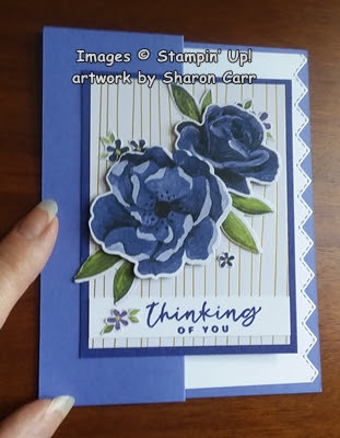
Isn't it pretty?  And it's even a quick and easy fun fold card!  It all starts with a half sheet of Orchid Oasis cardstock that measures 8 1/2" x 5 1/2".  Then it's scored at 2 1/8" and again at 4 1/4" to make a z-fold.  Fold it in half as usual, but then fold the top flap back on itself so it lines up with the side fold.

The gold striped layer is one of the free items from Sale-a-Bration.  It's 6" x 6".  I cut 2" from the bottom to make it 4".  Then cut it in half to get two 3" x 4" pieces.  I cut a piece of Starry Sky cardstock to 3 1/4" x 4 1/4" to layer the gold striped paper on with adhesive.

Now the fun starts.  There is a design in the Hues of Happiness Designer Series Paper that matches up with the Blossoming Happiness Dies which are part of the Happiness Abounds Bundle on page 108-109 of the Annual Catalog.  I kind of went a little crazy and die cut two full sheets of these gorgeous roses and leaves.  I've been grabbing out flowers whenever needed, but I still have a good size stash left.  I saved some of the scraps from around the roses that have these tiny 5-petal flowers and sometimes leaves too.  Now I know what it means to 'fussy-cut' something!  Woo Boy!  It sure was hard to hang onto those tiny flowers, but they really add so much to the finished look.

Now I have the roses, leaves, tiny flowers all set to go, but I needed a sentiment to go with the card.  The sentiments in the set are lovely, but not what I wanted to use this time around.  The sentiments in the Season of Chic set located on page 99 of the Annual Catalog were just what I was looking for.  I stamped the one I chose onto a 1/2" trip of Basic White cardstock using Starry Night ink.  It was trimmed to 3" to fit across the gold-lined paper.

It was time to build the focal layer of the card.  First the sentiment was added not quite to the bottom edge using adhesive.  Next the roses were arranged and attached using Dimensionals.  The leaves were tucked in around the roses and attached with adhesive.  Then the tiny flowers and leaves were added here and there.  They were attached with Mini Glue Dots to make it quick and easy. 


This layer was added to the folded card front using adhesive on the left side only.  When you lay the card out flat, you can see how the front is attached only on the left half that folds back.  

Now comes the cool inside of the card.  I was only going to use a quarter sheet of Basic White cardstock and keep it plain.  But after thinking about it, I decided to use one of the Basic Borders Dies (page 169 Annual Catalog) to dress up the edge since it showed when the card was closed.  I used the stitched zig-zag edge for this.  Doesn't it add to the finished look?

The sentiment inside the card is also from the Season of Chic stamp set.  It's stamped with Starry Sky ink to match.  Because of the little flowers tucked in and around the card, I decided not to use any other bling on the card.  The tiny flowers and the gold stripes seemed to be just enough.  No point in going overboard on the bling.  Unless you just can't help yourself.  But that's your choice then, right?

I hope you give this quick and easy fun fold card a try if you haven't made one of these in a while.  It's just a little different and a whole lot of fun.  Thanks for stopping in again to see what's happening.  You never know what you might see and or read!  Please use the Host Code shown on the top of my blog page if you're ordering soon.  Remember Sale-a-Bration is going on now and that lovely Gold/Silver DSP is one of the freebies.  That is one of the most versatile items in Sale-a-Bration brochure.  Who can't use more white paper with gold or silver stripes or dots printed on it?   Time to start thinking of those Christmas cards which would work so nicely with this paper. 

Happy stamping and creating!
Sharon

Friday, April 22, 2022

It's Friendship Friday Again

Yes, here we are and it's Friday already.  The time just seem to trickle through my fingers way too quickly now.  Is that what happens when you get older?  Or is it just me not keeping good track of the days?  I'm not sure.  Whatever it is, it seems to be my 'new normal'.  Anyway, it is Friday, and I have some really lovely Easter cards that I want to share with you.  So let's get started.

created by Jane Murphy - I love all the layering and the colors she put together.  The bits of gold showing everywhere make it so elegant.


created by Jan Hollmann - I love the embossing on the white layer, and all the added die-cut birds and leaves.  So pretty.  Nice contrast of all the white with the Highland Heather cardstock.
created by Connie Juengel - So pretty with the pink marble strip and the flower-embossed layer behind the darling bunny.  Love the watercoloring on the bunny and background too.  So adorable.


created by Judy Bur - love the tone-on-tone Soft Succulent colors on this card, and the cross behind that Bible verse.  Very special card Judy!

created by Barb Eisenman - just love this card, from the background layer to the cool cross die-cut, it's just gorgeous!  And there's a pretty butterfly with lots of die-cut flowers to match inside the card too.


created by Shirley Krone - so pretty!  This picture doesn't do it justice at all.  The lattice and leaves are a bright spring green and put against the dark wood-graining it's just lovely.  I like the added touches of purple sprigs to accent the leaves.


created by Phyllis Unthank - love the look of vanilla with copper.  So elegant looking with the embossed layer and the die-cut ovals.  Did you notice the cross die-cut on the stamped oval?  Very subtle.


created by Kathy Hintz - very simple and to the point.  You can't miss the message here!  Pretty lattice oval layer and gorgeous butterfly accent. 


created by Sue Fabris - how fun is this card?  Lots going on with the daffodil, bunny, and even a few tiny eggs thrown in for good measure.  Love the lacy die-cut edges with purple polka dot background.  So spring-y!


Hope you enjoyed these unique Easter cards as much as I did.  It was such a pleasure walking to the mailbox each day to see if there were any new treasures tucked in there.  It really made a bright spot in the day when my hubby wasn't feeling well.

If you can find the time, check back in tomorrow for more creativity and chit chat.  I'm working on tomorrow's post and not quite finished with it yet.  See you soon...

Happy stamping and creating,
Sharon

Monday, March 14, 2022

Birthday Waves Card

Hi all.  Yes, I'm still playing in the water with the Waves Collection.   This collection has so many possibilities, and I've just been scratching the surface.  Today's card was made for a friend's husband whose birthday is right around the corner.  He likes being outdoors, so hope he likes this card.  And anyway, the sentiments I've written inside will definitely fit him!

This card starts with a cardstock base of Daffodil Delight cut to 8 1/2" x 5 1/2", scored and folded in half.  The first layer I used is Night of Navy cardstock cut to 5 1/4" x 4".  Next up is the layer of Simply Marblous Designer Series Paper from Sale-a-Bration last month.  I thought the gray marble look would work for the background of a sky and sea.  This was cut to 5" x 3 3/4" to line up nicely on the Navy.

First the wave was stamped at the bottom of the DSP using Night of Navy ink.  I used the Stamparatus to hold the DSP in place and actually stamped the wave twice to get a nice clear image.  The birds from On the Horizon stamp set were stamped with Memento Tuxedo Black ink.  

The sentiment comes from the Let's Set Sail in the 2022 January - June Mini Catalog.  It was stamped with Night of Navy ink in the big open area to fill it in a little.

I removed the DSP from the Stamparatus after finishing the stamping to add the Daffodil Delight ink to it.  Using a Blending Brush, I built up layers of Daffodil Delight ink at the very top right corner for sunshine.  After getting it as bright as I wanted, I added some yellow to the wave area to make it look like the sunlight was shining through the water.  Not sure if it really worked out that way, but I can live with it.  😉

This layer was attached to the Night of Navy cardstock using adhesive.  Then it was attached to the folded Daffodil Delight card base using Dimensionals to give it some depth.

The inside of the card also has the two layers of Night of Navy and Basic White to carry the colors forward.  The Basic White layer is cut to 5" x 3 3/4".  The sentiment is stamped with Night of Navy ink.  The flock of birds were stamped off to the side using Memento Tuxedo Black ink.  This was layered onto a piece of 5 1/4" x 4" Night of Navy cardstock using adhesive.  Then it was all attached to the inside of the Daffodil Delight card with adhesive also.

At this point I thought the card was finished.  But it still wasn't quite right.  I wasn't crazy about adding any of the rhinestones to this card either, colored or clear.  Hmmm.  Then I remembered the Shimmery Crystal Effects that I have.  It's found on page 128 of the Annual Catalog.  Don't know why I always forget about this tool.  It's so simple to use and just needs about an hour of drying time so it doesn't smudge.  I added just a bunch of teeny tiny droplets to the foamy waters like splashes.  If the card is lying flat, you can hardly tell that they're there.  But when it's angled and some light is hitting it, some of the glittery-ness (?) and shine just sparkles so pretty!  Oh sorry, not pretty - it's for a guy you know.  "It has a nice subtle shine."  (How's that?  Not too frou-frou?)

Anyway, all kidding aside, I like how this card turned out.  I find it amazing how many different looks can be had by changing ink colors, cardstock, and DSP.  It's pretty remarkable.  If you're thinking about getting this set, you can either wait until the next catalog comes out in a couple months or get it now during the Sneak Peek time.  It's up to you.  Either way, it's awesome!

Have fun stamping and creating,
Sharon

Saturday, February 26, 2022

Otterly Awesome Floating Bridge Card

Hello friends and happy Saturday to you!   It's been a crazy busy week and I've done lots of stamping.  That means I have another card to share with you.  From the title, I'm guessing you think it's going to be a card featuring the Awesome Otters.  And you'd be right!  I wasn't sure I'd get this set, but after seeing so many cute projects on Pinterest, yes, I broke down and got it.  And it's free because it's one of the Sale-a-Bration items you can get for spending $50.  I already had the Simply Marbelous DSP which is another Sale-a-Bration free item that I've been having fun with, so I was set to create!

To showcase both the otters and the gorgeous DSP, I made a floating bridge card which is a very easy fun-fold card when you know the dimensions needed to make it.  I'm going to list all the cardstock and DSP dimensions here at the beginning of the post, so you've got them handy all in one place.


Card base - 4 1/4" x 8", score at 1 1/4" and 2 1/2" from each end.  Make sure you cut the cardstock to 8" or it won't fit into a medium envelope!
Bridge - 1 1/4" x 5 1/2"
DSP - 2 3/4" x 4", 1" x 5 1/4" (for bridge), 1" x 4" (2 needed) 
Basic White - 2 1/2" x 3 3/4" (front center layer), 2 3/4" x 4" (for back side), scraps for stamping extra images.

After the card base has been scored, add the 3 pieces of DSP to the corresponding areas using adhesive.  Also add the 1" x 5 1/4" DSP strip to the bridge - set aside for assembly later.

Now it was time to stamp those cute little otters and the sentiments.  The center Basic White piece was first.  I stamped the sentiment with Memento Tuxedo Black ink in the top left corner.  Under this approximately in the middle the otter in the water was stamped with Tuxedo Black ink.  The happy birthday sentiment is from the Party Puffins set and was also stamped with Tuxedo Black ink.  On scrap pieces of Basic White cardstock, the standing otter and party hat were stamped.  Looking for a gift idea for otters, I remembered the little fish tied up in a bow from the Party Puffins set.  I think the otter would love that for a gift, so I stamped 3 of them on scrap cardstock.  

Now it's time to color.  All the colors used are Stampin' Blends.  The otters were colored with Soft Suede Light and Dark.  Not sure what a real color for otters would be, but this worked for me.  The noses were lightly colored in with Smoky Slate Light.  The fish were colored with Balmy Blue Light and had Real Red Light ribbons tied on.  The party hat was colored with Balmy Blue Light and Real Red Light to keep the red as an accent color with all the blues.  The water around the swimming otter was sketched in with Balmy Blue Light and Dark with touches of Misty Moonlight Light to accent.  To add even more movement to the water, little swishes of Wink of Stella were added following the lines of the waves.

At this point, I added touches of Shimmery Crystal Effects (page 128) to each of the water splashes and the otters' eyes.  This takes a good hour to dry, so don't rush it and mess it up.  Take my word for this, as I touched an eye and smudged it a bit.  Oooops!

It's amazing that the Crystal Effects stand up so much that it throws shadows in this picture!  Can you see them under one eye and under some of the splashes?

While waiting for the Shimmery Crystal Effects to dry, the other sentiment from the Awesome Otters set was stamped on a 1/2" strip of Basic White.  The Banners Pick-a-Punch was used to flag both ends.  

The fish and party hat were fussy cut with Paper Snips, and so was the standing otter after his eyes dried. 

Now that everything was dry and cut out, it was time to put it together.  The swimming otter was attached to the center panel.  I attached with adhesive, but you could use Dimensionals if you liked.  Carefully check placement, add 4 Dimensional on the left end of the bridge so it will only attach to the front fold.  Do this.  Then line up 4 more Dimensionals on the other end to only attach to the fold on the right side.  The card has to be folded at this time to attach together.  To mail the card, fold it either to the left or right and it should lay flat and fit your envelope.

Now it's time to add the sentiment to the right side of the bridge.  I used a couple Dimenisonals to attach.  Then the otter needs to be attached to the left side.  Because the bridge is on Dimenisonals, only add a Dimensional under the otter's head, the body is left flat.  Each of the fish presents have a Mini Dimensional to pop them up where desired. 

You should have one more piece of Basic White cardstock left.  It's for stamping and/or writing your sentiment and attaching to the center back of the card.  You're finished with this cute little otterly awesome floating bridge card.

Hope you enjoyed the floating bridge card I shared today.  There are so many other possibilities for showcasing on a floating bridge card.  We have to explore some of those ideas at a later date.  Sorry to harp on this, but Sale-a-Bration ends Monday night.  Any last-minute order you need to place, now's the time.  Thanks for stopping by today.  Have fun stamping and sharing all your lovely creations.  You can be a blessing when you brighten someone else's day!

Happy stamping and creating!
Sharon

Friday, February 25, 2022

Birthday Party Puffins

Happy Friday to you all!  I have a confession to make.  I've had the Party Puffins stamp set (found on page 67 of the Annual Catalog) for months, and I haven't touched that rubber to ink yet.  What's wrong with me?  I thought it was so cute, and it is.  I thought I'd use it a lot, but I haven't.  Oops!  My goal for today was to finally use the Party Puffins stamp set to make a birthday card.  Then I won't feel so guilty about it sitting there being unloved and unused.  My other goal was to use the Sale-a-bration freebie Sunshine & Rainbows 6" x 6" Designer Series Paper so that I could post one more time about it.  Yes, I'm running out of time to do that!  Sale-a-Bration ends Monday!!  So why not be very practical and put those two goals together and make one fun project?

Here's what I made today.  And look, it's even a Fun Fold into the bargain.  I guess I really checked off all the boxes on this card.  Hope you're interested in seeing how it's made.

The card starts with a Basic White cardstock base that's cut at 8 1/2" x 5 1/2", scored at 4 1/4" and folded in half.  Pretty basic so far.  The first layer of the Sunshine & Rainbows DSP is the Bermuda Bay diagonal stripe that's cut at 5 1/4" x 4".  This is attached to the card front with adhesive as usual.  From now on, the card is on its side with the fold along the top edge.

Next you cut a piece of Basic White cardstock 1" x 5" and fold in half.  This will attach in the back and hold the layers together in the front.  Put adhesive on one half on the inside of the folded strip and carefully measure where the center of the card is.  Then attach it to the back.  You can see the flap is standing up at this time - only attached under the card back.

The polka dot print is the next piece to work with.  It is cut at 6" x 4 3/4".  This is folded to make it 3" x 4 3/4".  One of the folded sides of this is then tucked under the original card as a flap to go around it. It also covers up the bottom end of the white cardstock flap you just attached to the back.  The other half folds up over the card front making another layer.   I hope this makes sense.  Check the pictures carefully to see the striped back side of the polka dot paper that shows when it's opened up.

Here is how it looks when the bottom flap is opened up.  This also shows how the sentiment layers are added to each consecutive opening flap.

For all the sentiment layers, I die-cut hexagons from the Beautiful Shapes Dies (found on page 50 in the 2022 January-June Mini Catalog) using Basic White cardstock.  The front flap has the largest hexagon shape.  Underneath this is the polka dot layer of DSP which uses the 2nd largest die to hold a sentiment and 3 little fish.  (This is also the size die I used to cut the striped Bermuda Bay DSP that covers the back of the large hexagon.)  When you open the polka dot flap, you find the last hexagon which is the smallest of the four in the set with another sentiment.

The images and sentiments used for this card are all from the Party Puffins stamp set.  The wording was all stamped with Bermuda Bay ink, and the puffin and six fishies were all stamped with Memento Tuxedo Black ink.  The puffin was stamped on the largest die-cut hexagon.  'Make a wish' and 3 fishies were stamped on the next largest hexagon.  The 3 extra little fishies were all stamped on a scrap of Basic White. The coloring on the puffin and fish was done with Stampin' Blends in these colors:  So Saffron, Mango Melody, Pool Party, Soft Seafoam, Granny Apple Green, Magenta Madness, and Flirty Flamingo.  The little fish bodies also have a light coating of Wink of Stella for fun.

After coloring the 3 extra fish, they were cut out with Paper Snips.  They were added to the card with Mini Glue Dots.  I debated about using Dimensionals, but with all the overlapping layers, I thought it'd be too bulky for mailing.

When the final flap of the card is opened, you get to the last sentiment with plenty of room to write your own sentiments.  The 'happy birthday' was stamped on the inner card using Bermuda Bay ink.

The very last item was adding a little bling for this party card.  The multi-tonal gems that were available with the Eden's Garden bundle were used here.  Surprisingly they pick up so many of the different polka dot colors and flash them back at you.  

Thanks so much for stopping in today to see what's going on.  Hope this multi-flapped card wasn't too confusing.  Just remember that you have one small flap going up, one pulling down, another going up, and then the inside of the card.  Hope that helps.  To be honest, I've read through this post three separate times now, and this is the best way that I can explain the card.  If you get real mixed up, give me a call and I'll try to walk you through it.

Thanks to all of you that have been placing orders.  I truly appreciate your business so much.  You've been much more than a customer to me; you've been my valued friend.  Keep having fun planning and making your cards.  And make sure you send them out to bless someone else's day.

Many hugs,
Sharon

Wednesday, February 23, 2022

Beautiful Moments for Spring

Good morning!  Here it's rather wet and gray, so I figured you might need something a little like spring to brighten the day.  I wanted to use more of the Friendly Hello Designer Series Paper because I love it so much.  This is one of the Sale-a-Bration freebies in a bundle with the Friendly Hello stamp set.  If you can't tell by now, these two things are some of my very favorite items from Sale-a-bration.  This card was made to showcase the pretty prints of the Designer Series Paper.

I really struggled to get the colors right on this one and I'm still not sure if this works.  I knew I wanted those two prints of DSP for the card, but the rest, hmmm...  

To go with the spring theme, I ended up choosing Fresh Freesia for the card base.  It's cut at 4 1/4" x 11" then scored at 5 1/2" and folded in half.   The two pieces of the Friendly Hello DSP are cut at 2" x 3 3/4" and 2" x 4 3/4" respectively.  I tried numerous colors for the layering and finally settled on Soft Succulent for this.  The two pieces were cut at 2 1/4" x 4" and 2 1/4" x 5".  They were attached flat to the card front using adhesive.

I knew I wanted to try the Beautiful Moments stamp set for this card.  I tried several different rectangle and oval shapes to die-cut the focal image on this card.  After much debating with myself, I went with the Beautiful Shapes Dies that I had gotten recently but hadn't yet used.  I hoped the largest hexagon shape would frame these two little girls perfectly.  Guess it was time to give it a little love and caring!  

The girls were stamped with Crumb Cake ink onto Basic White cardstock to keep it very soft.  The coloring was all finished with Stamping Blends -
Skin - Petal Pink Light and Dark
Hair - Crumb Cake Light and Dark, Cinnamon Cider Light
Dresses - Fresh Freesia Light and Dark, Pale Papaya Light and Dark
Buckets - Soft Succulent Light and Dark, and the Color Lifter
For the sandy area, I used an Aqua Painter and just went over the stamped color to add a very pale wash of color.

After coloring, the little girls were die-cut.  Oh my, a perfect fit.  It still surprises me how well they fit on that hexagon, because I was concerned the die would be too small.  Just goes to show you really need to check all options even if you're pretty sure it won't work.  You just never know!

After spending time with my sister last week, I thought these words were very appropriate for the image.  The sentiment is part of the Beautiful Moments stamp set along with two other sentiments.  You know how I really like sentiments that employ two different fonts on the same stamp, so that makes the sentiment extra special!  It's stamped onto a 5/8" strip of Basic White cardstock using Soft Succulent ink.  

To stay with the shape of the hexagon, I used the Banners Pick-a-Punch on the arrow side.  I think it goes well with the hexagon shaped corners very nicely.

The little girls and the sentiment were both popped up on the card using Dimensionals.  I thought the card would be done at this point, but it needed just a tiny bit of bling.  The tiny Brushed Brass Butterflies (say that really fast five times in a row!) were just right.  Not too shiny and not too big as to overpower these little girls.  

I do believe this card is finished after struggling with it for hours.  Now I need to put away all the layers that were cut, but not used.  And also, the dies that were tried and didn't make the 'cut'.  silly pun 😉

If you struggle to come up with just the right ingredients to make your card, whether it's layout, color, shape, accessories, or whatever, know that we all struggle that way at times.  And some of us struggle more than others.  Hmmm, not naming names here, but the initials could be SC!  Anyway, I do love what I do, and I love sharing this with you too.  So please bear with me when I have one of those 'struggling' days.  We all just keep trying to do our best, and sometimes we have a real winner and other days it's just ok.  As long as we love what we're doing, it's all worth it!!

Keep up the creating!
Sharon

PS Quick reminder - Sale-a-Bration ends next Monday.  Don't miss out on what you've been wanting to order.  Thanks

Monday, February 21, 2022

Amazing Friendly Hello Card

 Hello there!  Hoping your day is going well.  I've been playing around with the Friendly Hello stamp and Designer Series Paper from Sale-a-bration again.  It amazes me that this is totally free as a bonus when you place a $100 order.  I really can't seem to get enough of this combo! The colors of the paper are so soft and fresh looking that I keep gravitating to them.  Guess I'm ready for spring, and this looks like spring to me.  Today's card is a different Fun Fold that I don't think I've shared here with you yet.  If it's not new to you, just bear with me.  OK?  It's funny that I don't even know what it's called, but I like it anyway.  Let's have some fun with it.

The card is sized to fit into a regular envelope, but it opens out into an 11" wide card.  Impressive, right?  Here's how to make it:  Start with Basic White cardstock that measures 5 1/2" x 11".  This is scored at 1 1/4", 5 1/2", and 9 1/4".  Fold the card in half at the 5 1/2" mark with the fold on the right side.  First fold the top layer back, then the bottom layer gets folded right over this to get the fun layering.  Isn't it pretty?

Next come the layers of paper that give it some character.  They are from the Friendly Hello DSP and I chose two of the Fresh Freesia prints that coordinate so nicely.  The left strip and the right panel are the same print.  They are cut at 1" x 5 1/4" and 3 1/2" x 5 1/4".  The middle print is a splattery, polka-dotty looking strip that is cut 1 1/2" x 5 1/4".  Each of these were attached to the matching fold of the card using adhesive.  

To keep the card closed and all together, a belly band was needed.  First up was the base for the focal image.  I chose to use the Scalloped Contours Die set.  I love the pretty edges and the stitching detail that makes them stand out.  This rectangle measures about 3 3/4" x 2 1/2" and is cut from Basic White cardstock.  It's just the right size to add a few flowers and the sentiment.   The sentiment comes from the Color & Contour stamp set.  The fonts used in this set always makes me feel happy, so it was a good choice.  The words were stamped with Memento Tuxedo Black ink near the top of the layer.

The daisy-like flowers in the Color & Contour set looked like they would go with the DSP, so two of them were stamped on a piece of Basic White cardstock also using Memento Tuxedo Black ink.  This is a two-step stamping flower, so the second stamp used Fresh Freesia ink for stamping onto the flower.  They were then die-cut using the Scalloped Contours Dies.

Before putting those flower stamps away, I inked them up again to stamp inside the card.  Both the outline stamp and the filler stamp were off-stamped before stamping in the card to keep them nice and light. 

When arranging the flowers on the die-cut rectangle, it looked too plain.  The Friendly Hello stamp set has a full spray of tiny leaves and a branch.  This was stamped in an arrangement behind where the flowers would be attached.  To make them a little lighter under the flowers, I used Basic Gray ink this time instead of black.  The flowers were added to this with one attached flat with adhesive, and the second one up on a Dimensional.

For the banding around the card, a piece of Fresh Freesia cardstock was cut to 11" x 1".  This was folded around the card and overlapped in front.  The rectangle focal point was attached over the center of this to cover the overlapped area.  After slipping the band onto the card to check it out, I realized it still needed some extra pizzazz.  Of course, I had forgotten to add any bling!  Oh dear, that's almost unthinkable!!  And this card was crying out for it.  The pretty and versatile 2021-2023 In Color Jewels were a perfect touch.  I used the Fresh Freesia color jewels and added three of them.  So pretty! 

After making this first card, I liked how it turned out so much that I had to make a couple more.  I had seen this retired Painted Season Designer Series Paper just the other day and really liked the colors and prints.  You can see, I made several of these cards to go in my stash.  The cards were so pretty, but really "general" looking.  I figured they could be used for many reasons, so I didn't add any sentiments yet.  

The flowerpot and the dangling flowers were stamped and cut out from the Plentiful Plants stamp set.  The succulents in the pot were just cut from the DSP.  Most of the pieces were just attached with adhesive, but the double succulent right in front was popped up with a Dimensional.  Just see what you can make with some coordinating DSP prints.  Stampin' Up! does all the hard work of making sure everything coordinates.  We just get the fun job and creating with them!

Here's your friendly reminder about Sale-a-Bration.  Yes, next Monday is the last day you can get any of these fabulous free products when you place a qualifying order.  Please don't wait too long to place any last-minute orders.  Don't want you to miss out on these fun and useful products.  If you have any questions, just give me a call.

Thanks for stopping in for another visit today.  Hope you like this fun fold idea and give it a try.  It really is easy when you get those correct scored lines in first thing.  I'll be doing this fold again because I really like it.  And of course, I'll be getting out this gorgeous Friendly Hello DSP to play with again.  I want to use up every little scrap of it I like it so much!  Yup, I'm totally hooked on it!  But that's it for today.  Stay warm and be creative!

Hugs,
Sharon

Saturday, February 19, 2022

Setting Sail

Good morning, friends!  Hope you're having a bright and sunny day this Saturday.  Right now, the sun is trying to peek through, and hopefully it will turn out to be a sunny day.  As promised, I'm turning back to some Sale-a-Bration freebies for my inspiration on today's card.  Make sure you check out the Simply Marbelous Designer Series Paper.  It really is very 'marbelous' and the color choices are perfect for my craving for pastels.  Just gorgeous!  Check out how the Balmy Blue and Misty Moonlight work together on this card to make a lovely watery background.

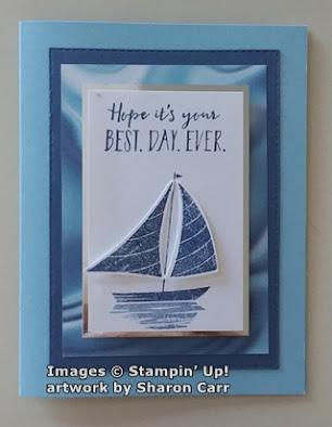
Aren't they just a perfect backdrop for the sailboat?  Ok, let's take apart this card so we can put it together again for you.  Start out with a card base of Balmy Blue which is cut at 8 1/2" x 5 1/2", scored and folded in half.  The next layer is Misty Moonlight.  It's been die-cut to be 4 3/4" x 3 3/8" using the versatile Stitched Rectangle Dies to give it a nice clean edge.  And of course, I love the stitching on it to define the edge.  Sometimes it's those little touches that make a simple card stand out.

Next the Simply Marbelous DSP is cut to 4 1/4" x 3 1/8".  I used the side that almost looks like a piece of scrunched together satin fabric with the light playing with the hills and valleys.  It really is gorgeous!  Of course, I chose to use the Balmy Blue/Misty Moonlight color choice.  It's just right for a sailing card.  This is attached to the Misty Moonlight layer with adhesive to keep it flat.  

Next, I cut a piece of Basic White cardstock to 3 1/2" x 2 1/4". Time to get out the Let's Set Sail stamp set from the January-June 2022 Mini Catalog.  You can find it on page 70.  I made the Basic White layer just big enough to have the words across the top without feeling too crowded.  They are stamped with Misty Moonlight ink.  Coming down to about 1" from the bottom on the white cardstock, the hull and mast of the sailboat were stamped with Misty Moonlight too.  The sails were stamped on a scrap of Basic White so they could be punched out with the coordinating punch. (I guess if I can't have a die for every set, a punch will work fine!)  

The sails were attached with Mini Glue Dots close to the mast, and a Mini Dimensional was used at the outer edges of the sails to make them stand out from the card.  I thought it looked more like it really was sailing this way.

The last bit of stamping on the front is the reflection of the boat on the water.  This is also stamped with Misty Moonlight ink but was off-stamped first to keep it much lighter than the boat.

To set the whole focal point off, a layer of silver mirror foil was used.  Since I was at my sister's when this card was made, the silver foil is an off brand that I have no name for.  I believe I have some mirrored foil in my retired stash of metallic papers at home though.  This is a good example of using what is at hand.  It was cut 3 3/4" x 2 1/2" to frame the focal images.  I like how the back sail (does that have a name??) flows off the card and gives an illusion of movement.  At least, that's my take on it!  To finish the front, this was all attached in the center of the card and popped up with Dimensionals.

The inside of the card has the sentiment stamped in Misty Moonlight right on the Balmy Blue cardstock.  I decided not to add a white layer inside of this card for a change.  A sailboat was added to the bottom corner for an accent.  It was stamped with Misty Moonlight off-stamped to create a much lighter look.

Just a quick reminder that Sale-a-Bration is ending soon - February 28th.  Can't believe that's almost here already.  Where do the days go?  If there's anything you still want from this, please don't wait until the very end.  So often items will sell out and not be available again.  I'd hate for you to miss out on some item you really wanted...  like the Simply Marbelous DSP!

Hope you're taking time to be creative.  It's a great way to relieve stress and really feel good about getting something accomplished.  And you have a card (or many cards) that you can share with family and friends.  See, it's a win-win situation when you get creative!  Have a very creative day!

Happy stamping,
Sharon

Wednesday, February 2, 2022

Another Friendly Hello

 Oh my goodness!  I just checked and this will be the 5th card I've shared using the Friendly Hello Bundle.  Hmm, does that give you the idea that I like it - a lot?!  Today's version started out similar to yesterday's card, but quickly took a turn in another direction.  When I started playing with the Friendly Hello DSP that I had cut yesterday, I thought it would become the same card with 2 exceptions - different base color cardstock, and a landscape style instead of portrait.  No biggy.  But as I tried to work with it, nothing wanted to play nice.  So, even though those changes are still there, there are a few extras added in to make it happy.  Let's see what all the changes brought about.

Wow, doesn't even look like I had planned on making the same card at all!  This one starts with a Fresh Freesia card base cut to 8 1/2" x 5 1/2", scored and folded in half.  Like yesterday's card, there is a Basic White layer next, and a layer of Friendly Hello DSP cut to 3 3/4" x 5" attached onto this.  There is also the same 1" x 5" strip of Pool Party and white DSP is attached to the card front.  The ends are not punched but go right to the edge of the layer. 

As an added bonus, the little diamond-detailed strip was added to go across this.  This is from the Delightfully Detailed Laser-Cut Specialty Paper that was retired a couple years ago.  I just have some bits left from it and couldn't throw them away because they're just too pretty as you can see.  I was going to use the white side, but when it was flipped over to add the adhesive, I realized the cream color was a softer look for the card. 

At first, I colored the bird on the DSP just like yesterday, but this one didn't stand out as much for some reason.  I had already stamped, colored with Stampin' Blends, and fussy cut a bird and flowers for another project that had been put on hold while I thought about it.  I held it over the bird on the DSP and realized they were a perfect match.  Now why didn't I know that before?  I also had a couple extra flowers colored and cut out to use as needed.  Well, this was the time they were all needed.  I love how they all work together even with the different tones for coloring that aren't part of the DSP colors.  The bird was colored with Balmy Blue Light & Dark, 2 flowers are Highland Heather Light & Dark, and 2 flowers are Fresh Freesia Light & Dark.  Flower centers are Daffodil Delight, but you can't really tell with the rhinestones over them.

The bird and flowers were all attached to the card front right over the original bird using Dimensionals.  The 2 extra flowers were tucked in a little under the bird's tail.  The focal point here still needed something else.  After looking for some type of delicate greenery to add, I remembered the Christmas Trimmings Die set in the Annual Catalog.  It has a spray of berries that is just what I was looking for.  There are 3 bunches cut from Fresh Freesia cardstock. I tried several green colors and wasn't happy with them.  So now I've got more "table trinkets" laying around for the next card marathon!

The sentiment is from the Celebrating You stamp set that I used yesterday.  Like I said earlier, it covers most sentiment needs other than the fall and winter holidays, so is a good useful and versatile word set to get.  It's stamped on a 1/2" strip of Basic White scrap using Fresh Freesia ink.  The Banners Pick a Punch was used to flag the ends.  It was then attached to the card front using Dimensionals.

Several of the gorgeous Iridescent Rhinestone Jewels were added to the flower centers for a pretty touch of bling.

I wanted the inside to be as pretty as the front, so a 1/4" strip of the lovely Pool Party and white print from the Friendly Hello DSP was attached across the bottom of the Basic White layer.  The strip was just a smidgeon too short, so I flagged one end.  Think it adds a cute touch.  

The sentiment is from the Friendly Hello stamp set.  It's stamped with Memento Tuxedo Black ink off to the left side.  And at the bottom right corner, a small stamp with flower and leaves was stamped in Fresh Freesia ink for the final touch.

Hope you've enjoyed seeing the different way you can use the very same products.  With a change in colors and/or accessories used, the final project can look amazingly different.  Just take one of your stamp sets (or maybe a piece of DSP like I started with) and start playing around with different colors and layouts.  I know we all have our favorite layout ideas, but maybe try something different today. You just might be in for a pleasant surprise and find a new favorite layout idea!  Or maybe get adventurous and try a new fun-fold idea!  The whole premise of this is to have fun creating and have even more fun sharing those creations with your family and friends.

Stay warm my friends and create something beautiful!
Sharon
 

Tuesday, February 1, 2022

Love That Friendly Hello

 Hi there!  So glad you've stopped by for a short read.  Both today and tomorrow, I'll be sharing cards that use the Friendly Hello Stamp Bundle from the 2022 January & February Sale-a-bration brochure.  Yes, I know I've shared something already using this bundle, and I've made several cards that I've popped in the mail for friends that you haven't even seen.  I'm just having trouble putting this bundle down.  Since this is February 1st, that means there are only 28 more days that you can get this for yourself.  When you place a $100 order, you can choose this bundle as your free Sale-a-bration item.  The stamps are both solid and line-art, and there are 3 sentiments that are becoming favorites of mine.   And the Friendly Hello Designer Series Paper is just too wonderful for words.  I hate to get too mushy-mushy, but I really do like these prints and colors.  Just perfect for my taste.  Here's the card for today...
This is my first Easter card for the year.  I wanted to make the DSP the main focus on this card.  The print with the bird would be the perfect piece to use.  I actually cut two pieces of this with the bird front and center.  I'll share the other card tomorrow.

Pool Party cardstock was the card base used here.  It's cut at 8 1/2" x 5 1/2", scored and folded in half.  The next layer is Basic White cut at 5 1/4" x 4".  The layer of Friendly Hello Designer Paper is cut at 5" x 3 3/4". These pieces are all layered together and attached with adhesive for a more streamlined look.

Before layering together, Stampin' Blends were used on the bird very lightly to enhance the color already there.  Pool Party Light, Pale Papaya Light, and Crumb Cake Light were used to make the bird and branch images stand out just a bit more.

These pastel colors put me in mind of spring, so I thought this would make a nice Easter card.  The sentiment is from the Celebrating You set in the January thru June 2022 Mini Catalog on page 65.  That is a wonderful stamp set that has sentiments for everything but the fall and winter holidays.  This is definitely a keeper!  The sentiment was stamped on Basic White cardstock using Shaded Spruce ink.  It was punched out with the Double Oval Punch.  The scalloped oval part of the punch was then used on Pool Party cardstock to provide a nice frame for the sentiment.

There is a 1" strip of the Pool Party and White print from the Friendly Hello DSP added to the lower portion of the card.  It has the ends punched with the Banners Pick a Punch before attaching with adhesive.   This makes a good base for the sentiment focal point. 

Before adding the punched sentiment, it needed some kind of greenery around it.  The new Bough Punch from the January thru June 2022 Mini Catalog on page 26 looked to be the right size.  I punched out two sprigs of the larger one from Soft Succulent cardstock, and two of the smaller ones from Soft Sea Foam.  Though these two colors aren't technically part of the color array in the DSP, I thought they blended nicely with this very soft looking card.  These sprigs were attached between the Basic White oval and the scalloped oval that is Pool Party.  Then the whole sentiment bundle was attached to the card front with Dimensionals.

Of course, the card needed some bling at this point.  The new Iridescent Rhinestone Jewels were my first choice for this pastel card.  The iridescence of the jewels picks up whatever color they are next to.  Some have a peachier look going on and some look more pinkish or lavender.  Just simply gorgeous! Gotta say these are definitely my go-to bling at the moment.

So last thoughts... Don't forget to check out the Friendly Hello Bundle in the January-February Sale-a-Bration brochure.  It's a real winner and so versatile.  I'll have another version of this card tomorrow so you can see how just a few changes will give you an entirely different card.  That is part of what I like about stamping.  Every time you sit down to create something, even when using most of the same products, you can create something totally new and beautiful.  You don't have to own half of the catalog yourself.  (oops, did I say that out loud??)  You can still create lovely projects that are different each time and uniquely you.

Have a happy creative day!
Sharon