Saturday, March 30, 2024

He is Risen!

Dear Friends,

He is risen indeed!  Alleluia! 


I'm so happy to be celebrating Easter again this year.  It's important to keep our eyes on Jesus, the Author and Finisher of our faith!  Wishing you a very blessed day.

Happy Easter!
Sharon

Saturday, March 23, 2024

Show Off Those Prints!

 Hey!  How are you today?  I've been playing around with ideas to enjoy both sides of your print paper designs.  Most of our designs are beautiful and coordinate both front and back.  It's so hard to choose which side to use to create your project.  I have to admit, there are times when I only like one side of the DSP, so there's not a problem deciding.  But sometimes, it's hard to choose.  And when the prints work so well together, it's a no brainer - use a design that showcases BOTH sides of the paper.  Even though this DSP was a Sale-a-bration item and no longer available, I still like the prints and colors and wanted to use it.  I know you've got some of this tucked away and maybe need an idea for using it.  Right?  Of course, this layout will work for so many other prints that are currently available.  Just use this idea as a jumping off place and have fun creating this idea with any other DSP prints that coordinate on both sides!

I really like the Pool Party and Wild Wheat colors together.  I had trouble deciding which way to fold the Softly Stippled DSP for this card idea as both ways worked quite nicely.  But this is what I chose.  Let's get to the instructions so you can make this idea too.

Start with the designer paper that you want to use so you can find a coordinating color for the card base.  For mine, I chose Wild Wheat as it matches the main print on the DSP that I wanted to use.  This is cut at 8 1/2" x 5 1/2", scored at 4 1/4" and folded in half.

The Softly Stippled DSP measures 6" x 5 1/4".  This is scored at 2" and folded back on itself.  The piece is then attached to the folded Wild Wheat card base with adhesive.

When the front flap is open, there is room for an extra sentiment.  A Basic White cardstock piece was cut to measure 5" x 1 3/4" which will fit on the fold over flap.  One of the Courage & Faith stamps (pg 72 in the 2023-2024 Annual Catalog) was used to add the sentiment.  It's stamped in Wild Wheat ink at the top of the white piece.  To fill in the bottom of this, a small rose from the Stippled Roses (Jan-April 2024 Mini Catalog) was stamped using Pool Party ink.  Before attaching this, there are a few other things that need doing.
The front of the fold over piece has a 3/4" x 5 1/4" piece of the DSP print attached down the center of the flap.  To dress this up, a ribbon was added.  This is a current ribbon combo (with Real Red) in the Annual Catalog.  It's more a neutral color, but I think it blended well.  The ribbon was cut 7 1/4" long to lay across the front and fold and attach on the back about an inch top and bottom.  After attaching the ribbon, the white layer was added using "green glue" to attach in place.  This will help anchor the ribbon in place too.

On the front of the card, a piece of Basic White was cut at 2" x 2 1/2" and a piece of Wild Wheat was cut at 2 1/4" x 2 3/4" to frame the white piece.  The sentiment is from the Biggest Wish stamp set.  The large Hello was stamped with Pool Party ink and the overlapping friend is stamped with Wild Wheat.  These pieces were attached together with adhesive.  Then they were attached to the card front using Dimensionals.  Make sure the Dimensionals stay to the side of this, so it doesn't catch the back when the card is closed.  A spray of leaves from the Stippled Roses dies was cut from Wild Wheat cardstock.  A few leaves were trimmed from this to fit the card better.  It's just tucked in under the sentiment using adhesive to keep in place. 

The inside of the card has a piece of Basic White cardstock cut at 5 1/4" x 4".  A sentiment from Hope & Prayer (pg 72 in A. C.) was added.  This time it's stamped with Memento Tuxedo Black ink.  I love how these two faith-based stamp sets go together.

To add interest, the rose leaves from the Stippled Rose set was stamped with Wild Wheat ink in the bottom corner and the butterflies were stamped with Pool Party ink around the sentiment.

After stamping, the Basic White layer was attached inside the card with adhesive.

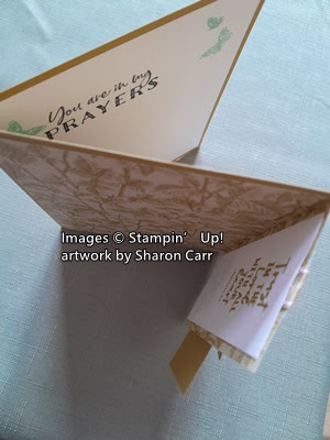
I thought a picture from a top angle would help to understand the special fold on this card.  

After looking at the finished card, I thought of the Brushes Brass Butterflies in the Annual Catalog that would be a good addition to this design.  They are small enough to add to the little sentiment tag and would coordinate with the butterflies inside the card.  That's it for this card.  But, I was on a roll with this DSP and tried another card...

Here's the next card made with this fun fold idea.  Changes to the design are minor.  The card base changed to Pebbled Path and a different DSP print from this paper pack was used.  A retired Calypso Coral ribbon was used this time.  

The same sentiment set as the first card was used with Calypso Coral and Pebbled Path inks instead, and the sentiment layer was changed to Calypso Coral cardstock.

The accents on this card are the 2023-2025 In Color Dots.  I added one of the Pebble Path Dots on each of the sentiment areas.

Hmmm, which DSP duo should I use to make the next card?  Any ideas or suggestions?

Hope you enjoyed this interesting way to showcase both sides of your DSP that you love.  I'm sure each card will be as unique as the DSP prints that are used.

Happy stamping and creating,
Sharon


Friday, March 22, 2024

Flowering Zinnias Quick Card

Hello there!  Hope you're enjoying your day today.  It's another sunny day and that puts me in mind of summer and flowers.  Who cares if it's chilly as long as there's sunshine.  It always brightens my mood and gives me a little extra boost of creativity.  Each time I get a new suite of products, I have a tendency to first play with the DSP before I get around to the stamps, dies, etc.  This gives me a feel for the colors and overall ambiance of the new suite.  That's what I've done with today's card.  It's very simple and totally focuses on the Flowering Zinnias Designer Series Paper (Online Exclusive) which is bold and beautiful.  So, to my mind, it needs bold colors to balance it out.

Ok, here's my bright and beautiful card.  This uses two different prints of the Flowering Zinnias DSP that I think go perfectly together.  You know this bold color is outside of my comfort zone, but I'm happy with how it all came together.  Using the color choices that are listed on the DSP, I added a small bit of Blackberry Bliss to my card for an accent.  Let's do a step-by-step walk through on making this card.

Start with a base of Basic White Thick cardstock that measures 8 1/2" x 5 1/2".  It's scored at 4 1/2" and folded in half.  I chose the white to frame up the bright colors and blend with the background of white on the main print.  White just seemed to draw it all together.

The layer on the card front is a Melon Mambo print from the paper pack.  The print is subtle, so it doesn't fight with the bold center piece.  This measures 5 1/4" x 4" and it's not attached just yet.

Next, I cut a piece of the zinnia print for the focal point.  This is trimmed to measure 4 1/4" x 3".  I made sure there was enough white space at the top to stamp in a sentiment.  The sentiment is from the Simply Zinnia stamp set and fit perfectly at the top.  It is stamped with Blackberry Bliss ink to coordinate with the darkest color on the flower print.  

The layer behind this print is Blackberry Bliss cardstock.  I was going to frame the whole layer with the Blackberry Bliss but thought that made the whole card fairly dark.  I wanted to keep more of the brightness showing.  So to compromise, I used a partial layer that is not as wide as the DSP, but it is longer.  The measurements are 4 3/4" x 2 3/4".  This added the Blackberry Bliss color but didn't add too much darkness to the overall look.

Next, the ribbon choice was made.  I wanted the ribbon to be a bold statement across the bold card.  The Black and White Gingham ribbon was a nice contrast to the print.  I preferred the look of the ribbon wrapped around all the layers instead of just the focal layers.  The floral layers were attached to the center of the Melon Mambo layer using Dimensionals.  Then the ribbon was wrapped around and tied into a bow in the front.  Finally, this all was attached to the white card base using "green glue".

The final touch was the Adhesive-backed Shiny Sequins that are also an Online Exclusive item.  The colors of the sequins match the DSP to a "T".  I didn't choose the reddish color because there was so much of this on the card already.  But chose the yellower color to pick up some of the lighter colors on the print.  

Like I said in the beginning, this was a very simple card.  Because of the boldness of the DSP, I didn't think it needed any more fussiness going on.  I hope this inspires you to check out the Simply Zinnias Online Exclusive bundle and all the coordinating items made to go with it.  Even though I'm more of a pastel kind of gal, this suite caught my eye.  Looks like it will really be fun to create all those bright summery cards I'll be needing.  

Thanks for stopping by today.  Hope you noticed the Retiring Lists on the previous post so you can get some of those items on your wish list before they're gone.  Happy shopping, and I hope you can find everything that you need.  Email me at sharoncarr50@gmail.com if you need any help.

Happy stamping and creating,
Sharon


Thursday, March 21, 2024

Last Chance Lists

Hello friends!  In case you have not noticed, my IT guy (aka hubby) was able to get the retired lists onto this blog post for you.   Hopefully you can open them up and see what is on the retired lists.  Remember that any In Color items will sell out fast, especially the ink refills.  NOTICE - The sale price on some of these items does not kick in until April 9th.  Please keep that date in mind!


Last Chance 2023-2024 Annual Catalog Products (PDF) 


Last Chance 2024 January - April Mini Catalog Products (PDF)


Just a little side note for your information:  In the upcoming new catalog, many of the core products will have a price increase just like everything else - gas, groceries, etc.  You may want to consider stocking up on some of these like cardstock, adhesive, ink and refills, Stampin' Blends and more.   If you can save a little now, I think it would be worth it.

Please consider using my Host Code at the top of this blog post unless your order is over $150.  Then you would get hostess benefits yourself.  Any questions, send me an email or text and I'll be happy to help you out.  Remember any sale prices on the Retiring Lists do not start until April 9th!

Thank you for your many years of patronage.  I love being your demonstrator and will continue to share ideas and serve you to the best of my abilities.

Happy stamping and creating,

Sharon


Wednesday, March 20, 2024

Two Tone Flora Fancy Card

Hello friends!  Here we are with what might be my last Easter card before they all get in the mail so they can arrive on time.  This time I didn't really use a set that is focused on Easter.  I went with a pretty spring-time floral instead.  So of course, this card would be very versatile to have on hand.  It would all depend on what kind of sentiment was used inside the card to determine its use.  I like that kind of versatile card to have on hand.  Just add a sentiment inside and you're good to go.

Isn't this pretty?  I wanted to stick with pastels for spring, and this worked out just fine.  Let's create together.

I started with a card base of Soft Sea Foam that measures 8 1/2" x 5 1/2", scored at 4 1/4" and folded in half.  The lacy frame is one of the Darling Details Dies.  It leaves a pretty lacy window to build this floral bouquet on.  The Basic White Thick layer of cardstock measures 5 1/4" x 4".  The lacy window was die-cut from the center of the cardstock piece.  This is attached to the Soft Sea Foam card base by using Tombow Multi Purpose Glue along the outer edges so that the lacy edge wasn't attached flat but has a shadowy effect that enhances the lace.

Next up is making the pretty floral bouquet.  All of the flowers and leaves for the card are from the Two-Tone Flora stamp and die set.  All the pieces are stamped on Basic White cardstock.  The two largest flowers are stamped with Flirty Flamingo ink.  The darker one is stamped full strength, then stamped again to get the lighter one.  The detail stamp uses Poppy Parade ink.  Again, it's stamped full strength on the darker one and then stamped again on the lighter one without re-inking.

The medium sized flower is also stamped with Flirty Flamingo ink that is off-stamped for the solid stamp and full strength for the detail stamp.  

The tiny flower clusters were off-stamped with Flirty Flamingo ink and the detail stamp was also off-stamped.  There were also two of these flower clusters stamped with Coastal Cabana ink that was off-stamped on the solid stamp and full strength on the detail.  


The leafy spray was stamped with Garden Green ink that was off-stamped first, then stamped twice on the Basic White.  That made one spray even lighter than the first.

Lastly are some two leaf sets that are stamped with Shaded Spruce ink.  These were all off-stamped to lighten them up a lot.  After stamping all of these pieces, they were die-cut with the coordinating Two-Tone Flora Dies.  

Next was positioning all the pieces into a pleasing bouquet.  I did cut apart the flowers from the pink tiny flower cluster.  I liked the look of tucking the individual flowers around the bouquet.  Some of the flowers and leaves are attached flat with just adhesive, while some of them have Dimensionals to build up the layers.  

The butterfly is from the Paper Butterfly Accents.  These are fun to add to your project with minimal fuss.  For this butterfly, I used a Blending Brush and a tiny bit of Flirty Flamingo ink on the outer edges of the wings.  The body and antennae were lightly colored in with a Basic Gray marker.  It's attached with two Mini Glue Dots under the body area.

The inside of the card has a layer of Basic White cardstock.  It measures 5 1/4" x 4".  The same flowers and leaves were stamped inside the card making sure to off-stamp each of the elements.

The sentiment is one I've had for years and years.  I love the words of the sentiment and also the unique font that was used.  Sorry, I have no idea who the stamp company is so I cannot give any credit.

I wasn't going to use any sort of bling on the card, but obviously I couldn't help myself!  There are five of the Iridescent Rhinestone Basic Jewels tucked in and around the design.  They pick up all the spring colors and really enhanced the design.

That's all I have for you today.  The retired list is out, but I've been struggling to get it posted on my blog.  Technology has done me in again today.  When my hubby gets a minute, I'll ask him to help me out here so I can share the list with you.  Believe me, it's a huge one and there are some good discounts on some of the items.  Stay tuned...

Thank you for sharing some of your valuable time with me today.  It's always wonderful to hear from you and have you share what you've been creating.  Keep up the creativity and make sure you mail out those beautiful cards you've been making.

Happy stamping and creating,
Sharon 


Friday, March 15, 2024

Easter Card Challenge

Hello my friends.  Hope you're staying warm and dry wherever you are.  I'd said that rain and colder weather was on its way, and it's arrived.  So, what do you do when it's raining?  Stamp, of course.  I checked out the Global Design Project website to see what the challenge was this week.  This is what I created from the design.  

I pulled together many different current and (retired) Stampin'Up! products to make the card.  As soon as I saw the card we were to CASE, this idea popped in my head to use a cross for the center cascading images.  Do you see where I followed the idea?  I prefer having a meaningful and Christian card to send out for Easter, and I think this fits the bill.


Contributors were to CASE a card by Jay Soriano.   This is his creation.  I really liked the look of the vertical lines with the cascading fruits down the middle.  I just had to try this look.

To make my card, I started with a base of Basic White Thick cardstock that measures 8 1/2" x 5 1/2" that's scored and folded in half.  I knew I wanted to use the soft floral print from the retired Flight & Airy DSP that was a Sale-a-bration item previously.  It's cut at 5" x 3 3/4", then it's cut in half to make two pieces of 1 7/8" x 5".  

After trying several colors of cardstock to be the backing layer, the Boho Blue watercolor print on the back of one of the Flight & Airy DSP papers was the perfect look.  This measures 5 1/4" X 4".  The two flowery panels were attached to this with Tombow Multi Purpose Liquid Glue.


The crosses are two die-cuts from the Cross of Hope Framelits set.  Not sure how many years back this goes, but I love the size of these crosses and have used them often.  The filigree cross is cut from Basic White Thick cardstock.  The smaller cross is cut from the Gold Foil Sheets for a contrast.  They are layered together with adhesive then attached to the center of the card using adhesive also.

For the cascading images, I found the flowers in the Sweet Citrus set were about the right size.  Several were stamped from Boho Blue and another couple from Balmy Blue ink.  There is just a touch of the same colors used to color the inside of the petals.  The centers of the flowers were stamped with Daffodil Delight ink.   Then they were die-cut with the Sweet Citrus Dies.

The leaves are from the Stippled Roses Dies.  To get the leaf color that I wanted, both Garden Green and Shaded Spruce ink were swirled on a piece of Soft Sea Foam cardstock using a small Blending Brush.  After they were die-cut, a little more Shaded Spruce was added to the outer edge of the leaves.

The leaves are attached to the card front with adhesive.  The flowers are shaped by cupping into the palm of my hand and using the large stylus end on my Take Your Pick Tool to shape it.  These are attached with Mini Glue Dots.

The sentiment is from the new Easter Lilies set.  It's stamped in Boho Blue ink and the words are trimmed apart for the card.  Both pieces are attached with Mini Dimensionals.

This whole layer is attached to the white card base by using Dimensionals.

For a little bling, several of the clear Rhinestone Basic Jewels were added to the design.

This was a fun project.  I love getting out my retired (but still loved) stamps and creating with them again.  This card was a good mix of many sets, new and not-so-new.  Hope you like and are inspired with this project.  Please feel free to leave a comment for me.  Now I have one more card made for my Easter stash.  I better get making a few more because they need to be mailed soon.

Thanks for stopping by today.  Now is the time to get out those stamps and goodies to create your own project.  If there are any products that you need to order for your next project, I would be happy to help you out.  Please consider using the current Host Code shown at the top of my blog page.  It is much appreciated.

Happy stamping and creating,
Sharon

Thursday, March 14, 2024

Easter Lilies in Pink

Hey my friends!  Hope you're having a great day on this sunshiny Thursday.  We've got to enjoy the lovely weather today because the rain and colder weather is right around the corner again.  I'm trying to figure out how it manages to rain every weekend lately.  Today it's nice enough that my dear hubby is out doing yardwork like spraying for spiders, ants, wood bees, and wasps.  Doesn't that sound like fun?!  Guess it's spring when the wood bees come out.  Before we moved here, I'd never heard of them.  Quick lesson, they like to drill holes into wood and nest in there.  Who wants small holes about 1/4" - 1/2" in diameter drilled into their wooden deck? What a mess and we're not happy about it.  Wow, I surely got carried away there!  Did you say you came by here to get some stamping inspiration?  Ok, let's get back on track.  Today's card is using the lovely Easter Lilies Bundle found in the current mini catalog.  I'm just lovin' this set and the cards made using it.  Come create with me...

Isn't this lovely?  The colors just remind me of Easter dresses and pastel jellybeans.  Love it!  The card has an easy fun fold that shows off both sides of the DSP so it's perfect for the Hello, Irresistible Designer Series Paper that is still available as an Online Exclusive.  

 To start, I chose a piece of Soft Sea Foam green cardstock that measures 8 1/2" x 5 1/2".  This is scored at 2 1/8" and again at 4 1/4".  The right edge of the front flap is folded back on itself to make the fun fold.  See, I told you it was easy.

The Hello, Irresistible DSP used here comes as a 6" x 6" paper pack.  Pay attention to both the front and back of the piece of DSP you choose to make sure they go together nicely.  The front piece of DSP is cut to measure 5 1/4" x 4".  I cut a 3/4" piece from the top edge first (I wanted less yellow on the front of the card).  Keep that 3/4" piece for use inside the card later.  Then cut 2" from one of the sides to make the width 4".  Layer this piece onto the front of the folded card and attach only on the fold-back half of the front.  I used two strips of Tear & Tape that I attached to the fold-back front area, then laid down the DSP to attach.  Keep the edges nice and even.

Next up was creating the lilies.  The two lily pieces were stamped on Petal Pink cardstock using Flirty Flamingo ink.  The stem, leaves, and buds were stamped on Soft Sea Foam cardstock using Soft Sea Foam ink.  I used a Blender Pen and a little coordinating ink to add a little extra color to each piece.  The stamens on the open lily were colored with the Daffodil Delight Dark Stampin' Blends.  I got those a little thicker than I wanted but decided to stick with it.  To mimic the spots on the inside of lilies, I used a Copper Clay Stampin' Blends to flick a little ink on the open flower only.  Each piece was die-cut with the coordinating die and set aside for a few minutes.

The sentiment comes from same stamp set.  It's stamped onto a Basic White cardstock strip that is about 3/4" wide.  Copper Clay ink was used for stamping both here and inside the card too.  The strip was trimmed to 4" and added to the card front about 1/2" or so from the bottom of the DSP.

The lily pieces were placed on the card front to fit, then attached.  The open lily petals were curled back using a bone folder to give it some dimension.  To attach, only one Dimensional was used in the center of the flower.  The stem and leaves were attached with adhesive.  The partially open lily was attached with adhesive.  Then the buds were attached.  A Mini Dimensional was placed near the tip of each bud, but the stem end was attached with adhesive under the open lily.  I like how this makes the buds look like they're separated from the lily and not just flat.

This is a top view so you can see how the fold works.  The sentiment is stamped on a piece of Basic White that measures 5 1/4" x 4".  The 3/4" piece of DSP that was cut originally is attached to the side of the Basic White and trimmed to fit.  This pink print is the backside of the front piece.
The sentiment is stamped with Copper Clay ink onto the white.  This sentiment is not a Stampin'Up! stamp.  I find it's sometimes hard to get a holiday sentiment that says what I want it to say.  This stamp has a label that says 2003 so I don't think it's available anymore.  Then the piece was attached inside the card.  Make sure the layer stays hidden behind the front piece when the card is closed.

Last peek of this Easter lily card.  I love how it all came together.  And I especially love the gorgeous pastel colors here.  This card is one of the favorites of what I've created in a while.  It just makes me happy to look at it.  Oh my, is that a grinning smile on my face?  Yup, I love this card!

Enough about me loving this card.  What do you think of it?  Hope you like it too.  This fun fold is so simple, and I love how it stands up nicely by itself.  Guess this is a good one to leave sitting out on the mantle or dining room table.  Hope you give this a try and enjoy making one too.  Let me know how it goes.

Happy stamping and creating,
Sharon

Monday, March 11, 2024

Stippled Roses Again

Happy Monday to all.  The sun is shining, and I've just returned from the grocery store.  Can you believe it - I still have a few dollars left over.  My goodness - the hike in grocery costs is truly crazy.  Maybe it's time to rethink having a garden again.  It would be a learning curve all over again with growing seasons and the heat and dryness.  Do I really want to start that up again?  It definitely needs more thought.  What doesn't need any extra thoughts is how much I love the Stippled Roses stamp bundle.  The roses are so realistic looking, until I start coloring them anyway!  I thought some Pool Party roses would make a pretty card, but I don't think you're going to find that color in nature.  I guess that's part of the fun in stamping - you can be creative with color!

To go along with the Stippled Roses bundle, a sentiment from the Thoughtful Expressions bundle made a good match.  I not only made some Pool Party roses for this card, but I actually stamped and colored a number of these roses with an assortment on ink colors to use on different projects.  For some reason, the Pool Party ones just called to me. 

Let's start making the card.  Start with a sheet of Pool Party cardstock cut to measure 8 1/2" x 5 1/2".  It's scored at 4 1/4" and folded in half to make a basic card size.  To soften the color, a piece of the Vellum Basics leaf print was cut to measure 4" x 5 1/4".  This was not attached until the images for the front on the card were finished and ready to place.

The roses are stamped onto a Basic White piece of cardstock using Basic Gray ink.  I thought the black would be a little too dark for the softer Pool Party color.  Using the Small Blending Brushes, Pool Party ink was blended on the roses and buds.  The color starts in the center and is swirled out to the edges.  This way the darker areas stay in the center of each rose.  It was a little difficult to stay on the buds and not go all over the place, but I tried to keep the ink on only an edge of the brush for more control.

After the Pool Party roses, it was time to color the leaves.  I used Garden Green ink to give bits of color to the leaves.  I was afraid to get too dark on the leaves and have it blend onto the roses.  So, after the color was added, I went back in with a Blender Pen and added small amounts of ink to the shaded areas of the leaves.  The sepals of the rose buds were colored in this way also and I made these a little darker than the leaves.  As a final touch, Wink of Stella was brushed over the roses for a bit of shimmer.  Unfortunately, none of the pictures really picked up this addition.  After coloring, the roses were die-cut using the coordinating die.

The sentiment is from Thoughtful Expressions.  The die used is the smallest rectangle shaped die from the set. The sentiment was stamped with Basic Gray ink to match the roses.

Putting the card together:  Several loops of the Simply Elegant Trim (pg 144 A.C.) in the silver tone were attached to the backside of the roses.  A couple of pieces of Tear & Tape was used to hold them in place.  After deciding on the placement of roses and sentiment, adhesive was used to attach the vellum piece to the folded card.  The adhesive was placed only where the roses and sentiment would cover it.  This keeps the edges free, and no adhesive shows through the vellum.  


The roses were attached with multiple Dimensionals to hold in place.  The sentiment was tucked in slightly under the roses and held in place with Dimensionals also.

For a little bit of bling, five of the Rhinestone Basic Jewels were added to the card.  This really enhances the silver color of the trim and gives the card that pretty sparkle.

Hope you enjoyed this idea.  I found it amazing how quick it was to color the roses and leaves with the Blending Brushes and ink.  The last time I used this set, I colored them with Stampin' Blends.  That was fun, but it was also time consuming.  So, when you're in a hurry, get out those Blending Brushes and give them a little swirl on the roses.  You'll love it!  Thanks for stopping by for another idea to create your own masterpieces.  I hope you get out your Blending Brushes often.  They are more versatile that you think.

Happy stamping and creating,
Sharon

Friday, March 8, 2024

Another Latte Love Card

Hello Peeps (and I don't mean the marshmallow chicks and bunnies!)  Hope you're all doing great today, well actually tonight.  The day just got away from me so I'm doing this post a little on the late side.  I told you I'd have a fun fold card for you today and I didn't want to let you down.  This is a quick and easy fun fold to make, but I can't remember what the name of the fold is.  I guess you can call it whatever you want.

I don't usually make cards this bright, but the plaid was really cute.  So why not?  The coffee cups, sentiment, and the plaid DSP are all part of the A Little Latte Suite that is an Online Exclusive item.  The pieces can all be purchased as a suite or individually in case you don't want it all.  But they're all so cute, you'll probably want it all like I did.

I started with a Lemon Lolly piece of cardstock that measures 8 1/2" x 5 1/2".  This is scored at 2 1/8" and 4 1/4" to make the card base.

A layer of Pecan Pie cardstock was cut to measure 5 1/4" x 4".  To layer over this is the plaid DSP print that measures 5 1/8" x 3 7/8".  This will give you a very small outline of the Pecan Pie to help separate the yellow and the print.  

The largest of the Radiating Stitches Dies was used on the edges of the plaid DSP.  This look sort of reminded me of fringe on the edge of a woven tablecloth or placemat and really sets off the coffee cups.  After die-cutting, the plaid was attached to the Pecan Pie piece with adhesive.  

Next was attaching the layers to the card base.  I used three strips of Tear & Tape on the bottom half of the layers to attach this to the card.  This lets the card fold and stand up on its own.  

Here's a picture that shows how the card folds.  Can you see how it works?  With the two pieces only attached on the bottom half of the card, you make a little tent-type fold that stays upright.

Another sheet of the DSP is covered with these cute cups with the different shapes and colors.  I trimmed up these cups with Paper Snips to use on my card.  Actually, I ended up cutting most of that whole sheet so they will be ready to use next time I need one.  I chose three different colors that coordinate with the plaid.  The pinkish cup is attached flat to the card front.  Both the blue and yellow cups are attached with Dimensionals.

The sentiment is from the Latte Love stamp set that is part of this suite.  This was stamped on a Basic White piece of cardstock that measures 3/4" x 2 1/4" using Pecan Pie ink to match.  The corner is tucked under the yellow cup just a little and it's attached with several Dimensionals.

The mechanism that holds the card front upright is at the bottom edge of the inside of the card.  First a layer of Pecan Pie cardstock that measures 5 1/4" x 1 1/4" was cut.  This was attached to the edge of the inside with adhesive.  Make sure the bottom edge and two sides all line up nicely because they will show all the time when the card is standing up.

This sentiment for the inside is also from the Latte Love stamp set.  It is stamped on a Basic White strip that measures 11/16" x 2 1/8" using Pecan Pie ink.  (I know it's a really odd dimension, but that's what worked for me.  You can always cut it to fit what you want.)  There's is skinny layer of Lemon Lolly showing behind the sentiment piece.  This measures 2 3/16" x 3/4".  This is layered on to the Calypso Coral piece that measures 2 1/2" x 1".  These three layers were put together with adhesive.  Then lastly, they were attached in the center of the Pecan Pie strip using Dimensionals.  Now you can fold up your card and tuck it behind the layered sentiment to stand the card up.

For embellishments, I was going to use the swirl gems that are part of this suite like I did yesterday.  But because of the boldness of the plaid, they just got lost.  So instead, I grabbed the Opaque Faceted Gems that have a nice dark Pecan Pie color.  Unfortunately, these were a free Sale-a-bration item and are not available anymore.  I would love it if Stampin'Up! would add these to the Online Exclusives offerings.  I certainly hope you were able to get these as they're perfect for this whole suite with the colors of Pecan Pie, Lost Lagoon, and Calypso Coral which are all on this plaid.

Hope you like this quick and easy fun fold card.  If you don't care for coffee, you can always use this fun fold idea to make many more styles of cards just by changing up the colors and focal points.  If you make a card with this fun fold, how about letting me know what you made!

Be sure to check out my online store where you can find the wonderful Online Exclusive items that were used on this card.  

Happy stamping and creating,
Sharon

Thursday, March 7, 2024

New Latte Love Card

Hey ladies!  I was so tickled when I open my last delivery and got a good look at the new Online Exclusive bundle called Latte Love.  Oh, my goodness.  The set is so darn cute, and the DSP is really gorgeous with it.  I'm really excited about this whole suite.  It could be changed up to make a cup of hot chocolate or tea instead of coffee.  Whatever you prefer.  It all coordinates so well that it will be a real treat to create with this!  I already made a couple of cards with the set, well mostly the DSP.  Today will be the simpler card, and tomorrow's post will be the fun fold.  And then who knows what will be next. 

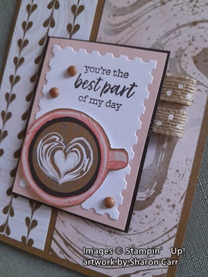
Isn't this cool?  I love the hints of Petal Pink in the swirls.  It works so nicely with the Pecan Pie color.  Love it!

For this card, cut Pecan Pie cardstock to 8 1/2" x 5 1/2" to make a base.  It's scored and folded at 4 1/4".  Next is the lovely layer of A Little Latte Designer Series Paper.  It measures 5 1/4" x 3 7/8".  The pieces shown are the same piece, front and back sides showing.  The piece is cut at 2 1/4" lengthwise to make the two separate layers.  You decide which side you want to see the most of on your card.  The pieces are attached with "green glue" (Tombow Multi Purpose Adhesive).

Now, on to the focal piece.  The first thing was to cut out the cup from one of the sheets of DSP.  I love these ready-made cups on this sheet that you can just die-cut and go.  So quick and easy.  I chose the Calypso Coral cup with the artisan cream heart in the center.  This cup blended in nicely with the pinkish background.

I used the Perennial Postage die set to cut the Basic White label.  I wanted it to be close in size to the cup, so I used the 3rd largest rectangle die for this.  A Petal Pink layer was cut to frame this.  It measures 3" x 2 1/4".  Then a layer of Early Espresso was used to differentiate the focal point from the card base.  I tried Pecan Pie, and that just didn't work very well.  

The white layer is stamped with one of the sentiments in the Latte Love set.  It is stamped with Early Expresso ink.  The white layer is attached to the Petal Pink, and then to the Early Espresso layer using adhesive.

Two 1" pieces were cut from the Polka Dot Trim that is part of this same suite of products.  Each of these were folded in half and attached under the right side of the focal piece using Stampin' Seal.   This is a really sticky tape, so it worked well here even though the ribbon was a little heavy and stiff.  

After adding the ribbon, Dimensionals were added to the label and attached to the card front.  The die-cut cup was added to the bottom of the label with Dimensionals.

For little accents, three of the Adhesive-backed Swirl Dots were added to the card.  These little dots are also part of this suite and are the perfect addition here.  Actually, I think any one of the three colors in this embellishment set would work on this card.

The inside of the card has a layer of Petal Pink that measures 5 1/4" x 4".  On top of this is a layer of Basic White that measures 5" x 3 3/4".  

One last look at the card.  I love the simplicity of the card, but it still looks like there is plenty going on.  Definitely not plain!  I thought of adding some speckling on the Basic White layer on the front to match the speckles on the DSP, but that seemed to be too much.  It needed a little white space amid all the prints in my humble opinion.  

Hope you like this card idea.  If you like coffee (or tea or hot chocolate) it would be a fun set to use to create your projects.  This is my first attempt using this new suite and it was fun to do and I love how it turned out.  It really is a quick and simple card.  But like I mentioned in the beginning, tomorrow's card will be a fun fold.  Hope you come back for that one too.

Happy stamping and creating,
Sharon
.

Tuesday, March 5, 2024

Easter Eggs and Rockers

Hello!  Doesn't that title make you wonder what I've been up to lately?  I had so much fun making the Rocker birthday card for my friend that I wanted to make some more.  Since Easter is coming up, I thought this would be a great time to use the Excellent Eggs dies on a fun fold card.  Ready to create along with me?  I made one version that was pretty close to Susan Campfield's idea, and then I changed things up and made another version of the card.  Hope you like this idea and give it a try.

These are the two cards I made using mostly the same materials with some minor changes.  But they look so different because of the colors used.  Let's break them down so you can make them too.

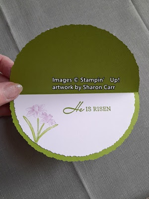
The base of the rocker part of the card is Granny Apple Green cardstock that is cut with the Deckled Circles Dies.  The second largest die was used because the diameter of the die is just about 5 3/8" so the card will fit into a regular sized envelope.

This one is the first one I made and looks very similar to Susan Campfield's card.  The half-circle layer of green on this card is the back-side of one of the designs in the Delightful Floral DSP.  It is a soft, mottled light green print.  This is an Online Exclusive paper and is gorgeous.  To cut this in a half circle, the third largest die from the Deckled Circles Dies was used.  The die was positioned on an edge of the DSP so only half of a circle was cut.  It was a little big to fit the card base, so a little was trimmed from the straight edge so it fit nicely. The piece was layered onto the folded circle using "green glue".

The eggs were cut from two different prints from the Lighter Than Air DSP.  Love these soft pastel prints!  The smallest plain egg was used to die-cut the eggs.  The same size die was used to die-cut eggs from Granny Apple Green cardstock.  The print eggs were attached to the Granny Apple Green eggs to give the back of the card a finished look as you can see here.

Tip:  When you're adding the eggs to your card, make sure they are less than 4 1/4" high so then will fit a regular size envelope.

The bird from the Easter Bunny set was stamped with Balmy Blue on Basic White cardstock.  It was colored in with Balmy Blue Light and Dark Stampin' Blends.  Daffodil Delight Light Blends was used for the beak.

The sentiment comes from the Easter Bunny set and is stamped with Granny Apple Green ink.  It's stamped on a Basic White 3/4" strip of cardstock.  After stamping the ends were punched with the Banners Pick a Punch to flag them.  The banner was attached on the eggs using Dimensionals.  The little bird was added to the banner with a Mini Dimensional.  

For this card several of the new Rainbow Adhesive-backed Dots were added for extra interest.  This time I used the Fresh Freesia dots and one of the Petal Pink dots.  A bow made from the White Glitter Ribbon is attached with a Mini Glue Dot under the sentiment.

Switching cards now, it is made the same way as the first card, but the colors have gotten a little brighter.  The green print layer is from the Meandering Meadows DSP.  I love how this really gives the feeling of grass to the card.  The eggs are cut and layered onto the Granny Apple Green on the back like the first card, but the prints used have a little extra pizzazz.  

The sentiment is the same except the strip is only 5/8" wide.  It's also attached with Dimenisonals.  The bird was stamped with Lost Lagoon ink then colored with Daffodil Delight Light and Dark Stampin' Blends.  Then attached with a Mini Dimensional.  

The same package of the Rainbow Adhesive-backed Dots were used, just different colors to match up with the eggs.  These are Balmy Blue and Lemon Lolly colored.  Don't they accent the card perfectly?  A double bow made from the Parakeet Party Metallic Woven Ribbon was added for a bit of glitz.

The insides of the cards are finished very similarly.  A half circle is die-cut from Basic White cardstock just like the green DSP layers.  The sentiment comes from the Easter Lilies stamp set.  It's stamped in Granny Apple Green ink.

The daffodils inside each card are one of the stamps in the February 2024 Paper Pumpkin kit.  They are colored with markers directly on the rubber to get the two-toned effect.  Just a smidgeon of extra color was added to them by using a Blender Pen and ink.

How about just one more picture of these darling Easter Egg Rocker cards.  I'm so pleased with how they turned out.  If they make me smile, hopefully they'll do the same for someone else too.

Please go to my Online Store to see all the new Online Exclusive stamps, dies, papers and other goodies.  I'm so NOT tech savvy and I've given up trying to post them here.  Sorry.  My first order of the new products finally came today, so guess what I'll be doing tomorrow?  Stamping!!!  I'm looking forward to creating some fun cards to share with you very soon.

Sale-a-bration is over for now, but you can still purchase each one of the items I used for these two cards.  Let me know if you're having any trouble ordering.  I'd be happy to help.  Thanks for stopping by today.  And thanks for leaving a comment along the way.  I love hearing from you!   

Happy stamping and creating, 
Sharon

Friday, March 1, 2024

Translucent Floral

Hello everyone.  Hope you're staying warm and dry today.  My grandsons have their season home opener baseball game for the school team today.  At this time, the weather is only 38 degrees and raining heavily.  Hmm, maybe March 1st isn't the perfect day for a baseball game.  We try to support the boys by going to games, but that's not happening today.  Of course, if we did drive to the game which is 45 minutes away, they'd probably cancel the game and we'd have made the trip for nothing.  Argh!  So, we'll stay snug and dry at home this afternoon.  Instead of worrying about the rain, let's talk about the Translucent Florals stamp set and dies that are carry-overs from the 2023 Sept - Dec Mini Catalog.  I really hadn't taken the time before Christmas to play with these, so I was happy they are a carry-over item.  Plus, the coordinating Delightful Florals Designer Series Paper is available as an Online Exclusive item.  It's so pretty that I decided to focus today's post on the DSP. 

Looking through the DSP prints, I noticed one that was covered with larger single flowers or clusters of flowers that could easily be fussy cut.  So, that was the start of this batch of cards.  There also were the tiny cluster of leaves in a darker green and a couple partial leaves from the cut edge that I also used.  After I had my pile of flowers and leaves cut out, it was time to design my card.

For this first card, I chose Fresh Freesia for the card base.  It measures 8 1/2" x 5 1/2" and is folded in half to make a landscape style card.

When going through the DSP pack, I found this tiny floral print that is so cute.  I cut a strip of this 4" wide, then cut it at 5 1/4".  I cut two of these so I could use the other piece for another card.  

I love the embossing folder that was a free item during Sale-a-bration.  It has a lovely delicate design that I thought would enhance the design.  After embossing the DSP, it was attached to the folded card base with "green glue" (Tombow Multi Purpose Liquid Glue).

A focal point was created using the third largest die from the Scalloped Contours die set to cut a Basic White label.  This wasn't attached to the card until the flowers were all attached, and it was ready to go.

The sentiment is from the Sale-a-bration Softly Sophisticated set.  I certainly hope you were able to get this stamp set and embossing folder bundle while it was available.  The font used on this set is pretty and feminine.  This time it was stamped with Blackberry Bliss ink to the right side.  The purple flower was attached with Dimensional and additional leaves were tucked under with a bit of adhesive on the bottom ends.  The daisy-type flower is die-cut with one of the Translucent Flowers dies from the backside of the scraps left over from cutting out all the flowers from the DSP.  The daisy is attached to the card with Mini Glue Dots.  It was also used between the two layers.  

The label was attached to the center of the card front using Dimensionals.   There are three gems attached to the card front that are from the Tinsel Gems Three Pack.  This is the Fresh Freesia color.  I wanted a little bow added to the card but couldn't find anything current that I owned that matched the card.  So...  I have a retired Soft Sea Foam sheer ribbon that worked okay.  It's attached with Mini Glue Dots.  Sorry, there are so many retired items here, but you get the idea for the card.  I know many of you have different embellishments and DSP going back a good number of years, just like I do.  Save those items because you never know when you're going to need them.

On to the second version of this card.  For this one, I chose a different color from the DSP for the card base - Berry Burst.  Right away this gives the card more brightness and spunk.  

This time I did not use the embossing folder on the DSP.  It's just directly attached to the folded card base. 

For this card, I used the second largest die from the Scalloped Contours die set. So, the label is a little bigger and leaves a smaller edge of the DSP showing.  The label was cut from the Basic White cardstock.  The same sentiment is stamped in the top right corner using Berry Burst ink to coordinate with the card base.

This time a flower cluster from the DSP was fussy cut for the card.  I love how these colors all blend together and pick up the mini flowers on the print layer.  The flower cluster is attached to the bottom of the white label using Dimensionals.

At this time, I used a water brush with a little Pretty Peacock ink and spattered lightly over the white background and the flowers.  I liked how this gave a subtle addition of color to all the white space.

The label is attached to the center of the card front using Dimensionals.  

The new Purple Fine Shimmer Gems were used on this card as accents.  These are the berry-colored gems from the pack.  So pretty with the card.

The card needed just a pop of something contrasting to pull it all together.  After trying several ribbon and twine options, I settled on the Black & White Gingham Ribbon to make a small bow.  It's attached with Mini Glue Dots.

Looking at these cards side-by-side, it surprises me how much a few color changes will make on a card.  I like them both, but maybe I like the berry card just a little more.  That pop of ribbon really sets it off.  Maybe I need to rethink the ribbon on the Fresh Freesia card.  Any suggestions?

Thanks for hanging out together with me on this cold and rainy day.  It's so much better spending time with friends.  Check back in a few days so I can show you the new Online Exclusives that will be available.  There are some truly awesome items that I can't wait to get my hands on.  Seems like the deliveries are getting slower each time I order!

Happy stamping and creating,
Sharon