Showing posts with label 2023 January - April Mini Catalog. Show all posts

Wednesday, May 17, 2023

Grapefruit Anyone?

Hello, hello.  Oh, have I got a fun technique and a citrus-y card for you today.  I love every part of the Sweet Citrus Bundle that I used here.  The stamps and coordinating dies are awesome on their own.  But when you add in the embossing folder that matches, woo boy, you're talking Awesome!  For this card I used all three components, plus added a few more goodies in with the mix.  What a fun project!

Ta-da!  Here it is.  Everything on the card is part of the Sweet Citrus Bundle (page 32), except the DSP and embossing folder that was used for the special technique.  Don't you just love the colors used here and the background texture that steps it up to the next level?  Today I want to focus on the background and cool technique used here.  The background is from the retired Country Floral Lane Designer Series Paper that was in the last mini catalog.  Yes, it has hearts on it so I wrote it off as Valentine's Day material.  But... here I ran it through the Gingham Embossing Folder.  The trick is to do a little sanding over the top of the embossed pattern.  It really hides the heart striped pattern and makes is into something totally different.  The trick is to make sure you sand very lightly so that you don't rip the paper where the embossed edges are getting sanded.  I also found that a light circular motion worked the best.  Now that you've got that figured out, it's time to give you dimensions and details for making this card yourself.


Start with a Petal Pink card base that measures 8 1/2" x 5 1/2".  This is scored at 4 1/4" and folded in half.  The Basic White layer measures 4" x 4 1/8".  The DSP measures 3 7/8" x 4".  It's embossed and sanded.  Then it's attached to the Basic White layer.  I used 'green glue' so I could maneuver the DSP to fit the white layer with just a skinny frame of white showing evenly all around.  This was then attached to the top of the Petal Pink card base.  Set aside until you're ready to assemble all the pieces.

The large 3 piece "rind" stamp from the Sweet Citrus set was stamped on a quarter sheet of Basic White cardstock.  I used Daffodil Delight ink for the color of the rind and had the stamp and cardstock lined up on the Stamparatus.  Lining up the inside of the grapefruit was next.  It was stamped with Petal Pink ink for that luscious pink grapefruit color.   The die to cut this out was lined up inside the embossing folder. Then the stamped images were lined up over these.  Run through the die-cutting machine and there you have three sections of grapefruit.  These can also be handled singly by embossing first and then die-cutting the images apart.  Both ways work well, just do what you're comfortable with.


Both the triple flower stamp and the single flower were stamped with Petal Pink ink onto Basic White cardstock.  The flower centers were stamped with Daffodil Delight ink.  Multiple sets of the double leaves were stamped with Granny Apple Green ink.  I did off-stamp on this color because it seemed a little too dark for the look I wanted.  All the leaves and flowers were die-cut with the coordinating dies for them.  

Next is laying out all the pieces on the card base to see how you want to finish the card.  I attached one set of leaves under the full half grapefruit with adhesive.  Then attached this to the bottom right of the DSP.  The leaf was barely going over the edge.  Next I added the slice of grapefruit slightly over the 1st image, attaching with Dimensionals.  Another set of leaves was tucked in under the 1st grapefruit.  The last grapefruit piece was also attached with Dimensionals.  Another set of leaves was tucked to the left of this.  Three of the flowers were attached with Dimensionals and one with adhesive.

The sentiment comes from the same Sweet Citrus stamp set.  It's stamped with full strength Granny Apple Green ink onto a 5/8" strip of Basic White.  After stamping, I trimmed the ends a little closer to the sentiment then used the Banners Pick a Punch to flag the ends.  This was centered and attached to the front of the card using Dimenisonals.  

Since Connie was here stamping with me, I figured you'd want to see her version of the card.  As you can see, she used all the same components and colors, but put her spin on it.  One of the many things I love about stamping and creating cards is that you can make little changes and get a different card each time.  She twisted the card on its side and added a larger layer of the Basic White.  She only used two of the large flowers.  Connie also made her leaves full strength while I off-stamped.  Just little things, but they make a big difference. 

Hope you enjoyed this little card idea.  Well, it's actually two ideas because there are changes here.  Like I said earlier, I'm really lovin' this Sweet Citrus Bundle.  It has so much going for it with stamps, dies, and a hybrid embossing folder that matches.  Plus, it has some cute sentiments included.  What's not to like?

Thanks for stopping by today to see what's happening here.  I should have more cards soon that Connie and I created together, but always differently.  It's so much fun stamping with friends (or a sister!).  Enjoy!

Happy stamping and creating,
Sharon

Friday, April 28, 2023

Sun Prints Card

Oh dear, here we go again.  It's so hard to say good-bye to so many of my favorite products.  Today's post revolves around the lovely Sun Prints Designer Series Paper.  The organic look and colors of all these prints remind me of blue batik patterns that I love.  And do you remember doing sun prints on specialty papers when you were a kid?  I always thought it was so cool how the sun could bleach out the paper and leave this awesome design behind.  That's what these papers remind me of on the blue side.  The other side has cute little prints in Gray Granite.  Together it's just awesome, and that's what I'm using for today's card.  I thought the blue and white would work both for ladies and men and I needed a slew of cards for the shut-ins this month.  This is just one of the card designs I'm working on.

It's all in blues with a little white and silver thrown in for an interesting accent.  Here's how it's made.  Start with a card base of Night of Navy.  It measures 8 1/2" x 5 1/2".  It's scored at 4 1/4" and folded in half.  Next is a layer of Basic White that measures 5 1/2" x 4".  This will fit right up to the top and bottom edges of the card, but with navy showing on both sides.

The Sun Prints DSP is the next layer.  I chose the print that has white fern-like sprigs and maybe dandelion stems on a mottled blue background. It measures 5 1/4" x 3 3/4".  It's attached to the Basic White layer with adhesive.  Then these layers are attached to the card base with adhesive also.

The leafy branches are from the Lighting the Way stamp set.  I stamped it in Night of Navy ink on Basic White.  The I used the coordinating die to cut it out.  The Lighting the Way Bundle is in the January-April Mini Catalog.  Unfortunately, the 10% off the Bundle price is gone at the end of April.   But I'm so happy it's carrying over into the new catalog and I can continue to share it with you.

Can you see the other two die-cut stem pieces?  They are much more prominent in real life.  First, I chose the skinny branch from the Harvest Dies.  This is such a wonderful basic branch to put behind other stems for a filler.  Alas, it is being retired.  This time I used some Silver Foil Paper to die-cut the branch.  

I also cut two butterflies from the same Silver Foil Paper.  Can you see the embossed detail the dies make when cutting?  I like having that extra detail on them instead of just being flat.  The butterfly dies come from the Meadow Dies.  These are also a carry over to the new catalog.

The second stem is cut from Vellum Cardstock.  This is one of the leaf dies from Poppy Moments Die set.  It has the look of a fern type of leaf to me, so it was the best choice for what I wanted to do.

First the silver branch was attached to the card front near the left side.  Then the vellum fern was attached over a little to the right of the branch with the stems coming together.  Lastly the stamped branch was attached on top of the others.  The two butterflies were attached with Dimenisonals.

The last thing I did was add a sentiment.  And wouldn't you know it, none of my other pictures actually show the sentiment on the card?!  At this point I wasn't even sure I was adding a sentiment.  That's why my pictures are bare.  But I did decide a sentiment was needed to fill the space.  I used a piece of Basic White that measures 3/4" x 2 1/2".  The sentiment comes from the Happy Labels stamp set.  It's stamped with Night of Navy ink.  The coordinating Happy Labels Pick a Punch was used to make those notches on each end.  The label was attached to the card front using Dimenisonals.  It's positioned just slightly over the stems to bring them all together.  Remember to go to the top of the post to see the totally finished card.  Guess I didn't have my mind fully in gear when I was taking the pictures.  So sorry!

The countdown is almost done.  May 2nd the new catalog goes live and we can order anything from it we want.  Woo Hoo!  As demonstrators we were only allowed to purchase certain stamp sets.  I wasn't a huge fan of the ones available, so I'm still playing with my old stamps.  It's time to bring on the new!  I can hardly wait to order.

Thanks for being here with me today.  I appreciate the time you take to visit.  You mean the world to me.  Remember if you're one of my customers, start looking in the mail for the envelopes I'm sending out.  And thank you for all your good wishes on my birthday yesterday.  You are a true blessing to me!

Happy stamping and creating,
Sharon

Friday, April 21, 2023

Goodbye, Wisteria Wishes

Hello there!  I've spent the last week rearranging my stamps and inks into areas that are current or retired.  And wouldn't you know it, every once in a while, I needed to sit down and play with one of the retiring sets.  I'm so sorry to see some of my favorites being shunted to the retired area.  I'll truthfully say, once they hit that area, they just don't get as much love and attention as they should.  The lovely Wisteria Wishes was moved to that area earlier this week.  But before it was banished, it needed to have a last hurrah.  Or something like that.  Last I checked, it's still available for the next few days if you're interested.  So here you go.  You probably won't see this on my blog anymore.  I'll still use it for my personal pleasure, but it's not business anymore.

As you can see, I had to make two cards.  They are very similar.  One card uses retiring In Colors, the other uses current In Colors that we still have for another year.  I love how these cards might be pretty much the same layout.  But because of the colors used, they still look fairly different.  One is soft and feminine, while the other has a much bolder approach to it.

Let's start with the Fresh Freesia card.  First of all, did you hear that Fresh Freesia will be one of the new core colors?  I'm so happy about that as it's a definite favorite of mine.  Woo Hoo!  Now, if they would have just kept Soft Succulent in the lineup, I would have been ecstatic.  But alas, they didn't so this is a goodbye to my favorite green.

The card starts with a base of Soft Succulent cardstock the measures 8 1/2" x 5 1/2".  It's scored at 4 1/4" and folded in half for your basic card layout.  The first layer is from the Dandy Designs that was a favorite Sale-a-bration item.  Well, if I make a card that's featuring retired items, I guess this counts too.  I loved the colors in this DSP, especially the Fresh Freesia prints.  This layer measures 5 1/4" x 4".  It's attached to the card front using adhesive.

The next layer is made from the Fine Shimmer Paper in the Soft Succulent tone.  Isn't it absolutely lovely?  Of course, it is not in the new catalog, but there is a new Soft Shimmer paper that will be available in colors that look so yummy.   This time it's die-cut with the Scalloped Contours Dies which leaves this lovely stitching inside the scallops.  Oh by the way, the Scalloped Contours dies are in the next catalog!

For the white layer I used Basic White cardstock and it's cut to fit right inside the stitching lines.  It measures just under 2 3/4" x 4".  There's actually nothing stamped on this layer.

The 'wisteria' (or maybe salvia or bluebonnets because I used them upright) were stamped on another piece of Basic White.  I inked them with Fresh Freesia then tapped in some Highland Heather ink near the bottom edges of the flowers.  The stems and leaves were inked with Soft Succulent ink and then tapped in with Evening Evergreen ink to get that two-toned look.

After die-cutting with the matching dies, these pieces were attached to the white layer.  The stems are attached with adhesive while there are Dimensionals under the flowers for lift.  There is a quarter inch piece of the Soft Succulent Fine Shimmer paper attached across the stems.  Then this layer is attached to the card front using Dimensionals.

The final touches on this card include the sentiment that's from the Go To Greeting set that is stamped with Soft Succulent ink on a Basic White strip.  The sentiment set is carried over to the new catalog thank goodness because I use it often.  The ends of the strip are flagged with the Banners Pick a Punch which is also carried over.  The sentiment is attached with Mini Glue Dots.  I've found if I roll them a little before attaching, they are slightly lifted off the base, but not as much as Dimensionals.  Sometimes I want just a bit of lift, and this works great.  

There are three of the pink Pastel Adhesive-Backed Sequins.  These are also carried over to the next catalog which I'm very happy about.  They seemed to be the perfect addition to the flowers.

Now for the next card...

The card base used here is Starry Sky - one of the In Colors that's sticking around for another year.  It's a lovely dark blue, and if you haven't used it yet, you should.  Take my word for it, you'll like it.  The cardstock is cut to 8 1/2" x 5 1/2" like the first card, but then a 3/4" strip is cut off the front flap.  

There is a layer of Basic White for the inside of the card that measures 5 1/4" x 4".  The white layer on the card front measures 5 1/4" x 3 3/8".

The plaid layer is cut from the In Color 6" x 6" paper in the retiring catalog in Starry Sky.   This is cut at 5 1/4" x 3 1/4".  There's also a strip that measures 5 1/4" x 1/2" for the inside edge of the card.  Attach both of these pieces to the white layers, then attach to the front and inside of the card.  The layer on the front of the card needs to shift right to the edge of the front flap.

Next is the focal point of the card.  Both the Basic White and Silver Foil layers are cut with the retiring Stitched Rectangles Dies.  What will I do without these??  Oh my, I just realized the Silver Foil Specialty Paper is also being retired!  What??  OK, calm down Sharon.  You'll figure it out and find new papers to use.  Anyway, I used two of the Rectangle dies to cut these pieces.

For this card, I used Lemon Lime Twist for the stems and leaves and tapped on Granny Apple Green ink for the 2nd color.  These I stamped directly to the die-cut white piece.  The flowers were inked first with Starry Sky ink, then was tapped on with Night of Navy ink.  I was surprised there was such a difference between those two colors.  The flowers were die-cut then attached with Dimensionals.  

The same Go To Greetings stamp was used here.  But this time the sentiment was die-cut using that really skinny Stitched Rectangle die to match with the other layers.  It is attached to the card front using Dimensionals making sure part of it is outside the front layer.  There are three of the 2022-2024 In Color Matte Decorative Dots in Starry Sky added for a little extra bling.  These Dots are not carrying over to the next catalog which is too bad.  They were definitely a fun addition to projects.

Okay, that's it for now.  I need to get back rearranging my stash so everything fits.  Last I checked, these items are still available in case you're interested.  If you need to place an order for any of these items, please use the host code shown at the top of this blog page.  I'd love to hear what you think of the new catalog - what your favorites are from the new and what you'll be missing from the old.  It's an exciting time whenever there is a change with all kinds of goodies to get used to.  Have fun checking it out.

Happy stamping and creating,
Sharon

Friday, April 14, 2023

More Playing in the Rain Cards

Hello, hello!  Hope you're having a fabulous day today.  I had so much fun creating with the Playing in the Rain Suite the other day that I got some of those same pieces out again today and did a different fun fold card.  I just adore this cute Rain or Shine DSP and I'm so sad it's retiring at the end of this month.  It's just a fun combo of colors and prints that always seems to make me smile - especially when it's raining (or just about to start up again)!

Here it is and isn't it sweet?  It's an easy fun fold card and I'm going to walk you through it.  Start with a card base that measures 8 1/2"x 5 1/2".  Score this at 4 1/4" and fold in half.  Open the card and cut 1" off the front flap on the card.  This allows you to add a cute DSP strip as an accent.  Cut another piece of cardstock that measures 3 1/4" x 4".  Score this at 1/2" on the long side and fold over to the back.  This gives you the flap that opens on the right side of the card.  Oops, forgot to mention that I used Mango Melody cardstock for my card.  It's one of those colors that are on the way out because of the Color Refresh.  If you like this color, pick up an extra pack right now.  There really isn't a color in the new color lineup that is anywhere close.

To make this card, we're going to start on the inside and work our way out.  So the next piece of cardstock you need is Basic White.  This is cut to measure 5 1/4" x 4".  The strip of checked DSP is from the Rain or Shine DSP.  It measures 1" x 5 1/4" and is attached to the Basic White piece right at the edge using MultiPurpose Liquid Glue.  

I used a piece of Tear & Tape along the inside 1/2" flap on the smaller Mango Melody cardstock.  Line the flap up carefully with the DSP and fold it around to the back side of the Basic White to create the front flap of the card.  After this is attached to the white, use adhesive to attach this layer to the center of the inside of the Mango Melody card as shown.

I used two different prints from the DSP.  The measurement for the left flap is 2 3/4" x 5".  It's attached to a Balmy Blue layer that's 3" x 5 1/4".  These layers are attached to the left flap of the card using adhesive.

The DSP layer on the right flap is 2 7/8" x 3 1/8".  This is attached to a Balmy Blue layer that is 3" x 3 1/4" using adhesive.  Then this is attached to the front flap of the card using adhesive.

The cute fox is die-cut from the Rain or Shine DSP using the coordinating dies.  Easy peasy.  The cloud was punched from Basic White using the Cloud Punch on page 153 in the Annual Catalog. The sentiment is stamped with Balmy Blue ink on it.  Then it's popped up on the card flap using Dimensionals.  The fox is also on Dimensionals and just barely over the cloud.  Some of the blue Pastel Adhesive-backed Sequins were added for a little rainy bling.

I haven't done any stamping inside the card.  I'll either save that for another day, or maybe just write out a note inside.  We'll see.  But wait, I'm not done yet...


I liked the last card so much, I sat back down and made another one.  This time I changed the background DSP to the umbrella print.  Thought that was really cute.  The fox is also changed for the bunny dancing in the rain.  Looking at these two cards together, I think I should have used the 'rainy-er' piece of the raindrop DSP print on the foxy card because she has an umbrella.  Oh well, maybe next time.  I really do think these cards came out so cute!  I wish this Rain or Shine DSP would be carrying over to the next catalog like the Playing in the Rain stamps and dies.  Oh well, I guess I can't have everything I want, now can I?  That means I have to be thankful for what I have and enjoy using it too!

Thanks for stopping by today to see what's new around here.  I've heard from some of you that your new Annual Catalog has arrived.  Woo Hoo!!  Hope you're having fun checking out everything that's new!  Please remember that you can't order anything from this new catalog until May 1st.  But you can still get some of your favorite retiring stamps, cardstock, ink, and embellishments until the end of April (if they are still in stock).  Some items are already sold out, so please don't wait too long.  Thank you!!

Happy stamping and creating,
Sharon

Tuesday, April 11, 2023

Happiness Abounds WV Fun Fold Card

 Hello Friend,  I'm shocked that I haven't made a single post yet this month.  I have to admit it's been a little bit crazy around here, but really!  That's just way too long to go between postings.  I'm sorry I've been off the grid for two weeks.   I do have a nice fun fold for you today.  I've made a similar card to this before, but I never had a name for the fold before.  So that part is new.  Now about the old.  You know it's time for the new catalog to appear very soon, and that means so many of my favorite products are retiring.  Today's card uses some of those items that I'll miss a lot.  As of this moment, the items I'm sharing with you are still all available.  But I really have no idea how long they will last.  So if what I'm using today is still on your wish list, you might want to get a move on to make sure you can still get them!  That said, let's get to the stamping and creating part.

Here's my WV Fun Fold card for you.  As you can see it folds up to fit in regular envelopes, so there's not a problem looking for a different size.  The card starts with a base that measures 5 1/2" x 11".  This is scored at 1 3/4", 3 1/2", 5 1/4", and 7".  This is for the W fold of the card base.  I used Night of Navy for this piece.  There's also a piece of Night of Navy cardstock that measures 3" x 6" and this is scored at 3".  This will provide the V for the card.

Flirty Flamingo cardstock was used for the layers on the card.  These measure (4) 1 1/2" x 5 1/4", (2) 2 3/4" x 2 3/4", and lastly (1) 3 3/4" x 5 1/4".  For the Hues of Happiness DSP, you need (2) of the small print that measure 1 1/4" x 5", and (2) of the floral print with the navy background that measure 2 1/2" x 2 1/2".  Yes, that's a lot of measuring and cutting, but the card is worth it when you've got it finished.  

As you can see, I used another sheet of this awesome DSP to die-cut the additional floral pieces both for the front design and the inside of the card.  The coordinating Blossoming Happiness dies make it so easy to die-cut these images.

This picture gives you a much better look at the WV aspect of the card.

Two of the 1 1/2" x 5 1/4" pieces and the largest piece of Flirty Flamingo cardstock were all embossed with one of the new Online Exclusive embossing folders - Basics 3D Folders that is a set of three.  Each of these embossing folders give you a totally different look and feel to your project.  I chose the one that sort of looks like an overall floral or starfish design depending on what I put with it.

After embossing these, the Flirty Flamingo layers get attached to the card front.  Panel one - embossed, panels two and three - plain, panel four - embossed, panel five - large embossed.  Still with me??  I attached my panels with Multi Purpose Liquid Glue.  Then the two square panels were attached to the 3" x 6" cardstock piece.

Next the Designer Paper panels were attached to the card front.  The two embossed panels have no DSP.  The two plain panels have the tiny print added to the center of the panel.  The two square panels are attached to the 3" x 6" sections.  

I die-cut the rest of the flowers and leaves on my last piece of Hues of Happiness DSP.  They were perfect for the card.  I chose a large Flirty Flamingo pink flower and a small Pool Party flower along with two of the leaf clusters for the focal point of the card.  I also chose a navy and a yellow flower to use inside the card.  The two flowers on the front were positioned then attached with either adhesive or a Dimensional for some depth.  

For the sentiment layer on the inside of the card, I started with a Basic White panel that measured 2 3/4" x 2 3/4".  The sentiment is from the Charming Sentiments set and is stamped with Night of Navy ink.  It's attached to the center of the back making sure that when the card is closed it doesn't show.  The yellow flower was tucked behind the top of the white panel and the navy one is layered on top of the flower and also over a little bit of the white.  This way it shows when the card is closed and just adds to the design on the front.

To add a little bling, three of the Adhesive-backed Pastel Sequins in the gold tone were attached at the bottom right corner on the back layer of the card.  With all the prints here, they are just a small, subtle addition to the card.

Remember, this mini catalog and the big Annual Catalog are only current through the end of April and that time is quickly approaching.  There are so many items retiring and I know I'll miss many of them.  The Happiness Abounds set and coordinating dies are on the retiring list along with the absolutely lovely Hues of Happiness DSP.  If you're interested, the time is running out quickly and they'll no longer be available.

Thanks for stopping by today.  Again, I apologize for not posting for two weeks.  My life really got away from me.  Just a little bit out of control.  lol  I hope you had a blessed Easter and are enjoying some nice spring weather.  Love to you all!

Happy stamping and creating,
Sharon

Friday, March 31, 2023

Playing in the Rain

Hello, hello!  It's almost time to say goodbye to so many of my favorite stamps and designer papers.  So today I'm sharing a card that focuses mostly on some DSP but uses the stamps and dies that coordinate as well.  The whole Rain or Shine Suite of products in the Mini Catalog are just too cute and fun to use.  I know the Rain or Shine Specialty DSP will not be available when the new Catalog comes out and it makes me sad.  It's been enjoyable to just die-cut some of those sweet animal images from the DSP and plop them on a card and it's almost finished!  Just that fast.  When you need something cute in a huge hurry, it doesn't get much quicker than that.

I love how quick this came together, but it's still adorable.  Start with a Balmy Blue card base that measures 11" x 4 1/4".  It's scored at 5 1/2" and folded in half.  The raindrops are from the Playing in the Rain stamp set.  They were stamped with Balmy Blue ink spaced out on the card front.

The Basic White cardstock for the focal point was cut with the Stitched Rectangles Die set that is in the Annual Catalog on page 174.  The rectangle size I used is about 2 5/8" x 4".  The same raindrops were stamped on the top half of this using the same Balmy Blue ink.  The sentiment is from the Nested Friends set page 25 in the Mini Catalog.  It's stamped with Memento Black ink.

The fox and turtle were both die cut from the Rain or Shine DSP with the coordinating dies.  Truthfully, the turtle is not fully there.  It was at the edge of the DSP and the edge of his shell was cut off, but I figured I could use it anyway and it wouldn't be a problem.  I think he looks just fine peeking out from the side of the layer.  In fact, if I didn't mention it, you probably wouldn't even notice.

Before adding the animals, a retired Balmy Blue ribbon was wrapped around the white layer and tied into a bow off to the side.  Then the turtle was tucked behind the top corner.  Both the white layer and the turtle were attached with Dimensionals.  Then Dimensionals were also used to attach the fox with the umbrella to pop it up on the white layer.

I just wanted to point out the glossy accents on the turtle and fox.  The turtle shell and daisy are glossy.  The hat and raincoat on the fox are also glossy. These are just fun touches to make the card special.  

Thank you for checking in again to see what's new.  This is just a fun card idea for you.  Hope it's just what you need.  Just wanted to remind you that the retiring list will be coming out soon and the new catalogs will be arriving soon after.  Keep watching the mail for your copy of the new Annual Catalog.  They'll be mailed out about the middle of April.  

Don't forget to order any of your ink refills you need now!  Stampin'Up! is doing a Color Refresh this year and we don't have all the information yet.  I know the In Colors usually retire each year.  So, if you need any of those refills, please order them now so you are able to get them.  It's good to be prepared.

Happy stamping and creating,
Sharon


Monday, March 27, 2023

Paper Pumpkin Easter Lilies

Hello Friend!  I don't know about you, but one of the things I enjoy seeing at Easter time are the lovely lilies that are in full bloom.  I think they are just gorgeous.  Stampin'Up! hasn't had a lily stamp set for a while, so I was very excited with my new Paper Pumpkin Kit that came last week.  First of all, there were two stamp sets included instead of the usual one.  And since the second set has a pretty lily stamp, I was simply thrilled.  Of course, I had to make something as soon as possible.  I finished it up this afternoon and here it is!

I love the softly serene look to the finished card.  I kept it fairly simple because I wanted the lilies to stand out, and I think they do.  The card base is cut from Soft Succulent cardstock and measures 11" x 4 1/4".  It's scored at 5 1/2" and folded in half.

The next step was deciding what shape I wanted to stamp the lilies on.  The Stitched So Sweetly dies were used here.  Yes, I know they're retired, but the size and shape worked so nicely.  The largest rectangle was chosen to cut the Basic White cardstock piece.

The lilies were stamped with Memento Tuxedo Black ink near the top of the die-cut shape.  The planter was stamped with Gray Granite ink onto a scrap of white.  The leaves were water-colored with Soft Succulent ink.  The planter is painted the same Gray Granite as the outline.  

After the water-colored images dried, all the images received a wash of Wink of Stella.  I think you can see this better on the next picture. The golden stamens were touched in after this.  I used the Daffodil Delight Dark Blends for this and just dotted them in.  The planter was also cut out at this point.

After trying to decide on an accent strip of some kind to fill in the card more, but not detract from the lilies, I decided on the leafy border die from the Delicate Edges Die set.  They are on page 170 of the Annual Catalog.  All of these dies are lovely, but I felt the leaves worked with the design the best.  It is cut from the Fine Shimmer Paper on page 86 in the January - April Mini Catalog.  This specialty paper comes in three colors - Soft Succulent, Fresh Freesia, and Gold.  If you haven't gotten these gorgeous papers yet, you don't know what you're missing!  The shimmer is very fine, and nothing will rub off.  And the colors!!  What can I say?  I think they were made with me in mind!  lol  The leafy die-cut does a lovely job as a subtle accent that draws your eye to the card, but it's not over-powering at all.  When die-cutting the leaves, I did run the die back and forth a couple times to make sure all the little bits would come out without fussing too much.

Before adding the leafy border to the card base, I used Soft Succulent ink and a Blending Brush to give me a darker swath to adhere the border to.  The area that was darkened was only about 1 1/2" wide and not quite out to the top and bottom edges.  I just wanted the pretty leaves to stand out from the card color a little more.  The leaves were attached to the card with Multi-Purpose Liquid Glue touched on very lightly.  If I would have been thinking ahead better, I would have used an Adhesive Sheet behind the paper before die-cutting.  It would have made attaching it so much easier.

The "Happy Easter" sentiment was stamped on the bottom edge of the card at this time.  The sentiment comes from the Easter Bunny stamp set. You can find this set in the January - April Mini Catalog on page 52.  It's stamped right near the bottom edge of the card using Memento Tuxedo Black ink.   

The lily layer was attached with Dimensionals to overlap the leafy accent a little bit.  The planter was added over the stem of the lily using a Dimensional to attach.

All that's left to do is the inside of the card.  The sentiment used here is from the Rejoice in Him stamp set.  It's in the January - April Mini Catalog on page 54.  It's stamped with Memento Tuxedo Black ink onto a quarter sheet of Basic White cardstock.  As an accent, the palm branch from this set was used to the side.  It's stamped with Soft Succulent ink that has been off-stamped to give it a lighter color.

I had planned to use a skinny strip of scrap Fine Shimmer Paper that was left over from a different project.  I mean, it's way too pretty to throw those extra strips away.  You never know when you might need them!  But it worked out that I had a mini strip of Soft Succulent cardstock sitting on my table too.  They layered up just right.  So, there you are, the final touch to this simple and elegant card.  I did debate with myself whether it needed any bling added and decided it didn't.  I liked the simplicity of the card.  And the Fine Shimmer leafy border was just enough.

Thanks for stopping by today.  If you'd like to place an order soon.  Please consider using the Host Code at the top of this blog post.  I really appreciate you continued patronage.  I'll be ordering the new Annual Catalogs very soon.  If you're interested in receiving one, please make sure I know.  Otherwise, you might not get one next month, and that would be sad, now wouldn't it?  I'm excited to see what's going to be new and what's retiring.  I'm especially excited to see what the new Color Refresh is going to look like.  I'm already happy that Lost Lagoon and Pretty Peacock are coming back.  But what's leaving??  I don't know any more than you do at this point, so I'm pretty excited!

Happy stamping and creating,
Sharon


Wednesday, March 22, 2023

Under the Water Card

Hello there!  When I planned to post this card, I didn't realize it would be raining again today.  I sort of feel underwater with water dripping down the windows and everything wet and all sorts of green tones outside.  I didn't plan it, but it really goes with my idea today.  This card all started with a 3" x 6" piece of the Fancy Flora Designer Series Paper (pg 14-15 Mini Catalog) sitting on my desk.  It reminded me of masterpieces of the Impressionist painters and especially of some waterlily pond pictures.  I kept looking at it and just contemplating what should be done with it.  It looks so much like our pond right now with all its greenish colors.  The watercolor feel of the paper fit right in with that thought.  Here's what came of that vision.

I started the card by pulling out several choices of green cardstock and played around with the different combinations.  I really liked the Soft Sea Foam, Soft Succulent, and Lost Lagoon color combo together with that piece of DSP.  The Soft Succulent cardstock was the choice for the card base.  It's cut to measure 8 1/2" x 5 1/2" that is scored and folded in half.

The DSP was cut down to 5" tall.  Then Soft Sea Foam cardstock was cut to 3 1/8" x 5 1/8" to back the DSP later.  

Trying to find just the right underwater pieces to stamp on the card turned out to be quite interesting.  The seaweed stamps I have were not quite big enough or bold enough for my idea.  This plant from Botanical Layers stamp set (pg 93 A.C.) sort of looks like seaweed and was the size I was looking for.  So, why not?  It's stamped with Evening Evergreen ink near the bottom left side.  The ink was dark enough to show up over the print colors but wasn't too harsh like black would be.

The card still needed fish.  I checked with all the current stamps I had and there were no fish that were the right size.  The Whale Done stamp set has fish, but they were too tiny for this card.  In my retired stamp stash from last year, I found the Seascape stamp set.  The little school of fish were just what I was looking for.  They were stamped a couple of times with Lost Lagoon ink on the DSP.  I thought it was cool how the colors and design on the DSP showed through the ink of the fish.  Interesting.

The DSP was attached to the Soft Sea Foam cardstock that was cut earlier.  Then it was attached to the folded card base using the Multi Purpose Liquid Glue.  I didn't center this layer but placed it a little left of center.

One of the sentiments from the Botanical Layers set was used here.  It's stamped on Soft Sea Foam cardstock using Evening Evergreen ink.  It was trimmed to measure 1" x 1 3/8".  This layer was attached to a small piece of Lost Lagoon cardstock which measures 1 1/8" x 1 1/2".  It was popped on the card using Dimensionals.

Did you notice all the Faux Sea Glass on the card?  I'm not sure I like it on the sentiment, but I love how it looks by the seaweed.  What do you think?  Should I make a different sentiment without the sea glass?  Should I add any other embellishments???
Just not sure what I should do about this, or do I leave it as is?

The inside of the card uses the same colors and brings in that piece of DSP that was cut off originally from the 3" x 6" piece.  Because it's only 3" wide, it doesn't go right out to the edge of the white, but I thought that looked ok anyway.  I tried a layer of either Lost Lagoon or Soft Succulent cardstock to go under it, but I just wasn't impressed with the look of either one right here.  The Basic White layer measures 3 1/4" x 5" and the Soft Sea Foam layer is 3 3/8" x 5 1/8".  There's plenty of room for adding your own thoughts.

That's my post for today.  Hope you enjoyed your underwater adventure.  It's interesting trying to find just what fits when you have an idea, but not quite the right stamps you need.  Go through your retired stash and always feel free to "improvise" when needed!

Thanks for joining me today.  If you're placing an order soon, I would appreciate you using the current Host Code shown at the top of this blog post.  

I find the Fancy Flora DSP makes me stretch my creativity into other avenues than I would normally go.  And that's part of the lure of stamping - it's all up to you how you want to create something.  I'm sure you can take this same print and come up with something that's totally different, but totally you!  I suppose it's time to think about what's retiring in the near future, and this Fancy Flora DSP is one of those items that are going away.  Consider ordering an extra pack now before they are gone.

Have fun stamping and creating,
Sharon

Sunday, March 19, 2023

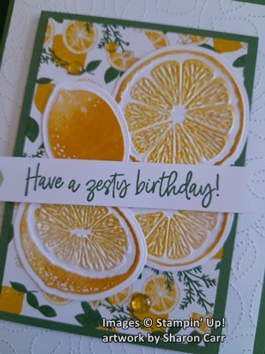
Sweet Citrus Lemons

Hello and a happy Sunday to you.  My goodness it's cold around here.  It was only 32 degrees when I got up this morning and I've been chilled ever since.  Brrrr.  My grandsons and family are in Atlanta for a baseball tournament the boys are playing this weekend.  Wish I could be there with them.  They are playing well and have won most of their games so far.  Yay team!!  What's that you said?  You didn't come here to hear about boys and baseball?  Oh, okay, we'll go back to talking card-making, all right?  

It all started when my friend Diane sent me a card last week that was just covered with lemons.  It was so darn cute it inspired me to get out my Sweet Citrus Stamp, Dies, and Hybrid Embossing Folder to create yesterday.  That was so much fun!  That suite of products is wonderfully coordinated, and you can find them all on page 49 of the January - April Mini Catalog.  You can use just part of it, or all 3 parts of it together.  Hope you like the card I made and get inspired to stamp some lemons too!

Here's my citrus-y card I'm sharing today.  I love how it turned out, especially the shine on the cut edges of the lemons.  It really is hard to get a picture of a shiny finish, but take my word for it, it has just enough shine to look juicy.  Almost makes my mouth pucker!!

I remembered one of the prints in the Tea Boutique Designer Series Paper (in the Annual Catalog) has lemons on it.  I thought it would be the perfect backdrop for these lemons I was going to stamp.  The colors I chose are those listed for the DSP, so it was an easy pick.

The card base is Garden Green and measures 8 1/2" x 5 1/2".  It's scored at 4 1/4" and folded in half.  The first layer is Basic White that measures 5 1/4" x 4".  I cut two of these, so I'd have one for the inside also.  The piece for the card front is die-cut with the Stitched Greenery Die to give it an all-over subtle design.  When it was attached to the card front with adhesive, the rough side (back) of the embossed paper is face-up.  This is for one of the shut-ins at church that will have her 90th birthday in a couple of weeks.  I've been told most of these shut-ins like to feel the cards, so layers and textures are a big deal.  I guess I'm still learning stuff every day!

The next layer is Garden Green again.  It measures 3" x 4 1/4".  The lemony layer of Tea Boutique DSP is cut at 2 3/4" x 4".  The two pieces are attached together with adhesive. 

Now comes the lemons!!  Since the DSP listed Crushed Curry as the yellow color on the paper, that's what I went with.  The outside of the lemons was stamped first onto Basic White cardstock using the Crushed Curry ink.  It looked kind of dark to me, so the inside of the lemons was stamped with Daffodil Delight to be a lighter color than the rind.  I really like how it turned out.  It's still darker than a real lemon, but the colors worked well with the DSP print.

For the cutting and embossing, I placed the die inside of the embossing folder.  It just nestles in there perfectly.  Then looking through the folder, the stamped images were lined up.  I used some washi tape to hold it in place, then ran it through the die-cutting machine.  I was so tickled when I had those cute little lemons in my hands.  They are so cool!  

After cutting the pieces, they are arranged onto the DSP layer.  After getting them placed how I like them, they were attached with just adhesive.  At this point, I used Wink of Stella on just the juicy areas on the lemons.  Can you get a look at the shininess a little better here?  I love how it shines when the light hits it just so.

The sentiment is from the Sweet Citrus stamp set also.  It's stamped with Garden Green ink on a 5/8" x 3 3/4" strip I had left over from some other project.  The ends of this were punched with the Banners Pick A Punch to finish them nicely.  There are four Dimensionals behind the strip to attach it to the focal layer.  Then this whole layer was attached to the card front with Dimensionals too.

Definitely needed some special bling for this card.  I used three of the Glossy Dots Assortment found in the Annual Catalog.  These are the Daffodil Delight color and look great with the colors on the card.  These dots are not faceted but pack a big shine factor, so seemed just right for this card.

The card is finished off inside with the extra Basic White piece I cut earlier.  I had a 1/2" wide strip of a different print of DSP from the same Tea Boutique pack.  I love that it's the same color as the front, but the loose plaid look is a great contrasting accent piece.  

The sentiment is from the Charming Sentiments on page 38 of the Annual Catalog, but I didn't used the dies that coordinate with it this time.  It's stamped with Garden Green ink to match the card.  And that's it.

I'm so tickled with the way this card turned out.  I hope the lady that receives the card will enjoy it.  And a big thanks to my friend Diane who inspired me to make some lemons into lemonade!  It really hit the spot!!

Thank you for sharing some of your day with me.  It's been a quiet day with not much going on.  These relaxing days are just perfect for me to get a card posted on my blog.  When the days are too crazy, I can't seem to think straight enough to make sense when I write.  And that's when I make mistakes.  If you ever find a mistake, please be sure to let me know so it can be fixed.  And I'll apologize now for any mistakes you may find.  I usually re-read the post 2-3 times to catch any problems.  But you know how those pesky little mistakes like to hide until it's too late.

Have fun stamping and creating,
Sharon

Friday, March 17, 2023

Lacy Layers

Hello my friend.  How are things going for you today?  Here we've been dealing with freezing weather again and alas, my pretty flowering trees are dealing with frost and not looking so pretty anymore.  This weather is so confusing, I haven't a clue what to expect at all!  And of course, it's raining again today.  It just makes me want to stay inside and curl up with a good book.  Or maybe a nap would be a good idea.  Instead, I've got two pretty cards to share with you.  I've been playing around with the Two-Tone Flora stamps and dies lately and just lovin' it.   You can find these on pages 14-16 in the January - April Mini Catalog.  But I haven't even used the big full-size lacy background die.  It's about time don't you think?

Aren't these two cards just gorgeous?  I can't quite decide what the final use will be for either card, so there are no sentiments yet.  But they will be easy to add with a little label-style die and the words.  Easy peasy.  But for now, let's get started putting them together.

The card base is cut a little differently than usual.  It measures 5 1/2" x 5".  The card is scored and folded 4 1/4" as usual.  This gives you just a 3/4" fold-over strip where you attach your lacy piece.

Next, the large lacy die was centered on a Basic White piece of cardstock that measures 5 1/2" x 4 1/4" so it's a full-size card front. Run cardstock and die back and forth through the embossing machine at least twice to make sure all the sections are fully cut.  Use the Brush Tip attachment to the Take Your Pick Tool (page 155) to easily remove all the little pieces from the pattern.  Isn't this leftover piece just beautiful all by itself?  On one of my cards, I used Basic White Thick and just regular on the other.  It seems both cardstock choices worked out just fine.

The lacy layer was added to the card front at this time.  I wanted a softer, muted look on the card, so a piece of Vellum Cardstock was cut to measure 5 1/2" by 4 1/8".  This is attached inside the front flap of the card making sure all the edges line up nicely.  To me, this was an important addition to the card design.  But if you like the card without the Vellum layer, do it your way!

The flowers and leaves were stamped next.  The colors used for this card are Flirty Flamingo, Evening Evergreen, Soft Succulent, and Orchid Oasis.  When stamping the flowers, the solid image stamps were inked up with the color and off-stamped before stamping on the Basic White cardstock piece.  The detail images were inked and stamped at full strength.  This gives you nicely color-coordinated flowers.  Don't you love the pretty periwinkle blue color that the off-stamped Orchid Oasis is?

The leafy stem is stamped in Soft Succulent ink.  There are two of these stamped to fill in the area better.  One of them was cut apart and only part of it was used. The larger double leaves were inked with Soft Succulent then touched on the edges with Evening Evergreen ink to give them a two-tone look.  Everything is then die-cut with the coordinating dies which make it so easy to make this card.

All the pieces were laid out in order.  Some of the pieces were attached to the lacy layer with adhesive.  You don't have to worry about the adhesive sticking to the inside of the card because of that Vellum layer inside the card.  Woo Hoo!  Otherwise, you'd have to be very careful where you added the adhesive.  The main flower has Dimensionals added under it to add depth to the look.

The final touch for this card is the Soft Succulent Satin Shimmer Ribbon found on page 146 of the Annual Catalog.  This is gorgeous ribbon and it's so easy to manipulate because of its softness.  

I've spent the last day arguing with myself about the use of added bling on this card.  After much deliberation, there are no extra bling additions to this card.  I thought it took away from the lovely lacy look too much.  That's the real focal point here in my opinion.

Here's the other version of the card.  The ink used for the flower colors changed to Mango Melody and Poppy Parade.  These colors were not off-stamped but were stamped full strength.  The smaller flowers were stamped with Highland Heather with Gorgeous Grape for the detail.  The leaf colors were the same as before.  As you can see, these colors make a much bolder and brighter card.  To give it some added appeal but not added color, a length of the White Glittered Organdy Ribbon was tied around into a knot on the side.

Well, I'm curious to know which of these versions do you prefer?  They are both beautiful.  I love the lacy look with the added Vellum behind it.  Makes it so elegant looking.  Let me know what you think.  I love hearing your comments.

Thanks for being patient with me.  Seems like my posts have been getting a little random lately.  I'm trying to get posts done on a regular basis, but I seem to be falling behind.  Thank you for checking back just in case there is something new.

Have you been online checking out the new Stampin'Up! Online Exclusive items?  There are some great products there for you.  I'll be trying to showcase some of them as the days go by.

Happy stamping and creating!
Sharon

Friday, March 10, 2023

New Card Template

Hello Friends!  Hope you're all staying warm and dry.  We're back to colder weather and rain again.  But a least there's no snow coming around here.  I've been talking with friends in Michigan and Maine.  Sounds like both states are getting slammed with cold weather and lots of snow.  That's something that I'm not missing at all.  Now my friends, I'm missing those a lot!  Wish I could drag you all down here for a long visit.  Just think of how much stamping and chatting we could do!!  Oh well, that's just wishful thinking on my part.

Today I wanted to do something a little different.  How about a template you can use over and over again to make as many cards as you'd like?  I've made two cards with this template and it's an easy template to use.  There aren't too many pieces that need to be cut or scored.  Just enough to make it interesting.  Here goes...

Here are the basic cardstock measurements:
card base   -  11" x 4 1/4"  scored @ 5 1/2"
DSP layer  -  4" x 5 1/2"
white layer -  3" x 5"

If you only have these three components, you can make a different card every time you sit and stamp.  For this card, I used Balmy Blue for my card base.  The DSP layer is one of the prints from the Country Floral Lane DSP.  It's found on page 9 of the January - April Mini Catalog.  I have used most of the prints in this paper pack for Valentine cards.  I thought this blue print would make a pretty birthday card though.

Before doing any stamping on the Basic White layer, I used one of the Basic Borders dies to cut a fancy edge at an angle.  Isn't that a cute addition?  I chose the birthday sentiment from the Happy Thoughts set.  I really like the size of the fonts for this sentiment.  It fits the card just like I wanted.  It's stamped in Balmy Blue ink to match.  

Two leafy stems from the Dainty Delight dies were cut from Mint Macaron cardstock.  They were trimmed a little on the bottom edges to fit the white layer in a nice curve.  Multi Purpose Liquid Glue was used to attach the stems to the left side.  The three flowers and bud were die-cut from Pale Papaya cardstock to match the dots on the DSP.  These were attached with Mini Glue Dots along the stems.

Before attaching the layer, a Pale Papaya ribbon was tied around the card front and tied into a knot on the side.  I know it's a retired ribbon, but it worked so nicely with the card.  Besides, this is to give you a card template for your use, not really showcase any particular stamp set.  After adding the ribbon, the main layer was attached to the card front using Dimensionals.

At this point, I planned to add rhinestones to the card.  I wasn't happy with the rhinestones, or the Iridescent Pearls, or anything else I tried.  Everything I tried was just too pale.  Imagine me saying that!  LOL Time to go raid my retired stash of embellishments.  These gold pearls are from a set of gold and silver pearls.  They're nice and tiny and can easily be used for the flower centers.

I had so much fun making this card, I went right ahead and made a 2nd card using this same template.  After changing up the colors, it sure does look different.


For this one, I started out with a base of Blackberry Bliss cardstock.  I used some of the Favored Flowers that were a Sale-a-bration freebie that I just love.  It's so rich and elegant looking.

The ribbon was changed to the White Crinkled Seam Binding Ribbon.  The Blackberry Bliss Light Blends was used to color the ribbon.  Such an easy way to get ribbon in any color you want!

The sentiment is from the Beauty of Friendship stamp set.  It's stamped with Blackberry Bliss ink.  

I changed the die used to cut the edge of the white layer to a retired set called Ornate Border Dies.  I like the lacy delicate look with the darker colors on the card.  It still has that elegant feel to it.

The two sets of flowers tucked over and under the sentiment layer are parts of the Favored Flowers DSP cut with my Paper Snips.  They just fit right in, don't they?

The bling used on this card is the Iridescent Rhinestone Basic Jewels.  Love, love, love these gorgeous jewels!  They tend to fit right in with anything you want to add sparkle to and make it shine.  I tried just three on the card, but that wasn't enough.  So I sprinkled on two more.  Yes!

Just wanted to share a picture of the inside of the card too.  The Basic White cardstock is cut to measure 5 1/4" x 4".  There is a 1/2" strip of coordinating DSP added to the bottom to match the front of the cards.  For this card, I chose a sentiment from the Irresistible Blooms stamp set that is an Online Exclusive.  Make sure you check out this set and all the other options online when you're ready to order.  If you have any trouble seeing them, call me and I'll try to help.

That's it for today.  Hope you give this card template a try.  It's a good idea to have some go-to templates to work with when you're stuck for a quick idea.  I know I find it helpful.

Thanks for stopping by to share a part of your day with me.  Feel free to leave me a message.  You know I'd love to hear from you!  If you're planning on ordering soon, please consider using the Host Code at the top right corner of this post.  Thanks so much!

Happy stamping and creating,
Sharon