Tuesday, May 31, 2022

Potted Geraniums

Hello friend!  I've recently gotten the new Potted Geraniums stamp and die bundle.  I always had geraniums in Michigan, so I really needed this set.  Right?  So now that I have it, it's time to play around with the new set and see what I can do with it.  The first project I made uses just the dies to make the geraniums for the focal part, no stamping.  It was fun doing this for the first time out with the stamping only showing up on the sentiment.  Let me share with you what I used to make the card.

I love how pretty the card turned out!  It's bright, but not too bright for my tastes.  It starts out with a card base of 8 1/2" x 5 1/2" Polished Pink cardstock.  This is folded in half for a basic card shape.  The first layer is Mint Macaron that's cut at 5 1/2" x 2" so it goes from top to bottom edges.  To give it some texture, I used the Wrapped in Texture Embossing Folder for that pretty dot design.  It was attached to the card base with MultiPurpose Liquid Glue about 1/2" from the left side.

The soft leafy print of DSP comes from the Design a Daydream Hostess DSP set.  The prints in this batch of papers are just so nice.  I knew this would be a lovely backdrop for the geranium dies.  The DSP is cut to 5" x 2" and is attached to the card front with adhesive.

I die-cut the geranium pieces first to see what size of layer I needed to place them on.  The back of the leaf die was cut from Mint Macaron to match the card.  For the detailed layer, I really like the look of the just retired Just Jade cardstock.  For the back layer of the flowers, I used Polished Pink to match.  None of the other pinks I had on hand worked for the detailed layer.  I ended up using a piece of Polished Pink and some Polished Pink ink and a Blending Brush to make my own darker color for the die-cut piece.  The colors match nicely and are just what I had in mind!  Yay, I love it when something goes from my mind to reality and actually works!!

I used the middle rectangle in the Scalloped Contours Die set.  This size was perfect for the geranium to rest on and was cut from Basic White cardstock.  It needed some texture, so I grabbed my faithful Tasteful Textile 3D Embossing Folder.  Yes, I know - it's retired.  But until Stampin'Up! comes up with another embossing folder that I like as well, I'm going to keep using this one.  Don't tell anybody though!

The die-cut pieces were attached to the white rectangle with adhesive to lay flat, except for the flowers which were attached with Mini Dimensionals to make them stand out a little more.

The sentiment came from the Botanical Layers set.  I liked the two different fonts and the size worked well on this design.  It was stamped in Polished Pink ink onto Basic White cardstock, then punched out with the Double Oval Punch.  To get just a tiny bit of color on the edge, I touched it to the Mint Macaron ink pad very lightly.  Just enough ink to separate it from the white background.  It was attached to the card with adhesive on the left side and a Dimensional on the right side so it lays flat.  

After checking out the bling situation, I added some of the retired 2021-2023 In Color Jewels.  The pink really stands out nicely on the sentiment oval.  I thought the extra three jewels reminded me of petals falling from the geraniums.

I guess I should apologize for using retired items again.  The thing it, I know most of you have these items in your stash.  So if I think they are the best item to use, I guess I'll keep using them.  I hope this doesn't offend anyone.  

There you have it - the first in a series of Geranium Cards.  Ta-da!  Of course, if it's the first, that means there will be more.  So that's all for today and I'll get myself back to my stamping table and see what other geranium projects I can make.  So far, this set is awesome to use and I love it. More coming later...

Happy stamping and creating,
Sharon

Thursday, May 26, 2022

Embossing Paste Background

 Hello Friend!!  A couple of weeks ago one of my grandsons was hanging out in my stamp room inspecting stuff.  Well, he was actually being curious and checking out what I had sitting around.  He wanted to know what the cool palette knives were for and could he play with them.  So we had a little show and tell about Embossing Paste.  I hadn't used it in ages and was surprised it wasn't dried out.  Yay!  Since we added some paste to cardstock using stencils, that means I have a couple pieces of background to create with.  

The background here is a quarter piece of the new Parakeet Party.  I wanted the green color to be a little darker behind the embossing paste, so I used a Water Painter and some Parakeet Party ink to do a wash in the area I'd be putting the paste.  I used the Heat Tool to quickly dry the area so we could play.  

When using embossing paste, there are a couple things that are important to remember.  1.  Take out the amount of paste you think you'll need and close the container right away, so it doesn't dry out.  2.  When using a plastic stencil to make a design, tape it down so it doesn't shift when scraping across it.  3.  Make sure you keep the embossing paste fairly thin on your project.  Scrape off any excess.  4.  Clean your stencil and tools immediately after using so the paste doesn't get dried on like cement.

After taking the stencil off, set it aside to air dry.  This will take a little while, so it's a good idea to make several background pieces at the same time while it's all out.  Then do your clean-up.  Test to check for dryness before handling the piece.  After drying, the piece was trimmed down to 5" x 3 3/4".

To go with the background, I chose to use the Quiet Meadow stamp set and the matching Meadow Dies.  I love the simple organic dies that make a quick, but stunning, image on your card.  I cut two different ones from Basic Black cardstock, and one from some Black Glimmer paper from last Halloween.  I thought the more subtle bit of glittery-ness was a nice touch.  All of these pieces were just attached with Multi Purpose Liquid Glue to lay nice and flat.  Then the whole layer was attached with adhesive to the Basic Black layer that was cut 5 1/4" x 4".

The die set also has this pretty label die that I used to cut a piece of Basic White cardstock.  The sentiment is from the Quiet Meadow set and was stamped with Memento Tuxedo Black ink.  The label was attached to the card front with Dimenisonals to give it a pop.

The new Parakeet Party 1/8" Metallic Woven Ribbon was used to accent the label.  I cut two pieces about 4"-5" each.   They are threaded through the loops on the die-cut label and attached behind the Basic Black layer with small strips of Tear & Tape Adhesive.  This is a trick I used to do a lot, but sort of forgot about lately.  It does make a pretty little accent though.

The inside of the Basic White card base has a stem of flowers from the Quiet Meadow set stamped at the bottom corner using Parakeet Party ink.  This is an easy way to bring some of the design from the front inside your card.  All the layers are then attached to the Basic White card base using Dimensionals.

As an added bit of bling, three Rhinestone Basic Jewels are sprinkled on the card front.  Just enough for an extra dose of pretty!

That's it for today's post.  I have to apologize about the quality of the pictures.  With all the dreary weather, I haven't been able to get any decent pictures to share with you.  I think each picture I took had some shadowing on it somewhere.  I've tried different lighting and different areas of the house trying to get something decent.  So it's either don't post, or have you deal with sub-par photos.  And you see what you are ending up with.  😒  Sorry!

One last picture for you.  Now that we've played with the Embossing Paste, I'll have to get it out more often.  It really is fun and leaves some wonderful texture on your design.  If you're like me and like to touch the finished card, this is a product you should try.  Have fun and remember to clean up right away!  I just cleaned up in a sink.  Easy peasy.

Thanks for stopping by today.  If you're planning on ordering soon, remember that the 2022 January - June Mini Catalog expires the end of May so you have just a few more days left to order from it.  And please use the current Host Code shown at the top right corner of my blog posts.  You're very appreciated!  Thank you for everything!  Blessings!!

Happy stamping and creating,
Sharon


Tuesday, May 24, 2022

Blue and White Charm

 Hello friends!   Hope you haven't given up on me yet.  It's been a rough week in many respects.  Hubby is doing so well and is down on the farm for a visit.  I've learned I really don't like to be here by myself this past week.  It's never bothered me before when he goes out of town, because I had so many friends dropping by to stamp and/or do lunch.  Or stick around visiting after class or club was over til all hours of the night.  That's definitely not the case here.  There have been several days in a row when I haven't seen or talked to anyone.  And I've found that my own company gets pretty boring after a while.  It all seems to affect my creativity which has gone down the tubes lately.  That's enough fussing for now.  But on a brighter note, I have been going to see both of my grandsons play ball more often.  Now, you know us grandmas, I have to brag for just a moment.  Carson's 12 and Under baseball team is ranked 1st in South Carolina for their category, 3rd in the Eastern Conference, and 12th in the nation.  Isn't that awesome?  I'm so proud of him and his team.  They really work hard together and are all great team players.  In fact, Rick and I will be traveling to Florida for a big tournament over the 4th of July holiday to see them play.  Well, I guess that's enough chit-chat, so let's get on with the stamping!

When I first saw the catalog, the Sun Prints Suite really caught my eye.  I just love blue and white together - so clean and crisp looking!  The Sun Prints Suite has a nice stamp set, dies to coordinate with it, gorgeous designer paper, and an embossing folder that works with it!  Wow!  It has it all and is gorgeous too.  The first card I wanted to make with this needed to really focus in on the Sun Prints Designer Series Paper.  Oh my, so pretty!  

To make the card, I started out with the Basic White Thick cardstock cut at 8 1/2" x 5 1/2", scored and folded in half.  I like white on white layers, so the next layer is Basic White cut at 5 1/4" x 4".  This is embossed with the Fern 3D Embossing Folder that is part of the suite.  It's so pretty I hated to cover up the design.  It was attached to the folded card front using Multi Purpose Liquid Glue.  I find this works best with the deeply embossed layers.


I chose to use two different designs of the Sun Prints DSP.  The first print was pretty plain with various shadings of blue.  It's cut at 2" x 4 7/8".  To give it some added interest, it's embossed with the Wrapped in Texture Embossing Folders.  (Please, forgive me!  I thought this was a current embossing folder, but it is not.  Sorry!)  I did like how the embossing sort of 'broke' the finish on the DSP and the white center shows through on the design.  I'll have to try this on another embossing folder to see how it looks.  This layer was attached to the card front with Multi Purpose Liquid Glue.  

The second print was cut with the Stitched Rectangles Dies.  Love this print!  It also was attached to the card front with Multi Purpose Liquid Glue.  So far everything is attached flat, but now we're going to start adding some dimension to the design.

For this card, I dug out an older stamp set called Lovely You - still current.  It's been around for a few years, but the words in this set are definitely worth having.  There are eleven sentiments in the set and I've used them all quite often.  I stamped the sentiment on Basic White cardstock using Night of Navy ink.  The new Stylish Shapes Die set was used to die-cut a stitched banner for the card.  This was attached with Dimensionals across the two prints.

In the Nature's Prints stamp set, there's a single flower with a stem and bud.  I stamped this with Night of Navy ink on Basic White cardstock.  A Water Painter brush was used to soften the center of the flower.  It was die-cut with the matching die from the same set.  It was attached to the banner with adhesive.

I used a piece of Baker's Twine from the Essential Pack, plus a piece of navy twine that was retired.  I didn't like the white alone, but the two together seemed just right.

The Rhinestone Basic Jewels were colored with a Dark Balmy Blue Blends.  I sprinkled four of the over the card front for some bling.  I don't usually use an even number of gems, but it looked right.  So I stopped while I was happy with the look.

The inside of the card has the same small flower and bud stamped in Night of Navy in the bottom corner to carry the design inside.  This was off-stamped before adding to the inside to keep it a little softer looking.

This is a clean and simple card look.  I love the blue and white theme.  If you do too, check out the Sun Prints DSP on page 134 of the new Annual Catalog.  The prints are really gorgeous.  I'm glad you took time out of your busy day to check this out.  Hope you like this pretty card and you try out something similar.  This card idea really lets the designer paper be the star.  If you've got some prints that you totally love, let them shine with an idea like this.  Thanks for stopping by.

Happy stamping and creating!
Sharon

Monday, May 16, 2022

True Beauty One Sheet Wonder

Hello!!  It's so good to be here getting another post ready for you.  It's a beautiful sunny day today which is very welcome after gray skies and rain the last two days.  I just ate my lunch on the deck watching the goldfish in our little pond.  Ahhh, summer!  Because of the sunshine, this morning I thought I'd make a card that's full of warm bright colors.   But I wanted to make something that I haven't made in a while.  Thinking about card ideas, I remembered a One Sheet Wonder card my friend Sue and I made last November.  That was so much fun and was truly one of my favorite Christmas cards I sent out last year.  Guess it was time to give the idea an update with new stamps and a new color too.  I'm so happy with how this turned out.

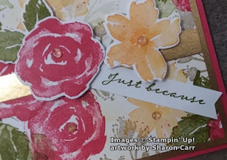
Here's one of the four cards that I made from the One Sheet Wonder design.   I started out with one sheet of Basic White cardstock.  My stamp set of choice for this was the new True Beauty stamp set and the coordinating die set Organic Beauty Dies.  This is the first time I've used the set, so it was totally new to me.  Exciting!  I just love the rush of trying out a new set and seeing what kind of creation appears.

The list of colors used is:  Sweet Sorbet (new In Color!), Old Olive, Mango Melody, and Crumb Cake.

This picture gives you a great idea of how to stamp out the different areas.  The first color used was Sweet Sorbet with the lovely rose stamp.  The three roses in the middle were stamped first.  Next two roses were stamped in from each corner.  Then there are four more roses (or partial roses) stamped on the middle of the edges.

Next, the double leaves are stamped using Old Olive ink.  The three roses in the middle have a set of leaves between each rose.  The double roses have one set of leaves between them.  Lastly the edge roses have either one or two sets of leaves depending on space.

The branch thing was stamped next with Crumb Cake ink.  I didn't ink the stem at all so it could be tucked in by the roses easily.  Most times it was stamped twice in an area without reinking in between stamping.  This fills it in a little more.

The wide-open flower from the set was stamped in the open areas using Mango Melody ink.  In a larger area, this was also stamped twice without reinking.  It just depends on the amount of open space you're dealing with.  While doing all this stamping, I stamped four of each rose, leaves, and open flower on a piece of Basic White.  These were all die-cut with the coordinating dies for use later when putting the card together.  There are also some speckles of Sweet Sorbet ink that are scattered throughout the design.  I used the speckle stamp from the Forever Fern set for this.

The 'just because' sentiment from the True Beauty set is one of my favorites.  It's perfect for those times when you just want to stay in touch with someone.  It is stamped with Old Olive ink on 1/2" strips of Basic White that are left over when trimming the cardstock down for layering.  I save these so I always have some on hand when I need them.  The right end of each was finished with the Banner Pick A Punch.  

Putting the cards together, I trimmed the large Basic White sheet I stamped on to make pieces that are 5" x 3 3/4".  These pieces were layered onto Gold Foil pieces that were cut at 5 1/4" x 4".  A 1/2" strip of the Gold Foil was attached across the middle of each card.  The die-cut rose, leaves, and open flower were arranged around the sentiment.  The sentiment strip was attached with adhesive.  Then the other pieces were all attached with Dimensionals.

The last step was choosing what kind of bling would enhance these cards.  I have a good number of the Genial Gems left over and thought they'd look nice here.  I used the peachy toned ones.  A larger gem was added to the centers of the flowers, and if needed, a smaller gem or two were tucked in around the design.

I didn't take pictures of the inside of the card, but I wanted to tell you what I did.  When I was trimming off the excess on the stamped design, I saved the strips and layered them inside the cards on the Basic White layer for writing on.  That is a fun addition to carry your design into the inside of your card.   I still have a few strips left over, but I think they're headed for the trash can.  I can only hold on to so much stuff to use later.  At least, that's what my hubby keeps telling me!  😁

Now that you've seen what I've made, try this idea out with different stamps, or maybe these stamps but with different colors.  I made a set of four cards using Balmy Blue, Highland Heather, and Mint Macaron.  Wow, totally different look!!  It's amazing what a color change can do to the total look of a design.  Give it a try!  Thanks for stopping by.  Hope you've gotten warmed up with these hot colors.  Guess I'll have to make do with my sunshiny colors, because it's already overcast again with more rain forecast.  Oh well, enjoy it while you can I guess!

Happy stamping and creating,
Sharon

Saturday, May 14, 2022

Time for a Cuppa

That would be a cup of tea for all of us that aren't British.  I just always loved the phrase.  It sounds like a fun get together for something so common.  And I've always loved sets that incorporate cups, tea or coffee.  So of course, this stamp bundle was a must-have for me.  I already had some ideas of what I wanted to do with this set, and this is how the first one came out.

I thought these new In Colors would work very nicely together on this card.  I did get a little bonus extra while stamping the cup though.  For some reason, my new Parakeet Party ink pad tends to create bubbles when inking up a stamp.  For line art it's not really noticeable.  But when you come to thicker lines, it almost looks like an extra print in the stamp.  How strange is that?  But I liked it.  So after three tries, I figured that's the way it will be.  Now I'll have to make a few more cards with those green stripe cups.  Can't let those extra cups go to waste now, can we?

The card base starts out with the new Starry Night In Color.  It's a nice rich brighter dark blue.  Using a full piece of 8 1/2" x 11" cardstock, score in half going in both up and down and side to side directions.  Then cut diagonally from corner to corner for the card base.  If everything goes well, this is the look you'll end up with...

When the flaps are folded in on the card, you should have a diagonal gate-fold card.  (Or whatever it's being called right now).

The Parakeet Party cardstock layer is cut at 4" x 5 1/4".  Then carefully cut this diagonally to match the front of the card.    The Tea Boutique DSP layer is cut at 3 3/4" x 5", and again cut diagonally to match with the rest.  It's very important to pay attention to the direction of the diagonal cuts.  It really makes a difference to matching it all up.  After cutting all the layers,  attach them together using adhesive.  I used the MultiPurpose Liquid Glue for my card.  For this card, I really liked the diagonal checks on the DSP.  I thought it was perfect for the rest of the design.

The scalloped white layer that is stamped on is the middle rectangle from the Scalloped Contour Dies.  The greenery that fits inside the teacup was stamped right at the middle line of this using Parakeet Party ink.  The flowers that go with the greenery were stamped with Orchid Oasis ink in between the tips of leaves.  

The striped teacup was stamped with Parakeet Party ink onto a scrap of Basic White cardstock.  I also stamped the outline for the tea tag.  The sentiment "sweet" inside the tag was stamped with Orchid Oasis ink.  Both the teacup and tag were die-cut with the coordinating Teacup Dies.  The teacup was attached to the layer with adhesive, and the tag was attached with a Dimenisonal.  

Figure out where the stamped white layer will be fitting on your card front.  Carefully mark where the tape needs to go so it is only on one half of the card front so it can still open.  At this point, I used two strips of Tear & Tape on the back to make sure it's very secure.  

Three of the Orchid Oasis dots (2022-2024 In Color Matte Decorative Dots) were added to the design.  Two tiny ones were added to the larger flower centers, and one larger dot was added near the bottom of the design.  

A bow made from the Orchid Oasis 1/8" Metallic Woven Ribbon was attached to the top of the tea tag using a Mini Glue Dot to hold it in place.  You've got to see how pretty this ribbon is.  You can even maneuver the ribbon to make it a little wider and more sheer.  Fun!  The front is now complete.  It's time to tackle the inside of the card.

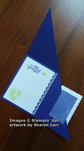
The inside layer of Basic White was cut at 4" x 5 1/4".  Check picture #2 to see images of the inside of the card.  I stamped another sentiment from the Cup of Tea stamp set using Orchid Oasis ink.  There is a small leaf spray that I stamped to the side of this with Parakeet Party ink.  The teacup with leaves was also stamped in green near the bottom.  Along the right edge, I layered a 1/4" strip of the same diagonal print using adhesive.  After looking at this layer, I went back with a Parakeet Party Stampin' Blends to add extra color to all the open leaves.

Looking at the finished card when it was open, I didn't like the back of the white layer showing so much.  I chose another print from the same Tea Boutique DSP and the next smaller die from the Scalloped Contour Dies and cut a nice rectangle.  This was added with adhesive to the inside as shown.  I think this gives the inside of the card a much nicer finished look.

There you have it.  The first creation using the Cup of Tea set and matching dies, and of course, the coordinating DSP.  So much fun wrapped up in that bunch of goodies.  Hope you like this idea and give it a try.  The most important part of the whole card is getting those diagonal cuts done right.  Then everything else just falls into place like it should.

Thanks for stopping in again.  If you're ordering, please use the Host Code at the top of my blog page if your order is under $150.  If your order is over that amount, make sure you get the Host Rewards for your order.  If you're unsure how to do this, give me a call and I'll be happy to help you out.  Now, get out there and do some creating.  I think I hear your stamps calling you.  Thanks again!

Happy stamping and creating,
Sharon

Friday, May 13, 2022

Wisteria Wishes

Good morning, friend!  So glad you stopped by today.  When I was out picking up prescription meds, I was struck by how lovely a hedge along the side of the parking lot looked.  It was covered in oodles of soft purple flowers - wisteria.  I'm not sure I ever saw wisteria in Michigan.  I'm sure it grows there, just not in anyone's garden that I'd ever seen.  Funny thing is, down here it almost grows wild.  There's a long fence along the parking lot edge just dripping with these flowers!  So of course, I had to make a card showing off the new Wisteria Wishes stamp and die bundle.

Here's my version of all the lovely wisteria growing around here.  The colors are not as pale as I've seen growing here, but it certainly gives you a good idea of how gorgeous these flowers are.  I started with a base of Highland Heather cut at 8 1/2" x 5 1/2", scored and folded in half.  I debated about stamping or embossing on the card front, but decided I'd prefer it plain to keep all the focus on the wisteria.

The Basic White layer for stamping was cut at 4 1/4" x 3".  The Gorgeous Grape cardstock layer behind this was cut at 4 3/8" x 3 1/8" for just a tiny frame around the stamped layer as an accent.


Because of the purple colors I was using, I dug out my newly retired Just Jade ink pad.  I love this color with purples, so sorry!  I'm using retired ink here.  If you don't have this color or only want to use current colors, I think Garden Green might work well.  It just wasn't what I wanted for this card.  I stamped the leafy stem coming across and down from the left corner. 

The more solid three-flower stamp was inked up with Highland Heather ink and stamped to connect with the hanging stems.  To get a fuller look, I huffed on the stamp and did a 2nd-generation stamping just a little above the first.  It's very light, but I think you can see it in the picture.  I inked up the stand-alone flower cluster with Gorgeous Grape ink and stamped lightly on each flower.  Looking at the flowers, the only place that really looks like the darker purple is there, is right at the tips of the flowers.  The rest of it sort of blended right in.

The stamped layer was attached to the Gorgeous Grape layer using adhesive.  This was then popped up at an angle on the card front using Dimensionals.
 

The leafy area on the card looked a little bare, so I die-cut a partial leafy branch from Just Jade cardstock to add to it.   This fills in the area so much better.  It's attached with some Mini Glue Dots hidden behind a couple of the leaves.  I also added a double bow of white Baker's Twine that's attached with a Mini Glue Dot.
  
On to the sentiment which is also from the Wisteria Wishes stamp set.  I love the mixed fonts used here and it's a nice sentiment that is pretty versatile.  It is stamped on a 1" wide strip of Basic White using Gorgeous Grape ink.  It was trimmed and then punched on the left side with the Banners Pick A Punch to flag the one end.  Just a smidgeon of the Highland Heather ink was added to the edges with a Blending Brush.  Otherwise it was too white-on-white and got lost on the card.  This was attached to the right edge using both a Dimensional and adhesive to keep the sentient flat.

The last addition to the front were three of the new 2021-2023 In Color Opal Rounds.  Oh my, these are so pretty!  These are really supposed to match the Fresh Freesia color, but I thought they fit very nicely here.

That's it for today's post.  Hope you enjoy the wisteria as much as I do.  One of these days, I'm going to have to walk over to that fence line, smell them, and maybe pick just a few because they're so pretty!  Is that allowed in a parking lot??

If you're planning on placing an order, please use the Host Code at the top right corner of my blog post.  I would appreciate it.  And feel free to add a comment to the bottom of my posts.  I love hearing what you think about my posts.

Happy stamping and creating,
Sharon

P.S. Happy Birthday Dad!


Tuesday, May 10, 2022

Wildflower Path Smiles

Hello Ladies!  Glad you could come back for another visit.  The idea behind today's card is an English-style garden with taller flowers in the back, then medium height and smallest in the front.  The Wildflower Path stamp set is a stand alone set with no dies or punches, but has enough different stems and flowers to make up my garden.  So, I gave the idea a try and here's my English garden in full bloom.

My thought was to use bright, summery colors for my garden, and I think this works.  This has a mix of some of the new 2022-2024 In Colors with some favorite standbys.  The card starts with a base of Sweet Sorbet cut at 8 1/2" x 5 1/2", scored in half and folded.  The next layer is So Saffron cardstock cut at 5 1/4" x 4".  It's attached to the card front with Dimensionals.  The stamped layer is Shimmery White cardstock that's cut at 5" x 3 3/4".

Stamping started with the heavier stems that I stamped in Shaded Spruce ink.  These were stamped four times across the card, but the two outer stems are partially off the side edges.  The thinner stem was stamped with the new Parakeet Party ink three times, once in between each of the darker stems. 

On the darker stems, I stamped what looked mostly like roses to me.  These are 2-step stamps.  The larger stamp was inked with the new Sweet Sorbet ink and off-stamped before stamping on the stem.  The more detailed stamp was inked with Sweet Sorbet also, but stamped full strength.  The flowers for the other stems were inked with Mango Melody and stamped.  (I tried So Saffron first, but it was too pale.)  I liked the garden so far, but it needed some darker flowers to offset some of brightness.  

There is a cluster of three flowers that would work for the lowest flowers in the garden.  These were stamped three times in Orchid Oasis ink.  The flowers were twisted each time I stamped so the flowers didn't look like little soldiers lined up.  There were a few more leaves stamped tucked in the bottom using Parakeet Party ink.  There's also a single flower in the set that was stamped a few times near the bottom using Mango Melody ink.  The last thing was to add just a touch of the grasses on the bottom edge with Shaded Spruce ink.

The sentiment is from the same Wildflower Path stamp set.  The words are wonderful and the font fits them perfectly.  This was stamped on a piece of Basic White cardstock cut at 2 5/8" x 7/8".  I used Shaded Spruce ink for this.  To make the whole sentiment layer stand out more, a piece of Shaded Spruce cardstock was attached across the card front with adhesive.  The size is 4" x 1/2".   This ended up a little dark for my tastes, so a strip of Vellum 4" x 1 3/8" was attached in the center only.  Then the sentiment layer was attached to the center of this using Dimensionals for some lift.  

I wanted to carry the design inside the card just like taking cut flowers inside the house to enjoy.  The inside of the card is stamped on Basic White cardstock using the same stamps and colors from the front of the card.  To bring in some of the So Saffron layer from the card front, I added a 1/2" strip across the bottom edge.  I liked how that gave it a more finished look.

Looking at the finished card, I realized the garden needed some butterflies flitting about.  I used the Brushed Brass Butterflies to finish my garden.  One of the tiny butterflies landed on the sentiment to draw attention there, and the other two are enjoying the many blossoms.

Thank you for joining me today on a walk through my English garden.  Hope you enjoyed yourself.  You can always make your own garden to enjoy with either the Wildflower Path that I used or any of the many floral stamps that Stampin'Up! has to offer.  Just pick your favorite flowers and start planting.  Oh sorry, I meant stamping!!

If you're placing an order, please use the Host Code found on the top right of my blog posts.  I appreciate it so much.  Please enjoy your day and find some time for gardening, whether that's creating with stamps or with real flowers and plants.

Happy stamping and creating,
Sharon

Saturday, May 7, 2022

Mother's Day Wishes

 First of all, I want to wish any of you who are moms a very blessed Mother's Day.  Children are the best gift God has given to us.  Even if some days it just doesn't feel like it.  Come on, I know you've all had days like that when you're pulling your hair out and asking "why?".  But really, those moments are usually few compared to the hugs, laughs, and companionship of our children.  I certainly wouldn't trade either of mine in for another.  Then there's the sons-in-law, or daughters-in-law for some of you. God truly blessed me with a wonderful one.  And lastly, the grandchildren.  Need I say any more?  Grandkids are the very best!!!  Anyway, today's post is for sharing the card made for my daughter.  This is being posted late so she won't see it before it's in her hot little hands.   Don't want to ruin the surprise.

Here it is.  It uses some retired Fine Art DSP, some new Hues of Happiness DSP, and sentiments from two different sets - both current.  It's a fancy fun fold card too!  It took me awhile to get it made, like most of the afternoon!  But it's really worth it.  Just gorgeous!!  This is my version of a card made by JanB in the UK.  Thank you!

It starts with a card base of 11" x 5 1/2".  This is scored at 1 3/4", 3 1/2", 5 1/4", and 7.  The next layer (V-fold) is cut to 6" x 3" and scored at 3".  Then a 2 7/8" x 2 7/8" layer was cut.  I used Merry Merlot for all these layers.

Basic White layers:  2 7/8" x 2 7/8" - cut 2
                                 2 3/4" x 2 3/4" - cut 1
                                 3 3/4" x 5 1/4" - cut 1
                                 1 1/2" x 5 1/4" - cut 4

DSP layers:  design 1 -  1 3/8" x 5 1/8" - cut 2
                     design 2 -  1 3/8" x 5 1/8" - cut 2
                     design 2 -  3 5/8" x 5 1/8" - cut 1
Trust me on all these cuts.  It was a little confusing until I started putting it all together.

First of all, I die-cut the flowers from the Hues of Happiness DSP using the matching dies from the Happiness Abounds Bundle.  The pink shades of color on the flowers looked great with the painted look of the Fine Art DSP.  What a happy coincidence for me.  I ended up using 4 flowers and 7 leaf sets on the card.  

Decide what sentiments you want on the 3 white layers that show.  Make sure your embellishment (flowers) fit around the sentiments with no problem.  I used two sentiments from the Happiness Abounds set and the "Mother's Day" sentiment from the Daffodil Daydream set.  I used Merry Merlot ink for the sentiments.  Each sentiment layer was stamped, layered onto the Merry Merlot cardstock that fit.  Make sure you pay attention to the front and back of the 6" x 3" layer especially.   Then the flowers and leaves were added.  Set these aside.

Now work on the white strips and the DSP that fits on them.  Attach the four strips together.  I used MultiPrupose Liquid Glue to put all the layers together.  Decide how you want them on your card.  I did mine DSP 2 - front, DSP 1 - next fold, DSP 2 -3rd fold, DSP 1 - 4th fold.  On this picture, you can only see the 4th fold and the inside of the card.   The larger piece of DSP 2 goes on the large white layer and is attached to the inside of the back of the card.

Now it's time to add the single sentiment piece to the inside back layer.  Attach it with adhesive keeping it lined up in the middle and straight on both sides.  This is now your guide for adding the 6" x 3" V-fold piece.  Make sure you understand how this will go together before adding any adhesive!!!! 

I used a strip of Tear & Tape on the back very edge of the V-fold piece just where it will attach to the 3rd fold.  I took the covering off the tape for the back of the V and laid it over the back design, lining it up straight.  Then fold the front layer down over it to attach.  Now add one strip of Tear & Tape to the other back edge of the V-fold piece.  Fold in all the layers properly, then take off the covering on the tape and fold down over the 1st flap.

Here is another view showing how the folds and layers all line up.  I truly hope this makes sense.  It was confusing enough making it.  Writing how to put it together was even worse!

The final touch was adding a number of the Pastel Pearls in the pink color.  I thought these blended nicely with all the pink and rose shades.  Three pearls were added on the front panel, two on the middle panel, and one on the very last panel.  This would be quite bulky going through the mail and would absolutely require extra postage.  But it really is lovely, so I guess it's worth it for the right person.  😍

That's it for today.  Thank you for stopping by for a few minutes.  If you want to try this and really get lost, call me.  Or check out JanB - UK who has a blog post on May 8th.  She also has a video, but she was using measurements for the UK.  It was pretty confusing.  But like I said, the card really is gorgeous!  Have a very blessed day.

Happy Mother's Day, my friend,
Sharon

Friday, May 6, 2022

Sweet Sorbet Tulips

Hey there!  Hope your day is going well.  I had one small goal for today - to make a card using the Flowering Tulips stamp set.  I finally got around to ordering the stamp set and it came last week.  I know you've probably had the set for a couple months already, but this is one I didn't jump on right away.  It frustrates me when everything I choose from the Jan - June Mini Catalog retires right away and I don't feel right sharing it on my blog all the time.  Since it's in the new Annual Catalog, I decided to pick it up.  I do love tulips and we've had many different tulip sets over the 24 years I've been a Demonstrator.  And yes, I think I've probably owned them all at one time or another!  Did I really need another tulip set?  Hmmm, guess I did!

I wanted to create a clean and simple card that keeps the tulips as the focal point.  I think that was accomplished.  I started with a card base of Basic White cardstock that was cut at 11" x 4 1/4".  This was scored at 5 1/2" and folded in half.  The Basic White layer for stamping was cut at 5" x 3 3/4".   At this point in the creating process, I planned on the card being more white-on-white instead a color layer tucked in.  But as the card progressed, I liked the skinny layer of Sweet Sorbet cardstock tucked in between the white layers.  If you want to cut that now, it is 3 7/8" x 5 1/8".

The tulips are from the Flowering Tulips stamp set.  I chose to use the largest and the smallest tulips for this card.  These are 2-step stamps made from Photopolymer so they're clear and you can easily see thru them for placement of the 2nd step stamp.  I used Sweet Sorbet ink for both of the steps, but the 2nd step was off-stamped before stamping to get a lighter color.  

The large tulip (with more of an outline) was stamped first so I could get the placement that I wanted.  Then the 2nd step stamp was used (after off-stamping) right over the first. 

I stamped the stem to connect with the tulip next using Old Olive ink.  A stem for the 2nd tulip was stamped crossing over the first stem.  Stamped in a few leaves at this time to get a feel for where they would go.

Switched back to the small tulip and stamped the outline with Sweet Sorbet ink.  The 2nd-step stamp was inked, off-stamped, then stamped at the top of the 2nd stem.  A couple more leaves were stamped to fill in the area.

The stamped cardstock piece was layered onto the Sweet Sorbet layer using adhesive.  This was attached to the card using Dimensionals to give it some lift.  

I cut a 1/2" strip of Sweet Sorbet cardstock about 4" long to lay across the card front.  The Banners Pick A Punch was used to flag the ends.  This was attached to the card front with adhesive.

The sentiment used here is from the Flowering Tulips set too.  There are six different sentiments that are pretty generic, so they will be coming in handy often.  It was stamped on Basic White with the Sweet Sorbet ink.  It was punched out with the larger scallop oval from the Double Oval Punch.  It seemed just too white and got lost on the card, so I used a Blending Brush with Pool Party ink to very lightly add just a smidgeon of color.  It was attached over the Sweet Sorbet strip using Dimensionals for a little pop.

I thought the new Sweet Sorbet Metallic Woven Ribbon would make a pretty bow under the sentiment.  This is seriously gorgeous ribbon.  Plus it's skinny - only 1/8" wide.  My kind of ribbon!  It's attached with a Mini Glue Dot just under the sentiment.  A medium sized Rhinestone Basic Jewel was used on either side of the sentiment.  Then three more small ones were sprinkled on the front.

I hope this card inspires you to try some very simple cards.  Just because there aren't tons of layers or fancy folds doesn't mean you can't have a pretty card.  If I didn't already have my daughter's Mother's Day card finished already, I might have changed the wording to turn this into one.  It's pretty and sweet, just like she is!

Thanks for stopping by today to see what's happening here.  If you're planning on ordering soon, please consider using the Host Code at the top right on the blog page.  I really appreciate it.

Happy stamping and creating,
Sharon

Wednesday, May 4, 2022

Sending Smiles to You

 Hello there!  Hope your day is going well and you're getting lots accomplished.  That would mean that one of us is!  😁  And not so much me.  Guess that tells you that I'm not doing as much as I should be doing right now.  Hopefully I can change that and get this blog post published today.  At least I'll have accomplished something worthwhile today then.  I made this card a couple days ago, but never got around to posting it.  I certainly don't know why not.  I really like how it turned out.  I was going for a look of lavender growing in big patch, and the wind blowing gently through and picking up the scent.  I can almost smell the lavender scent in the air.  Can you?

For my lavender fields card, I thought some of the new In Colors would be a great match for the new Sending Smiles Bundle.  The card base is the new Parakeet Party.  Isn't it a fun bright green that just makes you want to smile?   I like it so much more than I thought I would.  Often the really bright colors sort of intimidate me.  On this card, Parakeet Party is teamed up with another new In Color - Orchid Oasis.  Don't they match up perfectly on the card? 

Let's dive right into the dimensions.  The card base is cut at 8 1/2" x 5 1/2".  This is scored at 4 1/4" and folded in half.   I wanted more of a green edge on the card, so the layer of Orchid Oasis is cut at 5 1/8" x 3 7/8".   The Basic White layer is cut at 4 7/8" x 3 5/8".  Yes, I know, it's a little harder to measure, but it was worth it to have a bit more of the Parakeet Party cardstock showing on the edges.

For the stamping, I chose the stem with only two leaves and stamped it with Parakeet Party ink.  I stamped a row of them going across the card varying the height a bit on each stem.  I also stamped a few stems much higher to fill in but made sure to off-stamp first.  This kept the greenery full, but not too crowded.  I went in with the lavender-type of flower and stamped them in Orchid Oasis ink.  Some flowers were stamped on the lighter stems by off-stamping the Orchid Oasis ink on these flowers.  Some are even third generation stamped.  After finishing with this, the bottom of the card looked too blah, so I used the single leaf from the set and stamped a few leaves in on the bottom with Granny Apple Green ink.  The darker stamping seemed to anchor the flowers a little better.

The more detailed 'sending' word was die-cut from Basic White cardstock 1 1/2" x 4" that had a piece of Adhesive Sheets attached to the back.  The bolder 'sending' word was cut from a piece of Orchid Oasis cardstock cut at 1 1/2" x 4" also.  After die-cutting the two pieces, the backing was peeled off the back of the white word and it was attached to the center of the Orchid Oasis piece.  The rest of the sentiment was stamped with Orchid Oasis ink onto a 1/2" strip of Basic White cardstock then trimmed on the ends to fit. 

It was time to put all the parts of the card together.  First, the stamped layer was attached to the Orchid Oasis layer with adhesive.  This was then attached to the folded card base using Dimensionals.  The sentiment strip was attached near the bottom right of the card using adhesive.  The 'sending' layers were attached at an angle over the sentiment using Dimensionals.   

Lastly, the card needed some bling.  I still have my favorite 2021-2023 In Color Jewels that I totally love.  Yes, they are now officially retired, but I couldn't resist adding them here.  They seemed like the perfect touch.  Two of the smaller ones were added to the sentiment strip.  Then three more of the jewels were sprinkled on the stamped area.  Love it!

Thanks for stopping by today.  Hope you enjoy the lavender fields.  Aren't the new In Colors pretty?  I think I'm going to enjoy using these new colors.  I have been using the new Sending Smiles stamps and dies lately.  I love the double-cut 'sending' word.  It adds so much having that popped up on the card.  And there are eight sentiment phrases in the set to choose from that cover a lot of needs.  Very versatile.  I know I'll be using this set often in the coming months.  I have to admit that it's loads of fun getting and using new products.  It's always a challenge to look at something new and figure out what I want to do with it.  Sometimes that's harder than at other times.  For this card, I pretty much had an idea in my head, and it actually turned out the way I envisioned it.  Isn't that surprising?  Usually, I end up going off on a tangent and end up with something totally different than the starting plan.  Either way, I'm having fun creating.  Hope you do too.

Blessings and hugs,
Sharon

Sunday, May 1, 2022

Elegant Nature's Prints

 Happy Sunday to you!  Hope you were able to get to church today and refresh your body, mind, and soul.  I was not running at top speed this morning and walked into church a little late.  But oh my, it was an excellent sermon, so I'm glad I didn't miss it!  When I got home, I stood at the edge of our pond just admiring the goldfish and counting frogs.  I find it is so calming a peaceful for me to spend time with nature.  To my surprise, a little hummingbird flew right by me and inspected all the different plants there looking for something to eat.  I guess that means it's time for me to get my hummingbird feeder out of storage and out there feeding those lovely birds!  Since I've been thinking about nature today, it fits right in with the card idea.

Today's card features the new and fabulous Nature's Prints stamp set and die bundle.  Isn't it gorgeous?  Everything about this bundle in the catalog is shown in blue tones which is very lovely.  But I wanted to do a card in more traditional greens.  I started with a card base of Soft Succulent that was cut at 8 1/2" x 4 1/4", scored and folded in half.  Next was a panel of Gold Foil Paper that was cut to 5" x 3 1/4".  This was embossed with the new Fern 3D Embossing Folder.  This is just gorgeous the way the light plays off the embossing!  

I didn't want to cover it up too much, so the next layer of Evening Evergreen was cut thinner than I had originally planned.  It's cut at 5 1/2" x 2".  This is also embossed with the Fern Embossing Folder.  Still nice, but much more subtle.

The leafy images here are all from the Nature's Prints stamp sets and die cut with the coordinating dies.  The large, wider leaves were stamped with Evening Evergreen ink on Basic White cardstock.  A Water Painter filled with water was brushed over the leaves to soften and spread the leaf color before they were die-cut.   The smaller leafy stem was stamped with Soft Succulent ink and then die-cut.

There were other dies from the set used to cut the smaller stems from Soft Succulent cardstock and the taller stem from the Gold Foil Paper.  These were tucked in around the two main images.  

The sentiment is also from the Nature's Print set.  here are four sentiments to choose from and they all have two different fonts used on each sentiment.  That just makes them fun to use.  The words were stamped with Evening Evergreen ink on the Basic White cardstock piece, then fussy cut around the lettering.  

A small 4" piece of gold ribbon was trimmed and folded in half to tuck under the sentiment.  It's one of those treasures I have left over from last Christmas.  It seemed that the gold ribbon matched up nicely with the Gold Foil Paper.  Then I got some of the Gilded Gems to add to the card.  Again, the bright shiny gold just matched up perfectly.

That's it for today's walk with nature.  I'm so happy with how the card turned out.  I had made something similar using the Forever Fern set back a long while ago.  That sparked the idea, and I just went on from there.  Sometimes you don't need to look at other people's ideas, you can always CASE one of your own.  If you have a card that you made that you just love, take a good look at it and figure out how you can Copy it but with different colors or products.  It will make the idea fresh and new to you.    It's amazing how different two cards can look just because the colors are changed.  Or find a different stamp set to use instead.  Really, the possibilities are pretty much endless.  And FUN too!

Thanks for stopping in again to see what's going on here.  You've still got until the end of May 2nd to order from the old catalog.  Then it's on with the new!!  The new May 2022 - April 2023 Annual Catalog is live and ready for business on May 3rd.  So sit tight for another day if you want to order some of the new products I shared with you today.  I can't wait to share more new ideas and products with you in the coming days.  There's just so much to see and do and create!

Blessings this Sunday to you and your family!
Sharon