Wednesday, January 31, 2024

Another Flight and Airy Card

Hello friends.  What a gorgeous day we are blessed with today!  The sun is shining brightly even though it's rather cold outside.  I'm sitting here in front of the window with the sun's warmth on my shoulders.  What a perfectly wonderful day!  Since I had so much fun playing with the Flight & Airy DSP a while back, I thought I'd use some of that lovely Sale-a-bration paper again.  Let me know what you think of this one.

I chose two of the colors on the DSP to make this card.  Boho Blue is the 8 1/2" x 5 1/2" card base on this one.  There is a layer of Flirty Flamingo cut next.  This measures 5 1/8" x 3 7/8".  It is embossed with the Timeworn Type Embossing Folder for texture.

A piece of the Flight & Airy DSP was cut to measure 5 1/8" x 3 7/8".  I put a pencil mark on the left side at 1 3/4".   Then cut from that mark to the opposite bottom corner to cut a triangle piece off the DSP.  The left-over part was attached to the Flirty Flamingo layer using the "green" glue.  Make sure it goes right to the top and side edges.  If it overhangs any, just trim off with your Paper Snips.

With the corner of the paper you cut off, find a bird or two with flowers and fussy cut around them.  You can also cut extra flowers to add to the design if desired.  Set aside for now.

Wrap Linen Thread two or three times around the layers as shown.  Then finish off with a nice size bow.  This is then attached to the Boho Blue card base using Dimensionals.

The sentiment is from the So Sincere stamp set that can be found in the Online Store.  This set has 11 sentiment stamps that cover all your general stamping needs except for holidays.  I love it.  This has been one of my favorite sets for sentiments lately.  This sentiment is stamped on Basic White cardstock with Boho Blue ink.  It's punched out with the Heartfelt Hexagon Punch found in the 2024 Jan - April mini catalog.  

To fill in around the sentiment, several branches were punched with the Bough Punch (pg 148 in A. C.)  This punch has two different branches of leaves. I used a mix of greens for this - Garden Green, Old Olive, Soft Sea Foam.  These different green colors mimic the mix of greens on the DSP.

The green branches were tucked on top of the sentiment and attached with adhesive where they overlapped.  The fussy cut bird and flowers were the last thing to be added to the sentiment label.  This was also attached with adhesive to keep it a little flatter with all those layers of leaves.

The sentiment was finally attached to the card front using four Dimensionals.  This lifts up the whole sentiment layer and makes it stand out nicely.

The final touch for the card front is some Iridescent Rhinestone Basic Jewels.  I love how these tend to pick up the colors they are attached to and match mostly everything.

The inside of the card is Basic White with a skinny strip of the same DSP print attached to the right edge to finish it.  It will give me lots of room to write my own note.  This is one of the cards I'll be sending out right away because I've been needing lots of get-well cards lately.  Need to make even more or else people need to quit getting sick.  I think I'd prefer it that way.

Ok, the first month of Sale-a-bration will be over in a few hours.  That leaves only one more month to go.  Make sure you get what you want before the items are gone.   Just a reminder that the Flight & Airy DSP I used on this card is one of the free items with a $50 purchase.  I think every single print from this paper pack is wonderful and a need-to-have item.  

I've heard a rumor that there's a surprise coming next month concerning Sale-a-bration.  Make sure you check back here for the info after the 1st of February.  

Happy stamping and creating,
Sharon

Saturday, January 27, 2024

Adoring Hearts Valentine

Welcome this cold and rainy afternoon.  Since we're getting closer to the end of January, I've been ramping up the Valentine card making.  I've got all the cards for the church shut-ins ready to be put together by the ladies in the "Groovy Grans" ladies group at church.  This should be really interesting as I've coached only four of the ladies on how to make these cards.  We'll see how the other 25 - 30 ladies manage this.  But I've also got Valentine cards to make for family and friends and that will keep me busy the next week or so.  Because this is my focus now, I have a pretty Valentine that is mostly red and white with a slightly different fold.  Hope this sparks your creativity!

Definitely red and white!  But to make it a little different, the red is Sweet Sorbet so it's just a bit softer than Real Red.  Of course, if you prefer Real Red, by all means make that your color choice.  I just wanted a change of pace after all the Real Red that I used at Christmas. 

I started with a piece of Basic White cardstock that was cut at 8 1/2" x 4 1/4".  This is scored and folded in half.  Another piece of Basic White was cut at 4" x 4".  This was embossed with the new embossing folder that is part of a Sale-a-bration Bundle.  This includes the Softly Sophisticated stamp set to coordinate with it.  Both of these items are terrific either alone or together and a must-have as far as I'm concerned.  After embossing, this piece was attached to the card base with adhesive.  

Moving on to the square addition to the top of the card, the Stylish Shapes dies were used to cut both squares.  The largest size cut the Sweet Sorbet cardstock, and the next smaller size cut the Basic White cardstock.  

The rose from the Adoring Hearts set was stamped with Basic Gray ink to the white square.  It was colored with Stampin' Blends:  Sweet Sorbet Light and Dark for the rose and Lost Lagoon Light and Dark for the leaves and stem.  Touches of Color Lifter on the image to brighten some of the rose petals.  The Lost Lagoon Light Blends was spattered onto the background lightly.

The white layer is attached to the Sweet Sorbet layer using adhesive.  Two strips of Tear & Tape were used on the bottom half of this to attach it to the card base.  From the picture you can see how it's attached.

The die-cut words are from the Love For You die set.  The two word "bubbles" were cut from Sweet Sorbet cardstock.  There were also two hearts from the same set cut at the same time.

The white layer on top of the word "bubbles" is cut from Basic White cardstock.  This has a piece of the Adhesive Sheets added behind the cardstock before die-cutting.  It is so easy to peel the backing off and attach to the word.  The word "much" is attached to the card front using adhesive.  I used "green glue" for this to get a good adhesion.  Certainly didn't want my wording falling off the card!  The "love" was attached using Mini Dimensionals to add more interest.  The two hearts that were already die-cut are attached to the card using Mini Dimensionals.  

The sentiment inside the card is from the Adoring Hearts set and was stamped with Sweet Sorbet ink.  A few teeny tiny hearts from the Love For You stamp set were stamped near the sentiment inside.

There you have it.  I think this card has a lot of wow going on.  Just the pop of color on the white is a wow beginning.  I didn't think the card needed any extra bling, but you're free to add some if desired.  Okay, that's another Valentine made with many more to go!  Have fun trying out this easy fun fold.  It just adds a little bit of fun to the card.

Thanks for stopping by today on this dreary and rainy day.  I'm so ready for the rain to be done already!  Of course, in the middle of summer when it's so dry, I'll be praying for rain.  Never happy, am I?  Hope you're staying warm and dry.  These kinds of days are perfect for staying home and playing in your stamp area.  Don't forget all the wonderful items in the Sale-a-bration brochure.  Pick what you want for free with a purchase of $50 or more and have fun shopping.  Please consider using the Host Code at the top of this blog post.  Let me know if I can help in any way.

Happy stamping and creating,
Sharon

Friday, January 26, 2024

Sending... Card Set

Hello, hello!  What a week this has been so far.  Weatherwise we've gone from below freezing to the low 70's today.  Plus, there were heavy fog and rainy days too.  It's confusing trying to figure out what to expect and make plans to go out accordingly.  The weather has been really messing with my sinuses too.  Argh!  I feel like I'm falling apart some days!!  But today was a pretty good one and I got a few things accomplished.  Yesterday was a good mail day with several lovely cards delivered.  One in particular really caught my eye and I could easily translate the idea into a sympathy card that I needed.  So that was my plan for today and I had fun playing with the idea.  In fact, it turned into three cards.

Here's the card my friend Jean sent.  It's so pretty and after the foggy days we've been having, it put me in the mood for this softer Winter Meadow Designer Series Paper.  Yes, I know it was from the winter Mini Catalog, but I like it so that's what I used.

Jean used Basic White, Misty Moonlight, and a glossy white cardstock for the white layer on the sending.  It's so pretty, and it really inspired me to do some playing this afternoon.

This is the first card I worked on because I needed a sympathy card.  The first step to making these cards is cutting a 5" wide strip of the DSP from the 12" x12" sheet.  Then a piece was cut at 3 3/4" to be the print layer on this card.  A piece of Basic White cardstock was cut at 8 1/2" x 5 1/2" and folded in half for the card base.  

The Misty Moonlight cardstock layer was cut at 5 1/4" x 4".  The print layer was attached to this with adhesive.  Then these layers were attached to the card base with adhesive also.

The word dies from the Sending Die set were cut next.  The "bubble" layer was cut from Misty Moonlight cardstock.  For the white sending layer, I attached a strip of Adhesive Sheets (pg 138) to the back of a Basic White strip the same size, then cut.  It was so easy to take the backing off the word and layer it onto the blue layer.  I think these adhesive sheets make layering detailed things like this so much easier.

With the leftover white cardstock with the sticky backing, I die-cut several white flowers for a subtle accent on the card.  The die is from the same set.

The sentiment was stamped on Basic White with Misty Moonlight ink.  Then one of the skinny label dies from the same set was used to cut it out.

Both the "sending" and the label were attached to the card front with Mini Dimensionals.

Super tiny pearls from many years ago were added to the flower centers for an accent.

That was fun and I still had more of the DSP already cut, so why not put together another card or two?

This card has Orchid Oasis cardstock for the base layer of the card.  A layer of Basic White was added to frame the DSP.  

The sending bubble layer was Orchid Oasis with the same white layer on top of it.

The birthday sentiment is from the same set and is stamped with Orchid Oasis ink.  It's die-cut just like the first card.  The pieces were attached with Mini Dimensionals.

The gems used are a Berry Burst color from Tinsel Gems Four-Pack.  I liked how they picked up some of the mauve-y tones in the branches.

This card was changed to a horizontal look for fun.  The color layer is back to Misty Moonlight again.  It's used for the bubble layer of the sentiment too.

The words are from the same set.  This time when I die-cut the words, they were tucked over to one side so it's a much smaller label.   The "sending" word is attached flat to the card front, but the label is popped up with Mini Dimensionals.

The accent for this card is three of the Misty Moonlight color gems from the Tinsel Gems Three-Pack.  They picked up the color from the layers and the print.

Here are my three cards together.  Thank you, Jean, for a lovely card for inspiration.  Now I can get that sympathy card in the mail and still have two more cards for my stash.  

Hope you enjoyed this look at using the same piece of DSP and the same stamp set and still get some slightly different cards.  Of course, you can use any DSP you love and have on hand to play around like this.  You can change up the wording to make cards for birthdays, sympathy, thinking of you, or others.  Just enjoy yourself and have fun creating!


Happy stamping and creating,
Sharon

Tuesday, January 23, 2024

Lifetime of Love Birthday Card

Hello friends!  Seems like I'm having a hard time keeping up with all the cards I need to send out.  Since I have a bunch of birthdays coming up soon, this is a good time to add another one to my dwindling stash.  I was waiting for my order to come in to make this card, then decided to use papers I already have to get started on my birthday card marathon.  So, today's card uses an Online Exclusive DSP called Naturally Gilded.  I almost forgot I had this.  If you want to recreate this card, check your stash to see what you have that would work for this design.  If you're like me, you've got an abundance of designer paper.  Does that mean I quit buying more beautiful papers?  Ummm, that would be a resounding no!  Sometimes new DSP is just too pretty to pass up, so I don't.  But I do need to break out some of my stash and create with it on a regular basis.  Otherwise, I might end up buried under all the pretty prints and colors that I seem to need to be happy.  So on with today's card.  Hope you'll be inspired to create with what you have.  And if you don't have something comparable, there are always new prints and designs available for purchase!  😄

I couldn't resist the Lifetime of Love Bundle (pg 15 Mini Catalog) when I saw it.  I didn't think I'd need the DSP or the Cards & Envelopes that coordinate with the set.  I think I was definitely wrong about that decision, and I've since ordered those items.  But without them for this card, I went with what I had.
Let's stamp!

Start with a Cherry Cobbler cardstock piece that measures 8 1/2" x 5 1/2".  This is scored and folded in half.  Next a piece of Naturally Gilded gold-patterned DSP was die-cut with the largest die in the Scalloped Contours Die set.  This gives it a pretty edge to work with right away.  This gorgeous DSP is one the Online Exclusives you'll want to get your hands on.  So pretty!

Using a Blending Brush and Cherry Cobbler ink, color was added to the background.  The bottom right corner has the darkest color concentration and fades up.  After adding the color, it's important to rub over the paper with a tissue or soft cloth to remove any ink residue from the gold foil areas.  It's then attached to the center of the Cherry Cobbler card base with adhesive.

My idea was to use the flowers in the Lifetime of Love to frame a sentiment for a birthday card.  The larger and smaller flowers were stamped onto Very Vanilla cardstock using Memento Tuxedo Black ink.  A Blending Brush was used with Cherry Cobbler ink to loosely color in the flowers.  The leaves were lightly colored using Shaded Spruce ink and a Blender Pen.  After coloring the flowers, I thought they looked a little 'flat', so the Blending Pen was used to darken around the edges of the flower centers just a tiny bit.  The pieces were all die-cut using the Lifetime of Love dies.

The sentiment layers were cut using the new Thoughtful Expressions Bundle (pg 61-62 in the Mini Catalog).  Oh my, these are really lovely! There are two different label shapes and multiple sizes of each shape to give you lots of options for labels.  The largest 'rectangle' shape was used to die-cut a Cherry Cobbler layer.  The 2nd smallest size cut a Very Vanilla layer.  The sentiment used is from the Heartfelt Hexagon set (pg 12 Mini Catalog).  It's stamped with Memento Tuxedo Black ink in the center.  The two labels are attached with adhesive, then centered on the card front using Dimensionals.  The flowers were tucked around the sentiment and attached with adhesive just in the centers so that the edges were not flat to the label.

I wanted the inside to coordinate with the outside, so I used another of the Scalloped Contours dies to cut the Very Vanilla layer for the inside of the card.  After cutting, I stamped words from one of my favorite sentiment sets - Charming Sentiments.  It was stamped with Memento Tuxedo Black ink.  The little flower from the front of the card is stamped in the bottom corner using Cherry Cobbler ink.  

Upon looking at this card a lot while typing out this post, I think I'll go back and touch up the flower using the Blender Pen to give it just a little more color and definition.

I debated about which style of bling to add to the card.  I thought about the new gold-toned Birds and Dragonflies that are an Online Exclusive, but they kind of got lost.  Next, I tried the Petal Pink & Pretty Peacock Foiled Gems thinking they might blend nicely with my colors.  Nope, neither of those colors were quite what I was looking for.  Next, I tried the Iridescent Foil Gems.  Even though they look more purple-y in the catalog picture and the package, they were the perfect accent when I tried them on the card.  You never know what will work until you give it a try. 

So there you have another birthday card creation that could easily be used for a Valentine or even a wedding card.    If you've got lots of lovely DSP stored, this card would be a good time to get it out and use it!!

Thanks for sharing some time with me today.  I love your feedback and I'm always here to help in any way I can.  Thank you for all the lovely cards that have been coming my way.  I'm so impressed with how creative you are.  Especially when you're thinking outside the box on some of these cards.  You bless me so much with your cards and your kindness.  Love you my friends and miss you so much!

Happy stamping and creating,
Sharon

Thursday, January 18, 2024

Painted Lavender Wishes

 Hello there!  Have you warmed up yet?  I just got back from running errands and I'm so cold.  It seems as I get older, I can't tolerate the cold as easily.  I'm ready to get wrapped up in my fuzzy blanket and chill for a while.  Hmmm, maybe chill is the wrong word to use here.  How about warm up??  Anyway, I've got a card for you today that focuses on the gorgeous Perennial Lavender Designer Series Paper(found on pg 23) that's in the new mini catalog.  If you haven't noticed this yet, you need to take the time right now to check it out.  The colors used and the soft prints are simply fabulous "dahling"!  I just had to find a card layout that really showcased the prints.   This card is also a fun fold.  I think it's called a fold back front card.  It is a pretty card and easy to make too!  win-win

The card starts out with a Pretty Peacock base that measures 8 1/2" x 5 1/2".  It's scored at 1" and 4 1/4" and folded in half and then back again on the 1" mark.  See, so far it's very easy.

The Perennial Lavender DSP is cut at 5 1/4" x 2 1/4" for the checked print.  This gives it a little amount tucked in under the fold over front of the card.  The two strips of the other print measure 3/4" x 5 1/4".  

Attach the checked print to the front of the card using adhesive.  Make sure all the edges are even.  Attach the two strips of DSP - one to the fold over front of the card and the other to the inside of the back of the card making sure they line up evenly.  At this time, I added some Tear & Tape to the back of the fold over flap.  This will keep the flap flat in the front and be nice and smooth.

The Heartfelt Hexagon Punch (pg 12 Mini Catalog) was used to punch a label from Crumb Cake cardstock.  After it's punched out, I used Pretty Peacock ink and a sentiment from the Perennial Postage set (pg 25 Mini Catalog).  This label was attached to the front of the card with adhesive.  The center of the label matches the center of the fold over front and overlaps to the back inside as shown.  Make sure to keep the adhesive only on the part that is the front of the card.

The gorgeous cutout butterfly is also from page 23 in the Mini Catalog.  You get 40 butterflies to use in one pack, and there are 5 different sizes to choose from for your project.  They are all white and you can use either side, depending on what you need.  For my card, I used Gorgeous Grape ink and a Blending Brush to add some pretty color to the butterfly.  It's attached to the label only on the body of the butterfly with adhesive.  

When the card is opened, there is a layer of Basic White that's been hidden behind the flap.  This measures 5 1/4" x 3" to make it line up nicely with the other layers.

This sentiment is also from the Perennial Postage set.  It's stamped with Pretty Peacock ink to match the card.

Final look at this pretty card.  Did you notice the Purple Fine Shimmer Gems that are added to the card?  These are new in the Mini Catalog too.  They have three different purple shade of gems, so you'll have no trouble matching the purples on your project.  They're faceted so they sparkle nicely.  I was pleased at how nice they looked on the Crumb Cake label.  Sometimes putting gems onto a color really diminishes the impact of the gems.  But not these - they're fabulous "dahling" and you'll love them.

That brings us the end of another post.  Hope you were inspired to try this project or at least try out the materials I used.  If you gravitate more towards the softer looks in your cards, I think you'll like this one.  Have fun making this and let me know how it goes.

The products I've used are all in the Jan - April Mini Catalog and at this moment everything is available.  Purchasing these items will make you eligible for a Sale-a-bration freebie.  Remember that Sale-a-bration ends on February 29th.  For every $50 (or $100) you spend, you get to choose one (or more) of the items for free.  And who doesn't like free stamps, dies, DSP, or embellishments?  Woo Hoo!

If you are placing an order soon, please consider ordering from me and using the Host Code at the top of this blog page.  I truly appreciate it!  

Happy stamping and creating,
Sharon

Monday, January 15, 2024

Flight & Airy Card Collection

Hello and happy Monday to you!   Do you ever get an idea rolling around in that brain of yours about a card idea that just percolates for a while?  Then all of a sudden, you've got a full-blown idea that you can't wait to try making?  That's what happened with today's grouping of cards.  I love the layout I'll be sharing with you today.  It's one that is a real stand-by layout for me, and it gets used often.  The premise of the layout all hinges on a 2" strip that goes down either side of the card.  From that point, the possibilities are truly endless depending on colors and DSP used.  I hope you enjoy the collection I have for you today.  I tried to stick with a small palette of colors and the Flight & Airy Designer Series Paper that is one of the awesome items you can earn free during Sale-a-bration.  Let's have a look and you can decide if you like this layout, especially with this DSP.

This is the collection of cards that I made yesterday.  All of them use the Flight & Airy DSP as the focal point of the card, but there are different sentiments, colors, die-cuts, and embellishments.  I chose all the colors by using the colors listed on the DSP.  Aren't they a wonderful mix of bright springy colors?  They look like they belong in a gift set, and that might be how they end up.  Or they might all be sent out individually.  Who knows?  Let's get started with the instructions for each individual card.
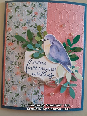
This one starts with a base of Misty Moonlight cardstock.  The layer of Flirty Flamingo cardstock measures 5 1/4" x 4".  The DSP print measures 2" x 5 1/4" and is attached near the left edge.  The bird is one of the Flight & Airy DSP sheets with all birds.  I fussy cut the entire sheet of birds and will continue to play with the individual birds adding them to cards as needed.  The fussy cutting was very easy as there wasn't very much detail.

The sentiment is from the Perennial Postage set.  It's stamped with Misty Moonlight ink onto a Basic White piece punched with the Heartfelt Hexagon Punch.

The leaves are all punched with the Bough Punch.  The green colors used are Garden Green, Soft Sea Foam, Shaded Spruce, Old Olive, and Lost Lagoon.  They are attached to the label with adhesive.  The label is attached to the card with Dimensionals.  The bird is added to this with Dimensionals also.  The gems are the Misty Moonlight color from the Tinsel Gems Three-Pack.

Next card starts with Boho Blue for the card base.  The layer is Misty Moonlight.  The DSP print is the same as the first and measures 5 1/4" x 2".  It's attached near the left edge.  

The focal point started with a label die-cut with the Perennial Postage set using Petal Pink.  It's attached flat with adhesive.  The same assortment of leaves is attached to the label with adhesive.  One of the birds from the collection was added over the leaves using Dimensionals.  

The sentiment is from Timeless Arrangements.   It's stamped with Misty Moonlight ink on a 1/2" wide strip of Basic White.  The Banner Pick A Punch was used to flag the ends.  It's attached with Dimensionals.  A double bow made from Linen Thread was tucked under the bird and is attached with a Mini Glue Dot.  The beautiful finish pieces are the pink pearls from the Blooming Pearls set. 


The next card in the series has a base of Flirty Flamingo cardstock.  The 2" strip of DSP is a different print than the others that I've used.  This is the back side of the blue print used in the next card.  It has a frame of Misty Moonlight cardstock surrounding it and attached with adhesive.  

A large circle was die-cut from Basic White cardstock.  It has a sentiment from the Perennial Postage set stamped with Misty Moonlight Ink.  The same collection of leaves was used with another bird attached with Dimensionals.  The circle was attached to the card with Dimensionals also.  

A double bow made from the Simply Elegant Trim was added to the sentiment area.  Three of the Misty Moonlight color gems from the Tinsel Gem Three-Pack were added to finish the card.

This is where my card designs changed, and I started adding the embossed background for added interest.  The card base on this one is Misty Moonlight.  The layer is Flirty Flamingo, and the DSP print is the blue background floral.  After attaching the DSP, the cardstock is embossed with the Softly Sophisticated Embossing Folder that is found in the Sale-a-bration brochure as a free combo item.  I love the delicate design it gives here!  Then it's attached to the folded card base.

The Heartfelt Hexagon Punch was used again, as was the Perennial Postage sentiment.  The same assortment of leaves were added to the sentiment.  The bird was attached to this with a Dimensional.  It's all attached to the card with Dimensionals.

A small double bow of Linen Thread was added under the sentiment with a Mini Glue Dot.  A trio of the new Iridescent Foil Gems was added to finish.

This card starts with a card base of Petal Pink.  It's embossed with the Timeworn Type Embossing Folder before adding any layers.  The 2" DSP is back to the pink floral.  It has a thin layer of Misty Moonlight cardstock behind is to frame it.

The large circle punch was used for the sentiment which is stamped with Misty Moonlight ink.  The same assortment of leaves was added.  It was attached to the card with Dimensionals, and a bird was added with Dimensionals also.  

A double bow of Linen Thread was added to the sentiment layer.  Three Iridescent Rhinestone Basic Jewels were added as an accent. 

The last card in this collection starts with Boho Blue cardstock for a base.  The layer is Calypso Coral this time with the 2" DSP layer attached to the left.  It's embossed with the Timeworn Type on both layers.  After embossing, they're attached to the card base with adhesive.  

The Perennial Postage dies were used to die-cut a Petal Pink label.  This is embossed with the 3D Basic cross-hatch embossing folder.  The assorted leaves are attached to this, then it's attached to the card front with Dimensionals.  The bird is added with Dimensionals..

The sentiment is from Timeless Arrangements and stamped with Boho Blue ink.  The ends are angle cut.  Then it's attached to the label with adhesive.

A double Linen Thread bow is added with a Mini Glue Dot.  Three Iridescent Rhinestone Basic Jewels were added to finish the card.

There you have six cards all made with the same basic layout and using most of the same pieces to assemble the cards.  What a pretty set of cards these turned out to be.  The different prints in the Flight & Airy Designer Series Paper pack are all gorgeous and easy to create with.  It was hard choosing what prints to work with.  I still have more ideas for cards using these items.  

I love how the mixture of different greens on the leaves add a lot of visual interest without taking away from the overall look.  I started making these cards with only Garden Green leaves, and it just didn't have the same appeal to me.  Once I planned to use more colors of leaves, I just punched a bunch of each color then picked through the stash to find what I wanted for each card.  So now I still have a stash of leaves and another of all the extra birds that I cut from that one sheet of DSP.  Ah, I see more cards in my future!  lol

Have fun creating your own cards with these ideas.  If you love this Flight & Airy DSP, place a $50 order so you can get the DSP for free.  It's only available through February 29th or until it's sold out, so don't delay on getting this.  It seems to be the most popular item in the Sale-a-bration brochure.

Happy stamping and creating,
Sharon

Friday, January 12, 2024

Lots of Beary Cute Cards

 Happy Friday to you.  What a week it's been with the heavy rains, high winds, and flooding going on around here.  Today it's supposed to start in on more of the same.  Wish we would have gotten a bit of this rain in the summer when it was so hot and dry.  Is there some way to gather up some of the rain and save it for future reference?  Hmm.  Something to think about.  Before the rains started today, I made a quick trip to the Post Office.  I had a stack of cards to mail to the shut-ins from church.  It was a large stack, so I figured I'd be better off taking them there rather than waiting for our mailman to take them all.  Even though the cards were designed in December and some of the items are now retired, I figured you might like to see the cards that were mailed for January.

I love the wintry look of the card.  It's a good  fit for January cards, right?  Let's walk through the steps to make this card.

I started with a card base of Gray Granite that measures 8 1/2" x 5 1/2".  It's scored and folded in half as usual.  The layer with the Aspen Trees is Basic White Thick cardstock.  It measures 4 1/8" x 5 3/8".  The die was laid in the center of this and run through my Big Shot.  I went through and back again to get a good cut on all the tree limbs.

The Balmy Blue print paper behind this is from A Walk in the Forest Designer Series Paper that was in the Winter Mini Catalog.  I liked how both this print and another snowflake print looked peeking through the trees.  This paper was cut at 4" x 5 1/4" so it's just a tiny bit smaller than the die-cut layer.  It's attached with adhesive at the edges and a few strategic places in the center of the die-cut.  Then it's attached to the card base with Dimensionals.

The bear is from the Beary Cute Bundle that wasn't carried over from the Winter Mini which is too bad in my opinion.  It was stamped with Basic Gray ink to give him a nice dark outline.  The scarf is from the same stamp set and was stamped with Balmy Blue ink.  It was punched out with the Bear Punch.

The sentiment is also from the set.  I love both the wording and the font used on this set.  (I'm hanging on to the set especially because of this sentiment.)  It's stamped in Gray Granite ink on a 1 1/2" x 1" strip of Basic White cardstock.

The bear is attached near the bottom with Dimensionals.  The sentiment is attached about the middle and on the left.  It's attached with Dimensionals also.

The added bling for these cards were three clear Rhinestone Basic Jewels.  I thought that they went well with the frosty feel of the card.

One last look at the stack of cards mailed out today.  It took a bit of time to assemble all of them.  I was thinking of you, Sue, when I was cleaning out all the bitty pieces in the trees.  I know you love your die-cuts, and so do I!

Sorry that most of today's card is using retired products.  But if you have the Beary Cute stamp set and punch, this gives you another idea on how to use it.  Thanks for stopping by to see what's being stamped today.  I need to get back to my new stamps and papers and get crafty!

Happy stamping and creating,
Sharon


Wednesday, January 10, 2024

Enduring Beauty Anniversary Card

Hello friends!  I'm so happy we made it through all the flooding that was going on in our area yesterday.  It was truly amazing how high our creek came up onto the yard and how swiftly the water was flowing.  To see large limbs just bobbing along in the water at such a quick pace gave me a real sense of the power of flood water.  Not something you want to be out in at all!  Thank God we have no damage here, but my daughter has some water seepage in their house that needs repairing.  Seeing how bright and sunny it is today, you'd never guess all this havoc was going on yesterday.  But on to the stamping portion of this report.  For today's card, I used the Enduring Beauty stamps and dies to create a lovely anniversary card.  Seems like there are a few anniversaries of family and friends that need cards this month, so I've been busy making them.

This is one of them.  To make this card, start with a card base of Lemon Lime Twist that measures 8 1/2" x 5 1/2", scored at 4 1/4" and folded in half. 

The front layer is Lemon Lolly that measures 5 3/8" x 4 1/8".  One of the Foursquare Decorative Masks (A.C. pg 136) was used with a Blending Brush to add the subtle background on this layer.  To hold the mask in place to the cardstock layer, a bit of Masking Paper (A.C. pg 151) was used.  Where it touched the cardstock, I made it less tacky by touching it to my jeans several times.  I used Lemon Lolly ink to keep the design unobtrusive.

After adding the inked background, the largest die in the Stitched with Whimsy set added the meandering stitched design into the layer for added interest.  

The large floral stamp from the Enduring Beauty set (2024 Jan - April Mini Cat. pg 38) was stamped onto Basic White cardstock using Memento Tuxedo Black ink.  Using ink pads and both large and small Blending Brushes, ink was added to the flowers and leaves.
Flowers:  Lemon Lolly and Daffodil Delight with a tiny touch of Calypso Coral
Leaves:  Lemon Lime Twist and Granny Apple Green
A Lemon Lime Twist Dark Blends was used to color in the stems a little to keep them connected.

Because I wanted a much looser look, I did not use the Masks for coloring that are made to coordinate with this set.  I'll have to give those a try next time around.

After coloring, the coordinating die was used to cut the image out.  There are also open leaf dies that I used to die-cut some additional leaves to fill out the design.  These are cut from Granny Apple Green and Garden Green cardstock.

The sentiment comes from an old, retired set.  I chose this old sentiment because I was looking for an anniversary sentiment that would fit the card.  It was stamped on a 1/2" wide strip of Basic White using Memento Tuxedo Black ink.  It's attached across a corner with adhesive.  Then the ends were trimmed to follow the edge of the layer.

The floral images were attached to the card front with Dimensionals.  The leaves were tucked in around the image and attached with adhesive.  Then the whole layer was attached to the Lemon Lime card front using adhesive.  

The inside of the card had to be pretty to match the front.  A layer of Basic White that measured 5" x 3 3/4" was cut.  It's stamped with another really old sentiment that fit what I wanted to say.  There's just a little of the Foursquare Mask that's used in the top corner to match the card front.

A small group of leaves from a Sale-a-bration set - Softly Sophisticated - were stamped on the bottom corner using Lemon Lime Twist ink.  The flowers from the same set were tucked in to finish the little bouquet.  Lemon Lolly ink was used for the flowers.

The white layer was attached to a Lemon Lolly layer that measures 5 1/4" x 4".  Then this was attached to the inside of the card.

One of the last touches for this card was the little bit of ribbon tucked under the flowers.  You have to look at the pictures closely to actually see this.  The ribbon is the Gold & Vanilla Ribbon (A.C. pg 144) that seems to be one of my go-to embellishments lately.  I only used about 2 1/2" of the ribbon for this little touch.  It's tucked under the flowers with a Mini Glue Dot holding it under there.

The very last touch is the bling, as usual.  What I chose are the Blooming Pearls that are a carryover from the Winter Mini Catalog (pg 53).  They're kind of easy to miss - I did.  But it's worth finding this embellishment and getting it.  These are so pretty with the spring colors and a golden pearlized finish on them.  I used the Garden Green colored pearls, and they blend with all the greens used on the card.  

That's it for this anniversary card.  One down, several more to go!  I hope you enjoyed seeing all the different pieces of this card come together.  Sometimes it seems to be the little things on a card that you almost miss that truly make it special.  Don't be afraid to use stamp sets and dies that are old and new together.  Sometimes the older sets have just the right sentiment or accent that you're looking for.  That's why I keep telling my hubby I can't get rid of anything.  You never know when you might need just that very item.  😉

Did you notice the Sale-a-bration item tucked in there too?  You've got until either February 28th or whenever the freebies are gone to choose whatever it is you've got your eye on.  From previous years, I want to caution that some of the favorite items have been gone a week or two before Sale-a-bration is done.  If you'd like to place an order with me, I'd appreciate it very much.  Please use the Host Code shown on the blog post to help out.  Everyone that orders always gets a card from me and sometimes there's a fun goodie tucked inside for you.  Thanks so much.

Happy stamping and creating,
Sharon

Monday, January 8, 2024

Softly Stippled Quick Card

Merry Monday to you!  What?  You don't think it's merry today?  When I start thinking about the wonderful items you can get free during Sale-a-bration, that definitely makes me feel merry.  Today's card is very simple and really showcases one the Sale-a-bration free DSP packs.  This one is called Softly Stippled and was made to coordinate with the Stipple Roses set found on page 64 in the new 2024 January-April Mini Catalog.  The prints and soft colors used on this DSP pack are really gorgeous and will make up into some lovely cards.  Today I'm pairing two of the prints along with some Pebbled Path cardstock to make this card.

Here's the project that I'm sharing today.  As you can see, it's pretty basic, but there are some fun changes that make it anything but boring.

To start, measure and cut a piece of Pebbled Path cardstock to 8 1/2" x 5 1/2".  Cut 1" from the front edge, and score at 4 1/4" to make the card base.  Save the cut off piece for later.

Cut a piece of the floral print to measure 5 1/2" x 3".  This will fit nicely on the front flap.  Attach it with adhesive.  

Cut a 5 1/2" x 3/4" piece from another print from the set.  I chose to use a Calypso Coral print with tone-on-tone roses.  So pretty!  Attach this to the inside back of the card so the print rans along the edge with about 1/8" of cardstock showing on the right edge.

Let's do some die-cutting now.  With that 1" strip that was cut from the card base, die-cut the 2nd smallest tag from the Tailor Made Tags die set.  The die will just barely fit on the strip, but it works fine.  Also cut some Basic White cardstock using the smallest die in the set.

Stamp the sentiment from the Darling Details stamp set found on page 68 in the Annual Catalog.  This is stamped with Pebbled Path ink.  The two tags are held together with a Calypso Coral bit of ribbon from several years ago.  It's been so long, I'm not even going to guess how old this ribbon is, but it worked great here.  

There is a Dimensional between the two tags to hold in the position that I wanted.  Then the Pebbled Path tag was attached with adhesive to the card front.  Be sure you keep the adhesive only on the part that attaches to the card front, not the over-hang.

There is a piece of Basic White that's cut to fit inside the card for stamping a sentiment or writing your own thoughts.  It measures 5 1/2" x 3".  It's attached with adhesive inside the card.  Cutting the cardstock and DSP to the dimensions I gave; you'll end up with a strip of the card base showing through the inside of the card looking like another stripe.
Last picture that shows the little brown sequins attached to the card front.  These are from the Neutrals Adhesive-backed Sequins found on page 141 in the Annua Catalog.  I like how these sequins play off both the Pebbled Path and Calypso Coral tones of the card depending on how the light is hitting them.  Perfect finish!

Hope you enjoyed this simple card sample.  It really showcases this lovely Softly Stippled DSP.  I love it when the Sale-a-bration freebies are so versatile and truly in my kind of color palette.  This DSP is one of the items you can choose to receive free when you place an order of $50 or more.  Make sure you check out the Sale-a-bration brochure to see all the other possibilities for you!  If you don't have a brochure yet, or the new 2024 January -April Mini Catalog, please contact me and I'd be happy to mail one out to you.

Happy stamping and creating,
Sharon

Saturday, January 6, 2024

Thoughtful Moments Duo

Hello my friends.  Hope you're staying dry on this chilly and wet Saturday.  We've gotten a good downpour that started last night and is finally easing off.  Then we're supposed to get another 2-3 inches of rain on Tuesday.  Whew - maybe we should look into getting that boat we've joked about.  Being on a hill sure gives me a feeling of security though.  With all the rain, I didn't go anywhere yesterday except down to my craft room.  I thought it was time to try out the Thoughtful Moments Hybrid Embossing Folder and Die set.  It's one of the new items in the 2024 January - April Mini Catalog that you can order from now.  It intrigued me and now it was time to give it a whirl.  I've learned a few things by playing with it and thought it'd be a good idea to share these findings with you.  So here goes.

Here is an image of the embossing folder opened up showing how the die fits inside the folder.  Let me give you some pointers here.  First off, I wanted to see how the embossing folder worked my itself, so I embossed a piece of white cardstock.  As far as I was concerned, it was pretty disappointing.  Next, I tried to emboss and die-cut together.  I used a blue cardstock for this.  The words were embossed, but it was quite hard to tell what the words actually were.
The last try was adding Night of Navy ink on the side of the embossing folder that has the SU! logo showing through.  The brayer worked quite well, and I didn't get ink all over the place where I didn't want it.  Then the die was placed inside the embossing folder.  It sort of 'clicks' into place.  And lastly a 6" x 6" Balmy Blue cardstock piece was placed inside the embossing folder.  It was shut and run through the embossing machine.  Here's what I got this time.  I love the fine lines of ink outlining the embossed lettering.  It really worked out very nicely.  Now that I had these pieces made, they needed a card to accent.  Right?

Oh, by the way, it's so easy to clean the embossing folder after inking it up.  Just hold it under running water in your sink, then dry it off with a soft cloth.  Easy peasy.  Make sure it's fully dry before using it again with a different color.

I was surprised I didn't have much in the way of DSP choices to match the sentiments I just made.  I ended up choosing this daisy print from the Fresh As A Daisy Designer Series Paper.  It doesn't quite match, but I thought it worked out well enough.  The strip of DSP measures 3" x 5 1/2".  I chose a piece of Azure Afternoon cardstock to frame it on the card.  This measures 3 1/4" x 5 1/2".  They are attached with adhesive, then attached to a folded Basic White cardstock base.
The Double Oval Punch was used to make a scalloped oval in Azure Afternoon cardstock.  I thought the sentiment would show up on this fine, but it wasn't quite dark enough as a contrast.  I tried the Copper Clay that matched the daisy centers but didn't like that.  Instead, I added a Night of Navy smaller oval using the same punch.  I really wish I'd used Basic White for making the sentiments instead of Balmy Blue which wanted to fight with almost everything I put with it.  Oh well, it's done now.  

Some white sequins from the Adhesive-backed Sequins Trio were added for a little bling.  These are found in the Annual Catalog.  For some reason I'm really gravitating towards the sequins lately.  They're a nice addition, but don't add a lot of height to the card for mailing ease.

At this point, I had another piece of the DSP lying on my table and all those other sentiments, so here we go with another one.

The daisy print is cut to 3" x 5".  A piece of Azure Afternoon was cut to measure 5 1/4" x 4".  To add interest to this layer, it was embossed with the Sale-a-bration freebie Softly Sophisticated Bundle.  I absolutely love this embossing folder!  It has a delicate dotted design that's a perfect backdrop when you want something subtle and interesting.  This was attached to the folded Basic White cardstock base with adhesive. Then the daisy print was attached to the center of this.  

One of the Countryside Corners Dies was used to die-cut a piece of Vellum Cardstock that was a little bigger than the sentiment.  The Hello was attached to the vellum with Mini Dimensionals.  Then use more Mini Dimensionals under the vellum where they're hidden behind the sentiment.  This means both the vellum and the sentiment are raised up from the card to highlight them.

Three of the brown sequins from the Neutrals Adhesive-backed Sequins found in the Annual Catalog were added as an accent.  They matched nicely with the centers of the daisies.

Hope you enjoyed this mini lesson on using the Thoughtful Moments Hybrid Embossing Folder and Die set and want to give it a try.  It really is interesting to work with and gives you another dimension when creating your cards.  Just for your information, if you purchase the Thoughtful Moments Hybrid set and the brayer to go along with it, that makes you eligible to receive one of the Sale-a-bration free items!  And if you order this from me, you'll get two punch points towards $15 off an order.  Just saying...  Sale-a-bration goes from January 4 - February 28.  Don't put off taking advantage of these freebies while they last!

Happy stamping and creating,
Sharon

Tuesday, January 2, 2024

Fluffy Honey Bear

Hello again.  Glad you're back for another dose of creative inspiration.  Today I played with the Fluffiest Friends stamp and die set that are Online Exclusive items in the Stampin' Up! store.  I think all of the littler critters are adorable, but I needed to play with the cute bear first.  He looks like he's really enjoying his pot of honey and I don't blame him.  

Isn't he just the cutest little guy?  I think so.  Yes, I think he looks like a guy, don't you?  If you'd like to make this adorable card, stick around and you'll have all the information you need. 

This card started with a piece of the Fresh As A Daisy Designer Series Paper that can be found in the Annual Catalog.  I had some smallish, odd shapes left from other projects and thought this background of daisies peeking through the opening would work to compliment the bear.  The piece was about 4" x 4".  Lemon Lolly cardstock was chosen to coordinate with this DSP and give a backdrop for the bear.  It measures 5 1/4" x 4".  The domed opening is part of the Fluffiest Friends die set.  It cut the Lemon Lolly cardstock about 3/4" from the bottom of the piece.  

After die-cutting, The Painted Texture 3D Embossing Folder added some detail to the background without being too busy.  Next the piece of daisy print DSP was attached behind the opening using "green glue" near the edges of the cut area.  These layers were then added to a folded Garden Green card base that measures 8 1/2" x 5 1/2".  Dimensionals were used to give this layer a little more definition.

The bear was stamped onto Basic White cardstock using Memento Tuxedo Black ink.  The tiny bees were also stamped on a scrap of white.  The bear was colored with Blends:  bear - Wild Wheat Light & Dark, honey - Daffodil Delight Light, honey pot - Copper Clay Light & Dark, bee bodies - Daffodil Delight Light.  After coloring the bear, it was die-cut, but the bees needed to be fussy cut.  At this time some extra die-cutting was done on a branch from Early Espresso, two styles of leaves from Garden Green and Old Olive, three sections of grass from Garden Green, and a beehive from Crushed Curry. 

The branch was added to the card front along with a bunch of leaves to fill in.  The beehive needed a little work on it before hanging on the tree branch.  A small Blending Brush was used with Wild Wheat ink to color the edges and give it some shape.  A Wild Wheat Blender Pen added the hole for the doorway.  Then it was attached to the branch with a Dimensional.

The bear was attached with adhesive.  He's slightly tucked under the bottom of the opening.  The three sections of grass were laid out across the opening then attached with adhesive.

I debated about adding bling onto this card but decided against it.  Instead of using any bling, just the itty-bitty bees were added.  Each of them has a rolled up Mini Glue Dot that attaches it.  Rolling the Mini Glue Dot gives it more height but is still tiny enough that it doesn't show out from the edges so it's the perfect solution.

There you have it, my friend.  The very first adorable honey bear card this year.  Since he is so darn cute, I'm sure there will be more times that he makes an appearance on this blog.  Watch for him to show up again and maybe bring along his other fluffy friends.  

Thanks for visiting my blog today.  It's just about time for ordering from the new 2024 Jan - April Mini Catalog.  Hope you're excited about that.  If you do plan on ordering, please consider using the Host Code shown at the top if your order is under $150 (you get hostess benefits for those orders!).  I'm still keeping track of points for my punch cards.  For every $25 ordered you get one punch.  After 12 punches you earn $15 off your order from me.

Now that Sale-a-bration will be starting January 4th, there's even more reason to shop!  Who doesn't want free merchandise with orders of $50 or more?   If you don't have either the Mini Catalog or Sale-a-bration brochure, get in touch and I'd be happy to send you one.  

Happy stamping and creating,
Sharon