Friday, April 30, 2021

More Ice Cream Please!

 Today I get to show you a card made for the birthday for one of my grandsons.  He does like him some ice cream.  mmm,mmm  In fact we just went out and got some at the Bruster's Ice Cream shop just down the street from us.  So this is what I thought would be perfect for his birthday this year.  For the last several years, I've always made him a card that was baseball themed.  Thought it was time to do something a little different.

He loves birthday cake ice cream and this was about the closest I could come to that.  Doesn't it look yummy?  He sure seemed to think so and decided we really needed to get some of the real stuff!  Ha ha, what a push-over this grandma is!  ;)

The entire Ice Cream Corner Suite was perfect to make this ice cream cone card a yummy looking reality.  I started with a base of Basic White cardstock cut at 5 1/2" x 8 1/2" folded in half.  The next layer was Bermuda Bay cut at 5" x 3 3/4".  This was attached with MultiPurpose Liquid Glue.  

Next I added a small layer of the cute Ice Cream Corner Designer Series Paper.  This print is a multi-color mixture of sprinkles for his ice cream.  (Of course he needed extra sprinkles on his ice cream when we got home - you can never have enough sprinkles!)  I thought this was perfect for a corner of the card and was cut about 3" x 2".  Again this was layered flat with adhesive.

Next up is the layer of Basic White cardstock that was embossed with stitching lines from the Stitched with Whimsy dies.  After the stitching part was done, I carefully trimmed around the square with paper snips to follow the stitching lines.  The sentiment comes from the A Grand Kid.  It has funny and cute sentiments for either grandsons or granddaughters.  This was stamped on the stitched label using Bermuda Bay ink.  It was attached to the card front using Dimensionals towards the top left corner.

Oh boy, time for the ice cream cone!  I used Bumblebee cardstock and stamped with Soft Suede ink.  Then the cone was also sponged around the edges with a Sponge Dauber and Soft Suede ink.  When it came to the ice cream itself, it was a no-brainer.  Two of the Ice Cream Corner DSP papers have splotches of colors - blues and greens on one and yellows, peachy-pinks on the other.  Since his favorite color has been green his entire life, I had to use something with that.  And his favorite ice cream being Birthday Cake which has swirls of blue frosting throughout, I chose the color mix of Granny Apple Green and Bermuda Bay.  How could I miss with that color choice?  Both the cone and the ice cream were punched out with the Ice Cream Cone Builder Punch.  Easy peasy.  They were added to the card front using Dimensionals.  

To finish off his card, I added a small sprinkle of the Ice Cream Cone Sprinkles that were part of the Ice Cream Corner Suite.  That was it - perfect for a boy who was turning 9.  Oops, I almost forgot!  Had to tuck some cash inside for my kiddo.  It's always nice to have a little spending cash on hand.  ;)

That's it for today!  If you'd like to place an order, please choose me as your demonstrator.  I'd greatly appreciate that!  And I do appreciate that you've taken time out of your busy day to stop here and read my ramblings.  It really makes me feel more connected to my friends.  Be sure to leave a comment.  I read each one and thank you for them.  But please let me know who is leaving the message?!  Just leave your name so I know you've been here.  Thanks!!

Sending sunshine blessings and hugs your way!
Sharon

Thursday, April 29, 2021

Tri-Fold Magnolia Card

 Hi there!  Hope you're having a great day.  I have something so pretty to share with you today.  It's using more of my retiring products that I'll miss creating with on a regular basis.  But even if you don't use the Good Morning Magnolia stamp and coordinating dies to make a card like this, the idea is totally awesome!    It's a tri-fold card that makes excellent use of the lovely prints of the Stampin'Up! Designer Series Papers.  I usually struggle with which side of the papers I want to use first, because they are both so nice.  On this card, you'll see how both sides are highlighted and shown off to their very best.

Here's what I was playing with.  Unfortunately the Good Morning Magnolia stamp and Magnolia Memory dies are on the retired list and won't be available after May 3rd.  Boo hoo.  I love the bold images and the 'scripty' font  and sentiments.  Those sentiments are really going to be missed by me.  I love the more general sentiments that can be used for many different occasions, and these have worked well for me. 

I was wandering around Pinterest and found this tri-fold card idea and was totally hooked.  I knew it was something I needed to share with you.  From one piece of DSP you can make two of the same style of cards, or only use half of it and save the rest for something else.  Your call...  Then with another of the print sheets, you can die-cut all those lovely magnolia flowers using the die from the set that either cuts a stamped image or the DSP image.  I think I got carried away with the die-cutting and actually cut the flowers from the whole sheet!  I didn't actually count how many I got, but it was definitely over 20 of them.  So now I've got a pile of them to play with.  Better get motivated!

Here you can see the cards a little better.  Aren't the prints just gorgeous?  I think they really make the card stand out.  To start you need one sheet of DSP that has prints on each side that go well together.  For myself, I thought the floral and stripes coordinated nicely so that's what I started with.  Cut it at 5 1/4" x 12".  Either cut the 2nd half at the same time to do two right away, or put the rest away for future reference.  Next step is to score this at 4" and again at 8" to make a tri-fold.  I kept the florals on the outside and the more subtle prints for the inside.

For the pink card, I cut a piece of Petal Pink cardstock to 4 1/4" x 5 1/2" for the card base.  The folded DSP was attached to this with MultiPurpose Liquid Glue.  This gives you the base of the card to work with.

The next step was deciding the front focal point.  I decided to work with the Rectangle Stitched Framelits dies.  I cut a piece of Petal Pink using the 5th largest die, and then cut a Basic White layer from the next smaller die down from that.  I love the extra interest the stitching gives to the card.  It's very subtle, but it's there.  I knew I was using the sentiments from the set, so that was easy.  It was stamped with Memento Tuxedo Black, then the little magnolia blossom was added to the corner edge.  I decided I wanted everything layered flat on the card.  Yeah, can you believe it - no Dimensionals?!  But to me it looked better that way.  So adhesive attaching the Basic White to the Petal Pink and again to the card front.  I did add a few Genial Gems that will be coming in the new catalog that goes live on May 4th.  They are so pretty and sparkly.  Half have a peachy-pinky color and the other half of the package are a green tint.  Just gorgeous!

When you open the card, the first flap gives you a view of the backside of the DSP and you can see how striking the prints are together.  I thought about adding a sentiment in here, but decided against it.  You could easily add another piece of Basic White with a sentiment to this layer.  Just keep it flat unless this will be a hand-delivered card.  The Post Office seems to be getting quite excessively picky about bulky cards.  Anyway, I thought this looked pretty just like this without any added anything!


Here's the 2nd flap opened.  Doesn't it look totally different from the front?  I love the contrast from striking floral to the very soft pink and white stripes.  

I did add another layer of Basic White in here.  It was die-cut with the 3rd largest die from the set and has the same stitching.  The sentiment was again from the Good Morning Magnolia set and stamped with the Tuxedo Black ink.  To add some interest here, I stamped the little magnolia flower using Petal Pink to the corner for a soft touch.

Now, am I right?  Isn't this a fun fold to try on the card?  It really showcases the lovely prints and gives such a feminine look to this card.  But the ideas are mind-boggling!  I'm imagining so many other DSP prints that would be really showcased doing a card like this! Something very masculine and outdoorsy, or one very kid oriented. Oh the amazing possibilities! 

If you'd like to watch the video from Bronwen Stewart, here's the video address.  (314) Mystery Card - Creative Online Retreat - Trifold Card using Stampin' Up Flower and Field DSP. - YouTube  She used a different DSP and her card is just adorable.  Give it a check.

Thanks for making the time to stop by today to check out what I've been up to.  Hope this idea gets your creative juices going full tilt.  It sure got me hooked!  Have fun stamping, creating, and sharing  beautiful things.  It makes the world a much nicer place to be.

Blessings and many hugs,
Sharon


Sunday, April 25, 2021

A Little New, A Little Old

 I've been making cards lately using some of retiring stamps, dies, and other goodies.  Today's card is a little old and a little new.  Kind of schizophrenic in a way.  I wanted to use the Ornate Borders dies again.  I think they're so pretty and feminine and just can't get enough of them.  But what to pair them with?  I had received my new Hand-Penned Designer Series Paper and it was sitting out on the table (because it was too pretty to put away - I just wanted to admire it!)  So why not use it for this card?  I've been so good not using all my new stuff right away and causing you to get frustrated because you can't get it yet.  Unless you want to sign up as a demonstrator - then you could get it in your kit.  Talk to me if you're interested.   Anyway, today was the day it was coming out to play.

Here's the card I made and I'm so happy with the terrific mix of retiring products and totally new ones.  Can you find the different ones?  Ok, I'll help you out here.  They'll be marked with R or N.

The card starts with a Misty Moonlight(R) base cut at 4 1/4" x 11".  This ended up being a side-fold card though instead of a top-fold.  Just a little different.
The pretty print is from the Hand-Penned Designer Series Paper(N).  Isn't it lovely?  It's so delicate and the colors are all pastels so it's my favorite right there!  I used the openwork rose border die from the Ornate Borders Dies(R) on this to compliment the floral print and really stand out from the Misty Moonlight background.
Before I attached it to the card base, I added two strips of the Seaside Spray Metallic Ribbon(R) that is also retiring.  It was perfect to add a little contrast and also a little subtle bling to the card.  I attached these to the backside of the DSP with adhesive then attached the whole thing to the card base.  Then it was time for the fun to really begin!

I knew I wanted to add little added flowers to the card around the sentiment, but I needed to figure out the sentiment first.  After looking at lots of stamps, I chose to use one of the sentiments in the Best Year stamp set.  I thought the font on this went nicely with the pretty DSP print.   I stamped on Basic White using Misty Moonlight ink and cut it out with the Rectangle Stitched Dies.  This is not retiring and for that I'm very grateful!  Then on to the little accent flowers.  For this, I chose the Wreath Builder Dies(R).  Just a little side note here - if you don't own the Arrange A Wreath and Wreath Builder Dies, you don't know what you're missing out on.  Either together or separately, these two items are definitely must haves in my humble opinion.  I've used each of them so many times I've practically worn them out.  But I still love them both and tend to grab them to use on so many projects I make.

For the flower colors, I used Purple Posy(R), Fresh Freesia(N), and Seaside Spray(R).  I thought they all played nicely together, so on the bling.  For the larger flowers in the purple-y shades, I used the new 2021-2023 InColor Jewels(N).  These are extra sparkly and simply gorgeous.  For the Seaside Spray tiny flowers, I used the tiniest sequins from the Woven Threads Sequins set(R).  These were attached with a tiny dot of the MultiPurpose Liquid Glue and my Take a Pick Tool to place them properly.

Lastly was the inside of the card to finish.  I carried the pretty Hand-Penned Designer Series Paper inside with a strip to the left side.  I used a different border die from the same die set to cut the lacy border.  The words were from the Best Year stamp set to coordinate with the card front.  They were also stamped with Misty Moonlight ink.

Ok, that's my slightly schizo card.  It really couldn't decide if it was a sneak peak or a goodbye to old friends type of card.  But I love how all the colors meshed together so well.  That's one of the things I love about Stampin'Up!  I'm really into 'matchy-matchy' stuff.  And even though some of these colors are old and retiring and some are new and up-to-the-minute, they still love to hang out and play together.  That's what this is all about.  Taking what you have and bringing in new and fresh ideas and making them all work together to make something that is pleasing to you.  Have fun playing with your old friends, but don't be afraid to make some new friends that you'll love just as well!

That's it for today.  I'm happy the sun is out and making my world bright again.  Yesterday was so dark and rainy that I just had a hard time creating and got into a funk. Just ask my hubby!  *grins*   But the sun is out today and so is the creativity.  Enjoy your day and make the most of it!  

Happy Sunday!
Sharon


Friday, April 23, 2021

Friendly Challenge

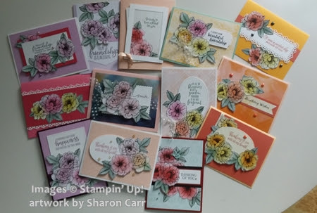
 I was talking to a friend on Monday.  She set up a challenge for me to see what I would/could do with it.  And was it ever a doozy.  At least I thought it was.  She asked me to take one of the sheets of True Love Designer Series Paper and get out my Blending Brushes and see what happened.  She gave me a list of rules to follow.  1.  I couldn't use just one ink color on the paper.  2.  I had to use lots of different layouts for the cards, couldn't keep repeating the same idea.  3.  I had to use multiple types of embellishments throughout the cards.  4.  See how many cards I could actually make from only one sheet of DSP.  5.  Use multiple cardstock colors for the card bases.  OK, it's taken me 4 days with many, many starts and stops, but I think I've done pretty good on the challenge.  Here's what I've made...

This was the starting place.  I used all sorts of colors, current and even several from the new catalog.  Oh yeah, that pretty soft plummy color and the pinky/rosy color are both new.  Can't wait for you to see them up close and personal like.  

Next I'll just post the cards I made.  There's 13 in case you're wondering.  Throughout making them I used lots of different cardstocks and also stamp sets for the sentiments on the cards.  I changed up the different dies that I used for them also.  All in all, it was a really fun challenge that really stretched me to come up with different ideas but using the flowers on each one in different ways if possible.  Here goes...


As you can see, there are many different colors, even added some different Designer Papers for the background layers.  There are different sentiments, different embelllishments, and different layouts.  I think I nailed this challenge!  Woo Hoo!  And it only took me almost 4 complete days to do it too!  Do I still like the True Love DSP?  Yes ma'am.  Do I still like my Blending Brushes?  You bet I do!  Can't wait for the next time I need to add some color.  They are truly one of the better tools out there for coloring.  And not just coloring an outline image.  They're great for filling in backgrounds with one color or giving a lovely sunset or ombre look to your background.  It's a really versatile way to color.

Ok, have I totally put you in overload status with all these cards?  I hope you give this challenge a try yourself.  It's really fun and you end up with lots of cards that are ready for you to use right away.  And that's always a good thing.  *big grin*

Just an update - I checked my calendar and there's only 11 more days until the new Stampin'Up! 2021-2022 Annual Catalog is live!  Woo Hoo!  Hope you'll enjoy shopping in it as much as I will.  Lots of new stamps and goodies for you to love and enjoy usingTime for me to say goodnight.  It's been a long day and a long week too.

Happy stamping and keep smiling!
Sharon

ps - the very first card shown uses the new Fresh Freesia and Polished Pink colors.  Aren't they just lovely colors?  And all of the leaves were colored with the new Soft Succulents ink.  Love it!

Wednesday, April 21, 2021

Friendly Seashells Double Z-Fold Card

Boy it's been a crazy few days around here.  We've had no decent internet connection since Saturday evening.  Every once in awhile it would reconnect, but then 5 minutes later it would be out again. You don't realize how many times you want to check something on the internet, but there is none!  It was a real wake-up call that maybe I spend too much time checking on the Stampin'Up! website or Pinterest and other such places.  I'll have to rein that in and be more productive I guess.  

I've had a few things I wanted to share with you, so I better get going here.  My card today is so pretty and right on the mark with some warmer weather and thinking ahead to beach time.  The stamp set Friends are Like Seashells and the Seaside Dies that match are still going to be in the up-coming Annual Catalog that will go live on May 4th.  I'm so happy they will be returning.  I haven't done nearly enough with these beach themed products.  Just now gearing up for those summery cards I'll need.  But if you love the Sand & Sea Designer Series Paper like I do, better hop on it now while it's still available.  It will not be in the next catalog.  Stock up now while you can.  As you can see, this card takes advantage of one of the pretty prints.  The layer in front uses the back-side of the pastel sea urchin print that is used on the tall middle layer.

Ok, let's get to the nuts and bolts of the card so you can make one too.
The card starts with a base of Thick Basic White cardstock cut to 4 1/4" x 11".  This is scored at the 5 1/2" mark and folded in half.  

The next layer is Seaside Spray cut to 4" x 10 1/2".  This was scored at 2 3/8" and 5 1/4".   It was then attached to the folded Thick Basic White cardstock base using adhesive leaving the scored half free.  Fold this up and then down to end up with a small 'mountain' in front.   

The next item up was cutting the pieces of Sand & Sea DSP.  I cut a strip of paper at 3 3/4" wide.  This was trimmed at 5" to fit the longer middle section of the card.  The next piece was cut at 2 1/8" and attached to the front section with adhesive.

Next come all the pretty shells and the sentiment.  The dies for the 2 sentiment layers are from the Painted Labels Dies.  They have nice clean lines with a tailored looking border that is embossed while cutting.  The first layer is Seaside Spray cut with the larger die.  The next is Crumb Cake cut with the smaller die. I stamped the sentiment (from the Friends are Like Seashells set) using Soft Suede ink before die-cutting.  They are attached together using Dimensionals.

On to the seashells, and the sand dollar too!  These were all stamped onto Basic White cardstock using Crumb Cake ink.  Then an extra layer of ink was added by using either Flirty Flamingo or Seaside Spray inks and the 'scribbly' stamps that coordinate in size to the shells.  Once I used the ink full strength, the other two times I off-stamped first to give a lighter, less intense color.  All of these were then die-cut.  When I had all the pieces ready to go, it was just a matter of playing around to see how I liked the layout.  The sand dollar and two of the shells were attached directly to the Seaside Spray die-cut layer using adhesive.  The last shell was attached to the sentiment layer with a Mini Dimensional off to the side to keep it held up from the rest.  A double bow of Linen Thread was attached to the side with a Mini Glue Dot.  Lastly I added several Pearls Basic Jewels because we're talking underwater here!
I didn't want to neglect the inside, but wanted it to be different than the front.  I die-cut another Crumb Cake label like the front and stamped on a different sentiment from the Friends are Like Seashells stamp set.

To continue the seaside effect, I ripped a piece of Crumb Cake cardstock that was 4 1/4" by 2 1/2" to give the look of a sandy beach.  Then I stamped the speckles stamp several times over this using Crumb Cake ink.

I had originally die-cut a Seaside Spray starfish, but didn't like it on the card front.  When I tried it here, it just seemed to work.  So that's where it landed.  Hope you like this card idea.  It was fun doing a different fold for a change.   I admit I have my favorite card layouts that I keep going back to all the time.  But we have to keep trying new things so we don't get stuck in a rut.  And this was a fun change of pace for me.

Happy stamping and hope you will have some lovely beach weather in the near future!
Sharon


Saturday, April 17, 2021

Blossoms in Bloom Birthday Card

I was in for a surprise when I was finished making my card to share with you today.  Guess my memory isn't as good as I think it is!  ;)  I thought The Blossoms in Bloom set was being retired, but I was in for a wonderful surprise when I checked in the new 2021-2022 Annual Stampin'Up! catalog just to be sure.  It's still in there!  Hooray!  I love the big bold blossoms that are all on one large stamp.  It's so easy to stamp it just once or even more times if you want to cover a full sheet of cardstock and make your own background paper.  I thought of doing that for the card today, but I had planned on only using a skinny layer so really didn't need to have so much left over.  Maybe we'll just save that idea for another day.  

I've been playing catch up with some birthday cards the last couple of weeks.  And yes, this is another one that is going to be rather late.  (That just means the birthday celebration can go on for the rest of the month, right?)  Anyway, I thought this bold and bright card fit this occasion perfectly.  So let's get to it...

The card all started with the Blossoms in Bloom stamp.  I wanted it to fill the card front and just shout out "Happy Birthday"!  So I started by stamping the blossoms on a quarter sheet of Basic White cardstock using the Highland Heather ink pad.  I had an idea of working in mostly black and white along with the Highland Heather, so I stamped the flower centers with the multi-dot stamp and Memento Tuxedo Black ink.  I added some Mint Macaron leaves to fill it out a little.  Then I trimmed it down to 3" x 5".  

It still needed just a bit of contrast, so I stamped the tiny filler flower from the same set with Mango Melody ink.  Some flowers were stamped full strength, some were 2nd generation stamping to give even more contrast.   As you can see, I think the yellow-orangy vs purple contrast worked well together.
 
At that point I went looking for a black layer to use.  The Basic Black cardstock didn't strike me as just what it needed.  Then I remembered the True Love Designer Paper that was all black and white prints.  Oh perfect!  Unfortunately, that lovely designer paper is being retired.  Maybe it's time to get another pack for my stamping needs before it's all gone.  I just love the black and white prints that can be so versatile!  Anyway...  I found the print that I wanted to use.  Because I wanted a good amount of both the print and Highland Heather cardstock to show, I cut the DSP to 3 3/4" x 5 1/4".  This way it kept the card tall and sleek looking.

I added a small strip of Basic White stamped with the sentiment (from the same set).  This was stamped with Gorgeous Grape ink so it would be a little darker than the flowers behind it.  The ends were trimmed with the Banners Pick A Punch.  Then a tiny 1/4" strip of Basic Black was placed behind this and also trimmed on the ends with the same punch.  A few Pastel Pearls were added for a light touch of bling.

On to the inside of the card...  I like to bring the front of the card around to the inside by stamping something coordinating in the corner.  I think it makes a special statement seeing the extra bit of care added to the inside of the card.  This time I stamped some of the smaller flowers in the Blossom in Bloom set.  The same colors were brought inside with Highland Heather and Mango Melody for the flowers and Mint Macaron for a few leaves. 

There was a 3/8" strip of the DSP print that had been trimmed off just sitting on my desk telling me it didn't want to be thrown out, so it was added along the right side of the Basic White layer.  It was a nice finishing touch to the inside.  

Instead of stamping a sentiment inside, I'll just be writing out my thoughts for my friend.  So the card is finished and in a few more minutes it'll be ready for the mail.  

Oops, the mailman was already here today.  So that means it's not going out until Monday.  *sigh*  Guess that's going to make these birthday wishes a couple more days late.  I hope she'll be understanding and know that my best wishes are with her, not just on her birthday, but every day!

Just a small reminder - if you'd like to place an order yet this month it would be very appreciated.  Please use the Host Code for April so I can send you a little goodie as a thank you.  

Please keep an eye on the retiring list.  So many items are discounted and that's always nice.  But that means they also sell out quickly.  Don't want you to miss out on any items you really need or want.

Thanks for stopping by to check out what's going on here.  Hope you'll leave a comment.  I love hearing from you!

Keep stamping and making the world a nicer place one card at a time!
Sharon

Friday, April 16, 2021

Friendship Friday

 I've been receiving such lovely cards from my friends and have been enjoying them immensely.  Then I had one of those special 'ah hah' moments!  Maybe you'd all like to see the gorgeous cards that have been filling my mailbox.  So that's my plan for one Friday a month now.  If I receive any cards in the preceding weeks, I'll share them here if I have permission from the ladies that made them.  Now I want to be sure you realize that not all the products shown on these cards will be from Stampin'Up!  Many of you have your own private stash of goodies that you love to use.  And that's all right by me.  I'd still like to share your creations with everybody else so they can see what you've sent to me.  I really miss our Sunday show and tell after Bible Class at church.  It was always so inspiring to see what my friends had made during the past week.  I think it inspired us all to go and create more!!  So that's my thoughts for this new endeavor.  I'll only post a name with the card (if that's approved), but not list any products used.  Most times you can tell what stamps are used anyway!  ;)

created by Jean Mazurek
created by Kathy Hintz


created by Judy Bur


created by Phyllis Unthank


created by Sue Fabris


created by Barb Eisenman


created by Jan Hollmann


created by Diane Wallace


created by Shirley Krone


created by Susan Wolan


created by Connie Juengel


Hope you enjoyed this gallery of cards.  Even though they were all Easter cards, each of them are as interesting, varied, and fun as the ladies that created them.  Please leave me a comment about this card gallery.  Do you like seeing what other people are creating?  Was it too much?  Or did you like this as a change of pace?  Should I do this again?  If so, send me your lovely creations so I can share them with everyone else.  

Love you ladies so much!  This is a small way I can keep in touch and show you how much I care.  We are loving it being here close to our daughter's family - especially our grandsons!  But I miss my friends more than I can express.  Receiving a card from you brightens my day so much!!

Many Hugs and  God's Blessings on you - 

Sharon