Wednesday, August 31, 2022

Two Versions of a New Fun Fold Idea

 Good Morning!  It's always fun to get two for the price of one, isn't it?  Well today, I have two totally different looking versions of the same fun fold for you.  They both use the Rings of Love Designer Series Paper that I think most of you might own since it's free during Sale-a-Bration.  And if it's free, you might as well get it and use it.  Right?  Since today is August 31st, it's the very last day of Sale-a-Bration.  With that said, we needed to use something from Sale-a-Bration to celebrate the past two months.  So here we go...

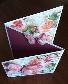
This is a terrific way to showcase two sides of DSP that you really like and don't want to hide one of the sides.  Come on, I know there are prints in those DSP packs that you really don't care for, so you use only the 'good' side.  Well, on this one, I liked both sides and thought they would play nice together.  And all the bits and the tree ring on the top layer are all fussy cut from a piece of that same DSP.  So I guess I couldn't go wrong here!

To start, you need two pieces of cardstock that measure 5 1/2" x 4 1/4".  That means one half sheet of cardstock, cut in half.  One of those pieces need to be scored at 2 3/4" and folded in half.  For this card, I used Soft Suede for these.  Next you need one piece of DSP that measures 5 1/2" x 5 1/2".  This needs to be scored at 1 3/4" making sure any directional print is going up and down.  Lastly, you need two pieces of Basic White that measure 2 1/2" x 4" - one to go on the front and one for inside to write your sentiments.

After scoring the DSP, attach it to one of the Soft Suede layers lining up the top and bottom.  You should have a 1/4" border on each side.  For this card, I embossed one of the white layers with the Tree Rings Embossing Folder.  Afterwards I very lightly brushed on Crumb Cake and touches of Soft Suede ink with a Blending Brush.  This really did emphasize the embossing nicely without being way too busy looking.  This is attached to the folded Soft Suede layer making sure the fold in on the RIGHT side!  The other white layer is attached inside this mini card.

With all the fussy cut pieces I had done from a corner of the DSP, I chose a tree ring from one side of the paper, and some mushrooms, a berry sprig and butterfly from the other side to enhance the front of the card. The tree ring was added on flat with adhesive, while the other pieces all used Dimensionals to attach them.

The sentiment is from the Charming Sentiments Bundle.  It's stamped with Evening Evergreen ink onto Basic White cardstock.  Then it's die-cut with the coordinating die in the bundle.  This is a great sentiment set as there are so many to choose from.  Plus each of the sentiments has it's own die to match.  If you like the look of sentiments cut out like this, but could never get it cut just right, this bundle is definitely for you!  Here it's popped up on Dimensionals on top of the tree ring.

To attach the sentiment layers, you need to attach the backside to the inside layer.  Again, make sure the fold is on the RIGHT side.  Use adhesive to attach in the center of the card as shown.

To close, fold in the flap on the left, then the top flap from the right.  That gives you the two folds and shows both of the Designer Paper prints.  It's easy to do but fun.  Plus it folds up nice and flat for mailing.  Yay!


You know me, if I try something new, I usually have to make another one right away, so I don't forget what I did.  LOL  Of course, you never have problems like that.  Anyway,  I thought I'd use another of the Tree Rings DSP prints and change things up a little.  Boy did I ever!  I chose to use Poppy Parade cardstock as it was one of the colors listed to match with the paper.  I knew I didn't want to do another floral design because that's always what I do.  So...  Here we are with a cute little ladybug instead!
I think she turned out pretty dog-gone cute.  Mint Macaron was the greenish-color in the plaid so I carried that through to the large leaf.  The little ladybug is punched from both Basic Black and Poppy Parade cardstocks.  The black wing-dots were stamped with Memento Tuxedo Black ink.  She is attached to the card front with Dimentionals, with added Dimensionals under her wings to help her take off and fly.  As an added bonus, she has eight Classic Matte Dots added to her wings for some bling.  She insisted it didn't make her wings too heavy to fly.

The sentiment came from the Nature's Prints stamp set.  It's been stamped with Night of Navy ink.

Hope you enjoyed these two versions of a new fun fold.  I don't think I'd ever made one just like this before.  So, it's another one for the Fun Fold File.  Have fun giving this idea a try and let me know what you think of it.  

Happy stamping and creating,
Sharon

Monday, August 29, 2022

Season of Chic First Try

 Good morning, friends!  Have you ever seen a picture of a card in the catalog or on Pinterest and just know you have to own that set so you can create gorgeous cards like that too?  Well, that's what I felt like when I saw the samples using the Season of Chic Bundle in the Annual Catalog.  I loved the stamps, the matching dies, and the Texture Chic Designer Paper - oh my!!!  I just loved it all.  Fast forward, I order it and it's in my hands - and I kind of freeze not knowing where to start.  There's just so much gorgeousness and I didn't want to mess it up.  Once I laid out the lovely DSP prints and decided which of the prints I wanted to start with, it was surprising how easily the elements all fell into place.

I love the print with the flower outlines scattered about in white with smudges of pink mixed in with the Pool Party on the woodgraining.  (Actually, I love them all, but this is the first one I'll use!!)  So first thing was the matter of cardstock colors to coordinate with this.  I chose to use Soft Suede cardstock for the base that's cut to 8 1/2" x 5 1/2", scored and folded in half.  To give a good contrast between the Soft Suede and the DSP print, Pool Party was cut at 5 1/4" x 4".  Then the DSP print was cut at 5" x 3 3/4".  Before the two layers were put together, I used my fingernails and Paper Snips to rough up the edges of both of them to give a more 'shabby chic' look to them.  After distressing the layers, they were attached with Multi Purpose Liquid Glue.  Then layered onto the Soft Suede card base with Dimenisonals.


My next step was making flowers that would coordinate with the DSP print.  I stamped three of the solid flowers with Petal Pink ink onto Basic White cardstock.  Before going further, the color was softened with a Blending Brush and Crumb Cake ink.  Then the detail flower was stamped over the first flowers using VersaMark ink.  I used a pearlized white embossing powder to emboss with and heat set all three of the flowers.  Then they were die-cut using the coordinating dies in the Chic Dies set.  

For added interest, three different open-work flowers were die-cut from Pool Party cardstock as accents.  The net-looking piece was die-cut from the Brushed Metallic Cardstock in copper.  What a fabulous base to build the focal point of the card!

The sentiment also comes from the Season of Chic stamp set.  There are seven sentiments with fun fonts to go with all the lovely images in the set.  This one was stamped with Soft Suede ink onto a 3/4" strip of Basic White cardstock.  One of the flowers was partially stamped over the sentiment using Petal Pink to tie it in with the card.  There is a speckly image stamp in the set that was used to stamp a few speckles of Pool Party and Crumb Cake over the sentiment tag.  The left edge of the tag was punched with the Banner Pick a Punch to finish it.

It was time to put it all together and see what it looked like.  First the copper net was layered onto the card front using touches of Tombow Multi Purpose Liquid Glue.  There was a tiny 1/8" strip of the DSP left over after trimming.  I turned it to the back-side and glued it over the copper net near the left edge.  It was just the right amount of Petal Pink accent.  Next two of the die-cut solid flowers were attached to the netting with Dimenisonals.  Then the open-work Pool Party flowers were tucked in around the flowers and attached with Mini Glue Dots.  The sentiment layer was attached near the bottom with adhesive.

The inside had some extra attention too.  First I cut a layer of Basic White cardstock 5 1/4" x 4".  To follow the 'shabby chic' look going here, the edges were softened with Crumb Cake added with a Blending Brush.   A 3/4" strip of Pool Party would make a nice bottom border.  After attaching it, I added some of the same speckles to match the front in Pool Party and Crumb Cake and added a few speckles in Petal Pink too both on the Pool Party strip and the right edge of the Basic White layer.  

Since I had made three flowers, but only used two, that left a flower that I couldn't throw out.  So it was added here with adhesive.  It looked bare by itself, so a leaf from the die set was cut in the copper and added to the flower.

The last addition for the card was the bling.  The Brushed Metallic Dots in copper were the perfect touch.  A large one was added to the larger open-work flower, a smaller one added to a smaller flower, and another small one tucked down near the bottom corner. 

All in all, I love how this turned out.  I wish I had shared it with you all right away when I made it at the beginning of the month.  But life seemed to have other plans for me.  I'm still struggling with the fatigue on an hourly basis.  That means I'm getting very little accomplished each day.  But I'm still alive and kicking so I have tons to be thankful for - and I am!

Just a quick reminder that Sale-a-Bration ends at the end of August.  So if there's anything you've been putting off getting, you're running out of time.

September 1 - 30 is the time to get your Perfect Partners dies that Stampin'Up! is offering.  Six stamp sets in the Annual Catalog that do not have coordinating die have those dies available for one month only!  I know I'm excited to get the Apple Blossoms Die to go with the Apple Harvest set.  Anytime I can die-cut versus fussy cut, I'm on it!!  Check out the info at the top right of the blog page.

If you do order from me, please consider using the Host Code shown on the blog page also.  It's much appreciated!  Thank you so much!

Happy stamping and creating,
Sharon  

Friday, August 26, 2022

Friendship Friday Multiplied

Hello my wonderful friends!  First off, I have to thank you for all your prayers on my behalf.  Sounds like God was inundated with prayers from friends around the whole of the USA.  How blessed I feel knowing so many people care about me.  Next, I want to apologize for having a lousy month's worth of postings.  I feel bad there were so few posts and will try to improve on that.  Lastly, I do have cards to share.  I'll start off with the cards sent to celebrate our anniversary.  48 years and counting!  Whew!  I'm amazed that the years have just sped by, and we received some lovely cards to commemorate our special day.  The cards are all beautiful and reflect on the personalities of the ladies that made them.  Some are all Stampin'Up! products, some are not, some current items, some not.  But they're all wonderful and were greatly appreciated.  They are shown in no particular order.  On with the slide-show! 

created by Connie Juengel


created by Kathy Hintz


created by Shirley Krone


created by Sue Fabris


Aren't these all gorgeous?  And also totally different from one another.  Love that!  Now we're going on to the get-well wishes that were received.  Again, all of them are totally different styles and colors and themes.  They just 'fit' each of the creators.

created by Barb Eisenman


created by Shirley Krone


created by Kathy Hintz


created by Connie Juengel


created by Sue Fabris


created by Judy Bur


Judy's little furry friend card arrived today so it just made it in the line-up.  I certainly wouldn't want to miss him!

Now it's on to the general cards that arrive as an extra special surprise for no reason whatsoever!  Usually, these are the best, but I've already shown you some real fabulous cards.  You decide which is the best card.   Hmmm, maybe we should have a vote and a special prize or something....

created by Diane Wallace


created by Kathy Hintz


created by Dorothy Bartlett
sent by Marty Vukonich


created by Diane Wallace


created by Diane Wallace
The inside and back of the card are filled with notes from a bunch of ladies that all got together to have fun one day.  Wish I could have been there sharing the day with them!


That's all I've got to share right now.  Like I mentioned, aren't these a fabulous mix of cards?  And each and every one of them brightened my day when it showed up in my mailbox.  You ladies are truly a blessing and the best medicine available!! Hopefully I'll get my head in gear and get posting again real soon.  I do have some cards ready to go.  It's just a matter of making the brain function well enough to make sense without too much of a struggle.

Thank you for not giving up on me and taking the time to see what I've been posting.  Sale-a-Bration is down to the wire with just a few more days to get freebies for spending $50 or $100.  I do thank you for all the purchases you ladies have made already.  Like I keep saying - I am so blessed to know each of you!!!  Thank you for your prayers!!

Happy stamping and creating!
Love and hugs, 
Sharon


Sunday, August 14, 2022

Cottage Wreath Double Header

Wishing you all a wonderful Sunday today.  I had made a card a few days ago and didn't get around to posting it.  Since then, I've made another card using the same stamps, dies, and Designer Paper.  So today I figured I'd get them both posted so you can compare and contrast.  It always surprises me when I can use the same products and change the colors and layout and two (or more) cards end up looking nothing at all alike.  That's the idea I'd like to share with you today.  Since both cards are pretty straight forward, instead of lots of info, I'll just give you the basic information.  OK?

The stamps used on both cards are the Country Wreath set with the Country Wreaths Dies set.

1st card starts with a base of Crushed Curry that measures 8 1/2" x 5 1/2", scored and folded in half.  The first layer is Mossy Meadow at 5 1/4" x 4".  A layer of Gingham Cottage DSP that measures 5" x 3 3/4" is added to the Mossy Meadow using adhesive.  A color for the DSP print is not llisted, but I believe it's So Saffron.

A layer of Very Vanilla cardstock is cut to 3 1/4" x 2 3/4".  This piece is used portrait style with the longer part up and down.  The leafy wreath is stamped on this using Soft Suede ink that has been off-stamped first to keep it a fairly soft color tone.

This is layered onto a piece of 3" x 3 1/2" Kraft cardstock using adhesive.  After layering, you can add it to the card front with Dimensionals.

The cluster of oak leaves in the set were stamped with Old Olive, Pumpkin Pie, Crushed Curry, and Cajun Craze ink to give me an assortment of fall leaves.  The bow was stamped with Mossy Meadow ink.  The acorns were inked with Cajun Craze and Crumb Cake.  After everything was stamped, they were die-cut using the coordinating dies.   

The sentiment was stamped with Mossy Meadow ink onto a 1/2" strip of Very Vanilla.  It has an end punched with the Banner Pick a Punch.  A piece of the Kraft cardstock backs it and is also punched with the Banner Pick a Punch.    It's attached flat to the card front with adhesive.

The leaves are layered up with Mini Glue Dots and/or adhesive onto the wreath with the bow added on also.  Acorns are added both to the bow and the sentiment.  Extra leaves are scattered on the bottom corner of the card.

I don't always show you the inside of my cards, but I really love how this one turned out.  Partial wreaths are stamped both on top and bottom diagonal corners.  I kept it light just like the front.  Instead of layering leaves onto them, I just stamped some leaves with the same colors on each of them.  Really like how this adds to the card!

No extra bling was added to this card.  I liked it just as is!


This is the second version of the Cottage Wreath with Gingham Cottage DSP.  Totally different look.

This starts with a base of Basic White Thick cardstock cut at 8 1/2" x 5 1/2", scored and folded in half.  There is a 4" x 5 1/4" layer of Basic White that's embossed with the Timber 3D embossing folder.  A 2" x 5 1/4" layer of the Gingham Cottage DSP gray plaid is attached to this with adhesive.  The layer is then attached to the card base with Dimensionals.

Instead of stamping a wreath this time, the larger open wreath is cut from Basic Gray cardstock, and the smaller wreath is cut from Smoky Slate.  They are layered together using Multi Purpose Liquid Glue, then attached to the card front also using the same Liquid Glue.  

There are several leaf sprays each cut from Basic Black and Basic Gray cardstocks.  These are attached to the left side of the wreath and attached with adhesive.  

A bow is die-cut from Silver Foil Specialty Paper.  This one I chose to use is almost a semi-matte silver look.  It's attached over the leaves with a Mini Dimensional.

A spider was stamped on Smoky Slate with Memento Tuxedo Black ink and die-cut with matching die from the set.  A Basic Black marker drew in the web line that the spider is hanging from.  A large Matte Black Dot is centered on the spider body.  Smaller Matte Black Dots are used on the wreath.

Boo was stamped on a skinny Basic White strip.  It was trimmed close and the backed with a Basic Black strip.  It's carefully tucked in under the plaid paper near the bottom.  

There were some extra leaves and a second spider that seem to have ended up inside the card.  I just couldn't let them go to waste, now could I?

There you have it - a twosome of cards using the Cottage Wreath stamp set and Country Wreaths Dies.  The first card is mostly stamping, the second is mostly die-cuts.  And both use the Gingham Cottage Designer Series Paper.  I wasn't too sure about using some of these bold plaids, but so far, I'm having fun with them.  Give them a try and see what you can make with them!


Wednesday, August 10, 2022

Splendid Thoughts Today

Hello Friends!  Have you ever sat down with an idea, and you knew just what you were going to make?  Then oops! - the second cut you made in your cardstock was almost a whole inch off!  What was I thinking?  And where did I ever learn to measure?  Yikes!  Actually, I put the piece of cardstock aside for a few days and went on to do what I'd originally planned.  Today I just now got back to it.  The new card idea turned out pretty cool, I think.  It looks totally different than what I made originally, but that's what makes it so fun!  

This card starts with an 8 1/2" x 5 1/2" piece of Cajun Craze cardstock.   It's scored at 4 1/4" and has 1 3/4" cut from the open right edge. Like I said, not sure what I was thinking when I cut that, but I was determined to work with this piece!  The Rustic Pumpkins Designer Series Paper was sitting out and there were some cut pieces sitting there left over from the other project.  I had used the other side of this paper that has these awesome pumpkins on a black background. The bold stripes were a little daunting for me, but why not?  I liked how they angled differently but met up in the middle quite perfectly.  It was like they were made just for this card.  How crazy is that?  The right-side piece measures 1 1/2" x 5 1/4" and the left side measures 2 1/4" x 5 1/4".  They are both attached with adhesive.

A panel of Cajun Craze cardstock was cut with the Rectangle Stitched Dies to hold the focal point of the card.  I cut a piece of Mossy Meadow cardstock that measures 2 3/4" x 4 1/8" to back the Cajun Craze piece.  These are layered together with adhesive.

Then it was time to find something bold that would work with the Cajun Craze and also with black & white stripes on the card.  No easy task there!  After looking at several different stamp sets and almost choosing the Celebrate Sunflowers set, I decided to try the Splendid Thought stamps and dies instead.  Good choice, I think!

I stamped two of the leafy images with Mossy Meadow ink.  This time I used the Water Brushes to add light touches of both Mossy Meadow and Cajun Craze inks.  The water softened the stamped edges and blended the two colors onto the leaves.  If I had wanted crisper edges on the leaves, I would have stamped them with Stazon Jet Black ink instead.  After water coloring, they were die-cut with the matching Splendid Stems Dies.  To add a little filler behind the stems, another leaf stem was die-cut from Mossy Meadow cardstock.  This open-work stem gives just a hint of more greenery behind to fill.

To go with the bold look that was developing for the card, Gold Foil was die-cut with the half-circle die in the set.  Afterwards, it was embossed with the Hive 3D Embossing Folder to give it lots of texture and interest.  Stampin' Seal was placed on the backside of this near the top to carefully attach the water-colored stems as desired.  The openwork greenery was attached to the Cajun Craze panel with MultiPurpose Liquid Glue near the top.  Then the planter with plants was attached over this using Dimensionals. 

One of the sentiments from the Splendid Thoughts set was used to stamp onto Basic White using Mossy Meadow ink.  I wanted to use one of the Rectangle Stitched dies again, but none were the right size so I die-cut it with the edge of the sentiment near one of the ends.  Then moved the die closer to the other end being careful to keep the stitching in line and ran it through again.  I don't think you can tell which end has the second cut at all.  Very handy trick to get the right size die!

The focal images were attached to the card front only on the open flap.  It's set over more to the left side to accommodate the sentiment.  It's attached flat with adhesive.  The sentiment was attached with adhesive to the planter and one Dimensional onto the corner of the Cajun Craze panel.  The rest of the sentiment is unattached.

To finish up the card, a panel of Basic White that measures 2 3/8" x 5 1/4" was attached inside the card.  To be a little different, I attached three of the inside pieces die-cut from the open-work stem on the front of the card.  They're just attached in the corner to look like another plant inside the card.  Just a little fun addition.

Lastly, what to do about bling?  Tried several options and decided on the Brushed Brass Butterflies.  They have a little shine, but don't compete with the awesome planter.  Just enough.

Hope you like today's card save.  You just never know what you'll come up with when you're struggling to use a miss-cut piece of cardstock.  Most times I end up using it for scraps on other projects, but this time I felt like addressing a challenge.  So glad I did, because this card is really out of my comfort-zone.  It's bold and I don't see a pastel color anywhere!  Of course, while water coloring with those dark colors, I did manage to keep them a little softer!  😁

Thanks for stopping by today.  Don't forget Sale-a-Bration is still going on until the end of August.  Get your goodies while you can!  If it's too hot to be outside, take time to stay in and get creative.   It's a wonderful way to spend some of your summer!

Happy stamping and creating!
Sharon

Saturday, August 6, 2022

Rustic Pumpkin in Neutral Colors

 Hi Friends, can you hear me laughing?  I'm just about rolling on the floor here.  I'm laughing at myself, or maybe I'm just groaning and rolling my eyes in amazement at how out of touch I am.  Not sure - could be both.  Think back the last year or maybe two to all the advertisements during the fall at the craft decorating stores.  Remember all the ivory and crumb cake, with a touch of teal decor ideas out there?  I always loved the look and this year I thought I'd jump on this look early for a Thanksgiving card.  Love how it turned out and couldn't wait to share it with you.  I got this bright idea to show some 'advertised items' from websites to go with my card.  But lo and behold!  That color combo isn't shown on any of the websites I checked out.  So the laugh is on me.  A day late and a dollar short here, but what else is new.  After giving my dilemma some thought, I'm going to share it with you anyway.  I still think it's a pretty card idea, and hope you like it too.  I might try to revisit the idea with more of an updated twist to it.  We'll see.   If not, hang on, I'll probably be sharing something else tomorrow.

To make this card, start out with a sheet of Very Vanilla cardstock cut to measure 8 1/2" x 5 1/2", scored at 4 1/4" and folded in half.  The 1st layer is Bermuda Bay and measures 5 1/4" x 4".  This is attached to the Very Vanilla card base with adhesive.

The next layer is Crumb Cake cardstock that measures 5" x 3 3/4".  This is run through the Stampin' Cut & Emboss Machine using the new Leaf Fall 3D Embossing Folder.  You might have missed this in the July-December Mini Catalog, but it's a great embossing folder with lots of leafy details which you can see here.  You can find it on page 81.  After embossing, the Crumb Cake layer was lightly brushed with the Blending Brush and Crumb Cake ink to define the leafy detail more.  It's attached flat to the Bermuda Bay layer using adhesive.

The next step was die cutting the pumpkin pieces.  The Rustic Pumpkin Dies was used for this.  Two sections of pumpkin were die cut from Very Vanilla, the stem is cut from Crumb Cake, and the vine from Bermuda Bay.  Can you see all the cool detail on these pieces?  To make them stand out even more, a very slight brushing of Crumb Cake was added to each of the pieces before putting them together.  The middle section of the pumpkin has Dimensionals behind it to make it stand up from the back.  The stem is tucked under it.   And the Bermuda Bay vine is tucked in between.  Then the whole piece is added to the card front using Dimensionals.

The sentiment is from the Hello Harvest stamp set.  This is definitely turning into one of my favorite sets!  It's stamped with Bermuda Bay ink onto a Very Vanilla cardstock piece.  The banner used to die-cut the sentiment is from the Stylish Shapes Dies.  I think the sentiment fit inside perfectly and like the added detail of the pierced edging.  This piece also has just a slight brushing of Crumb Cake on the edges.  Then it's attached to the card front using Dimensionals also.

The last thing to add is the bling of course.  For this card, I used the Leaf Label and Amber Gem Combo found on page 83 in the July-December Catalog.  As you can see, the Leaf part of this wasn't used, but I liked the amber gems with this card.  They made a nice contrast with the Bermuda Bay accents.

That's it for today.  Hope you like this simple card.  I think it has an elegant feel to it.  It's a good Thanksgiving card (or anytime card really!) that's quick to make, but still classy.  

Just a quick Sale-a-Bration update.  As more items have sold out, Stampin' Up! has added new freebies to the Sale-a-Bration line-up.  Check for the updated list at the right of the blog page under "More to Sale-a-Brate".  Any changes will be posted there.  

Thanks for stopping in to see what's new today.  It's time for me to get back to my stamping table and move on to something else.  Hmmm, wonder what I should create next.  Any suggestions???

Happy stamping and creating,
Sharon

Thursday, August 4, 2022

Wonderful World Take 2

Hey there!  I promised I'd be back today with another version of the Wonderful World stamp set and Designer Paper Bundle that Stampin' Up! is offering during Sale-a-Bration this month.  When you place a $100 US order, you can get these two items at no extra cost to you.  And they are really worth it!!  I think sometimes Stampin' Up! saves back some of its very best ideas to offer as freebies during Sale-a-Bration.  There are always a good number of items that I can't wait to get my hands on and play with.  Right?  Hope you've been able to get some "wonderful" items too!

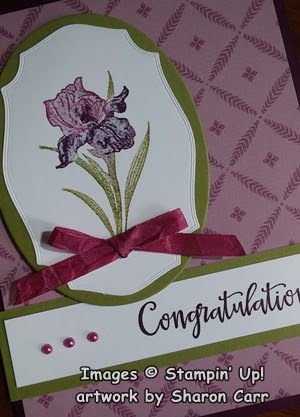
For today's card idea, I took my cues from the DSP print for color and feel of the card.  This print gave off a vibe that spoke of vintage wallpaper to me.  Maybe you see it differently, but that was my inspiration for the card.  Note- there are some retired items used here.  If that's a problem, guess you need to quit reading right now.  😏 That said, let's move on.  This DSP measures 5 1/4" x 4".  It's attached to the folded Blackberry Bliss card with adhesive.   The Blackberry Bliss measures 8 1/2" x 5 1/2" that's scored and folded in half.

The iris used is of course from the Wonderful World stamp set.  The DistINKtive images in this set are so nicely detailed and easy to work with.  For this card, I used markers directly to the stamp, huffed, then stamped onto the Basic White cardstock.  Both Rich Razzleberry and Blackberry Bliss markers were used on the flower and an Old Olive marker was used on the stem and leaves.  This is a great way to get more than one color on a single detail stamp.  

After stamping the iris on the Basic White cardstock, I looked for a die that has a vintage feel to it.  I found this one from the retired Tasteful Label Die set.  It was the perfect size and shape for the iris.  To frame it, I chose the Layering Ovals Die set, which is also retired.  It makes a very nice frame of Old Olive cardstock behind the white.  These are layered together with adhesive.  

The sentiment is from the Peaceful Moments stamp set on page 29 in the Annual Catalog.  I love the mixed font look of the set, and wouldn't this be a wonderful anniversary card?  It's stamped to the right onto a 3/4" x 4" strip of Basic White cardstock using Blackberry Bliss ink.  It's backed with an Old Olive strip that measures 1" x 4 1/4".   It's layered together with adhesive, then attached to the card front about 1" up from the bottom edge.  This is attached with adhesive too to keep it flat to the surface.


Now it's time to add the iris layers.  They are attached with Dimensionals to the left side of the card front and slightly overlap the sentiment layers.  I used a Blackberry Bliss Blends to color the 1/4" White Crinkled Seam Binding.  It's tied into a sweet bow and added to the iris with Mini Glue Dots.  The last little bits are the pearls.  They had color added with the same Blackberry Bliss Blends.  Then three were attached in a row to the left of the sentient. 

There you have it - another card to add to my stash for the next rash of anniversaries.  I love having friends that are having anniversaries of 50 years and more!  What a testament to love and lots of compromise over all those years!  An inspiration to be sure!

Thanks for stopping back again to see what's new.  No telling where my next foray into stamping will take me.  It's time to go downstairs and have a look around and make a choice for the next card.  Hope you'll join me on my stamping journey.

Just a quick reminder that Sale-a-Bration is going on until the end of August.  You still have a couple of weeks to cash in on the free items you can get when you spend either $50 or $100 or more.  Stampin' Up! has added more choices to the Sale-a-Bration freebies since they were selling out so fast.  Click here to see what's been added for you.  If you have any questions, please feel free to call and I can place your order for you or walk you through doing it on your own.  Remember, if you order is under $150, please use the Host Code shown at the top right of my blog page.  It's much appreciated.

Happy stamping and creating!
Sharon

Tuesday, August 2, 2022

Wonderful World Take 1

Hello Friend!   Oh my!  How did we fly through July already and land in August? The summer has really flown by this year.  Time seems to be going by quicker and quicker.  Of course, it really doesn't, but it sure feels that way lately.  Since we're in August already, this is a gentle reminder that Sale-a-Bration is half over.  And two of the items are already gone - the Pool Party & Soft Sea Foam Cards and Envelopes pack, and the Tree Lot Dies.  I'm so bummed because I was waiting to get the Tree Lot Dies this month.  😞😢 Oh well, I'll have to set my sights on something else instead.  One of the items you can receive free with a $100 order is the Wonderful World stamp set and Wonderful World 12" x 12" Designer Series Paper combo.  Lovely?  Oh yes and make that a great big yes!  The stamp set is a 'DistINKtive' stamp that means lots of lovely detail etched right into the stamps.  So every time you stamp, you have great detail! And the DSP is a lovely mix of prints in a pleasing color palette that you'll love.  Those are the items I've been working with the last day or two.  Here's the first card idea.

I've been sending out lots of anniversary cards the last two months and I've totally run through my stash.  I made this one as an anniversary card to start filling up my stash again.  I guess June, July, and August were great wedding months!  

This card starts out with a Starry Sky base that's 11" x 4 1/4", scored at 5 1/2" and folded in half.  I love how the Starry Sky cardstock really enhances the colors of the Wonderful World DSP print that I chose.  The DSP measures 4" x 5 1/4" and is attached to the card base with adhesive.  

To stay with the rectangular card shape, I cut a piece of Basic White cardstock with the Stitched Rectangle Dies that just framed the Bachelor Buttons stamp.  To stamp it, the whole stamp was first inked with Rich Razzleberry.  Then I used Sponge Daubers with Old Olive ink on the stems and leaves, and Starry Sky ink to add color to the center of one flower and very lightly on the outer edge of the top flower.  Make sure you 'huff' on the stamp before stamping.  It's amazing how just a little extra ink on a Sponge Dauber can change the look of the flowers so dramatically!

You can get a good look at how the sponging of a little color really makes a big difference.  I didn't worry about getting the Old Olive color sponged right to the edge by the flower.  Just get it close and it works fine.  Any part that's still darker just looks like shading.

After stamping, the rectangle was attached to the card front with Dimensionals.  It's placed a little higher than the middle. 

The sentiment comes from the Celebrating You stamp set found on page 17 of the Annual Catalog.  This is a set of sentiments that cover pretty much anything you need throughout the year.  I love when you're able to go back to use a set over and over again.  Lots of different fonts too.  I stamped the anniversary one on a 1/2" strip of Basic White cardstock.  Starry Sky ink was used on this.  After stamping, it's trimmed shorter and then punched with the Banner Pick A Punch on each end.  To make it stand out even more, a skinny strip of Silver Foil that measures 3 1/4" x 1/4" was added.  This attaches behind the sentiment strip, then it's added to the card front with Mini Dimensionals.

A triple bow of the pretty Metallic Starry Sky Ribbon is attached under the sentiment using Mini Glue Dots.  For some extra bling (besides the Silver Foil and Metallic Ribbon), three Rhinestone Basic Jewels were scattered around the flowers.  

Last look at our card.  So pretty and perfect for the next anniversary that comes along.  Like I mentioned in the beginning, this paper is simply gorgeous!  Very feminine prints and the colors are lovely too.  That's it for the first card.  It's fairly simple and comes together quickly.  Tomorrow's card will be another look at this combo.

Don't forget to get your orders in as soon as possible so you don't miss out on your freebies!  Items do 'sell' out quickly and the stock won't be replenished on any Sale-a-Bration item.

There's a new special coming on September 1st that you'll love.  I'll have information coming soon for you.  So stay tuned for further info!

On a side note, I've been dealing with A Fib issues again and running a little slower than usual.  My meds are being adjusted to try to get it back under control.  Please pray.  I'd appreciate it!  Thank you, my good friends!!

Happy stamping and creating!
Sharon