Monday, January 3, 2022

A Friendly Hello Bundle

Oh, my goodness!  I've been having so much fun with a new Sale-a-bration bundle.  Yes, you heard correctly there.  After you spend $100 in regular merchandise, you can choose to get this bundle.  It has an awesome stamp set with 13 photopolymer stamps to start with that includes 3 sentiments.  And it has a gorgeous 12 x 12 set of Designer Paper that coordinates with it!  They're my sort of colors too - more on the brighter pastel side.  Woo Hoo!!  Can you tell I'm just a little excited? 

Here's the first one I made with both the Friendly Hello stamp set and the Friendly Hello matching Designer Paper.  It's turned out such a bright cheerful green as the main color on the print I used is Granny Apple Green.  It just screams 'spring!' to me.  To make this card, I started with a card base of Garden Green for some contrast.  This was cut 11" x 4 1/4", scored at 5 1/2" and folded in half to make a top fold card.  The layer of DSP is cut 5 1/4" x 4".  It's attached to the card front with adhesive.  I wanted as much of this to show as possible, so I looked for a die that wouldn't be too small for the sentiment.  But it shouldn't cover the whole card front either.  The die from the Tasteful Labels Dies was just the right size and a pretty shape with a little outline detailing too.

The hello friend sentiment from the set was stamped with Garden Green ink more to the right side of the label.  That left lots of room on the left side for the pretty flowers that are part of the set too.  These were stamped with Garden Green ink onto a scrap of Basic White cardstock.  I also stamped 5 solid leaves with the Garden Green ink on the scrap of white.  

The flowers were just lightly accented with some water and a Water Painter brush to soften the shading lines inside each flower.  It actually makes the centers look like Granny Apple Green.  Who knew...?   

The flowers and leave were all fussy cut because there are no dies or punches.  Surprisingly, it took almost no time at all to cut the 6 pieces.  It was time to position all the pieces around the sentiment.  The flowers were attached only on the edge of the label die-cut.  Several of the leaves were tucked underneath the flowers.  The label and flowers were attached to the card front using Dimensionals.  The last two leaves were attached flat to the card front with adhesive.  This gave the flowers cluster more depth.


Looking to finish off the card front, I added a length of the new 3/4" wide Frayed Ribbon wrapped across the top of the card and tied into a square knot.  There is a bit of extra fraying going on with the ribbon edges on purpose.  I liked the shabby chic look of the fraying. This ribbon is pretty thick though, so I'll probably need to add extra postage when I mail it.

The flower centers looked really bare, so I added some Genial Gems which are found in the 2021-2022 Annual Catalog.  There are some green gems, but they didn't look nice with the greens already going on here.  So I used the Pale Papaya ones instead.  These added just a bit of color without being overpowering.  The two flower centers are the larger gems.  Then I couldn't stop myself and added 3 of the smaller gems to highlight the sentiment.
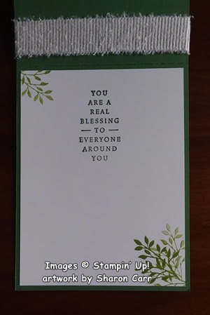

The inside of the card got some special treatment too.  The sentiment is from the new Blessings of Home stamp set.  It is stamped on a layer of Basic White cardstock with Garden Green ink to match the front.

The Friendly Hello stamp set has a leafy branch that I thought would be a good accent.  It was stamped with Granny Apple Green in the top left corner and the opposite bottom right corner.  On the bottom corner, it was stamped once at full strength and then off-stamped two more times to fill it in.  I also like the look of the frayed ribbon wrapping around on the inside of the card.  Just an added benefit.

Thanks for stopping in today to see what's happening.  I'm enjoying playing with the new stamp sets I've already purchased from the 2022 January - June Mini Catalog and the Sale-a-bration bundle I received free.  It's always interesting to see how people interpret using the new sets.  Yes, I've been hanging out at Pinterest to see what others are doing.  It seems to jump-start my own creativity to see what's out there.  If you're like me and need a little push to get going, I hope my ideas will jump-start your creativity!  If there are any questions you have, feel free to contact me.  I'm here to help you be the very best stamper you can be - and have fun doing it!!

Happy creating and stamping!
Sharon

Sunday, January 2, 2022

Sending Rainbows to You

Here it is already, 2022!  We have a fresh new year ahead of us.  Have you made any new year's resolutions?  My big one is to make a greater effort to stay in touch with my family and friends.  Sometimes I get off in my own little world and kind of shut the door behind me.  Well, I'll be working on doing a better job of staying connected and being there for my family and friends.  If you find me slipping, remind me.  OK?  One of my favorite ways to stay in touch is with sending cards.  Duh, as if you didn't know that already!  Today's card was made with that in mind.  It uses one of the new 2022 January - June stamp sets and a Sale-a-bration stamp set and a Designer Paper freebie too.  Lots of new goodies to play with.  Ready to have a Sneak Peek two days early?  Both of these catalogs go live on January 4th so you don't have a very long wait at all.

I figured this card would be perfect for letting someone know you were thinking of them and brightening their day.  What do you think?  The card uses a new set called Rainbows of Happiness.  I've always been partial to rainbows as they are a symbol from God to mankind that He would never destroy all of mankind again in a world-wide flood.  When still living in Michigan and having our basement flooding - not yearly, but way more often than I wanted, I always loved seeing rainbows.  They were a beautiful symbol of hope to me.
For this card, I didn't want a traditional fold, so I started with a Basic White base that was cut at 4 1/4" x 11".  It was then scored at 4", and at 9 1/2".  This gave me an asymmetrical gate-fold card to work with.  The designer paper is one of the free items from the Sale-a-bration catalog.  It's a perfect match for the Rainbow of Happiness stamp set and is called Sunshine & Rainbows.  This is a 6" x 6" paper pack with 48 sheets of playful prints that are bright and sassy.  Don't you just love these sassy prints?  It has both big, bold prints and some lovely, bright pastels too.  For this card I chose two different prints to coordinate.  The bolder, Misty Moonlight print is cut at 4" x 3 3/4" to fit the left side of the gate-fold.  The Mango Melody print is 4" x 1 1/4" for the right flap.  
TIP - When you're cutting this DSP, you need to be very aware of the direction of print.  For this card, you wouldn't want them going side-ways and looking weird.  Check twice before cutting!

Of course, I had to stamp a rainbow for the card.  Checking the size of the rainbow to the different dies, it fit nicely on the 2nd largest rectangle die in the Stitched So Sweetly Dies.  That was cut from Basic White cardstock for the focal point.

I decided to use the colors of the rainbows on the DSP print for my rainbow.  These aren't traditional colors at all, but they are fun (and matched too).  The largest color band is So Saffron.  Next up comes Pool Party.  This one also has the sentiment stamped over it in Misty Moonlight ink.  The 3rd band is Magenta Madness and the smallest is Petal Pink.  I added a few Magenta Madness teensy hearts over the rainbow to make it happy.  This was attached to a cut-to-fit rectangle of Magenta Madness cardstock using adhesive.  

When attaching the images to the card front of a gate-fold card, figure out where the left edge of the front flap is.  Do NOT attach your adhesive beyond this point.  I used four Dimensionals under the images only on the left side to attach this. 
After finishing the front, I felt it needed just a little bling.  There are three of the new Iridescent Rhinestone Basic Jewels added.  You can really see from this picture how pretty those rhinestones are.  Just gorgeous!

When I got to the inside of the card, I might have gotten just a little carried away.  The sentiment comes from the Special Moments stamp set in the Sale-a-bration catalog that you can get free.   Lots of great sentiments in there!

Then I decided I wanted some sunshine inside the card.  This cute sunshiny guy is from the Sharing Sunshine set in the 2021-2022 Annual Catalog.  Love how cute it is, especially with that smiley face.
There were two little strips of DSP left over, so why not add them to the card?  And of course, there just had to be more of those teensy little hearts added too.

That's it for today.  I hope you're inspired to try making a gate-fold card again.  Don't know why it's been a while since I've made one.  They're just so cute.  I need to make them more often.  (Along with all the other stuff I need to do!)  Stay happy and healthy.  And keep stamping and creating!

Sharon

Friday, December 31, 2021

Blue Butterfly Birthday Card

 Happy New Year!

Rick and I wish you the very best new year yet, filled with family and friends, laughter and contentment.  Hope you will take time to stay creative in the days ahead, and not get too busy to take time for yourself.   I find my whole outlook on life is much brighter when I've been creating something.  Now I'm not saying everything I make is share-worthy, but it still brightens my day when I've been puttering in my craft room.  And if I can get someone to play with me, that's even better!  Anybody ready to make the trip south for a visit?  I'm ready for some stamp therapy with my friends.  Until you can get here, I'll just keep on keeping on.

Today I have a pair of cards that are similar and use many of the same products.  They are just put together a little differently.  They both start with a Misty Moonlight card base cut at 8 1/2" x 5 1/2", scored and folded in half. The first layer is Basic White cardstock cut at 5 1/4" x 4".  Cut two of these so you're all set for the inside of the card when you're ready.

When it comes to the next layers, this is where the changes come in.  For this design, the next layer of Misty Moonlight is cut at 3 1/2" square.  The Beauty of the Earth Designer Series Paper is cut at 3 1/4" square.  I love this print with its water-color droplets of pale Misty Moonlight through out.  The colors are perfect together, and the leafy print can be used for so many reasons.  They are attached together with adhesive, then attached to the card front with adhesive also.

TIP:  Before I layered the pieces together, I die-cut a butterfly from the Misty Moonlight layer.  This is a great way to cut a little bulk from your cards while conserving some of your cardstock.  Win-win there!

The butterfly die is part of the Brilliant Wings Dies.  If you look close, you'll see a solid butterfly underneath that's die-cut from Vellum Cardstock.  I wanted to have more of a division between the DSP and the butterfly.  (It was interesting trying to take pictures of this.  The vellum underneath had a tendency to make it look out of focus.)  The butterfly is attached to the vellum with Mini Glue Dots, then attached to the card front with Mini Dimensionals.

The sentiment is from last fall's Sale-a-bration.  I debated about using it, but it really was exactly what I wanted for this card.  Something that was more out there instead of a simple happy birthday.  So, bear with me while I use some retired stuff.  OK?  It was stamped with Misty Moonlight ink on Basic White.  The Basic White piece is 2 1/2" x 1 1/4" and is attached to a layer of Misty Moonlight cardstock that is 2 3/4" x 1 1/2".  This was attached to the card front using Dimensionals to give it a little extra lift.

Can you see the tiny little brass butterflies on the card?  They are new in the upcoming mini catalog.  They have adhesive on the back so they're just too simple to pop on your card wherever you want!  Just too cute!

Here's the other version of the card.  I had a smaller piece of the Designer Paper on hand that I decided to use.  I mean, I always need birthday cards, so why not make another one since everything is already out and ready to use.  The DSP is only 2 3/4" square and the Misty Moonlight piece is 3" square.  On this card, this layer was put on with Dimensionals too.  The butterfly was treated the same way as the first card.

The sentiment layers are also the same size as the first card.  I just moved the layers around a little to fill out the card in a pleasing way.  In that big white area near the bottom, I added 3 Rhinestone Basic Jewels to give it some balance.  The jewels were colored with a Misty Moonlight Stampin' Blends for color to match.

There you have it - the same products but still a different look.  Sometimes you just have to make adjustments to your plans depending on what you've got to work with.  And just because you start out with one idea, nothing says you can't go off in another direction to see where it takes you.  Just have FUN!

I want to wish you a very blessed new year ahead.  Each year the slate is wiped clean and you are starting out fresh again.  Set different goals for yourself - realistic goals.  Then sit down and figure out all the little steps needed to reach your new goals.  Work on those first little steps, and don't get overwhelmed by the big picture.  And yes, I'm talking to myself here!  This is what I need to do too.  Boy, I've sure spent a bunch of time pontificating today.  Guess that's what happens at the end of one year and the beginning of another.  Ok, I'll get off my soapbox now and just wish you a

Happy New Year!!!!

Blessings,
Sharon

Thursday, December 30, 2021

Blessings of Home Card

Hello again!  Glad to see you stopped by.  With yesterday's card, I had one strip of the Harvest Meadow Designer Series Paper left over after I had the stack of cards finished.  And that pack of Soft Succulent cardstock was still sitting out, and the Basic White cardstock was just sitting there too.  So, since everything is out already, why not design a different card to use up those items.  I've got some friend's birthdays coming up that I'll need cards for in January and thought it would be a good place to start.

This card uses the Soft Succulent cardstock for the base with a layer of Basic White on top.  Before the white is attached though, I stamped the largest floral stamp in the new Blessings of Home stamp set as a soft, mono chromatic background.  The stamp was inked, then off-stamped for a softer, 'sketchier' look to the background.  That left-over 1" strip of the DSP was attached to the left side again to anchor the design.  Then it was all attached to the Soft Succulent card base using Multi Purpose Liquid Glue.

The next part of the design was stamping the smaller floral image onto a Basic White layer.  The Stitched So Sweetly Dies have a pretty scalloped and stitched rectangle die that looked to be the perfect size for this.  After die-cutting the white, the floral image was stamped using Memento Tuxedo Black ink.  
For coloring, I chose to use my Stampin' Blends.  I have a couple friends that love purple - any shade will do to make them happy!  So of course, this card has a mix of purple shades for the flowers:  Purple Posy L&D, Highland Heather L, Fresh Freesia L&D.  The leaves are Soft Succulent L&D.  And the flower centers are So Saffron L&D and Cinnamon Cider L.  The pictures really don't do the small flowers justice.  They are the ones colored with Fresh Freesia ink and are so cute in real life.  Much pinkier-purple than they look in the photos.
After coloring, the die-cut was attached to the card front using Dimensionals for some interest.  

The sentiment is the same one from the Inspiring Thoughts set that I shared yesterday, except today the full stamp was used.  It's stamped on Basic White with Soft Succulent ink, trimmed, then layered on a Soft Succulent cardstock piece.  This is attached with adhesive to lay flat on the left and a Dimensional on the right to keep it level.

Hopefully you can see some of the layered Stampin' Blend colors on this close-up of the image.  It was fun using so many layers of color on each flower to get the look I wanted.  Yes, I do love my Blends!!

Underneath the sentiment I added a small knot of Fresh Freesia 3/8" Open Weave Ribbon.  It's attached with a Mini Glue Dot.  

For this card, I felt I needed to add some bling.  The 2021-2023 In Color Jewels just called out to me, so I gave them a try.  I could have used the Fresh Freesia ones, but finally decided on the Soft Succulent gems.  Either color would have worked out well, but since I have more of the Soft Succulent gems I used them for this card.  I love the iridescent look of these gems!  It actually makes them blend in with so many more colors than just the In Colors they should match.  In my humble opinion, these are a must have in your "bling box".


Hope you enjoyed today's post.  I'm having a great time playing around with my newest stamps.  I might have to start branching out to other colors though.  I've been stuck on the Soft Succulent for awhile now.  What color should I play with next?

Happy stamping and creating!  It's a great way to finish out the old year. Of course, it's also the perfect way to start fresh in the new year!  Have fun...

Blessings and many hugs,
Sharon

Wednesday, December 29, 2021

Amazing Silhouettes Sneak Peek

Wow, the time has been really flying by this past week.  I managed to design two cards and thought I'd have them posted already.  But alas, my planning isn't quite lining up with reality.  Today I'm sharing a card that I made to enclose with all the catalogs that I put in the mail today.  Yes, that's running slower than I had planned too.  But at least there are a whole pile of catalogs that were taken to the Post Office earlier today.  Now it's up to the Post Office to see how long it's going to take to get them to all my customers.  If you don't have one in the next ten days, please give me a call and I'll see what I can do.  Anyway, back to the card... 

As a demonstrator, I signed up for the Stampin' Up! Onstage event last November. One of the many fun things I received is this Amazing Silhouettes stamp set which will be available January 4th in the new January - June 2022 Mini Catalog.  It's so much fun getting stamps early!  There are three stamps in this set and they all look like this one with just a silhouette image.  I love the look of these stamps.   And I'm amazed at the amount of detail that shows from just having the image in silhouette like this.  They are really gorgeous.  This is the largest stamp, and after using it on these cards, I'm going to have to try out the other two stamps to see what I come up with.

Because I was making a whole pile of these cards, I was looking for a simple layout that wouldn't take too much time.  I set up the stamp on my Stampa-a-ratus and just stamped away on card after card.  What did I ever do before the Stamp-a-ratus?  It makes stamping multiples so quick and easy, and you always get the image exactly where you want it.  Some of the cards I stamped with Soft Succulent and some with Mint Macaron ink for a slightly softer look.

The color for the card base is the Soft Succulent cardstock cut at 8 1/2" x 5 1/2", scored and folded in half.  This seems to be my favorite color lately.  Out of the last three cards I've designed, all of them use Soft Succulent for the main color.  Hmmm, guess I really like it!  The next layer was Basic White cardstock cut 4"x 5 1/4".  The image was stamped over to the right side.  A 1" x 5 1/4" strip of Harvest Meadow Designer Series Paper was cut and attached to the left side on the Basic White cardstock piece using MultiPurpose Liquid Glue.  Then the Basic White layer was attached to the Soft Succulent base using the MultiPurpose Liquid Glue again.

I used the sentiment from the Inspired Thoughts stamp set that's found in the 2021-2022 Annual Catalog.  I like the way the font skips between all caps and all small letters.  Just something a little different.  I couldn't find a plain Thinking of You in the set, so I used a Soft Succulent marker and just inked the words I wanted.  This is actually a birthday sentiment, but you'd never know.  

TIP:  Make sure you really look at your sentiment stamps to see if you can use just a portion of the stamp to say what you want.  It's so easy to ink up only the words you need using a marker.

The sentiment was stamped on a Basic White strip and then backed with a slightly larger piece of Soft Succulent cardstock.  It was attached to the card front using several Dimensionals.  A tiny knot of Soft Succulent 3/8" Open Weave Ribbon was attached to the left side of the sentiment using a Mini Glue Dot.

As you can see on this last picture, I splatter-tapped some Wink of Stella on the front of this card.  Some cards I left simply plain.  After giving it a lot of thought, I decided to keep the card 'bling-less' this time around.  I really liked the nice, clean look of this card.  Hope you do too.

Well, that's it for today's installment.  Please continue to keep checking in with me.  I'll try my hardest to get more consistent with my posts.  You know, the best laid plans of mice and men oft times go astray.  And I seem to be having a lot of that 'astray' going on!  😁 

Happy creating and stamping!
Sharon

Saturday, December 18, 2021

Peaceful Holly Card

Today I have a bold and bright Christmas card to share with you.  It took me awhile to get it right.   I shared the first version of this with my friend Ruth and my sister Connie.  They both agreed that it was way too busy and really needed help.  Connie and I brainstormed a bit, then I went down to my craft room, tore parts of it off, changed up parts of it and put it back together again.  Both ladies now gave it a thumbs up.  So here it is being shared with you today!

In person, it really is a bold, beautiful card with lots of layering and textures for all of you, like me, who are always 'touching' the cards that come in the mail.  I love the different textures and layers that make a card really stand out as different.

The card starts out with a base of Real Red cardstock that's cut at 8 1/2" x 5 1/2", scored and folded in half.  There is a section of the Painted Christmas 12 x 12 DSP that is cut to 5 1/4" x 4".  This is attached to the folded Real Red card base using MultiPurpose Liquid Glue.

Over this is a section of Real Red cardstock that is 2 1/8" x 4 1/4".  This has two pieces of the 1/4" Gold Shimmer Ribbon wrapped around it and attached on the back.  Then this is attached to the front of the card, just a little lower than center.  To give this area some texture and interest without becoming overpowering, I added a layer of Real Red cut 4" x 1".  Before attaching to the card front, this was embossed with the Tasteful Textiles 3D Embossing Folder.  I think this bit of extra texture really adds so much to the finished look.  If you don't own this embossing folder yet, you need to get one for yourself!  It's such a wonderful basic look that enhances just about any card you might make.

Now on to all the 'fun stuff'!  The sentiment label was cut from Basic White with the Seasonal Labels Dies.  The sentiment was stamped with Real Red ink and is from the Inspired Thoughts stamp set.  A Blending Brush and both Shaded Spruce and Evening Evergreen inks added a little color to the edges.

The holly, berries, and pine needles are all from the Christmas Season stamp set.  The berries were stamped with Real Red, the holly leaves with Shaded Spruce, and the pine needles with Evening Evergreen inks.  Each were die-cut using the coordinating Seasonal Labels dies.  This makes it so easy to add all those wonderful pieces!

All of the stamped and die-cut pieces were added to the card front at this time.  They were either tucked under the sentiment or were attached with Dimensionals over it into a pleasing cluster.  While arranging all the pieces onto the card front, I decided to add 3 of the Gold Holly Leaves.  This brought out the shine of the bands of gold ribbon across the card.

One last picture to show the finished inside of the card.  I had a couple extra holly leaves and one little berry left over.  I couldn't neglect them, so I just had to tuck them in right next to the sentiment.  This sentiment is from the Perfectly Plaid stamp set. I love the font on this Merry Christmas and it seems to be the perfect size to use on so many cards.  For this card, it was stamped with Real Red ink.

As a finishing touch, I had a 1/2" strip of one of the smaller prints from the Painted Christmas Designer Paper.  I thought it was a cute addition to add to the bottom of the Basic White layer and ties all the colors together.

That's it for today.  I know I'm cutting it really close to Christmas for sharing these cards.  But at this point in time, I'm really not making much of anything else.  I'm trying to get all my own cards out in the mail.  Unfortunately, at last count I'm about 15 cards short of my goal.  Guess I need to get back to my craft room and make a few more.  Hope you're farther ahead than I am and have all your Christmas cards out in the mail already.  Oh well, better late than never is going to be my motto this year.  I might even get around to making a cookie batch or two during the Christmas break for the grandsons and they can have some fun helping.  I don't think they'll care too much that the cookies weren't made weeks ago!

Christmas Blessings to you and your family!
Sharon

Thursday, December 16, 2021

Merriest Frames Christmas Card

 Ok, I think I'm back again.  Whew, it's really been an ugly three weeks dealing with the flu.  I'm surprised how badly it knocked me off my feet.  Rick and I are still in the recovery mode trying to get back our full energy.  It's amazing how quickly we tire out doing such little things.  But I wanted to take a minute to thank so many of you that have been keeping us in your prayers every day.  It has really made a huge difference in our lives.  We could have been so much more worse off, but instead we're on our road to full recovery.  Thank you for your prayers and thank God for touching us with His healing hand!

Today I want to share a card I had ready to go and I'm just now getting around to it.  The colors are not your everyday red and green, but I love how the colors interact.  It starts out with a base of Thick White cardstock cut at 8 1/2" x 5 1/2", folded in half.  The first layer on the card is Pool Party cut at 5 1/4" x 4".  This was embossed with Timeworn Type 3D Embossing Folder to give it some lovely texture.  It was attached to the card base using MultiPurpose Liquid Glue.

Next layer is Just Jade cardstock.  Love that color!  I used the Merriest Frames Hybrid Die and Embossing Folder.  Doesn't it give just fantastic detail?  To make it stand out even more, I used a Blending Brush and Just Jade ink on the edges of all the die-cut details.  This was also attached to the card front using MultiPurpose Liquid Glue.

The sentiment is stamped on Basic White cardstock that was die-cut from the Merriest Frames Dies to fit right into the embossed frame.  The words are from two stamp sets, Perfectly Plaid and Heartfelt Wishes.  I thought they went together nicely.  Both Just Jade ink and Polished Pink ink were used for this. 

The accent pieces on the card were cut using the Merriest Frames Dies.  The holly leaves were cut from the retired SAB Be Dazzling Specialty Paper.  They were attached under the flowers using Mini Glue Dots. 

The small poinsettias were cut from Basic White cardstock.  The color is added using a Blending Brush and Polished Pink ink.  The flowers underneath on each of them were colored darker than the top flowers.  I love the extra contrast of the colors on the poinsettias.  Each of the poinsettias were added with a Mini Dimenisonal.  

To add the final bit of glitz, I added the smaller Garden Gems to the center of each flower.  The colors of these gems are just a perfect color touch with an iridescent sheen with the pinks and greens.

Ok, I think I remembered to add all the information on this card.   Surprisingly it's only taken about 4 hours total to get this written.  (I had to take a rest in the middle of it 'cuz I got too tired!  Gee Whiz!!)  Anyway, hope this card inspires you to try different color combos for Christmas.  And consider trying the awesome Merriest Frames Hybrid Dies and Embossing Folder combo.  These really do make up some fabulous images.

Thanks for stopping by today to see what's new.  Thank you also for your prayers and caring.  We truly appreciate all the prayers!  Keep checking in.  Hopefully I'll be back soon with another idea for you to try.  

Stay well and keep creating!
Sharon