Tuesday, May 30, 2023

Courage and Faith Cards

Hello there.  I have to tell you a sad little story.  On Saturday I went out to feed the cute little fish in my pond.  It seemed like there weren't quite as many as usual and there seemed to be no frog's hopping out of the way and hiding.  Hmmm.  It rained all Saturday night and throughout Sunday, so I never went out to feed them.  Monday morning, I went for my usual morning visit with my fish and frogs, but I couldn't find a single one.  I was cleaning out the pond, still no fish.  How could I have killed them all off?  What had I done?  I felt so sad I had to make some brownies to cheer myself up.  Oh yes, and I ate few too.  This morning, Heather came by early and as she pulled into the driveway, she startled a heron that was standing in the pond.  It took off and it was much bigger than it looks like down in the creek which is yards and yards away.  Oh no!  Guess it's been snacking on my fish and frogs and ate them all up.  At least I know what happened, but I'm still not happy about it.  We'll have to figure out how to heron-proof the pond before we buy any more fish, that's for sure!

Ok, that's my sad tale for the day.  Not exactly what you came here for, is it?  So let's move on.  Today I worked on two cards that were needed.  I wanted to use the new Courage & Faith stamp set (page 72) for both of these cards and thought the Fresh as a Daisy Designer Series Paper would be a quick and easy solution.  Here's what I came up with to share with you.

I love this blue and white daisy print and wish I had more.  I cut a 5 1/8" strip through the middle of the sheet.  There was still 4" on the top for some other cards and a strip from the bottom that was left over.  I know those strips of daisies will come in handy soon.  I cut it this way, because I wanted the daisies to be near the top of the cards, but not chopped off at the top.  I almost felt guilty cutting right into the middle of the paper, but it's all good and will get used soon.  The DSP was then cut into three 4" sections.  Each was trimmed down a bit to 3 7/8".  I was playing around trying to decide just how much I wanted off the sides and kept all the tiny strips for later use.
This is the first card I made with this print design and wasn't too sure what I'd come up with.  But I liked the finished one enough to actually make two of these.  After cutting the DSP, I decided to layer it onto the new Copper Clay 2023-2025 In Color cardstock.  This is a gorgeous coppery brown color that I really love.  The measurements for this layer are 5 1/4" x 4".  The DSP is attached directly to this with 'green glue'. 

The sentiment is from the Courage & Faith stamp set.  There are some great Bible verses along with some greenery sprigs that make up the set.  It was one of the earliest items I purchased, and I know I'll use it often.  I like that each sentiment has the place listed where to find it in the Bible too.  I couldn't find a current die set that fit this sentiment.  I rummaged around in my retired sets and found this one in the Tasteful Textures set.  It's die-cut from Basic White cardstock, then the sentiment is stamped with Copper Clay ink.  

To keep it simple, the new Copper Clay 3/8" Textured Ribbon was wrapped around these two layers and attached with Tear & Tape Adhesive (page 138).  This is a quick and easy way to get your ribbon to stick well to the back of your card.  Then the sentiment layer had Dimensionals added along the top and bottom of the die-cut.  This allows the ribbon to slide in between.

To finish off the card, attach the layers to the front of a Basic White card front with Dimensionals.  The card base measures 8 1/2" x 5 1/2" scored in half and folded.  

For the pretty bling, I used three of the 2023-2025 In Color Dots.  This color is Boho Blue.  So lovely.

Now for the other card sample...

Of course, there are a few changes here.  First of all, the card base is the new Boho Blue cardstock that matches nicely with the blues in the DSP.  Again, the layers are attached to the base with Dimenisonals for some extra height.

Still using the Courage & Faith set, I changed up the sentiment, so I could also change the die to fit it.  This is one of the Tailor Made Tags and I think it works very well here.  Don't you love the stitching that defines the tag?  There is a short length of some retired copper ribbon from a couple years ago that's strung through the tag.  The sentiment is still stamped with Copper Clay ink.


Now remember all those bits of DSP that were cut from the sides of the daisy layer for the three cards?  Well, here they are showing their lovely back sides to us.  Since I was trying to see how much I wanted to take off the sides, there were different widths of DSP to play with.  I decided to use all three sizes and attach to the card front in a stair step fashion.  They were all about 5" long, so the extra was trimmed off after adding them to the card.

To finish the card, the tag was attached to the front with Dimensionals.  I didn't add any bling on this card.  It seemed too much with the three strips of DSP that were added already.  But of course, you could always add some if you wanted.

Thanks for stopping by today to see what's new.  So sorry you had to listen to me vent about my fish and frogs disappearing, but I really am upset about them being gone.

Heads Up ladies!  Did someone say sale???  Stampin'Up! is having a Designer Series Paper sale during the month of June.  You can save 15% off on any and all of the DSP's shown on pages 129 - 132.  How awesome is that!?  I know I'll be getting another package of the Fresh as a Daisy DSP.  And maybe a few other besides!  Love those sales!

Happy stamping and creating,
Sharon

Saturday, May 27, 2023

Boho Blue Medley

Happy Saturday.  Hope you're having a good day and maybe doing some Memorial Day celebrating.  I thought I'd get a post in today while I still could.  I've been fretting about which one of these cards to focus on, but really couldn't decide.  They all use the same colors and DSP and embossing folder and dies, but all have a slightly different twist to them.  This morning I got the brilliant solution to just share them all in this post and give just a small bit of information on each one instead of a long dissertation on each.  Hope you like this approach today, as it will give you ideas to use when looking at a piece of Designer Paper and not sure where to go with it.  Ok, let's dig in.

My idea started with the thought of using a 3 1/2" wide strip of Countryside Inn Designer Series Paper (page 129) and cutting a segment as needed for my project.  For the first card made, I cut the DSP at 3 1/2" to make it a square.  Basic White Thick is used for the base.  It's cut at 10 1/4" x 4 1/4", scored at 5 1/2".  The 3/4" piece that was cut off the front was attached to the bottom of the inside of the card for as extra layer.  A layer of Basic White 4 1/2" x 4" was embossed with one of the Basic 3D embossing folders (Online Exclusives), then layered onto the card base.  Changed my mind about the layout and trimmed down the DSP to 3" wide and attached it to the base.  The 1/2" I cut off was turned on its side and attached to the bottom of the inside of the card that shows.
Now for the fun part.  The Timeless Arrangements Bundle (page 67) is so much fun to create with!!  I was die-cutting the different layers of leaves with Night of Navy, Misty Moonlight, Boho Blue, Balmy Blue and Silver Foil.  I had a small pile of pieces to choose from when putting these cards together.  I started by stamping a sentiment from Inked & Tiled set (page 95) with Misty Moonlight ink onto a Basic White 1" strip.  I trimmed it to fit my design, then laid different pieces behind it until I had something pleasing to my eye.  Each piece was attached with adhesive then the whole piece was attached to the card front with adhesive.  One card done, on to the next.

First the minor changes.  The added Misty Moonlight layer was cut to 5" x 4" and run through the embossing machine with the same cross-hatch design used above.  Then 1" was cut from the bottom end.  Both of these pieces were attached to the folded 8 1/2" x 5 1/2" Basic White card base.  The DSP was again cut to 3 1/2" x 3 1/2" but not attached to the card front yet.

The sentiment is from the Timeless Arrangements set.  It's stamped with Night of Navy ink onto a 5/8" x 3 1/4" strip of Basic White.  Then again, I played around arranging the bits and pieces die-cut from the same bundle.  All the colors but the Balmy Blue were used here.  As you can see, several pieces were also stamped in Night of Navy ink on white, smudged with a little Wink of Stella and die-cut.   This gives another dimension and texture to the die-cut pieces.

The pieces were all attached behind the sentiment strip.  Then this all was attached flat to the DSP layer with adhesive.  Then the DSP was attached to the card front using Dimensionals.

Two clear Rhinestone Basic Jewels were added to the sentiment strip.  Some small flowers die-cut from the Sentimental Park die set were added to the design.  They are attached with Mini Glue Dots.

I wanted to add some of the Boho Blue Ribbon but didn't want a bulky bow or knot.  So instead, a 3 1/2" piece of ribbon was cut and attached over the bottom piece of Misty Moonlight cardstock using adhesive.  Another texture without the bulk.  Ok, another one finished.  On to the last design.

Same Basic White card base and same Misty Moonlight layer as before.  The Misty Moonlight was not embossed this time.  The DSP layer is also the same 3 1/2" x 3 1/2" size but was turned over so the back side could show.  It is framed with a 3 5/8" x 3 5/8" Basic White layer to break up all the blue.  The white layer is attached to the card front with Dimensionals.

The sentiment I wanted to use for this card is from the new Courage & Faith set on page 72.  I really like the sentiment/Bible verses in this set.  It's stamped on Basic White with Misty Moonlight ink.  It's die-cut with one of the rectangles in the Timeless Arrangements Bundle.  I like the slightly different look to the stitching lines on these and they're great sizes to fit a sentiment.

After die-cutting the sentiment, the layers of greenery were attached with adhesive.  This time only the Balmy Blue and Night of Navy pieces were chosen.  This gives it a cleaner look than the last one.  The sentiment was attached with Dimensionals and the greenery is not attached at the top, just on the sentiment layer.  

At this point I realized I had forgotten to add the ribbon knot to the front of the card.  I pried up the edges and tucked the ribbon in behind the Misty Moonlight cardstock.  That's definitely the hard way to do it!  It was a little loose, so a Mini Glue Dot was tucked under the knot to hold it in place.

To finish it off, three clear Rhinestone Basic Jewels were added to the design.  

By now, I'm assuming you noticed that all the cards basically have the same layout.  But the look is quite different with the layering and pieces used.  I'm definitely a huge fan of the Timeless Arrangements Bundle and all the coordinating pieces that go with it.  If you love blues, you'll love the Countryside Inn DSP.  It's so pretty.  And don't think this can only be done with blues, because the sky is the limit with color combos.  I've already used the stamps and dies with greens, and I've got ideas dancing around in my head with fall colors too.  Yes, this is a total must-have in my book!

If you have any questions about these projects that I didn't cover, please get in touch with me.  I'd love to hear from you and help you out.   Thank you for sharing your time with me and my ramblings.  Enjoy the rest of your holiday weekend.  Make sure you take time to think about all the soldiers through the years who have given their lives for our country.  And don't forget all those who have served in the Armed Forces and are dealing with the aftermath of war. We are truly blessed to live in this country even though there are many problems going on at the moment.  Keep our country in your prayers.

Happy stamping and creating,
Sharon

Tuesday, May 23, 2023

Back to Daisies

Hello Friends!  We've been having rain off and on again lately, so I was looking for an idea that was bright and cheery looking.  I thought making the daisies in yellows would look about as cheerful as I could get.  So that was my idea when I started this card.  Then things changed a bit, as usual.  Still have daisies and still have yellow, but that's about the only part that is the same as my original idea.  Oh well, necessity is the mother of invention they say.  So, what would you call the mother of creativity?  Not having it look right and starting over from scratch??  Yep, that's my idea.  Hopefully you'll like what came out of a mish-mash of ideas and changes.

Here it is.  Isn't this nice and summery and oh, so cheerful looking?  Definitely bright. Let's start with the daisies, because that was the beginning of the whole card.  

The Cheerful Daisies stamp and die bundle is so very easy to work with.  For this card, all three layers of these daisies are die-cut.  The bottom layer is the three daisies that die-cut together and was cut from Daffodil Delight cardstock.  The top detail layer of each flower was die-cut from the new Lemon Lolly cardstock.  I originally was planning on using only the two yellow layers together, but it looked kind of blah.  I liked the white layer peeking out between the other two layers, so the detail layer was cut again using Basic White.  The white contrast really seemed to brighten the look.  While attaching these layers together with 'green glue', make sure that the layers are slightly twisted so that you can see all the colors together.

The flower centers were inked with Daffodil Delight ink, rolled a little on one side in Crushed Curry ink, then stamped onto Basic White cardstock.  The leaves were stamped with Parakeet Party ink on Basic White cardstock.  The leaves were all off-stamped before stamping to keep the color light and bright.  Six of the leaves were stamped, then the leaves and the flower centers were all die-cut with coordinating dies.

Switching gears here, I thought that a white and navy design would offset the daisy colors.  I just received the Countryside Corners stamp and die bundle that I really wanted to try out.  It is just one stamp that has six concentric octagons that stamp all together.  Then there are dies that let you cut those designs into multiple frames.  You can die cut each one separately, or cut them in chunks where 2, 3, or more frames are left together to form a sort of bull's eye effect.  I stamped it in Night of Navy ink onto Basic White cardstock.  I used the second and third dies from the center to cut the dotty frame.  I used the fourth from the center die to cut a Night of Navy piece to frame the white.  Then used the fourth and fifth from the center to cut the stitched white frame. 

I cut another piece of white cardstock that used the third from center die.  The sentiment from the Wonderful Thoughts stamp set was stamped on this using Night of Navy ink.  There are still a few pieces of frames left over for another project.  This was much easier to use than I thought.  An important tip when cutting multiple frames together is to use washi tape to hold the pieces place so they don't shift during the cutting process.  This made them very easy to cut either one or the whole batch at the same time.

At this point, I still thought the card base would be white.  But the more I played around with all the different layers, I changed my mind.  I still kept the card base as Basic White cardstock that measures 8 1/2" x 5 1/2".  But I added a Parakeet Party layer next instead.  This is cut so there's only a tiny frame of white behind it.  It measures 5 3/8" x 4 1/8".  Before adding it to the card base, it was run through the Basic 3D Embossing Folder using the cross-hatch design.  This is one of those great Online Exclusive items that has quickly become of basic staple in my stamp room.

To finish the card, the Parakeet Party layer was attached to the Basic White card base using 'green glue'.  The octagon pieces were all layered together as shown and attached with 'green glue'.  Lastly, the daisies were attached to the corner of the framing.  They were also attached with 'green glue' except for the flower centers which were attached with one Dimensional in the center of each.

The clear Rhinestone Basic Jewels were scattered across the card front for some sparkle.  

That's it for my post today.  I hope it didn't totally confuse you with the Countryside Corners Bundle.  It's really kind of cool to work with and I'll have to revisit that soon.  More to come on that idea.  Have fun with your stamping and don't fret when some project doesn't work out the way you envisioned it.  It's just a chance to spread those 'creativity wings' and try something a little different.  Thanks for stopping by today.

Happy stamping and creating,
Sharon

Saturday, May 20, 2023

Another Share a Milkshake Idea

Hi there!  It's been so chilly lately; I can't believe this is the south.  I think you guys in Michigan are just as warm as we are.  Maybe even a touch warmer!  What's going on here??  I was hoping there would be some hot weather to share these ice cream ideas with you, but it's not working out that way.  Oh well...

As you can see, I'm getting a little obsessed with this milkshake idea.  It's just so fun!  Today's card uses a new color - Bubble Bath.  What a fun pink color this is.  I was surprised that it paired nicely with Moody Mauve.  So here we are.  Another milkshake, but different.  

For my card (the one on top) I used Moody Mauve for the card base that measures 8 1/2" x 5 1/2", scored at 4 1/4" and folded in half.  The Bubble Bath layer is cut at 5 1/4" x 4".  I didn't attach this to the base until the end in case I needed to start over.  Not quite sure what my plan was at this time.  There was going to be an ice cream cone for this card, but when putting the pieces together, I changed my mind. I really didn't like the cone with the white grid pieces.  So back to the milkshake idea. 

This time, the glass was only off-stamped on the detail stamp, not the solid stamp.  This made the glass much darker than the first one I made.  For this one, two scoops of ice cream were added.  The chocolate scoop is stamped with Pecan Pie ink.  I think it turned out great.  The other scoop was my favorite black cherry ice cream of course.  This is stamped with Berry Burst ink.

Both the chocolate and black cherry scoops have some speckles added   I used the speckle stamp from the Quiet Meadow stamp set (page 66) with the same color ink.  I think it added a slight bit of extra goodness to the ice cream scoops.

The Share A Milkshake die set has this awesome grid die that adds so much to the background.  I cut two of them in Basic White Thick cardstock.  They were added to the Bubble Bath layer with adhesive.  I positioned the milkshake where I wanted it, then realized I really didn't have too much room left for a sentiment.  Oops.  But not to worry, there are lots of sentiments in my stash that I could choose from.  I found this sentiment in the Sweet Citrus stamp set (page 32).  I liked the wording, but it was one long stamp that wouldn't fit anywhere.  After stamping it on a long strip of Basic White, it was cut to separate the individual words.  I didn't try to keep them straight when cutting.  It had so much more interest with the slightly different angles.  The words are attached flat on the card front with adhesive.

The Bubble Bath layer was attached to the card front with 'green glue'.  Then it was time to put together the milkshake.  Adhesive was added to the back of the chocolate scoop and positioned on the glass.  Adhesive was added to the back of the black cherry scoop and positioned onto the chocolate scoop.  The straw was tucked in last.  It has some adhesive behind it where it overlaps the ice cream to hold it in place.  Carefully turn the milkshake over and strategically add Dimensionals to hold it all together.  Then add to the card front.

Again, this card has no added bling.  It seemed there was enough going on already and anything more added would just be a distraction.  I am open for suggestions if you feel it really needs something more.  Let me know what you think.

Ok, as you saw in the first picture, Connie made an ice cream cone for her card.  Let's talk about that.

First change is the card base is Berry Burst.  Doesn't the whole look of the card change with just that small difference?  

Connie cut two of the grid pieces from Pecan Pie cardstock.  This carries over the look of the cone.  The cone is also cut from Pecan Pie cardstock.  It already has score lines for folding like a cone.  And it has all that lovely detail embossed right into it!!  How cool!

She also used Pecan Pie and Berry Burst inks for her ice cream scoops.  An Early Espresso marker made the small chocolate chips.  

Cherry Cobbler was used to ink the cherries.  Garden Green marker was used to color the stems.  She also used Pecan Pie and Cherry Cobbler markers to color the sentiment on the side of the card.  A little swish of Wink of Stella over the cherries was the finishing touch.

Hope you like these ideas.  Thank you, Connie, for playing along with me.  It sure was fun.  I'm going to have to move away from the ice cream and milkshakes because I'm going to put on too much weight just playing with them!  😄    I promise the next post will be something besides food.  See you soon!

Happy stamping and creating,
Sharon

Friday, May 19, 2023

Milkshakes or Daisies?

Hi guys!  I was in a bit of a quandary today.  Do I share food or daisies?  Either way I have some goodies to share.  But I think today the food wins out.  I recently purchased the Share a Milkshake Bundle (page 54) and had to sit right down and play with it.  It seems the perfect set to play around with since the weather is warming up.  Well, at least it was yesterday.  Today we're back to clouds and rain.  I keep telling myself that all the rain is making my flowers happy, but it's still not cheering me up too much.  So let's move on to the milkshakes.  It's been a few years since I actually had one, but these ideas are turning out so yummy looking, I might need to have one soon!

This card reminds me of the Stroh's Black Cherry ice cream I always had in Michigan which I absolutely love!  They don't have it down here, so I'll just have to keep dreaming about it and make my own version. 😋  Yum!

I started out with a piece of Hello Irresistible DSP that's found only on the SU! Online Exclusives area of the ordering page.  Yes, it's still available as of this writing.  I had this piece left over from another project and it was just sitting there patiently waiting for me to do something with it.  The size is 4" x 3".  Just the right size to use here.  Even though Moody Mauve isn't listed as one of the colors on the DSP, I thought it worked nicely.  It's framed up with Basic White that measures 4 1/8" x 3 1/8".  The sentiment from the Share a Milkshake stamp set is stamped with Moody Mauve directly on the DSP.

Time to stir up our milkshake.  Use Basic White cardstock to stamp the glass.  For this I used one of the new 2023-2025 In Colors, Moody Mauve.  Both of the stamps to make the glass were off-stamped before stamping on the white cardstock.  The ice cream was stamped with Berry Burst ink.  Then these pieces and a plain straw were die-cut with the coordinating dies.  After die-cutting the straw, I used the Moody Mauve Light Blends to add stripes to it.  I had planned on keeping it white for the card, but it just didn't work.

To put the card together, the glass was attached to the DSP layer with adhesive.  The straw was tucked into the ice cream through the little slit that the ice cream die cuts.  This makes it so much easier that trying to cut a slit for the straw by myself.  Then the ice cream and straw were attached above the glass using Dimensionals.

The whole layer was attached to the folded Moody Mauve cardstock base.  I used a top fold card base that measures 11" x 4 1/4" and is scored at 5 1/2". Dimesionals were used to attach the focal layers.

For finishing, I haven't decided yet to leave as is, or add some bling.  I'm happy without anything added at this point, but I'm open to suggestions.  What do you think?

I have to say that I really love this combo of colors.  The more I look at it, the happier I am with it.  But wait, remember my sister Connie was here and she made one of these cards too.  Well, her version of it anyway.

As you can see, there were changes made right from the beginning.  She used the same DSP pack of paper, but she went with the Soft Sea Foam and Lost Lagoon colors.  She changed the card base to Soft Sea Foam and the white layer got just a little tweak.  

Her glass was made with Soft Sea Foam layers on Basic White.  These layers were not off-stamped.  The ice cream was Soft Sea Foam that was off-stamped to make much lighter.  With an Early Espresso marker, she drew in some chocolate chips to make it look like mint-chocolate chip ice cream.  

She used Lost Lagoon ink to stamp both the words and the straw.  Cute!  I'm not sure which one I like better.  But I do know they were both fun to create.  Stick around.  There'll be another post soon with more ideas using the Share A Milkshake stamp set and dies.

Thanks for stopping in today.  Hope you enjoyed sharing a milkshake or two with me.  I appreciate the time you take to visit my blog.  I try to keep it interesting and informative.

If you're planning on ordering soon, please consider using the Host Code shown at the top of this post.  Thank you so much for your business.  Love you guys!!

Happy stamping and creating,
Sharon

Wednesday, May 17, 2023

Grapefruit Anyone?

Hello, hello.  Oh, have I got a fun technique and a citrus-y card for you today.  I love every part of the Sweet Citrus Bundle that I used here.  The stamps and coordinating dies are awesome on their own.  But when you add in the embossing folder that matches, woo boy, you're talking Awesome!  For this card I used all three components, plus added a few more goodies in with the mix.  What a fun project!

Ta-da!  Here it is.  Everything on the card is part of the Sweet Citrus Bundle (page 32), except the DSP and embossing folder that was used for the special technique.  Don't you just love the colors used here and the background texture that steps it up to the next level?  Today I want to focus on the background and cool technique used here.  The background is from the retired Country Floral Lane Designer Series Paper that was in the last mini catalog.  Yes, it has hearts on it so I wrote it off as Valentine's Day material.  But... here I ran it through the Gingham Embossing Folder.  The trick is to do a little sanding over the top of the embossed pattern.  It really hides the heart striped pattern and makes is into something totally different.  The trick is to make sure you sand very lightly so that you don't rip the paper where the embossed edges are getting sanded.  I also found that a light circular motion worked the best.  Now that you've got that figured out, it's time to give you dimensions and details for making this card yourself.


Start with a Petal Pink card base that measures 8 1/2" x 5 1/2".  This is scored at 4 1/4" and folded in half.  The Basic White layer measures 4" x 4 1/8".  The DSP measures 3 7/8" x 4".  It's embossed and sanded.  Then it's attached to the Basic White layer.  I used 'green glue' so I could maneuver the DSP to fit the white layer with just a skinny frame of white showing evenly all around.  This was then attached to the top of the Petal Pink card base.  Set aside until you're ready to assemble all the pieces.

The large 3 piece "rind" stamp from the Sweet Citrus set was stamped on a quarter sheet of Basic White cardstock.  I used Daffodil Delight ink for the color of the rind and had the stamp and cardstock lined up on the Stamparatus.  Lining up the inside of the grapefruit was next.  It was stamped with Petal Pink ink for that luscious pink grapefruit color.   The die to cut this out was lined up inside the embossing folder. Then the stamped images were lined up over these.  Run through the die-cutting machine and there you have three sections of grapefruit.  These can also be handled singly by embossing first and then die-cutting the images apart.  Both ways work well, just do what you're comfortable with.


Both the triple flower stamp and the single flower were stamped with Petal Pink ink onto Basic White cardstock.  The flower centers were stamped with Daffodil Delight ink.  Multiple sets of the double leaves were stamped with Granny Apple Green ink.  I did off-stamp on this color because it seemed a little too dark for the look I wanted.  All the leaves and flowers were die-cut with the coordinating dies for them.  

Next is laying out all the pieces on the card base to see how you want to finish the card.  I attached one set of leaves under the full half grapefruit with adhesive.  Then attached this to the bottom right of the DSP.  The leaf was barely going over the edge.  Next I added the slice of grapefruit slightly over the 1st image, attaching with Dimensionals.  Another set of leaves was tucked in under the 1st grapefruit.  The last grapefruit piece was also attached with Dimensionals.  Another set of leaves was tucked to the left of this.  Three of the flowers were attached with Dimensionals and one with adhesive.

The sentiment comes from the same Sweet Citrus stamp set.  It's stamped with full strength Granny Apple Green ink onto a 5/8" strip of Basic White.  After stamping, I trimmed the ends a little closer to the sentiment then used the Banners Pick a Punch to flag the ends.  This was centered and attached to the front of the card using Dimenisonals.  

Since Connie was here stamping with me, I figured you'd want to see her version of the card.  As you can see, she used all the same components and colors, but put her spin on it.  One of the many things I love about stamping and creating cards is that you can make little changes and get a different card each time.  She twisted the card on its side and added a larger layer of the Basic White.  She only used two of the large flowers.  Connie also made her leaves full strength while I off-stamped.  Just little things, but they make a big difference. 

Hope you enjoyed this little card idea.  Well, it's actually two ideas because there are changes here.  Like I said earlier, I'm really lovin' this Sweet Citrus Bundle.  It has so much going for it with stamps, dies, and a hybrid embossing folder that matches.  Plus, it has some cute sentiments included.  What's not to like?

Thanks for stopping by today to see what's happening here.  I should have more cards soon that Connie and I created together, but always differently.  It's so much fun stamping with friends (or a sister!).  Enjoy!

Happy stamping and creating,
Sharon

Saturday, May 13, 2023

Love Those Daisies!

Hi there!  Couldn't sleep tonight, so here I am at 1:30 working on a blog post.  I must be nuts.  Or at least on a stamping and creating overload.  😁  My sister Connie has been visiting for a few days and oh boy.  We've been so busy stamping that we hardly even take time out to eat.  We've come up with some fabulous cards that I think you'll like.  I'll be sharing them in the upcoming days.  Like after she goes home, so I've got time to think about something besides stamps and colors, papers and inks!  While she's here, I've got to take advantage of the creativity that flows between us and keep creating. 

Before she arrived, I'd made a graduation card for a young lady at church.  I'd heard she likes daisies, so that's what I used.  I'm absolutely loving the new Cheerful Daisies bundle (page 111).  They can be used in so many different ways, and I'm trying them all.  On this card, there are three layers on each daisy so there is a terrific amount of texture.  It's really awesome in real life.  I just keep touching the finished card because it almost looks like frosting layered on.  Yeah, crazy, right?  Let's get to the details.

The card base is made from Garden Green cardstock that is cut to measure 11" x 4 1/4".  It's scored at 5 1/2" and folded in half.  Next a layer of the Fresh as a Daisy Designer Series Paper (page 130) was added.  It measures 4" x 5 1/4".  It's attached with "green glue".

The next step is cutting all the daisy layers.  You'll need about 1/4 sheet of Basic White cardstock to die-cut all the pieces needed.  There is one die that has all three daisies connected along with some leaves.  Cut one of those.  There are three detailed dies that fit on top of the first set of daisies.  Cut one of each of the three sizes.    The sentiment tag was cut with one of the Tailored Tags Dies (page 167).

Next the solid framing layer of each of the daisies was cut.  For this layer, I used the new Wild Wheat 2023-2025 In Color.  One each of these was cut.  I also die-cut a couple of leaves that were part of the large original die I used.  These were cut from Garden Green cardstock.

After all the pieces are cut, line up the Wild Wheat daisy layers behind each daisy and use a small amount of "green glue" to attach them behind the three attached daisies.  Next line up the detail pieces of the daisies and use "green glue" to attach them to the front of each daisy.  Cool, right?

Trim off the extra white leaves that are attached to the daisies.  You won't need them now, but you could always save them for another project later.

Stamp the sentiment onto the Tailored Tag.  I used a sentiment from the Charming Sentiments (page 18) and stamped it with Pebbled Path ink.  This is one of the colors listed in the DSP, but next time I think I would use Garden Green instead.  Or maybe even Pecan Pie ink.  Either would work nicely.

Next, add color to the center of the daisies.  I used Lemon Lolly Dark Blends first.  Then switched to a regular marker in Crushed Curry to add some shading.  Went back to Blends and used Pecan Pie Light to add dots around the flower center.  Just play around until you're happy with the look.

Arrange the tag and trio of daisies on the card front and attach them all with Dimensionals.  The extra leaves I die-cut from the Garden Green were tucked in around the daisies and attached with adhesive.  

The last step on the card was the bling.  After trying a few that I thought would be perfect, I hit a snag.  I wasn't happy with any of them.  Then I thought of the Pastel Adhesive-backed Sequins.  At first, I thought they would get lost on the card, but the gold ones seem to work out fine.  They really bring out the tiny flowers on the DSP.  I did use five sequins on the card.  A few more than I normally would, but that's what seems to work.

Well, here it is, definitely later!  I'm not going to admit how much time I've spent getting this post together.  I certainly hope you love these daisies as much as I do.  I didn't think I needed another daisy stamp set, but I'm so very happy that I gave this one a try.  It's a real winner.  In the coming days, I'll have more ideas for you using this bundle.  Like I said earlier, there are so many different ways to use this stamp and die bundle and I want to try them all!

Thanks for dropping in to see what's new around here.  Be sure to hurry back in a few days to catch the next installment.  Thanks for taking the time to read these posts.  Your interest and comments are really appreciated and keep me motivated.

Happy stamping and creating,
Sharon

PS - if you find any mistakes, please blame it on lack of sleep   😏😉

Wednesday, May 10, 2023

Lighting the Way Foliage Card

Greetings Friends!  Glad you stopped by today.  I'll be sharing a really gorgeous card with you today.  Well, at least I think it is.  I saw these colors used together on a card that I believe Mary Fish made.  Who would ever think that Crushed Curry, Cajun Craze, and Pretty Peacock would turn out to be fabulous complimentary colors?  I don't think I would have ever thought to put these together - well maybe in the fall.  And this would be a great fall card!  But instead, I'm using it for right now!  Let's get to creating this card together.

We'll start with a base of Very Vanilla cardstock that measures 8 1/2" x 5 1/2".  It's scored and folded in half.  Next, cut another piece of Very Vanilla that measures 3 5/8" x 4 7/8".  This is what we're stamping on.

Using the largest branch stamp from the Lighting the Way stamp set (page 24), ink it with Crushed Curry then stamp it close to the left side just at the bottom.  Next ink the 2nd largest leafy branch from the set using Cajun Craze ink.  This is stamped just to the right of the previous branch.  Stamp it just a little lower than the first one so it will be going off the bottom of the cardstock.  Ink up the Crushed Curry stamp again and stamp to the right, leaving a space for another branch between and continue to stamp lower than the last branch.  Ink up the Cajun Craze stamp again and stamp at the right edge.  Now take the 3rd leafy stamp from the set.  Ink it with Pretty Peacock ink and stamp it in the center of the bottom of the card.

Here's where I went off-script from Mary Fish's card.  I added a small amount of Pretty Peacock ink to the bottom edge of the card front.  Using a Blending Brush and a very light touch, just blend in ink lightly on the bottom edge of the card.  The color barely comes up the sides maybe an 1".  I can't stress a light touch enough!  That means inking the Blending Brush then going on scrap paper to take off most of the ink before you even touch it on your card.  Better to have to add more color to get it dark enough, than trying to figure out how to get the color lighter!!

At this point, I decided to add a sun to the card also.  I die-cut a 1 1/2" circle from a piece of scrap computer paper.  This is partially laid over the top corner of the card.  I used a Blending Brush and Crushed Curry ink for the sun.  Reminder, this again needs a light touch on the ink!

Next comes the layering.  Pretty Peacock cardstock was cut to measure 3 3/4" x 5".  The stamped Vanilla layer is attached to this using Multi Purpose Liquid Glue.  Then a layer of Crushed Curry was cut to measure 4 " x 5 1/4".  This was also attached to the other layers with the Multi Purpose Liquid Glue.  I'm getting tired of calling it Multi Purpose Liquid Glue.  I'm going to refer to it as "green glue" (because it has a green cap) from now on.  

After attaching these three layers together, a 6" piece of the new 2023-2024 In Color 3/8" Textured Ribbon in Copper Clay was attached across the card near the bottom edge and taped on the back of the layers.  These layers were added to the folded Very Vanilla card base.  For this step I used Dimensionals.  I love how this new In Color ribbon blends so nicely with the Cajun Craze ink.  

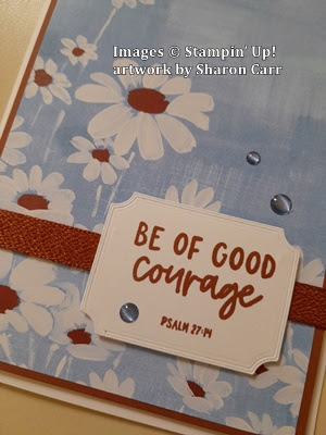
For a sentiment, I chose this one from the new Circle Sayings stamp set (page 17).  This is stamped on Very Vanilla cardstock with Pretty Peacock ink.  I had trouble finding a new die set that fit this stamp correctly, so I pulled out the Stitched Nested Labels that are retired.  I liked the look of this one.  It's die-cut, then the Blending Brush with Crushed Curry ink was barely blended on the edges.  The sentiment was then attached with Dimensionals.

The bling used here was sort of a surprise to me.  I had the 2023-2024 In Color Dots sitting on my work table.  This uses the Wild Wheat color gems and I love them with this card!

You know me, after making one card, I had to sit down and make another.  This one has just two changes.  Yes, I know, always tweaking my cards.  

The sentiment was attached to this card straight on.  Not sure which way I like it better.   What do you think?

The other change was using the Copper Clay 2023-2024 In Color Dots.  Which do you think work better?  I think I'm leaning towards the Wild Wheat accents for this card.  Or should I have gone with a gold or maybe a bronze-y or coppery color instead??  Help me out here with your thoughts.

Hope you like the new color combo used on these cards.  I was very surprised by how much I liked these colors together.  Give them a try and let me know what you think.

If you're planning on ordering soon, please use the Host Code shown at the top of this post.  You know I truly appreciate you supporting my business.  You're what keeps me going with the creating and crafting, then sharing these cards with others.  Thank you so much!

Happy stamping and creating,
Sharon

Saturday, May 6, 2023

More Irresistible Cards

Hello and welcome.  Today's post is showing the rest (or most of the rest) of the cards that I made for the shut-ins at church for this month.  I had planned on posting this before the new catalog change-over but didn't get around to it in time.  So, you get it today instead.  I was worried that this awesome Hello, Irresistible DSP wouldn't last this long in the Online Exclusives and be sold out by now.  But it's still available and I so love it!  Yay!  So, here's (most of) the last of the cards that were made for this month.  Hope you like them.  Of course, you can change the idea to fit whatever DSP you have on hand.  This is just a great card template to use anytime.  And it works especially well with that 6" x 6" DSP that you're hoarding.  Another bonus if you're making multiple cards of this type is there's minimal stamping and no die-cutting.  Just some quick and easy layering.  Let's get stamping!

So pretty!  Just love this DSP and can't get enough of it!  I had ordered two packs originally, and some of the designs are already gone.  I need to make sure all of them have been used before I'm allowed to order more.  The boss said so!

This batch of cards started out with the Petal Pink cardstock that measured 8 1/2" x 5 1/2".  It's scored and folded in half.  

The Hello, Irresistible DSP comes as 6" x 6", so cutting it this way you're able to get three cards from each piece.  Way to stretch those lovely prints.  First, a 1/2" slice was taken from the bottom of this design to make it 5 1/2" long.  Then the sheet was cut into three 2" strips.  

I wanted just a very skinny black strip to make the DSP stand out more.  The Basic Black cardstock was cut to measure 5 1/2" x 2 1/8".  This will give you just a 1/16" on either side.  They were attached together with Multi Purpose Liquid Glue for ease in lining it up correctly.  Then this was attached to the card front about 1/2" in from the folded left edge.  Like I said, easy peasy.  Right?

For the sentiment, I chose a simple one from the Happy Labels (page 50) stamp set.  I love the two different fonts on one sentiment and they do such a good job of that.  This one was stamped with Memento Tuxedo Black ink on a 5/8" wide strip of Basic White cardstock.  The coordinating Happy Labels Pick a Punch was used on each end to make it a little dressier.  The label is attached to the card front with Dimensionals.

For a little extra something on the card, I added two of the Brass Butterflies.  Usually, I only add odd numbers for bling, but the two seemed happy just like that.

Here's a pic of the bunch of these cards that I made.  As you can see, a couple of them have a different print with the Petal Pink background.  Then there were three more that used another print from the set.  This time I switched things up to use Soft Sea Foam cardstock for the base because I liked it better with the print paper.  

Between these cards and the blue cards, I shared earlier in the week, there was a goodly pile of cards that went to the post office this morning.  Hope each of these cards will bring a smile to the recipient's face.  Just need to keep spreading God's love and caring to those around us.

If there's anything I can do to help you with your stamping needs, please get in touch with me.  I'm here to help you with any questions you might have.  I'd love to hear from you and hear about the creations you are making.  If you're placing an order soon, please use the Host Code shown at the top of this post.  Thank you so much!!

Have a very blessed day!
Sharon

Friday, May 5, 2023

Friendship Friday Again

Hello, hello!  As many of you know, last Friday was my birthday.  Yup, another year older, and hopefully just a little bit wiser.  But boy, did I ever get some beautiful and creative cards!  A couple of you have mentioned you missed seeing the cards I receive from my friends each month.  So I figured this would be a perfect opportunity to share some lovely cards with you.  So here goes...

created by - Judy Bur
Wonderful coloring and composition here!  Makes me want to find a window seat and relax
created by - Jean Mazurek
Those sweet tulips!  And add all the other die-cuts to give this card a lovely feminine feel to it.
created by - Sue Fabris
Wow, look at all the die-cuts!  A really fresh-looking floral card
created by - Kathy Hintz
Love Misty Moonlight and love that sweet little bird too
created by - Jan Hollmann
Nice, crisp looking card.  Love the black and white with a touch of green
created by - Barb Eisenman
Love the use of both this DSP and the Two-Tone Flora on the card front and the inside too
created by - Connie Juengel
Interesting front flap cut
created by - Shirley Krone
Beautiful layering on these flowers and the coloring of the hummingbird is gorgeous.
created by - Anita Wright

created by - Anita Wright
I just had to show you the inside of this card too!  Isn't it fabulous?

created by - Kathy Hintz
This isn't a birthday card, but it came during that time frame , so I figured why not add it?

There you have an overview of the wonderful cards that have been showing up in my mailbox.  They are all beautiful and I treasure the time and effort each of you ladies put into making them.  Thank you all (including the store-bought cards that came too) for making this birthday a special day.

Hope you enjoyed the peek at all this creativity.  You ladies are wonderful!

Keep stamping and creating!

Sharon